A UI design critique of the AI tools in Microsoft Designer
Microsoft’s new design tool emphasises generative AI. How good is its UI?

Microsoft Designer is a new web app for visual designs. Examples include creating posters, cards and visual posts for social media. Its presentation heavily emphasizes new AI features, which mainly generate layouts and images. How good is its UI?
I closely follow the current surge of such AI tools, as a professor and researcher, working at the intersection of Human-Computer Interaction and AI.
With this article, I take this release as a motivation for a short UI design critique. Spoiler alert: There are some interesting ideas, as well as some room for improvement. In discussing these, I hope to provide useful takeaways for the many UI/UX designers who currently face the task of creating strong UI designs for AI tools.
Let’s analyse the main UI views, step by step.
“Copilot” view
Starting a new draft opens the “Copilot” view. Here, users are given two options:
- Users can either start by describing the content, which will generate layout suggestions, using text elements and stock photos (no AI-generated images here).
- Alternatively, users can enter a prompt for an AI image generator, which will then generate and display three images.

Surprisingly, these two entry points are not actually alternatives: If we describe content first and then generate an image, it suggests layouts using the generated image(s). That’s great and useful but the UI says “start” twice (see image: “start with your content” vs “start with an AI-generated image”), so initially it’s not entirely clear that this combination is possible.
Generation view
This view is shown upon submitting a text prompt for the image generation feature described above.

- Good: The UI shows prompting tips while the user is waiting for the image generation to complete.
- Bad: The eventually generated images are small versions (I think), only blown up on selection. While this reduces initial waiting time, it also introduces an unexpected second waiting phase upon selection (see video below). That’s not the best UX but it’s admittedly not easy to work with such long delays.
Edit: It is possible to zoom in on the generated images directly, indicating that the second loading phase is not due to upscaling but rather layout generation.
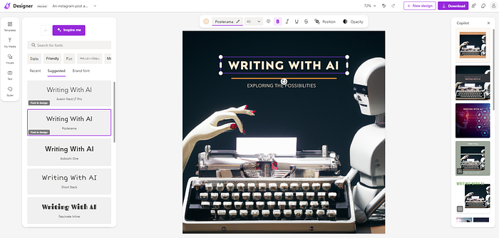
Main view
This is a typical “work view” with a canvas and toolbar. Let’s focus on the AI features again, which come in the form of two types of suggestions.
- Left side of the canvas: This toolbar shows context-dependent suggestions, such as fonts if the user has selected a text element on the canvas. The “AI” feature here is integrated as an “Inspire me ”-button that randomly (?) selects options (e.g. fonts). Alternatively, users can of course choose manually.
- Right side of the canvas: This toolbar shows selection-independent suggestions, namely alternative layouts. This is again branded as a “Copilot” feature, so presented as AI. There are no manual controls here — take it or leave it. However, after choosing a suggested layout alternative, users can of course further edit it directly on the canvas.
Overall, this is a simple UI layout for both local and global exploration features. What could be improved?
In such a design tool, users would benefit from a visual history that keeps track of their design exploration and iteration.
While an undo button indeed exists, there is no visualization of past designs. For example, imagine having a filmstrip-like history at the bottom.
Problems with iterating prompts
On the main view described above, I stumbled over a key problem: There’s no way back to the initial generation view!
That means that users cannot directly iterate on their initial image prompts. It is not even possible to copy the original prompt to paste it into a new draft. The prompt is used as a default draft name but trying to edit it brings up an empty text box, so it cannot be copied from there, either.
To be fair: It is indeed possible to enter new prompts via “Visuals -> Generate” (see image below). However, selecting an image there adds it as a new image object to the canvas — so it does not allow iterating on the initial image directly.

Summary
In summary, there are two interesting UI ideas in this new web app that I can see being useful as inspiration for similar tools in the future:
- Handling waiting time for AI generation by giving the user prompting tips. Bridging loading times with tips is also a common UI pattern in video games. While useful initially, it can be expected that users benefit less and less from this pattern over time, as we all become more familiar with prompting, both in general and within a specific application.
- A simple three-part UI layout, which integrates both selection-dependent (i.e. local) suggestions and independent (i.e. global) suggestions, around a central canvas. I think this is a solid starting point. The fact that these two types of AI suggestions are integrated here might be a useful takeaway for some in itself (i.e. reminder that both local changes as well as broader changes could be targets of AI support in design tools).
That said, the current UI also leaves room for improvement:
AI design tools like this one should better support the user in exploring and iterating on a design draft.
To give concrete recommendations here: Add a visual history, add a way back to the initial prompt, add UI elements for direct prompt iteration.
Towards better prompt representations
My high-level suggestion for this application, and others like it, is to work on improving the representation of prompts in the UI.
To make this concrete, here’s a simple idea for the case of the UI of Microsoft Designer: Give image objects on the canvas a “prompt handle” (e.g. icon in the existing contextual toolbar, or an “earmark” in one of the corners of a selected image on the canvas).
Users could then click that handle to bring up a text box in which they can change the prompt in-situ; see my mockup below. For fun, I’ve also added a quick attempt at a “flipside” metaphor but that’s not needed.

That’s it for this design critique. In conclusion, for adding AI to UI design tools, it seems crucial to support users in their design exploration and iteration and think about how to address workflow delays imposed by (current) computation times of AI models. Looking ahead, it will be interesting to see how the integration of AI tools into new and established applications progresses.
If you’re interested, more thoughts on prompt representations (for text generation) and related UI ideas can be found in this short workshop paper by my research group.
Edit March 23, 2023: Microsoft has updated Designer and some of the screenshots here are now outdated. Happy to see that these updates address some of my points of critique!