A usability test on WhatsApp Web
How to solve pain points identified in the WhatsApp experience.

WhatsApp is a messaging service for mobile phones and web that allows you to send text messages, images, audio and video through the internet. WhatsApp is being used worldwide and is the most popular online messaging app.
WhatsApp desktop version is also very convenient to use and send messages to your contacts while working on your system. However, when tested with users it reveals few pain points that they face while using certain features.
This article presents the details and results of a Guerrilla usability test along with a few recommendations.
Objective
To identify the users’ pain points on the WhatsApp web.
Testing Parameters
- What is tested: Two most commonly used tasks in WhatsApp web
- With whom it is tested: 3 users with 2 new users of WhatsApp web
- How it is tested: Through observations and interviews
Process Followed
The process of Guerilla usability testing is followed to test the identified tasks on WhatsApp. This involves following stages.

1. Identify User Tasks
A list of tasks is created that a user is able to perform using the WhatsApp web.
2. Prioritize Tasks
Tasks are prioritized based on how frequently a user will perform them.
Each task is marked with a point from 1 to 3.
Most commonly used tasks are given 3 points, tasks that are performed occasionally are marked with 2 points, and tasks that are done in a while are given 1 point.
Two tasks are identified as the most commonly used, and given 3 points.
- Send message to your friend
- Share photos with your friend
3. Perform Testing
The selected tasks are given to users along with instructions. Two methods are followed to collect their feedback.
- Users are observed while performing actions
- They were talked about their experience when they perform certain tasks
Below is the user flow of each task along with an indication of their expressions at that point.
Task 1: Send a message to your friend

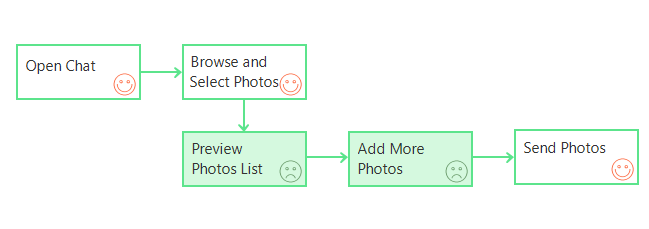
Task 2: Share photos with your friend
4. Analyze Pain Points and Recommend Solutions
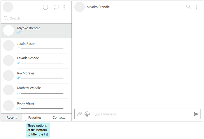
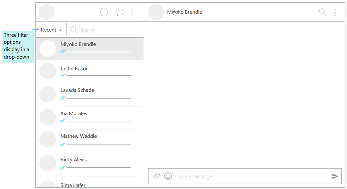
Pain Point 1: Finding a Contact
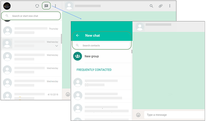
There are two ways to start a new chat: (i) Search within the Chats list, (ii) Go to New Chat icon on top and search contact. The user was not clear to differentiate between these two options.
Searching in Chats list gives an assumption that search will run through the Chats list only, and in fact it works for both Chats and Contacts. On the other side, New Chat option also provides a list of Chats as well as Contacts. This requires some kind of clarity.
Recommendation:
A clear separation between Chats and Contacts needs to provide. This can be done by giving a filter option in the Contact list, or a single list can be sorted based on Recent Chats or Contact names.
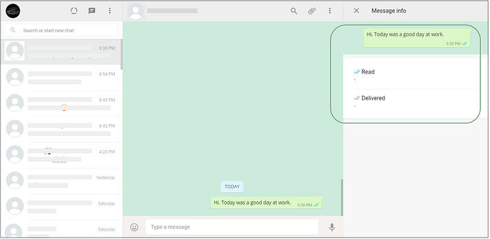
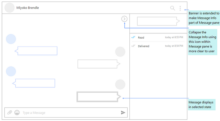
Pain Point 2: Viewing Message Info
In Message Info pane, the area showing message status is merged with the Message pane. Also, it is not clear that the user is viewing the status of which message. Also, it took time for the user to find Close icon on top on Message Info pane.
Recommendation:
The area of Message info pane and Message pane needs to differentiate clearly. Since this is desktop version and Message area is still visible when Info pane is opened, the link between message and its info could be made more prominent. The selected message is shown as highlighted.
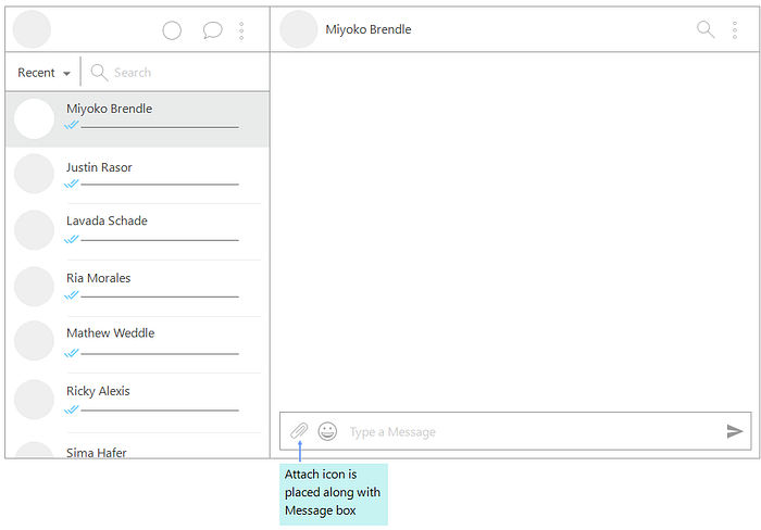
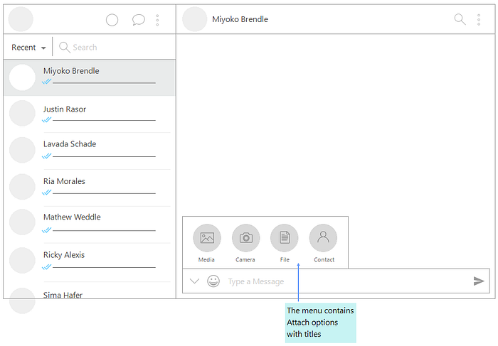
Pain Point 3: Using Attach Option
The Attach menu and tooltips do not match with the UI. It gives a totally different theme and experience in the current screen.
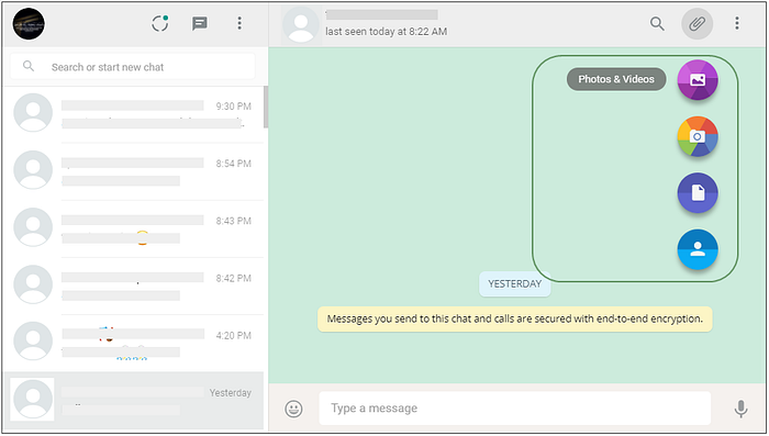
Recommendation:
Menu placement and theme is made consistent with UI. Instead of Tooltips, the option names along with icons seem more helpful.
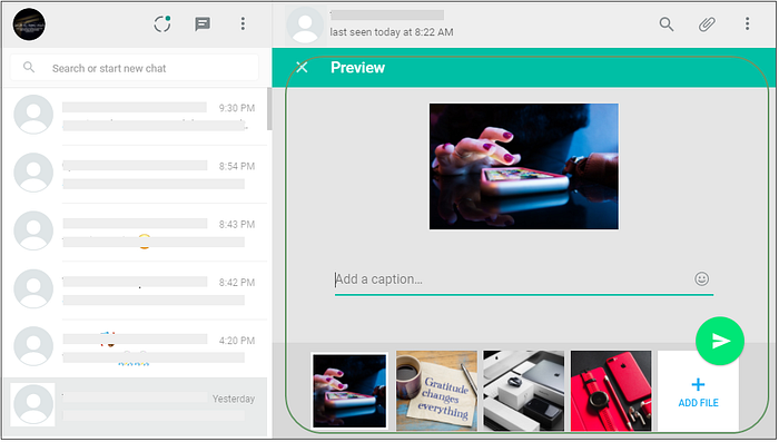
Pain Point 4: Attaching Photos
Close icon with Preview title is confusing. The user clicked it just to close the preview of selected photos, but it discards all the selected photos.
Adding more files option is not clear. The Attach icon still displays on top, but it is not functional. The user clicked on that icon first.
It is difficult to navigate large number of selected files.
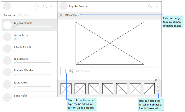
Recommendation:
Preview area is renamed to Attachments to avoid any confusion for the user. Scrolling is provided in thumbnails area. User can add more files by clicking the Add icon with Caption box.
Few More Observations
- Using a scrollbar requires high accuracy to hold the bar and scroll it. The cursor got changed to resize when user tried to scroll Message pane. Scrolling cannot be done using keyboard in Contacts pane and Contact/Group Info pane.
- Notifications in response to an action display on bottom left corner of Contact list where user skipped it multiple times.
- Status cannot be updated on desktop version, neither user can delete his status. Also, user is not able to see the viewers of status.
Final Thoughts…
The purpose of this article is to provide user feedback about WhatsApp Web. There is no questions on the innovative user experience that WhatsApp is providing to its users, and I hope this exercise will help to further enhance it.
Happy WhatsApping !!