Redesigning the university’s website information architecture and user interface — a UX case study
A General Assembly Project — NAFA IA & UI redesign.

Objective
The objective was to analyze the current flow of NAFA’s website with the different methodologies with my teammate and to reintroduce a new information architecture and user interface with a working prototype.
NAFA Background
Established in 1938, the Nanyang Academy of Fine Arts (NAFA) is Singapore’s pioneer arts education institution, well-known for grooming diverse artistic talent. Through industry-led practice and experiential learning, NAFA nurtures creative skills which lead at the forefront of both traditional and contemporary art practices.
The academy offers full-time diploma and degree courses through the School of Art & Design comprising 3D Design, Design & Media, Fashion Studies and Fine Art Programmes; School of Arts Management, Dance & Theatre; and School of Music.
Competitive Analysis
Me and my partner Tezel started by comparing two other competitors who are the prominent art institutions, Lasalle and NTU’s ADM, and evaluated their content and usability with ours using Jakob Nielsen’s ten heuristics evaluation.


After analyzing the user experience of all three sites, we calculated that NAFA’s website fared the lowest when it came to learnability, efficiency, memorability, error recovery, and overall satisfaction (LEMErS scale).
The three major pain points we came across were Consistency, navigation flexibility and recognizing errors page to page. These are changes that we decided to take on during the restructuring of the site.
At the homepage, we noticed that lacked precise information about NAFA, and the poorly designed navigation drop-down menu which leads to a complex linking system between selections also highlighted that the three major pain points of consistencies, navigation flexibilities, and error recognition.
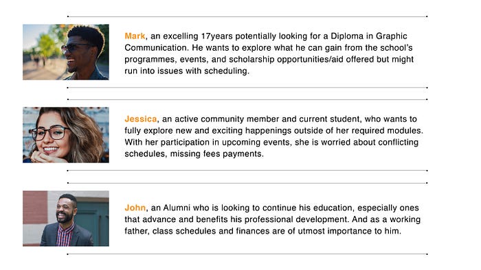
Our User Personas
The new site would have the needs of the users represented by our three personas, and here there are.
To understand more insight into our competitors, we put together a same list of task to compare the persona’s journey in all three schools.
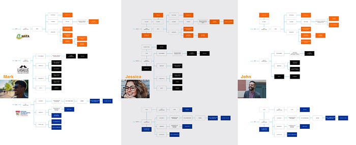
The persona’s journey showed that the users took more steps on NAFA’s website compared to Lasalle and NTU’s ADM.
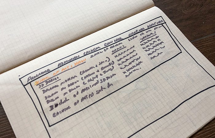
NAFA’s Current Information Architecture
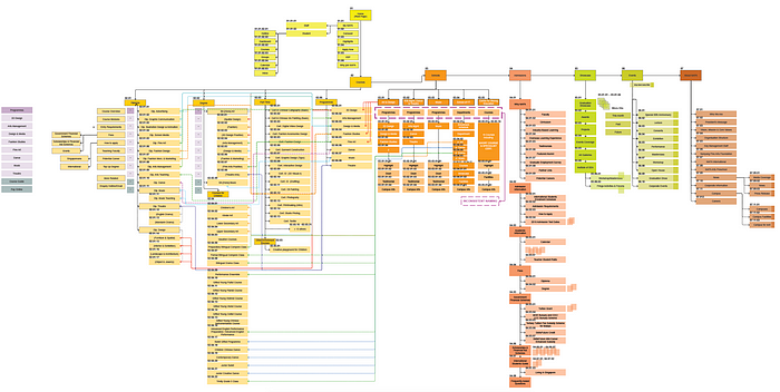
We reached inside into the issue starting with a content audit of NAFA’s site and drew up an overview Information Architecture of the current site. One thing we quickly realized was that although the navigation spread out systematically, the two headers ‘Courses’ and ‘Schools’ had overlapping pages and two ways to access, and that could not be easily comprehensible by new users.
Card Sort
Our first round of card sort revealed the issues we gathered during our primary research so that we decided to redo the menu listing again.


In the 2nd round of card sorting, we gathered more useful insights. And we were able to recognize a pattern in the way users categorized the pages.

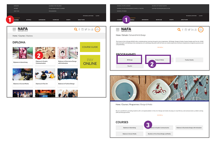
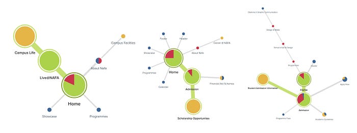
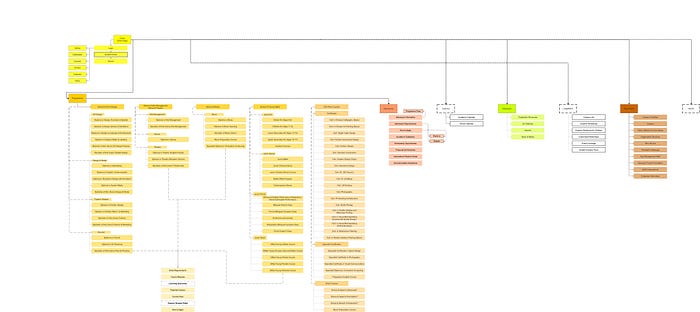
Armed with the card sort results, we moved on to the new information architecture of the site and arranged the pages and categories in the best way to the user experience. We decided to have one mega drop-down menu to eliminate two steps to reach the user goal which the current site has. For example, Mark selecting diploma in graphic communication on the main menu.
Tree Jack
We conducted a Treejack test study for persona Mark. Users were given a set of tasks to complete based on his task.
The Treejack results gave us the clear understanding of how the users were navigating in the task. The new Information Architecture with a success rate of 88%, and the directness of a 75% score for completing the tasks.
With the successful results of the Treejack, we finalized the new Information Architecture for the site.
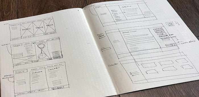
Sketches and Wireframes
With some quick sketching, I manage to draw some basic low-fidelity wireframing.
Usability test
We did our usability testing on mid-fidelity wireframes. Users easily achieved given tasks. But the lack of hierarchy of items positioning was quite visible and cannot be ignored.


Usability Test

- First visual takeaway lacked excitement and the extra oomph!
- Sticky header for the programme was wonky and needs revamping
- More course information should be displayed instead of just course information
- Buttons on the side of Programme was too chunky, and separators required
- Same goes for buttons on the Scholarship page
- Scholarship page has the poor hierarchy as to what is the header and body copy
High-fidelity prototype
We created the user interface designs and interaction with Axure.
High-fidelity prototype here
For best view pls use Safari or Chrome browser

Thanks for reading my project. This project enables to empathize more with people, understanding that needs and wants. I truly enjoyed the process from the beginning to the end. The entire process allowed me to understand how vital UX can be, and the impact it has on peoples’ lives. This is still a work in progress, but there are some improvements I am thinking of adding in.
Pls, feel free to leave feedback to improve :)