Accessibility in Design
A reflection on why we should make products more accessible.
In my last story, I reflected on what I learned about the design process from an experience about designing for visually impaired users. Here, I will reflect on what I learned about designing for accessibility.

First, what is accessibility?
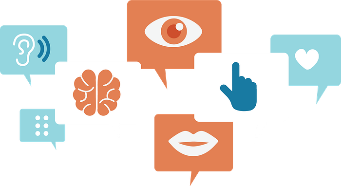
If you search “accessible” on dictionary.com, you get the very misleading answer of “easy to approach, reach, enter, speak with, or use.” This definition is a common misconception and is more related to usability. In a design context, accessibility describes how many people can use the interface. This usually involves designing for people with various types of disabilities, such as vision, hearing, mobility, cognitive, etc.
Why should we care about accessibility?
Many companies see accessibility as a burden. We expect products to be usable and even desirable to users, but accessible? We can only hope. From a business point of view, accessibility is a tough challenge to face and may consume a lot of resources for the sake of a fraction of the user population. This may be true in many cases, but there is always a fine balance between profit and ethics (related: dark patterns). As UX designers, it’s in our best interest to keep business goals in mind, but it shouldn’t be at the cost of user experiences. Because the design process is iterative, early products usually start out with limited accessibility. However, companies and designers should constantly have accessibility in mind and know when it’s appropriate to start tackling the milestone.
My Experience
Last year, I got the chance to work with visually impaired and blind users in a product design class. I won’t explain the whole project here, but I will say that the overall experience was extremely enriching and fascinating to me as a UX designer and as a human.
A memory that especially stood out to me was when a teammate and I were interviewing a congenitally blind man. As part of early user testing, we gave him a surface that had an image of a bike embossed in it and asked if he could recognize what it represented. He had no idea. And I’m actually laughing a bit while writing this because it’s funny to me how much my team’s understanding has changed since then. We were living under the assumption that every other human perceives the world the way we do — a prime example of what not to do as UX designers. A lesson well-learned ;)

When we told him the image was a bike, it fascinated him. To him, a bike meant a bike seat and handle bars. Similarly, a car would mean a leather seat and a seatbelt. This was when I started realizing that he had a whole different perception of the world — that exchange was only a mere glimpse.
The rest of the interview continued in a similar manner (ie. me being mind blown), so I’ll end the story with some final thoughts:
I still have a lot to learn about accessibility and UX design in general, but hopefully this reflection sheds light on the excitement of facing these challenges. There are many obstacles in designing for accessibility, and the only real tool for finding solutions is empathy. Understand people’s needs as much as possible. Make yourself open to worlds unlike your own. It’ll make your product more accessible, but also more human.
I’d love to hear what other people think about this topic. Thanks for reading!


