Accessible design: How much motion is too much motion?
A process breakdown of how to create Accessibility compliant interaction design within a framework.

Interaction design (Ix) is a niche apart of User Experience (Ux) that when created with intent and combined into the User Interface (Ui) and Ux process can help to guide your story. Motion when used in certain ways can excite and delight, but it can also be detrimental to a user's experience and make people sick thus creating negative connotations with a brand. At its worst, motion can even be the cause of death for those that experience severe sicknesses in response to fast-moving designs that create a strobe effect. For these reasons, it’s important for a motion to be considered thoroughly with accessibility in mind.
When creating an Interaction Design plan from the ground up, it is important to understand why motion is helpful, its anatomy, where it will be slotted, which type you want to implement, how it can be streamlined, and what is or is not considered accessibility compliant.
Why Motion is Helpful
There are many benefits of motion that are important to highlight. Understanding the ways motion can be helpful to users will direct your focus when determining which interactions to use so that you don’t implement an excessive amount of motion.
- Creates entertaining experiences: Motion supports longer user retention and engagement convincing users to stay on a screen beyond the average time user attention span allows for (10–20 seconds).
- Minimizes cognitive load: Motion within Ui can help to minimize cognitive load by limiting and guiding the amount of information users see at a time. This can help users concentrate on specific areas at different times in order to lessen the focal point.
- Offers faster-perceived performance: By distracting the user from the amount of time things are actually taking to load (if you have lengthy load times due to site bloat).
- Focus attention & visual feedback: Motion can focus user’s attention on the areas designers want them to see at any given time, creating a sense of hierarchy. Feedback to offer motion is helpful to avoid users being blind to occurring change.
- Shows Orientation: Motion can create spatial relationships, helping users navigate and make smarter decisions.
Motion Anatomy
Following this pattern of motion anatomy within every movement can lend a clearer view of how motion is perceived.

- Triggers initiate an Interaction. Triggers can be user-initiated or system initiated and can be started by scroll, load, or click, hover, or mouse enters or exits.

2. Rule determine what happens when the trigger is initiated and are a set of parameters that the interaction follows.

3. Feedback is anything that a user experiences when they initiate a trigger. For example, if a user clicks a button and something happens whatever they experience that happens is the feedback.

4. Loops and Modes. Loops refer to how long an animation occurs for. This includes how an object repeats changes over time. Modes are subject to variation. Modes can transition in order to visually signal change. Motion helps to communicate differences in modes.
Macro vs. Micro Motion
Once you understand where motion will be slotted you can start to define what motion will be incorporated. There are two types of motion that can help to organize the different types of motion you implement: Macro Motion and Micro Motion.
- Macro Motion: Motion that covers a large amount of visual landscape. For example, transitions, objects moving across screen, panel reveals etc.
- Micro Motion: Micro interactions cover a smaller amount of visual landscape. For example, state changes, drill downs, opacity changes etc.
As mentioned above, Macro Motion includes motion that a user would experience over a large amount of screen space. Macro motion can be experienced in areas such as page transitions, panel reveals, and objects moving across the screen. Parallax interactions are also considered macro, though aren’t necessarily considered ADA compliant (will address this shortly). Micro interactions include motion that is experienced on a smaller visual level, such as state changes, drill downs, drill down transitions, and other effects such as opacity changes, color changes, pulsing effects, etc.
When conducting an audit to determine where motion should be slotted, you can use these types of categories to understand the types of motion you can add to your components and patterns.
Micro Interactions
- Drill Downs include the use of motion to help present additional information within the same page. These can be seen through examples of tabs, tab content, modals, pop overs, accordions, drop downs and carousels.
- State Changes are events that provide feedback to actions. For example, the state changes that happen when components are interacted with to show the user that things are actionable. Things such as buttons, form factors, checkboxes, radio buttons, input fields, etc. often have state changes.
- System/User Alerts are displayed with micro interactions when issues are triggered.
Macro Interactions
- Hierarchal Interactions present a sequence of events in which information is presented. The order that content enters and exits the screen can be done hierarchically.
- Page-Page Transitions offer a connection between whole pages within a design. Transitional motion offers a sense of choreography to move a user through the journey.
- Content Motion speaks to motion that is controlled or manipulated to move apart from the content itself. Examples of this can be seen in parallax concepts and content masking.
Motion Rules
Another thing that needs to be addressed when considering “what motion” are the motion rules themselves. Motion rules determine what happens when the trigger is initiated by a set of parameters that the interaction follows. These rules are things such as timing functions (easing and springs), duration, delays, direction and distance.
- Timing Functions: Easing and springs are considered timing functions that address the way movements enter, exit, and move. Since brains aren’t trained to see things linearly, using easing and springs can create a more natural approach to acceleration and deceleration for a user.
- Duration: Duration is how long motion takes to get from start to finish and should depend on the size of an object and the distance it travels. Durations should be slow enough to highlight change, but, fast enough to not keep a user waiting. Research shows that a single object’s duration generally falls between 200–500ms. This does not include sequencing, as sequencing of patterns are multiple objects put together.
- Delays: Delays define the time-lapse in between when an event is initiated and when the rule is reflected through feedback on the screen. Delays can help establish focal points. It is important to note that delays should not be noticed and any significant delay will cause frustrations or discomfort to a user. Delays are measured in milliseconds and should help to establish a choreography amongst objects on a page. Below are a few recommendations that can be easily digested.
- Distance: Distance determines how far something is subject to move. The farther something moves away from its starting coordinate, the faster it needs to move in order for it to still display efficiency. The longer a user waits for a motion sequence, the less attention they will provide. In addition, moving things across too much of a grid can be problematic from an accessibility standpoint and determine whether they are macro vs. micro, so it is important that a distance grid be incorporated into motion decisions.
- Direction: Direction defines the path that an object moves. Simple directions for example are left, right, up, down. Or they can be more exact x,y coordinates.
Where motion will be slotted
When determining where motion will be slotted into the framework, it is good to create an audit of the framework to understand what components and patterns will require motion so that you can look to understand what motion will be incorporated. Within this, the criteria that will be filled out will help to address where motion can be slotted. For example if the type of motion required is to support a drill down, motion is slotted on open and close, so rules that support that need definition. If the type of motion required is to support a transition, motion needs to be slotted on click or on hover (mouse enter/mouse exit). If the type of motion required is for hierarchal purposes, motion needs to be slotted on load or on scroll. This list can evolve so define your motion.
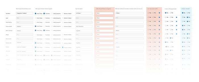
Streamlined Motion
To streamline motion within a framework, it’s best to group types of motion into categories that would assume the same interaction rules. You can look back to the audit for examples as to the criteria to fill out and how you can group these rules. For example, if we’re looking at drill downs, accordions and drop downs they display content that opens and closes, so you could assume the same rules such as timing, duration, and direction could potentially be the same. Another example is state changes. It can be assumed that hover states and pressed states would assume the same timing functions and durations, as these should provide a consistent experience.
What motion is considered Accessibility Compliant
It is to note that I am not an accessibility specialist and these are only suggestions to help create further conversations. But, I have worked with some folks that are accessibility professionals to try and create a list of motion effects that can be implemented safely, others that are more risky, and motion effects that are not to be used.
If you want to learn more about the success criterion of Web Content Accessibility refer to this link provided by W3C.
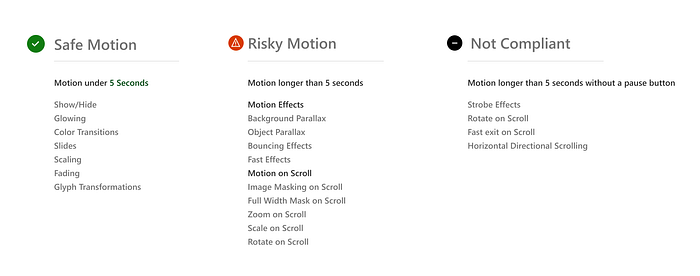
Safe Motion vs. Risky Motion
So what motion is considered safe: Accessibility standards appoint certain criteria that consider motion passing or failing. For example, motion that automatically plays under 5 seconds is considered ok, but if motion is automatically playing for longer it can bleed into the risky motion zone. Motion that moves vertically, and follows a natural scroll pattern is considered passing, whereas motion that moves horizontally, while a user is scrolling vertically is deemed risky. Motion that flashes more than 3 times is considered not compliant, as it replicates a strobe effect.
Motion List
In conjunction with Accessibility specialists, I’ve devised the following list of safe, risky and not compliant motion. Non-compliant motion are things that have been addressed as unsafe, non-negotiable and can lead to death as a worst-case result. A big portion of the risky motion category are parallax effects and relating concepts that have been used all over the web. The list below outlines the types of components and patterns in correlation to whether or not motion would be considered accessible.
Reduced Motion
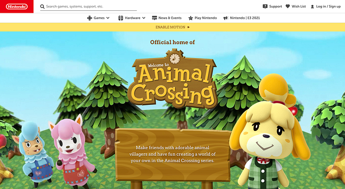
Reduced Motion concept explains if a user is able to opt-in or opt-out for heavy motion use within a web page before a user experiences any motion that risky motion can be implemented in a design. Web browsers already have the option for reducing motion, but not everyone is familiar with this functionality as it is tucked away in the browser settings. An alternative to ensure that users understand that they are able to turn off or on motion is to provide an on-screen component designed into your web page. Let’s look at one example in particular.
Animal Crossings Nintendo https://animal-crossing.com/
This is a great example of a reduced motion component being built into the top of the screen to help ensure that users can opt for motion to be turned on or off before any motion is played.
Motion can be used intently to aid a better user experience and provide feedback where necessary. Motion can excite users and create a “wow” moment that helps market and sell whatever your website is pitching. Motion can be built into a framework and streamlined through a process to help define similar motion rules to make the implementation process easier to design for. It is important to ensure that motion implemented is considered passing by The World Wide Web Consortium (W3C), or accessibility, to ensure that nothing you put on your site can be harmful to your users, thus turning them away from the intent your site is aiming to serve.
Have fun when implementing motion into your designs, but keep all considerations in mind.
Happy Designing!