Adding a new feature through Design Thinking
We use many different apps and like some more than others. And from those apps we like, there are some features we really love, it’s like they were made for us! So the question is: how do we come up with a feature users will love? The answer is Design Thinking.
Definition
Design Thinking is a human-centric methodology for creative problem solving. The goal of the process is to come up with a useful product or feature that people will love.
It starts with a problem definition, continues with getting insights from users and driving conclusions to redefine the problem if needed, then brainstorming all possible solutions and finally prototyping and testing the best ones.
Even if it’s broadly used in the digital world, it can be used by anyone, from large organisations to individuals, to solve any kind of problem.
So let’s use Design Thinking to create a new functionality for Citymapper!

Citymapper is a public transit app and mapping service. It integrates all urban transport methods, both public and private and it’s main goal is to provide users with the fastest and cheapest routes for going from A to B.
Everything in Design Thinking starts with a design challenge
The current product already solves some of the main problems of urban mobility, but there are still some pain points. My design challenge will be to solve the pain of having to buy many public transport tickets through different channels for going from A to B.
The Design Thinking process
Phase 1: Empathize
Empathizing is putting yourself in someone else’s shoes.
One way to build empathy is doing interviews to your potential users, in my case, anyone who uses public transport, especially abroad.
The goal of the 5 interviews I conducted was to discover what are my users main pain points when using public transport. These were some of the questions I asked them:
- “How do you move around when you are abroad?”
- “How do you plan those trips?”
- “Can you tell me about the best and the worst experience when buying tickets for public transportation abroad?”
- “How would you like to buy and keep public transport tickets?”
And here the insights I gathered from the interviews:
- Google maps: all of the interviewed use Google maps to see how to go from A to B while travelling, but they admit it has some pain points as well. “I can’t even think about another app to plan my route”. “But it doesn’t always show all the transport options available”.
- It’s time consuming: users feel they have to spend too much time searching for the best way to go from A to B, and then buying the different tickets, either online or physically. “Every time I travel abroad I spend too much time looking for the best way to move around”.
- Too many physical tickets: users complain about the amount of tickets they can accumulate at the end of the trip. “They end up filling all my pockets. Later I find them in the washing machine”.
- Mobile phone as a tool: some users suggested it would be nice to be able to directly pay with your phone or use it as a ticket. “I already pay everywhere with my phone, why can’t I pay for my public transport with it?”. “It’s absurd that I have to exchange currency just to pay the subway ticket”.
- Trustworthiness is key: users prefer to use those transport methods that seem clear and easy to buy and understand, even if sometimes they are not the cheapest ones. “I don’t care so much about the price. I just want to know that I will arrive safely and on time to the destination”.
- Language issues: Some cities’ public transport is explained only in their own language, which makes it difficult to use. “It’s a real challenge to buy a subway ticket in Tokyo”.
- Tracking transport expenses: some users complained about having to spend time after the trip to know how much they actually spent in transportation during their trip. “Buying different tickets per day, with different payment methods… It’s difficult to know the total spent at the end”.
- Walking is the preferred option: when abroad, users prefer walking around the city if the distance is manageable. “It’s a great way to discover the city while saving some money”.
Phase 2: Define
With the insights we got from our empathy exercise, in the define phase we can revisit the initial design challenge and re-define the problem if needed. For doing so, a PoV (point of View) can help.
PoV = persona + need + insight
In this example:
Ainhoa, a 27 seven years old woman who loves to travel abroad many times a year, needs to be able to buy transport tickets in an easy-to-use, cash-free and trustworthy way.
Also, our insights can help us define the main pillars our solution must have:
- Avoid the use of cash and physical tickets
- Use of mobile phone for all the actions required: search, payment and ticket keeping
- All transport combination options for going from A to B in one same place.
Phase 3: Ideate
After redefining the problem it’s time to work our brains out generating ideas that can solve it. This phase has 2 sections:
1. Diverge (Create Choices): brainstorm and come up with as many ideas as possible. Here the ones I came up with:
- Have an in-app wallet where users can put some money from whenever they want to buy the transport tickets they need.
- Insert credit card details that the app will remember when paying for each ticket.
- Users buy as many transport tickets as they want and the app accumulates the expenses, which are charged to the user once a month.
- After buying the transport, the user receives an email with the ticket in PDF format.
- Every ticket has a QR code that can be scanned at the transport station.
2. Converge (Make Choices): select the best ideas that will go into the next phase.
In this case, I will go with a solution where:
- The user will be able to see all possible transport combinations for going from A to B and the price of each.
- The user will be able to buy all the tickets needed with just one click (credit card details have already been inserted and can be used every time the user wants to buy transport tickets).
- Tickets will be kept in the app’s wallet in QR code format.
Phase 4: Prototype
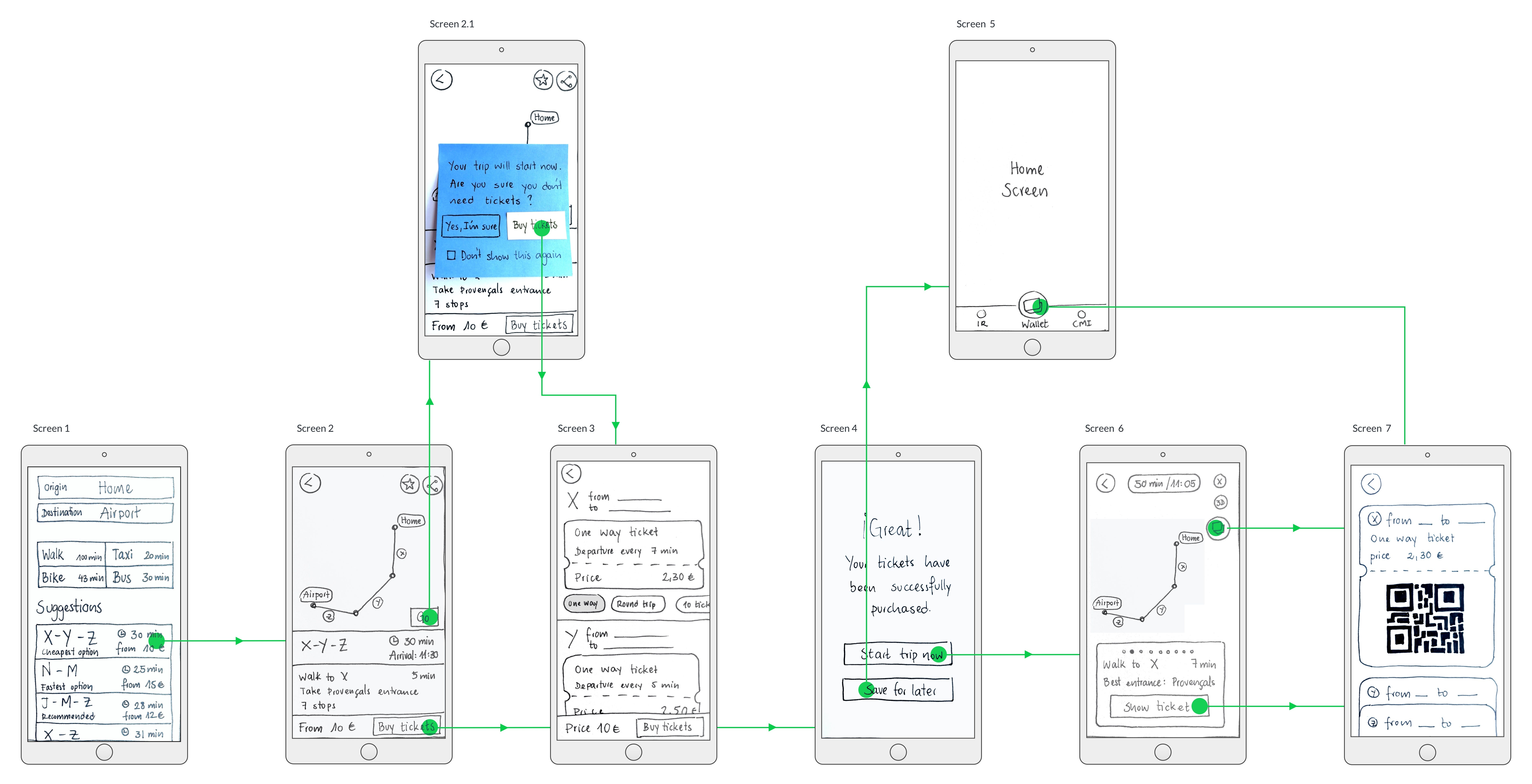
With this solution in mind, I sketched the prototype:

Screen 1: The letters (X, Y, Z, etc) represent the different transport options that the route involves. This screen is similar to the current one, but I added 2 things:
- The from price of the route tickets. This way the user gets an idea on how much it costs.
- Some of the routes have a tag showing its benefit: It can be the cheapest, the fastest, the recommended one by most users, etc. This can help solving the “trust” painpoint some users mentioned.
Screen 2: The user lands on this screen after selection one of the transport suggestions on screen 1. I added the sticky bar with the from price and “Buy now” CTA.
Screen 2.1: If the user clicks on “Go” button in screen 2, a pop up will ask the user if he/she is sure that he/she doesn’t need to buy tickets.
Screen 3: On this screen, the user can buy all needed tickets. If there are many options for each ticket, the user needs to click on the preferred tag, which is marked in grey.
Screen 4: Success screen. The user can save the tickets for later or start the trip now.
Screen 5: “Save for later” brings the user to the home screen, where the wallet has been added on the bottom tap bar.
Screen 6: “Start trip now” will display the map of the route and the instructions. Whenever there is a ticket available, the CTA “Show ticket” will be there. There is also a button to the wallet available at any time.
Screen 7: The user will have all the bought tickets in QR format saved on the wallet.
Phase 5: Test
After the prototype is created, we need to test it with real users. In this case I didn’t go so far, but this is a crucial phase to refine our PoV and solution proposed, and to learn more about our users.
Learnings and conclusion
Some learnings I got from this challenge:
- Users are the source of insights we need to design the solution. The problem you are trying to solve might not be your own, so to gain empathy with users is key!
- During interviews, seeking for stories is a good way to get great insights.
- The narrower the problem definition is, the better. It is easier to find a tailored solution to a narrow problem than to a broad one, which maybe requires more than one solution.
- There are no bad ideas, so the more you can generate, the better. It is key to focus on the user’s insights to choose the one that will be a better fit for to solve the problem statement.
Design Thinking is a user-centered methodology that will start with a problem we need to solve for our users and end with a solution made from the insights you got from them. And it’s an iterative process, so we would go through all the phases again if needed to find the final solution to the problem.
Thanks for reading!


