Adding value to your design by understanding motion and its tools

The original intention of writing this article is because most of the designers around us basically rely on feelings when designing interactions. Although the final work looks beautiful, it doesn’t really add value to the user experience.
So, in order to better understand interaction design and its tools, let’s first take a look at the classification, techniques, and specifications of micro-interactions. Then we will move on to the second part, comparing some interaction design tools from two aspects: design and motion.
Here is the summary of what I’m going to talk about:
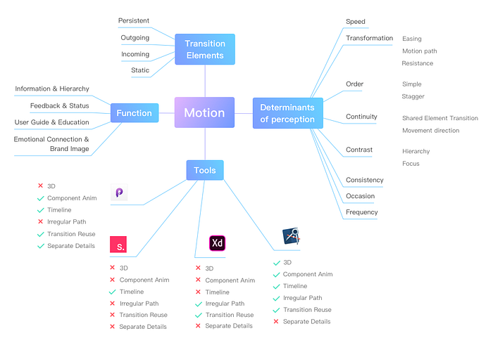
1. Function
According to the functionality, we can divide the micro-interaction into the following four categories:
1.1 Information & Hierarchy
Navigational transitions that help users understand the relationship between elements or interfaces.
Interfaces are either of the same level or parent-child relationships. Vertical scrolling is usually the way information is viewed, and horizontal sliding is usually a reflection of the same level. Volume changes, even 3D transitions, are often ways of embodying parent-child relationships.
1.2 Feedback & Status
Including feedback status, undo operation, prompt message, etc. It is intended to give users timely feedback, which is convenient for users to understand their own status or even cancel operations.
1.3 User Guide & Education
It usually occurs when the user performs an operation for the first time, with guidance and feedback as the mainstay, helping the user understand and familiarize with the function.
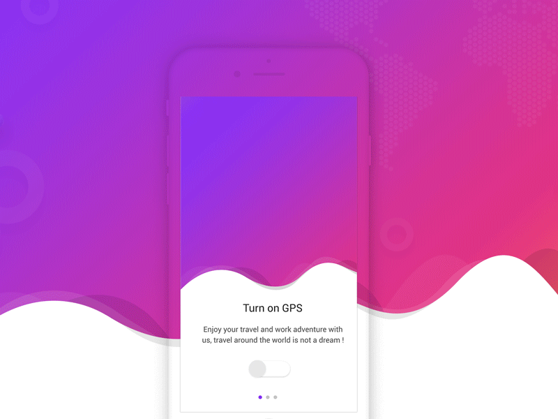
1.4 Emotional Connection & Brand Image
Including opening, icon animation, loading, etc., in order to enrich information, enhance interest, establish a brand image and increase user loyalty.
2. Transition Elements
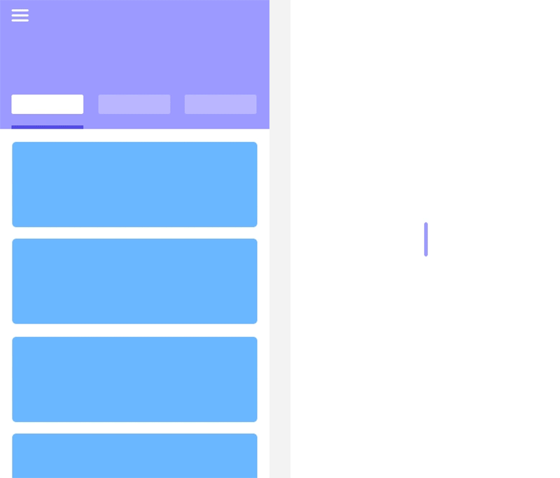
Material Design divides the transition elements into the following four categories: persistent element, outgoing element, incoming element, and static element.
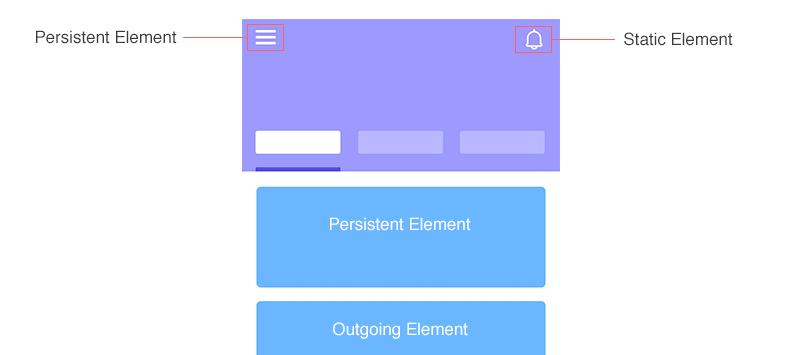
2.1 Persistent Element
A persistent element remains in the interface, but their shape, size or position may change depending on the browsing state. The choice of animation can be shared element transition(see below) or tweening.
2.2 Outgoing Elements
An outgoing element is an element that no longer appears in the next interface. The choice of animation can be faded out, drawn out, and so on.
2.3 Incoming Element
An incoming element is a newly introduced element in the new interface. The choice of animation can be fade in, fly in, etc.
2.4 Static Element
A static element is an element that remains the same in both interfaces, without any change.
3. Determinants of perception
Sometimes we can feel the nuances between animations, but can’t tell the specific reasons. So let’s take a look at the factors that determine the final rendering of motion: speed (duration), transformation, order, continuity, contrast, consistency, occasion, and frequency.
3.1 Speed (Duration)
By simply changing the speed, two animations with exactly the same factor will have a very large perceived difference.
On average, human visual perception takes 230 ms and, for different people, it varies between 70 and 700 ms. (You can get more information from Wikipedia by visiting Human processor model.)
That’s why short transitions are too abrupt, and long transitions keep the user waiting. We need to adjust the duration based on the complexity of the animation to produce a smooth and clear transition.

3.2 Transformation(Movement)
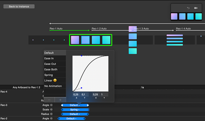
3.2.1 Easing
Easing is the opposite of linear effect and can be subdivided into ease-in, ease-out, ease-both, and of course bounce, elastic, cubic, and so on. I won’t cover complicated easing here, you can see all the easing functions at easings.net.
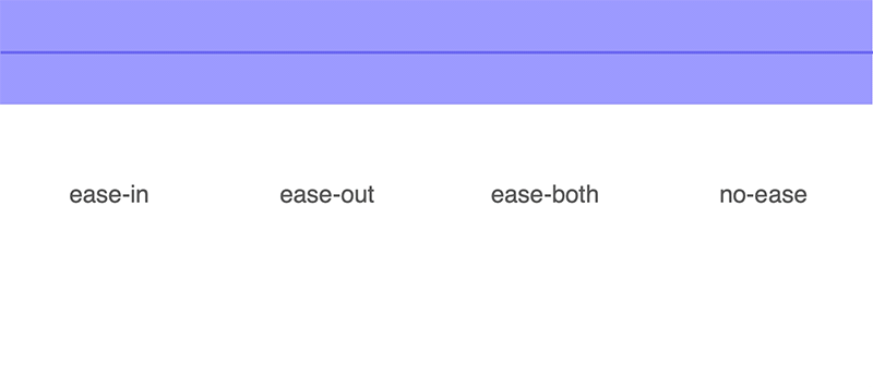
We can easily understand this movement with the help of simple physical knowledge:
- Ease-in: slow at the beginning, fast at the end (commonly used for outgoing elements)
- Ease-out: fast at the beginning, slow at the end (commonly used for incoming elements)
- Ease-both: slow on both sides
- No-ease/linear: an object that moves at a constant speed
3.2.2 Motion Path
When an element moves, the line (track) it draws is called the motion path, which can be a linear motion or an arc motion.
An element moves linearly by default, and the motion path forms a straight line or diagonal. An element can also do arc motion, which usually occurs when the ratio of the element changes.
Arc motion is sometimes vertical out, sometimes horizontal out.
- Vertical out: the movement starts in the horizontal direction and ends in the vertical direction. (The horizontal velocity is greater than the vertical velocity.)
- Horizontal out: the movement starts in the vertical direction and ends in the horizontal direction. (The horizontal velocity is less than the vertical velocity.)

Material Design gives us a way to determine the orientation of our arc: “The arc should match the primary scrolling axis of the UI. ” Personally, I prefer to imagine the direction in which a finger or mouse interacts with the screen to determine the direction of the path.
3.2.3 Resistance
The resistive force is a force whose direction is opposite to the speed of the body. In other words, the object resists movement to stay constant.
Resistance mimics real-life movements such as overshoot, oscillation/spring, stretch, parallax, etc.

The use of resistance makes it easier to establish emotional connections between users and products, which also helps narrow the gap between virtual and real-world interactions.
3.3 Order
Transition order helps users understand the focus of the transition.
A simple sequence is that all elements move together like a whole.
A complex sequence, such as persistent, outgoing, and incoming elements change together, the ideal order is: first, the outgoing element disappears, secondly, the incoming element enters, and the persistent element transition completes throughout the process.
In complex sequences, staggering helps us understand the structure of information and increase its richness.

3.4 Continuity
In order to demonstrate the continuity of the interface, it is not only necessary to take into account the ‘speed’, ‘transformation’, and ‘order’ mentioned above, but the proper use of Shared Element Transition is also extremely important.
Shared Element Transition is very well known in terms of Android development, which helps implement the transition in the shared view. In iOS, it is called View Controller Transition.
Another important criterion for continuity is to ensure that outgoing and incoming elements move in the same direction and avoid conflicts.
3.5 Contrast
The so-called contrast describes the hierarchical relationship between transitions.
An animation always has its primary element (focus element). By increasing duration, delaying movement and increasing volume to highlight the focus element, users can quickly identify the purpose of the interaction.
In order to reflect contrast, the transition of focus elements usually ends after other transitions, showing a kind of visual extensibility. And the staggered elements must have a very short time interval to keep the focus unbiased.
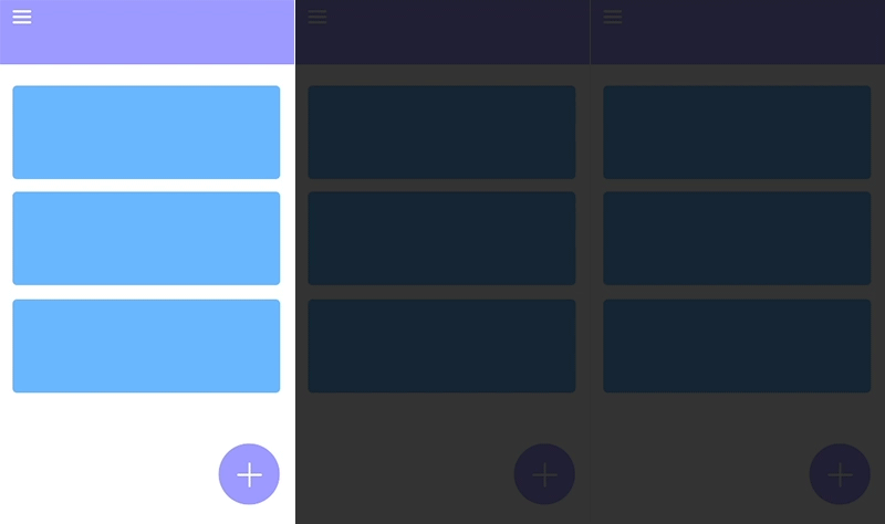
As shown in the figure, the purpose of the animation is to highlight the three options after opening the add button. The options are very well highlighted with a staggered interval of 0.15–0.25s. However, the visual continuity disappears when the interval increases to 0.4s or more.
Finally, we need to reduce the number of transition elements to emphasize the focus element. We can group the same type of elements and use group movement instead of separate movement.
When our focus element is in a container (mask), the direction and duration of their movement sometimes lead to conflicts. At this point, it is necessary to reduce conflicts by giving up shared element transition.
3.6 Consistency
Consistency between transitions of the same category should be ensured.
Software such as Invision and Zeplin can generate DS (Design System) automatically, incorporating transition criteria into Design System is also one of the future trends. DS will not only be limited to color, font, and components.
In order to ensure the rationality of the animation, we also need to take occasion and frequency into account. The over-high frequency of complex animation can also affect the browsing experience.
4. Interaction design tools
Currently, Principle, Invision Studio, XD, Flinto, Framer, Anima, Marvel, Axure are the most powerful interactive design tools. I am not going to cover all of them, and the following is just a brief comparison of the first four commonly used ones.
Of course, some people may say that none of these tools can be compared with After Effects, but After Effects, after all, is designed for more complex animations, which is really not suitable for interactive design in terms of real-time interaction, online sharing, and rapidity. More importantly, the gorgeous animations designed by designers who are not familiar with development are very difficult to achieve in the development process.
The logic of these tools is basically the same, they automatically animate elements of the same name. However, the smoothness and diversity of this automatic process vary from tool to tool — each tool has its own advantages and drawbacks.
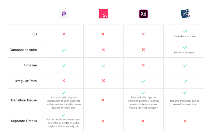
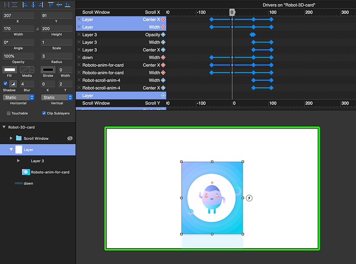
4.1 Principle
The design interface of the Principle does not have much advantage. There is no vector pen currently, and the gradient shape is not supported.
One of the greatest strengths of Principle is its component animation, which saves a lot of time currently wasted in re-creating animations of the same elements.
The timeline of Principle can not only adjust the movement and duration for each element, but also set details such as center X, center Y, rotate, opacity, radius, and scale, which greatly increases the richness of animation.
Principle does not support irregular shape animations, nor does it support 3D transitions. Still, you can make similar effects, such as 3D transitions and animated characters, by using scroll group and setting up appropriate drivers.
4.2 Invision Studio
In terms of design features, Invision Studio completely surpasses all other software, and can completely restore the various layers and paths from Sketch.
Studio is currently free and the Windows version is also in production. At present, it does not support irregular paths transition or component animations.
Studio’s responsive design system is similar to Sketch’s, which allows you to group elements into containers and implement a screen-friendly interface.
4.3 Adobe XD
Inheriting Adobe’s operating system, XD’s design interface is also very neat.
However, its mask and vector pen are not yet up to the level of making complex interfaces or illustrations.
After updating the automatic animation feature, XD has gained a lot of ground. The interface and interaction design are integrated into one software, which greatly facilitates the synchronization of the UI and animation files.
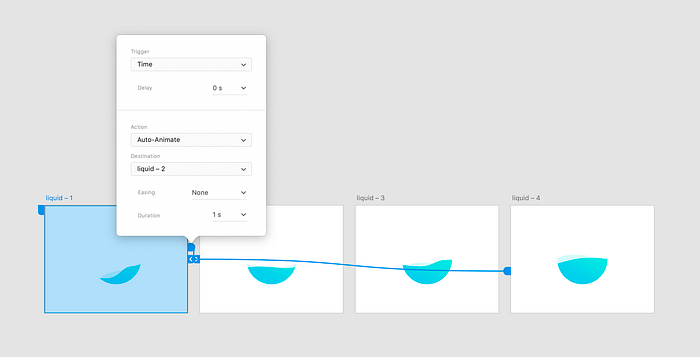
XD has no timeline, so it is impossible to adjust the animation of each element separately. For example, the juice animation in the following picture is slightly stiff without the effect of stagger.
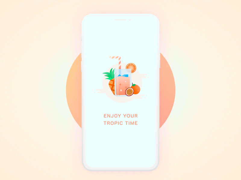
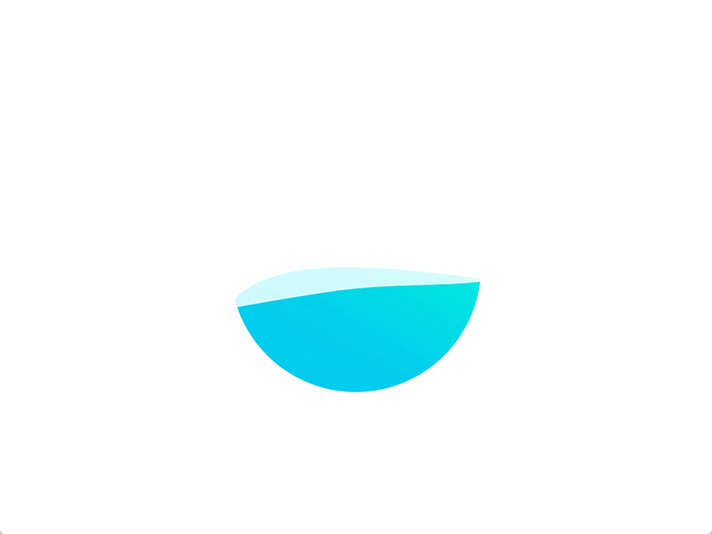
One of the great advantages of XD at this stage is that it supports irregular path animation. Liquid animation in XD has been very popular recently.
4.4 Flinto
The interface of Flinto is slightly different from other software, it is rather a powerful PowerPoint animation tool, supports pen tool, no gradient for the moment.
Flinto is also based on auto-animation. Unlike other software, Flinto has a transition designer dedicated to screen transition, which can assemble all dynamic elements in the same interface. And a behavior designer, which is similar to component animation.
In the transition designer, elements can be very well separated. Persistent and static elements can be merged by connecting layers. By setting the start and end states, all the elements will be auto animated.
The following animation is an imitation of the Airbnb App using scroll, clip and behavior designer.

5. To conclude
Finally, we reach the end! Aside from all the specifications and techniques that I’ve written there, there is still a lot of progress to be done. How to apply these animations to a specific project and create a brand identity? How to create your own interaction library?
Anyway, details are everything!
