UX Principles that include Cognitive Accessibility
As so much of what neurodivergent users need is rooted in a mixture of usability best practices and accessibility considerations, I wondered if there was a need for a Cognitive perspective on UX Design Principles that not only brings a neurodivergent perspective, but also grounds itself through links to relevant guidance and resources. Then one thing lead to another…

Design Principles are nothing new. There are Universal Design Principles, Inclusive Design Principles, NN Groups Usability Heuristics, etc.
These are all very useful resources, but they did not feel like they were quite what I was looking for as something seemed to be missing.
Cognitive design as a practice came out of studies in user interaction with consumer products in the 1970s, and by the 80s their use was commonplace in the product design industry. Parts of these principles have transferred into the digital space as “Usability Heuristics” but they have an issue.
They are like all the other aforementioned principle frameworks, they are relevant but only from a rather neurotypical perspective. Why? Because they predate the recent upsurge in interest and appreciation of neurodiversity within user groups.
So I set myself a challenge. To draft a set of principles based on NN Groups Usability Heuristic interpretation of Cognitive Design, but re-imagined from a neurodivergent perspective.
These are in no way a replacement for COGA or other programmes focusing on cognitive accessibility, but a way of re-contextualised a proven design framework from a single neurodivergent person’s perspective (me).
After each of the following principles, there are links to both the NN Group’s Usability Heuristics as well as the related BBC Accessibility Guidelines for websites and native mobile applications.
The reason I have added links to the BBC’s guidelines is that they were written with cognitive accessibility built-in. This then takes the principles and adds practical guidance regarding their implementation.
1. Standard Elements
Many user errors are actually caused by design inconsistencies in how things work, so ensure that similar elements work the same way. Standard design patterns help prevent errors which is why design systems, design conventions, and web standards are so important.
Users should not have to re-learn the interactions of common tasks locally when they have already learned them universally.
All functional designs should have audio and visual consistency from both interactive and informational perspectives.
See related NN Group articles on Do Interface Standards Stifle Design Creativity? and Usability Heuristic Consistency Standards
2. Affordances and Signifiers
An affordance is a perceived way in which an element will behave when interacted with. Not all affordances are intentionally designed.
Signifiers are icons, labels, colours or sounds that define how and where actions are to be performed. A signifier tells us what needs to be done and clarifies affordances.
Affordances and Signifiers enable a designer to take advantage of perceptions and expectations.
The concept of both affordances and Signifiers are closely related to that of a standard, but much less consciously determined. Whereas a standard is a formal agreement to eliminate inconsistencies, affordances and signifiers can also be based on an informal convention that has evolved through time.
There should always be a strong relationship between the perception of the need to take any action and the action itself.
See related NN Group article Match Between the System and the Real World
3. Simplicity
There is such a thing as too much information and this can either be an issue of volume, or information provided in too complex a fashion. In general, visual and UX design best practice strives to simplify both presentation and interactions.
Clutter divides attention and increases cognitive load reducing user response time and accuracy.
See NN Group article on Aesthetic and Minimalist Design
4. Clear Communication
Another common problem is caused by a user not being able to identify or interpret a message.
There are issues in presenting clear images and messages: noticeable, distinguishable, and interpretable.
Important messages must be noticeable. They should contrast with their surroundings and be given appropriate priority.
Important messages should be distinguishable from surrounding information. Unrelated messages should be easy to distinguish from one another, so the degree of their relationship is clear.
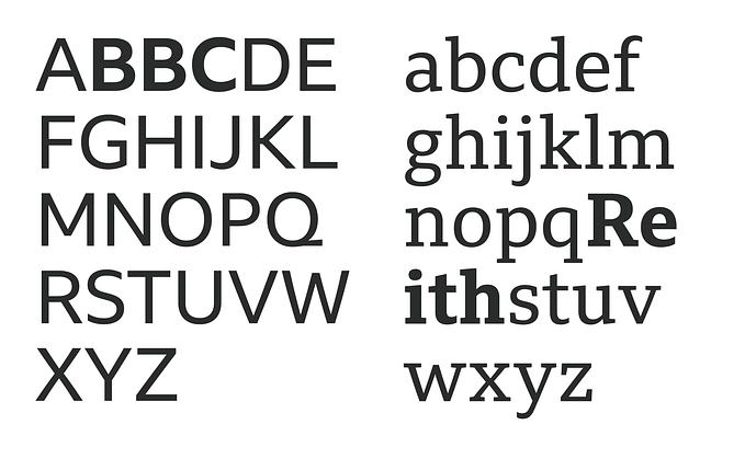
All messages should be interpretable. An example of one type of issue is avoiding the use of characters that look alike e.g. 1lI, B8, QOCD, and try to break up long strings in phone numbers e.g. (000) 000–0000
Interpretation is key when displaying errors. The technical information is important but non-technical advice should also be included so the user knows what they should do to resolve the issue.
Choose an accessible typeface too… not one that says it is “accessible”. For more information see my previous article on Choosing an Accessible Typeface.
See NN Group article on Help and Documentation
5. Redundancies
Sometimes one message or mode of interaction is insufficient. Because mistakes are easy to make and humans have many limitations, it is important to consider the provision of the same information in more than one way and in more than one place. If the user misses or cannot access one cue, they pick up on another.
This can sometimes mean there is duplication of effort (consumption or interaction) on behalf of the user and this needs to be considered by the designer against any risk of error.
Redundancy is not just information but also interaction modes such as point, speak, touch or tab that are cognitively more accessible to different users.
Every system needs the flexibility to support the needs of both novice and expert users, but flexibility should also extend to users with different cognitive requirements such as styles of learning, communication and control.
See related NN Group articles on Flexibility and Efficiency of Use and Accelerators Allow Experts to Increase Efficiency
6. Patterns
Humans can be pretty good at spotting and grasping the purpose of patterns. Information presented as a pattern can be understood quickly and accurately whereas if there is no obvious structure or hierarchy people can become confused. In this way grouping information, content, or controls in related outcomes, subjects or functions aids user engagement. Similarly, placing elements in patterns or in a specific context will help indicate to the user what to do.
Patterns enable people to learn, relate and engage as their comprehension is built upon all previous interactions with particular products or services.
7. Recognition Rather than Recall
Most users can build up a mental map and understanding of a system to enable them to use it ever more efficiently however some users neither have the short or long-term memory to be able to support this. Make objects, actions, and options obvious and persistent so the user is not dependant on having to remember information from. Help and instruction should be easily identifiable, contextual and easily retrievable, and if user error is persistent a system should be able to detect when a user needs help or advancement.
See NN Group article on Recognition Rather Than Recall and the video on the same subject.
8. Variable Stimuli and the Pop-Out Effect
All humans detect an occasional novel stimulus more readily than a constant one because our senses fatigue easily with continuous exposure.
Terms and Conditions or warnings are notorious for being overlooked since they quickly become part of the background and simply are not noticed. This filtration process is something that is generally seen as a benefit as it is a sign that people are developing strategies from ongoing interactions however in some instances it is important to avoid excessive use of a single way of presenting information, especially when it comes to user commitment or safety.
This is also important to consider when introducing a new proposition or an extension to the provision of an existing service. Unearthing and exposing underused functionality that adds benefit to a user is also important if people bypass something that could be of use to them later.
9. Feedback and Notification
As a general rule the sooner and clearer feedback is given, the easier it is to determine if an error has been made or not.
The total absence of feedback prevents a user from knowing if an action has been successful and if a mistake has been made. It also greatly increases the likelihood that user error will be repeated.
As products and platforms can have multiple background applications running, notifications have become a key part of any user experience. These should always be a mixture of visual, audible, and haptic with the user being able to control the individual level of persistence.
Notifications shouldn’t compete with each other for attention but instead should uniquely identify themselves in each communication mode.
See NN Group articles Visibility of System Status, Help and Documentation, Avoiding Unconscious Slips and Help Users Recognize, Diagnose, and Recover from Errors
10. User Control and Choice
Products should always be designed in a way that enables users to choose how they control the interface and what mode they wish to consume content.
From a control perspective, this covers all standard modes of user input: pointing device, keyboard, touch screen, and voice command.
As well as all modes of output: Static Text, Video, Audio, Timed Text or Braille.
All text must be able to be heard, all dialogue should be able to be read and complex interactions such as games should be able to be re-configured.
See NN Group articles User Control and Freedom and Visibility of System Status
I’m hoping that this article will get others thinking about UX Design from different cognitive perspectives.
For another perspective, I’d recommend you have a watch of Jamie Knight’s Cognitive Accessibility 107 Beta, 103 Gaming Addition talks, and blogposts Cognitive Accessibility Part 1 and Part 2. There are lots of useful links at the end of this article too.
#accessibility #a11y #cognition #neurodiversity #ADHD #dyslexia #autism #usability #inclusion #UX #cognitivedesign #UXdesign
Related Videos
If you are after something for Cognitive Accessibility for Video Games then check out the NN Group Heuristics for Video Games, Games Accessibility Guidelines cognitive accessibility section and the BBC GEL Games Accessibility for Children.
Useful links:
Are You A Cognitive Designer? Don Norman
A Customer Experience Is Not A Journey
BBC Accessibility for Digital Products
BBC GEL: Construing Cognitive Design
Design for the way People Think. Don Norman
Games Accessibility Guidelines
How to use the psychology principle of confirmation bias in UX design
Nielsen Norman Group 10 Usability Heuristics
Nielsen Norman Group 10 Usability Heuristics Applied to Video Games
Principles of Human Centred Design. Don Norman
The Dawn of the Cognitive Design Experience
WCAG Cognitive Accessibility Issues Paper
WCAG Cognitive Accessibility User Research
WCAG Cognitive Accessibility Gap Analysis
Web Aim Cognitive Disability Design Considerations


