Adobe has finally made it with their new gradient tool — a UX review

Photoshop
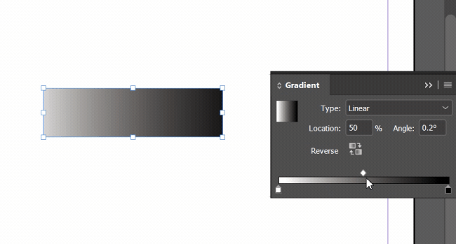
UX:
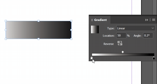
At first glance, the UX looks okay; it’s pretty clear. The user gets to know how to use this tool right away. The color palette is located above, and the gradient down below. The diamond between the two colors controls gradient intensity and smoothness, which is useless in my opinion. What is not easily understood is why there are four (4) color indicators, one set above and another set below. And then you realize it’s for opacity. Maybe they could do it differently.
Feedback and Preview:
The user doesn’t get an instant preview when he is performing the action, and this is a problem.
Gradient Level:

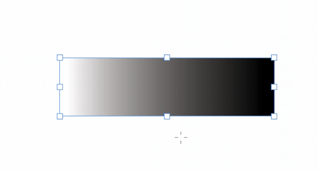
The gradual blend of the gradient is not smooth enough.
However, the handles of the gradient tool outside itself are great, except that I can’t change the gradient intensity: I need to hop again into the menu.

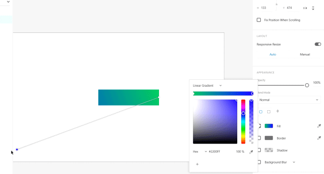
Illustrator
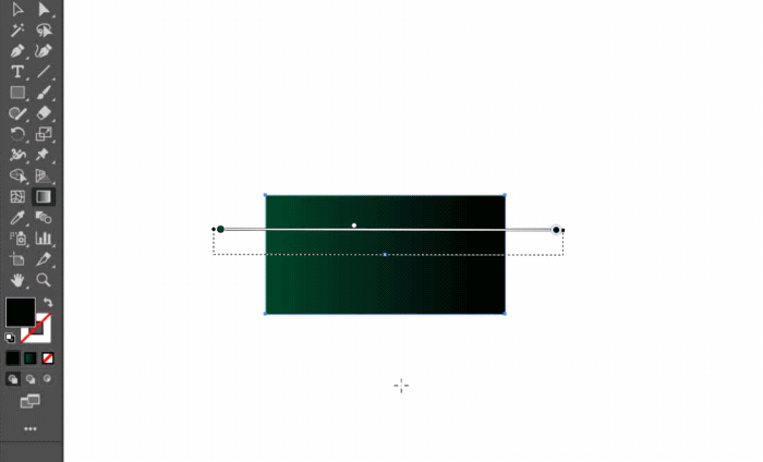
In Illustrator, the situation is a little bit different. You can see two dots that you can play with to achieve the desired result. But color selection is done through the primary color picker, not by clicking on the dots.
UX:
When the user wants to edit the gradient, they do so on a shape. They need to find the hidden gradient panel, then click on one of the dots on the gradient to change the color. (With one click it works, and with another click it doesn’t.)

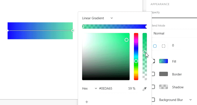
And after the panel opens, the right mental model that I know from every Adobe software is double-click on the color square = the color picker opens, and I select a color. But think again.

And then the user goes to the Swatches panel in the same window, but is unable to pick from the color picker. One can only choose from specific colors here. Disappointment.

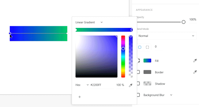
A pleasant surprise is that you can stretch the handles outside the shape and create a more gradual blend.
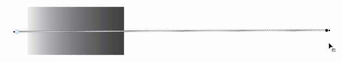
But if you want to pick a specific color, you need to click on the first color of the left main panel, not on the little circles like everybody would think.
Indesign
UX:
Everything is clear as to what the user needs to do. But again, the same problem. Double-click on the color indicator, and nothing happens. You need to drag from the Swatches panel a color on top of the indicator or pick from the main panel. Frustration.
Feedback and Preview:
The preview is right online: I make a change and see it too. Here, the gradient change is on the panel, unlike Illustrator where the change is on the shape itself.
Gradient Level:
Here you can change it right on the panel, and it’s not as gradual and smooth as in Illustrator.
And the winner is…
🎺 🎺 🎺 🎺🎺 🎺
XD
✔ Great UI: the handles can be manipulated like butter, and the gradient is silky smooth.
✔ You can also adjust the opacity, and it’s fun.
✔ You can add as many colors as you like and it’s smooth.
✔ There is always an instant preview near the gradient panel — very comfortable.
To sum it up:
The only missing link is the change in the gradual blend of the gradient, because the handles here are so elastic that you can stretch them far. With this action, you can control the gradient, but it’s not enough.
Overall, I’m delighted with this gradient tool. Good job, guys! I look forward to its implementation in other Adobe products.


