How UX and business team battle on ads placement — a UX Case Study
Each product has their own preference in placing ads, where ads could be classified by its location and condition. Back in September 2017, I have done a case study from one of messenger apps that has not implemented any kind of ads on its homepage and read page, yet. Ads placement and UI/UX of the should work fairly. Thus the ads placement should not disturb user while they are using the app.
This messenger app was developing new features to add more values for users, news platform was one of its focus. This case study aims to understand how ads would impact on user experience while exploring and reading articles. In UX perspective, ads might distract the users, they will abandon the experience and directly leave the page.
On the other hand, ads has the important role for increasing revenue (of course!). That is why, sometimes business and UX people had a long discussion-battle to compromise each other. This case study challenged me to find the best solution from both perspectives.
I have compared 5 similar apps to evaluate their ads placement on homepage and read page. To result, there are several findings that could enrich this study:
1. Insert an ad after several numbers of news
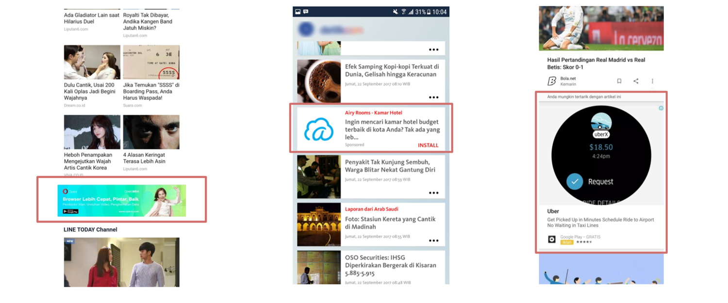
Make a pattern! Following images are how the apps insert an ad after several numbers of news on their homepage. I have found that an ads effectively inserted after 6 to 10 set of news. But why is it so? By inserting an ads in the middle of streamline, it might distract the user and encourage them to spend a bit of their time to see the ads. Gotcha!
2. Creative look of an ads (well known as native ads)
Again, the advertisers and the product themselves are smart. They understand ads might interrupt user while reading. But with a camouflage ads, they could minimise the distractions by designing a native ads. On homepage, a native ads is a card or banner of ads that look alike with another cards.
While on reading or article page, native ads is card or banner of ads that made as it part of the article.

3. Special ads
Each product also takes a chance to display ads more creatively. For instance, a pop up ads or even an ads that has a interactive button.

4. The size does matter
As we can see, each ads has its own characteristic that can be distinguished by its location, condition and even its size. The size does matter, yes it does. The bigger ads, the more it would be distracting. So, how the product handle it?
What next?
After analysing how competitors placing their ads on the homepage and read page, me and my team agreed that user experience is the most important thing in arranging ads strategy. Importantly, the variety of ads location and condition should not disturb user. Thus we classify the experience into two different parts as follows:
Optimising the view-ability
We might need to locate the ads comfortably for users. It should be smooth where user barely recognise it was an ads.
Optimising the action
There are several ways how advertiser pays for the ads, either pay for each impression or clicks. Apparently, it might depend on several factors: advertisers’ need, cost, product speed performance, content, etc.
Recommendation
According to the study, several type of ads might be implemented. Those, well known as inventory, should be less distracting and could maintain the app speed performance. The inventories below are ordered by its comfort to user experience:
a. Native ads
This kind of ads might look similar to nearby part (e.g. articles in the streamline)
b. Hanging Banner Frame (HBF) ads
It might be located at the bottom of the screen
c. Below Article (BA) ads
It is located at the end of paragraph or article
d. Rich Media
This ads is interactive, where user could interact with the banner (e.g button on the video)
e. Interstitial ads
It would replace splash screen by putting our our brand logo on advertiser’s banner
f. Premium ads
This ads is special, where it could be as customisable as requested. Occasionally, advertisers want different actions on their banner

The (best) formation
6 types of ads inventory has been recommended. Apparently, the combination of them should improve and enhance the value of UX and business oppositely. Further discussion amongst team and stakeholders needed, where we should navigate hard decisions to create win win strategies for the product.
These following 2 diagrams would be tricky. Hence, I decide to map them from different perspectives.


This study is a part of my journey as UX researcher, any feedbacks, advice or even critiques are welcome! Thank you so much for reading through!