After the search: how to interpret your data?
Posterior to the research phase comes the data analyses and brainstorming. As a UX designer, some tools will be beneficial when gathering this information and the affinity map is one of them.

Behind a great product, there is an excellent research…that’s What we hope for! As a UX/UI designer, we will stumble into “research needs”, and the data acquired by it will be the pillar of your future product. From understanding the problem, creating a buyer persona until building your prototype, all will be based on the data brought up by the initial research.
At the point where you have to define and create a user point of view (what are their needs?), the Affinity Diagram will be your best friend. See the picture on the side? That is the result of my group work, made during my UX/UI Bootcamp at Ironhack. So when will you use it? An Affinity Diagram is a method that gathers personal data (ideas, opinions, issues), making it possible to organise them into groups by relationships. Any time you need to:
1- Interpret a large quantity of data;
2- Find patterns;
3- Better understand the user behaviour;
And on many other occasions, that will be the best method to take advantage of. In my case, this method helped my group to come across essential issues, insights and build a buyer persona. Erick is 100% data based, and all his characteristics were based on insights gathered with the diagram and previous survey.

Categorising your data:
Maybe I forgot to say, but building an affinity diagram requires some teamwork. In the first step, you will go through your interview/survey data and write (on a post-it) any quote and insights you might find relevant. This first part should be done individually. After your group is done with it, you shall display all the post-its in a random way on a wall, window or on any surface that you may find convenient. As a group, you will start gathering the information that is similar and in the end, create a header for each column. It should look like this:

The next step is actually to link those pieces of information together. We did start the process on the window, but we digitalised with Miror, an excellent tool for this and other projects!
Now you need to see the relationship between your data and group them under a bigger umbrella. It should look like a very colourful board in the end. If by any case some notes were left out — not applicable in any category — you can leave it “alone”. Now you should have something like this:
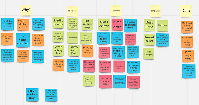
As you can see, an Affinity Diagram is a method used to cluster information and findings so that you can physically see trends and relationships in data. It is a visual resource that brings the whole team together and makes it easy to find design opportunities in repeating patterns.

