Redesigning Airbnb for the new normal — a UX case study
A UX Case Study redesigning Airbnb for a more cohesive community experience post Covid19.
Across the globe, once-bustling airports are hauntingly quiet. International borders are closing, and there is no doubt about it — Covid-19 has had a huge impact on the travel industry.
With Airbnb amassing over 500 million guest arrivals, I was fascinated by their response to the unprecedented crisis -they were able to pivot and accommodate their community as consumer needs shifted, providing specialised online experiences for users.
Inspired, I wanted to push myself to develop a case study in which I could develop new solutions to improve the current user experience — in preparation for the “new normal”.
Approaching The Redesign
Explore
Airbnb is not new to the travel industry. Since 2007 they have redefined the traditional view of B&B. Over 7million listings and available in 191+ countries, their impact is global.
The purpose of this case study is to challenge me. My focus regarding this project remained on one task: How can I make simple changes to improve the user’s current experience? I wanted to learn new UR methods, test with new tools all while creating a seamless and simple redesign.
To begin, I followed the following Design Process — Explore, Define, Ideate, Develop & Learn.

Disclaimer: This is a passion project. I am not affiliated with Airbnb, I simply took on this challenge because I’m passionate about travel &designing.
Define
The define phases started with in-depth User Research to empathise and learn about Airbnb’s users. To get both quantitative and qualitative data, I conducted a survey and then interviewed users.
Survey
20 users were surveyed to gain a better understanding of demographics, key points within their journey & working out a general idea of how they view Airbnb.

I was able to draw some interesting insights from the survey:
- Over 50% of the users I surveyed have started looking to book holidays post-COVID 19.
- Airbnb Experiences are not on the radar of the users.
- 70% of users find booking group trips less than easy.
- 80% of users are less likely to book experiences on Airbnb.
- Holiday with friends is the main purpose of trips
- 25% of users are solo travellers.
- 65 % travel with family and 70% with friends.
Interviews
Following the survey, I conducted interviews to dive deeper. I recorded, analysed and categorised my findings into an affinity map. This process helped me to discover the following:

- Many users select a destination based on social media or family/friend influence so their opinion is important to users.
- Users hold a preference for Airbnb when making group bookings or when looking for cheaper options.
- The total price is a big deciding factor for many users.
- Some users mention hygiene, safety and misinformation as reasons why they shy away from Airbnb.
- Some user’s hold a preference for package deals.
- Users get frustrated by indecisiveness (price, accommodation, facilities, dates etc) when completing group bookings. That impacts how quickly they can make bookings.
- Many users are not drawn to experiences. This may be due to price, lack of trust, not attracted to the feature, multiple choices and preference to explore organically.
App Store Reviews
I gained a lot of information from conducting the survey and interview. However, to get a wider view of existing pain points I headed to the app store to read reviews from existing customers.
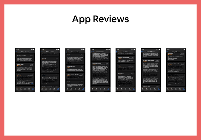
Key problems mentioned by users:
- Multiple bugs within the app
- Issues with Airbnb’s response during COVID-19
- Filters did not help users complete an easy journey with as average night did not include all fees.
- No specific filter for balcony or outdoor space filter.
- Users complained of sneaky fees not showing up until payment
- Upon searching without dates, prices are no longer shown
- Users are not shown a precise location
Persona
Following the above research, I collated all that I had learnt to formulate 3 personas. Within those personas, I also identified 4 scenarios within the use of Airbnb.
Scenarios:
1. Destination & Date chosen
2. Destination is chosen (no date)
3. Date is chosen (no destination)
4. No Date & Destination chosen
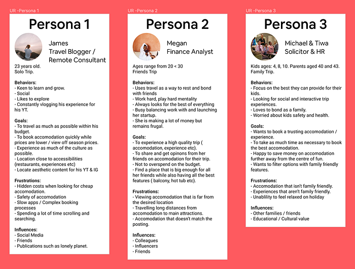
Throughout the project, I kept my persona’s in mind, I set the goal to improve each of their experiences.
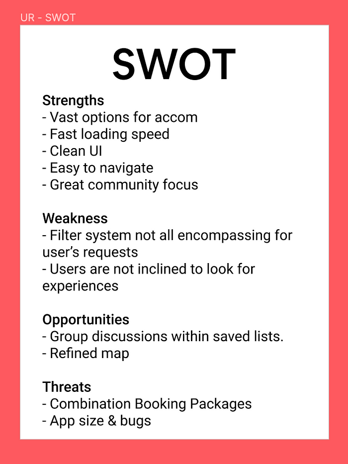
SWOT
To round up the Define Phase, I quickly completed a SWOT analysis to analyse Airbnb as a business. I was able to briefly identify internal and external factors affecting Airbnb.
Pain Points
To conclude the Define Phase, I rounded up my research into the following pain points:
- Users are unable to filter unique filters.
- Users are not able to view stays primarily by total price.
- Map location of stays may not be in the precise location that the user searched for.
- Disparity with user’s understanding and usage of Experiences.
- Even though users can create group lists and share quick opinions, users still have to leave the app to further discuss with friends or family.
- Limited exploration is available for scenario 4 (No Date & Destination chosen).
Ideate
I started this phase by ideating solutions to solve the pain points above. After generating numerous sketches I moved on to wireframes.
To develop the inital ideas, I needed to create design principles to follow. I turned key insights and pain points into HMWE statements in order to generate useful design solutions. Along with the HMWE, I also researched further into Usability Heuristics — I added this to my list of design principles as it was important for me to ensure that my designs would pass Heuristic Evaluation.
During the ideation process, I was able to generate many solutions, however, after discussion with my mentor, I was able to set constraints and focused only on simple solutions that would generate a big impact.
I didn’t want to move onto building the prototype without testing the ideas with users. I decided to run 2 Usability Tests.


Usability Testing
To test the solutions I came up with, I created 2 Usability Tests.
Test 1 was 5 Second Test. This test was completed on 7 users, each user viewed 2 screens for 5 seconds each and answered 2 questions regarding the screens. By completing this test, I aimed to test the following usability heuristics:
- Recognition rather than recall
- Consistency and standards
- Visibility of system status
Test 2 was a Design Test. The aim of this was to test the flow of the proposed solutions with real users. I wanted to see if users were able to complete tasks, all the users I tested managed to complete the tasks efficiently. I was really happy to see this as it solidified my thinking and proved that the features would reduce excess time while also creating a more efficient and enjoyable experience.
Develop — The Solution
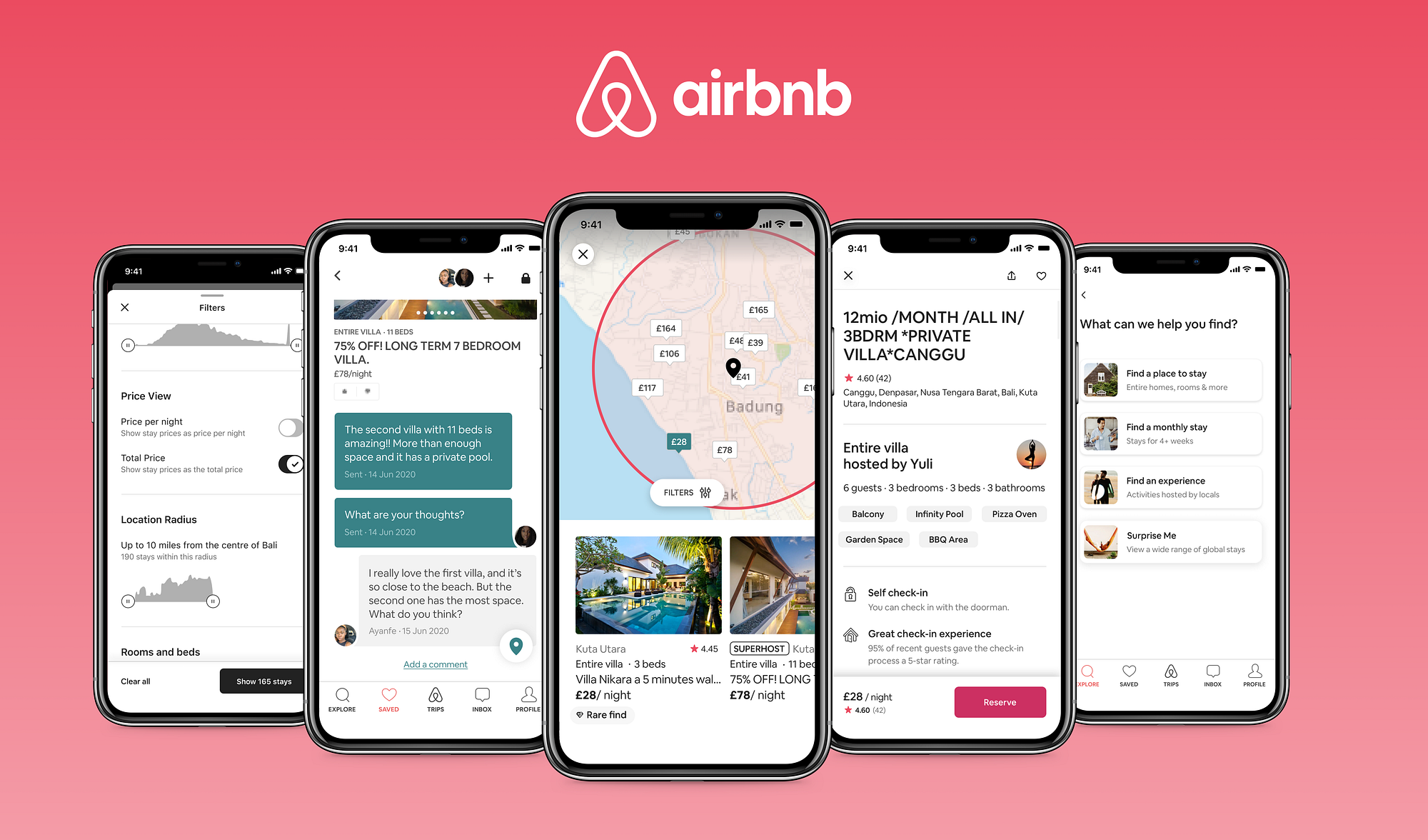
Updated Filter System
To address pain points 1,2 & 3, I made changes to the current filter system. Firstly I added a section where users can decide between per night and total price as the primary price view with a stay. I implemented this feature as a way to generate faster payments, users can choose to view primarily by total price henceforth they spend less time pondering and make decisions faster.
The second feature of Location Radius gives users more autonomy in viewing products from a more precise area they choose. As people are motivated by autonomy so by creating this feature, more users will be motivated to purchasing. Only stays within the defined radius are shown, the radius is highlighted on the map with a circle matching Airbnb’s style guide.
The third feature added to the filter system is Tags. I implemented this feature to aid the user to find specific features within stays that aren’t mentioned in amenities and facilities(this filter has only 4 options!). It is explained more later on.
Group List Comments
From my research, I gathered that the main reason for travelling is to travel with friends (60% of users sampled), Airbnb has a great feature where users can create lists with others. The original group lists feature also allows users to rate on stays that are shared within which is cool, but I started thinking ‘Why should it end there?’. To finish the discussion on which stay to book, users have to leave the Airbnb app, leaving the app gives way for a lower conversion.
To combat this I designed a feature allowing users to comment within the group lists, after all, if users can discuss and express their personal opinion it increases the personal connection they make with a stay of their choice. If there is more personal connection then users are more willing to purchase. On top of that, the messages will keep users coming back to the Airbnb app.
Another reason why this feature was implemented is due to the community. Airbnb has done an amazing job at curating communities and connection through its brand, to further this the comment section allows for more connection. People want to connect and in that connection they are able to do things together and bond.
Experience’s Prompt
To combat the disparity between knowing and booking experiences, I added an experience carousel prompt to the Group List and Selected Stay Pages.


Following the addition of the comment feature within the Group Lists. I implemented an experience prompt at the bottom of the screen. Users can get recommendations of experiences that people have booked based on the content of the lists.
Similarly, at the bottom of the Selected Stay page, users are prompted with an experience carousel.
Rather than telling users to check out experiences, placing a carousel shows them. By mentioning that ‘people also booked’, users are more inclined to purchase due to social proof. In this case, I chose to ‘Nudge’ users to encourage them to view experiences.
Stay Tags
For this feature, I allowed stays to have unique tags.


Airbnb hosts a wide range of unique stays that have unique features. To make the unique features easier to find the Tags feature was born. Hosts can add the tags and users can select specific tags within the filter section. Users can process features of stays better as they are tagged in bite-size chunks.
People have thought long and hard about what features they would want in their first trip post lockdown, henceforth the need for a feature to accommodate those dreams.
Surprise Me Search

The Surprise Me feature was added to create a solution to Scenario 4(No Date & Destination chosen). Users are already looking into where to travel to when borders reopen, however they are unsure of where to go. While some users get recommendations from people around them, the rest of users decide to look by themselves which often leads to an overwhelming feeling due to the vast amount of choice.
To solve this issue, the surprise me search feature gives recommendations of stays across the entirety of Airbnb. By narrowing down users options, they are more likely to book a stay.
I’m always left in awe when I reach the end of a project, the thought and care that UX entails is amazing to see. I learn so much during a case study and applying that learning to create solutions that solve the user’s problem is the icing on top! To further develop this, I would move onto the Learn Phase in my design process where I am able to complete more tests, learn from data and refine the solution.
Special thanks to my mentor at LoveCircular for all the feedback and advice.
I’d love to continue this conversation more and hear any feedback you may have — please reach out!
Tools: Figma, 5 Second Test, Miro and Google Forms.