Alexa, stop scaring me!
How a lack of proper feedback in a voice interface device can cause an unnerving experience.

This story was originally published in Portuguese here.
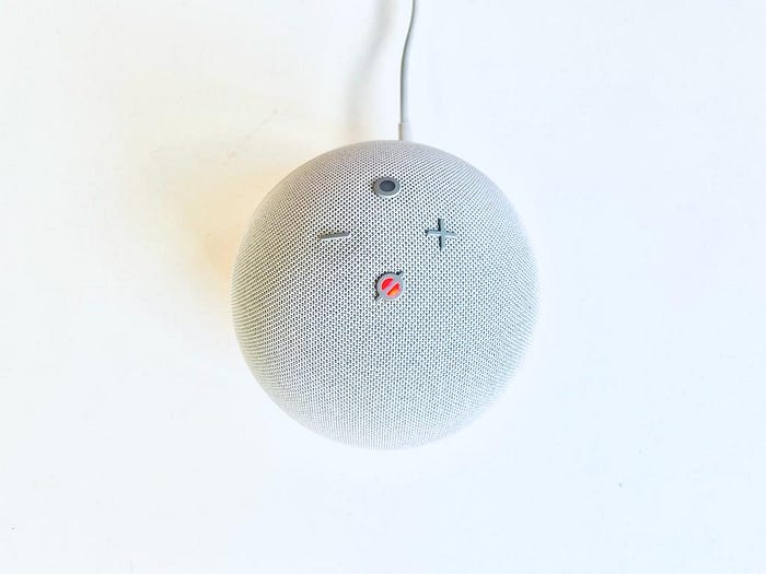
Voice interfaces are here to stay. They can be found in many of our devices such as mobile phones, computers, smart TVs and ones specially designed for this kind of interaction: the Echo dot — one of Alexa’s (a voice assistant created by Amazon) bodies.
Alexa has helped people to remember which items are running low in the refrigerator, what the time for a medical appointment is, to order food, or how long is left before tea is ready (I love this one!). Besides those, there are hidden features we could never imagine existing…
Another sunset on a dull Saturday. My boyfriend went out with his friends. I took the opportunity to watch something on TV — a film or documentary always fits the bill in moments like these.
While passing the time watching the film, the twilight sky quickly turned dark when, by surprise, I hear my boyfriend calling me: “Ingrid!”.
“Huh, is he already back?”, I thought to myself.
Being on the third floor and judging by the volume of his voice, I wondered: “is he on the ground floor calling me?”
I looked out of the window. There was no one there.
“Maybe there just happens to be another Ingrid in the neighbourhood and someone with a similar voice to my boyfriend is calling this person”.
I looked at the next building, and there was not a single person there either. At that moment, I had already accepted my fate: “I’m hearing voices and it is not even halloween”.
All of a sudden, I hear: “Ingrid, can you hear me?”. “Now he really is here — My mind can’t be creating this”, I thought.
Looking from one side to another, I realised a green light gently flashing right before my eyes.
Well, he both was and was not there.
This was when I discovered he was actually talking to me through Alexa in the room. What the hell?!
What happened?
There is a feature in Alexa’s app called drop in, which allows you to activate a device connected to your account and use it as an intercom. Go to Alexa’s app, select the Echo device, click on drop in and that’s it: you are already inside the room where Alexa is. It is as simple as that, with no big fanfare. Even someone outside your household can use this feature: if you give them permission for the first time, they can directly enter your house without even knocking on the door.
This is a controversial feature that might cause problems with Alexa’s user experience, because it raises questions about freedom, control and privacy. As designers, we usually evaluate products and the interactions they provide and we tend to identify problems that we can somehow solve. With this in mind, I will share some reflections about the problems the drop in feature brings to the table.
Visibility of the system status is weak
The discomfort was caused by some crossed wires between the machine (Alexa) and the human (Myself). What happens when we receive a phone or video call from someone? There is an audible feedback showing someone is calling you: the unforgettable ring ring.
“But Ingrid, the drop in feature also makes a sound…”
Indeed. However, the duration of this sound is really short and it is produced at the same level the volume in Alexa is set.
In other words, the feedback is completely inaudible when it is made in a room with other sounds such as those from TV which can totally overpower those from Alexa.
Considering I was in the same room as the voice device and couldn’t hear anything, could you imagine how this sound could possibly be heard by someone in another room in the house?
After Alexa makes this single sound at the beginning, whoever has activated the drop in can already hear what is happening in the room and speak through the device. This breaks the Nielsen's first heuristic that explains about the visibility of system status:
“Communicating the current state allows users to feel in control of the system, take appropriate actions to reach their goal, and ultimately trust the brand.”
— Nilsen e Norman Group
The NN group basically makes a connection between communication and transparency: no action that brings consequences to people should be made without clearly informing them what is happening.
In our case here, this lack of communication informing you that someone is trying to talk to you through the device causes a feeling that someone is breaking into your house and eavesdropping on you.
Lack of control and freedom
According to Nielsen’s third heuristic, it is appropriate to provide freedom of usage to people when using products. In other words, if people perform any actions mistakenly, the system must provide a way to undo their mistakes, or leave the interaction with a cancel button, for example.
“By thinking about carefully crafting clear exit points and Undo features, you can leave users feeling in control of the experience, rather than at the mercy of your design.”
— Nilsen e Norman Group
However, when someone is controlling Alexa through the mobile app, it neither offers those in the same room as the device the possibility — no matter how small — of refusing the other person’s entry, nor cancelling after the intruder enters.
While using drop in, Alexa does not respond to commands. The only way to regain privacy is pressing the microphone mute button, or unplugging the device.
In addition, the fact that Alexa, in this feature, skips the step of “accepting/refusing” the call, makes the receiving person dependent on hearing the initial sound, or perceiving the green light.
It doesn’t give you the control to simply accept if you want to receive the caller — in this case, intruder! — or not!

Accessibility issues
It is undeniable that voice interfaces have massively helped people with any kind of visual impairment. However, as the device uses only a short sound at the beginning, followed by visual feedback to signify that the drop in feature is being used, it excludes people that cannot see from knowing something is happening.
This turns out to be a huge accessibility problem that could be solved with a more effective sound before and during drop in usage.
Moreover, what feelings could be caused in someone who is blind by hearing a voice of someone they know being emitted from a device like this?
Would it be possible to distinguish whether or not the person is in the same room as the listener?
Privacy invasion
By allowing the existence of this feature, Alexa reaffirms the fear that people have about the lack of privacy created by the device. There’s a lot of talk about Alexa always listening in on people, but what if it’s actually another human eavesdropping on you through the device without you realising it?
Thanks to Louis Suggett for assisting with this translation and for teaching me everything about English in recent years.
Read more
- Amazon Alexa Calls vs Drop In: How Do They Differ
- ‘Alexa, are you invading my privacy?’ — the dark side of our voice assistants
- Alexa for accessibility: how voice user interfaces can change lives
- Visibility of System Status
- User Control and Freedom (Usability Heuristic #3)
- Usability Heuristic 3: User Control & Freedom (Video)
- 10 Usability Heuristics for User Interface Design