All you need to know about colors in UI Design — theory & practice
A series of tips, theory, best practices and examples about how to use color to design interfaces.
This week I was thinking a lot about colors. Exist a lot of colors to use and especially in interfaces, where we have more opportunities to take combinate colors, using high contrasts, choosing brighter colors and attract more attention.
The color is one of the principal characters of this story (the interface) along with other characters such as typography, space, etc. But today, I want to tell you about our friend, The Color.
Have you ever wondered how we can improve the color harmony in our interfaces? When I interview a new UI Designers (or Visual Designers) I always try to know his sensitivity color and his knowledge about how we can use the color. If you are new in UI Design or really like to do digital products, this can help you.
Let’s start talking about the famous Color Wheel. When we talk about color, contrast, harmony; we must have this image in our head:
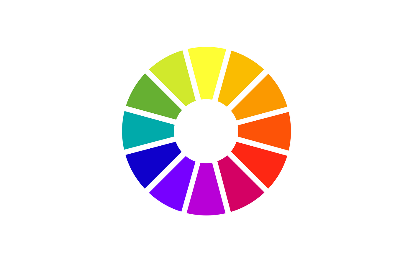
There are 3 important things about color that you should know: Hue, Value & Saturation. Now I am going to explain each of them :)
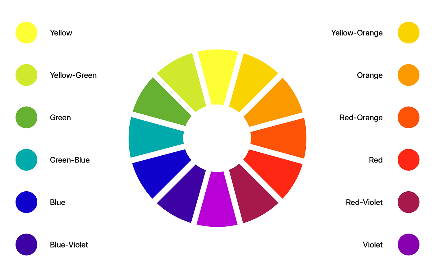
1. Hue
Hue is the color in natural state. For example blue, gren-yellow, yellow, red, etc. Without any variation of light and darkness. Another example that can help you understand this is define hue as each of the colors you see in the Color Wheel without any other alteration of light and shadow. See the image below
2. Value
Value is the amount of light and darkness color has, a clear example in our daily life is to see things closer to light with white tones and other things that are in the background with more darkness.
When we walk, we see some elements change color in the morning and at night. For example, a mountain has a brown color, in the morning has lighter tones (Light) and at night it has dark tones (Darkness).
If you are closer to the light, you will have more light tones (light) and if you are further away from the light, you will have more shadow (darkness).
In UI (User Interface) the value plays an important role, because when we use it well, we can get a good contrast and also different surfaces in our interface.

A clear example is Material Design by Google. They use different surfaces to identify important elements.
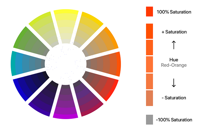
The Value is the amount of light or darkness in each color. This gives us a feeling of surfaces. When a color has the value at 100% it results in a white color. When a color has the value at 0% it results in a black color. I hope this image below helps you :)

3. Saturation
Now let’s talk about saturation, saturation is the intensity of the color, when we saturate a color, we have more intense and vivid color. When we desaturate color, we have a dull color, an example of this is when we completely desaturate a color, we have a gray color.
Saturation is something that we can’t use to much in the printed world, because in the real world we have a limit to how far we can saturate the color. For example when we are going to make a book, poster. In the digital world we have more posibilities.
Real Life vs Digital Life
There is an important point that we must touch when we talk about saturation in interfaces. Unlike the real world where very rarely we see vivid and intense colors, in the digital world we can do it this, because we use RGB and not CMYK. That’s why it’s very important to use with responsability.
Back to basic
When we talk about color, another important topic is how to combine colors. One thing I remember a lot about this is my Color Theory class, specifically contrasts and harmony class. Contrast doesn’t always mean harmony.
To have a harmony between colors, is necessary between them exist a amount color from the other.
See this image below. As you can see, the opposite colors have more contrasts, while the close colors have less, and here is more noticeable the harmony between them.

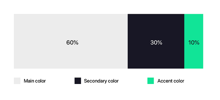
The rule of 60 30 10
No, it’s not the measurements of a supermodel, but the proportion to successfully combine colors. You must choose a dominant color and use it in 60% of the space, another secondary so that it is in 30% and a last color for the remaining 10%. Yes only 3 colors! It is something that is used a lot in interior design.

When we design an interface we need to think that we are designing our living room, and every tone of color, lighting and position must be perfect and have functionality.
As you can see in the image 3 colors are used. White, Pink and Green, the green color gives the accent. If we bring this metaphor to interface design, the accent color can be defined as the color of our CTA (Call To Action).
Be inspired by nature
Did you know that the human eye can see more than 10 million colors? You can always find harmony and contrast in nature and what you see! Nature, objects, animals, spaces. Everything has a color palette, you just need to take a lot of attention.

Shadows are never black, and lights are never white 🤔
There’s a very common mistake we make when we use light and shadow, is to think that if we want to make a shadow we need to put a black color with opacity and for light we must use white with opacity.

If you are still not convinced, just look at real life, the darkness always has some tones of its base.

Darkness is never black, darkness is the color tone of the object that is shaded with value tones. The shadow of the lemon is a very dark green almost black and the shadow of the wooden board is a very dark brown almost black. But it is never black. Black would be only when there is a total absence of light.
Use grayscale to test the harmony and contrast of your colors.
Using unsaturated or grayscale colors, we remove the hue from the equation and only keep the light and shadow. Light and shadow give that feeling of realism and depth.

when we are left only with gray scale we can see that there is a difference between the tones (value), there are some darker and others lighter. This gives us a feeling of harmony between them and contrast. This is an example of what should happen.
Grays with color tones
Today the interfaces are cleaner and whiter, and another character comes to light, the Typography. But in another post we will talk about our friend typography, now I want to talk specifically about color.

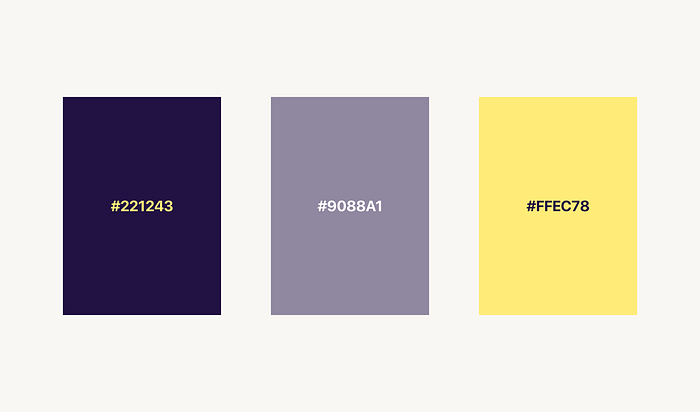
The one on the left has black color #000000 and the other has a very dark blue color #15163D. They both look black, but they’re not. Why is this so important? Look at the image below.
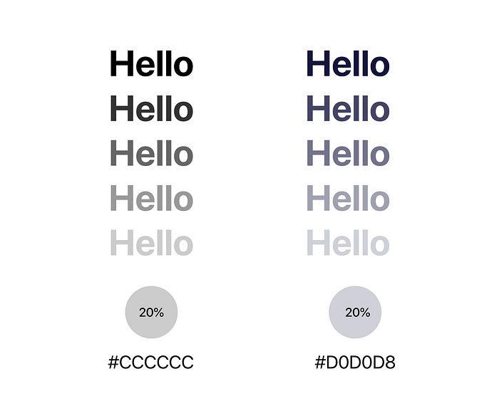
Both have the same opacity, but different results. One is grey the other is grey blue. When we use texts with a tone of some color we are giving more opportunities to have more harmony with their environment. Remember I told you that to have a harmony between colors, is necessary between them exist a amount color from the other.
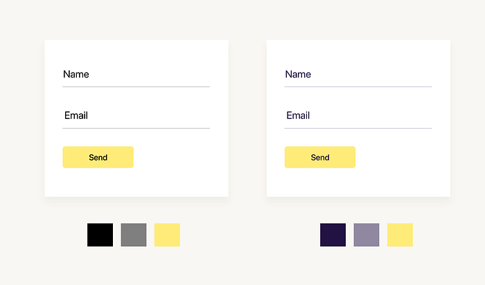
Both look black, but one has shades of violet which is a complementary color to yellow. By doing this, we achieve both contrast and harmony.
So it’s bad to use black and gray? No! It all depends on what you want to do. Black is a neutral color and always looks good with any color. But sometimes, like the example, if we add other color tones we get another color sensation.
Exercise your eyes! Find the light!

Just as we go to the gym to exercise our body, we should see inspirations to exercise our eye every day.
Many of us see colors that are not as saturated or as vivid, that’s normal. The world is not perfect and neither are the colors. Many of us come from a physical world where we only used CMYK and where color had a limit.
When we are in the digital world the possibilities of colors are many and we must be prepared. A good exercise that I highly recommend is to see daily inspirations. Christian how do I see daily inspirations? I have a lot of things to do.
Hack your own system in such a way that it doesn’t seem like a task, but something natural.
One thing that helps me a lot in this is Instagram. Instagram is already part of my daily life and is a non-exclusive social network for designers. I don’t feel that it’s a task. I follow some inspirational pages, where I see many interface designs every day and how they apply color.
Final Thoughts
Like everything in this life, knowing how to combine colors is practice and practice. It’s normal if in the begining is difficult and complicated, but then you will notice how it is easier. Never stop learning and practice a lot.
I invite you to follow me in my social networks . I share my daily work, tips and my knowledge with the community
- Instagram: https://instagram.com/christvizcarra/
- Behance: http://behance.com/christvizcarra
- Dribbble: https://dribbble.com/christvizcarra
- Linkedin: https://linkedin.com/in/christvizcarra/
- Twitter: https://twitter.com/christvizcarra
Thanks a lot! Any feedback leave it in the comments, I’ll be happy to read all of them.