Amuse UX Conference 2017 — Takeaways Part 1 (Day 1 & Atmosphere)

Amuse is an international UX conference in Budapest, over the 2 days of the event there were 14 highly inspirational talks and excellent speakers.
Diversity: a wider perspective on UX
The organizers of the conference decided not to have a theme for each year, their goal was to cover a wide range of topics instead: many different aspects of UX design and research, and some loosely related areas (e.g. sketchnoting or magic).


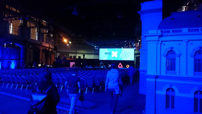
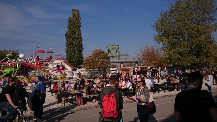
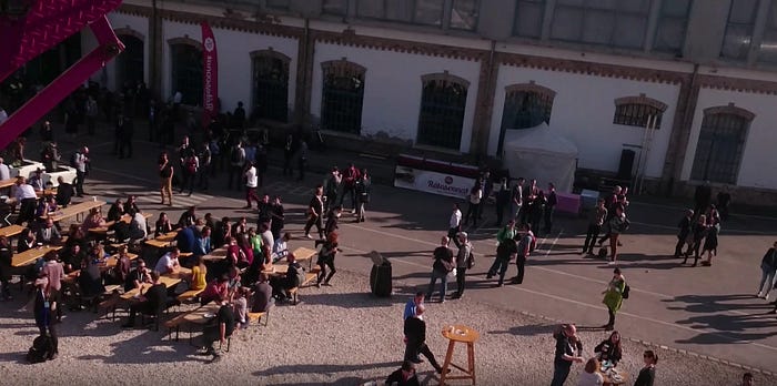
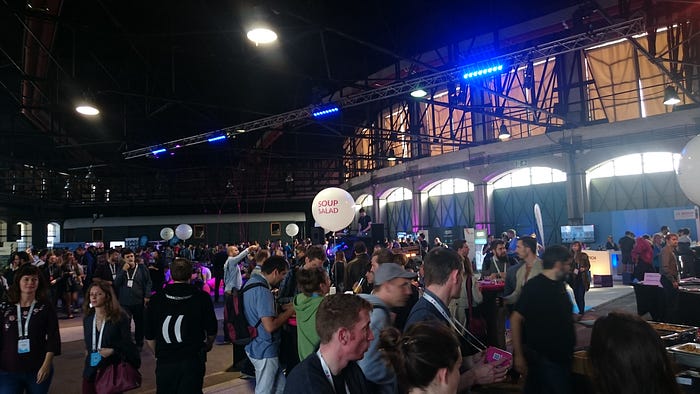
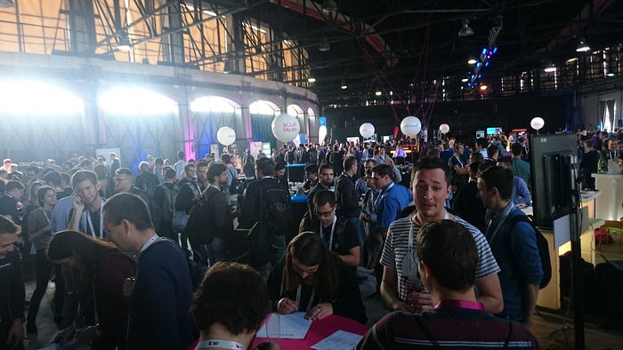
Just like in the case of my similar Amuse UX article from last year, this article is not meant to be consumed all at once. I tried to capture not only the essence of the talks, but also the atmosphere, so I included some photos about the venue and the crowd.
Here is a Table of Contents that will hopefully help you navigate this long beast:
- What Boardgames Can Teach Us About Designing Experiences (#gamedesign #boardgamesandUX) by Stephen P. Anderson
- Travel Stories (#uxresearch #airbnb) by Chris Monnier
- The Art of Noise (#voiceui #inclusivedesign) by Léonie Watson
- Culturally Responsive Design (#designethics #multiculturaldesign) by senongo Senongo Akpem
- 5 Steps to Change Your Note-Taking (#sketchnoting #sketching) by Eva-Lotta Lamm
- UX in Motion: Principles for Creating Meaningful Animation in Interfaces (#animation) by Val Head
- Design by Magic: Applying the Techniques of Magic to User Experience Design (#magic #inspiration) David de Léon
- Atmosphere of the Conference (some pictures)
Here you can read about the takeaways from Day 2 (topics: banishing your inner critic, service design at Gov.uk, qualitative research in a housing project, storytelling and UI patterns, UX of AR/VR, digital afterlife, Film UI) & from the Amuse Special Edition Meetup.
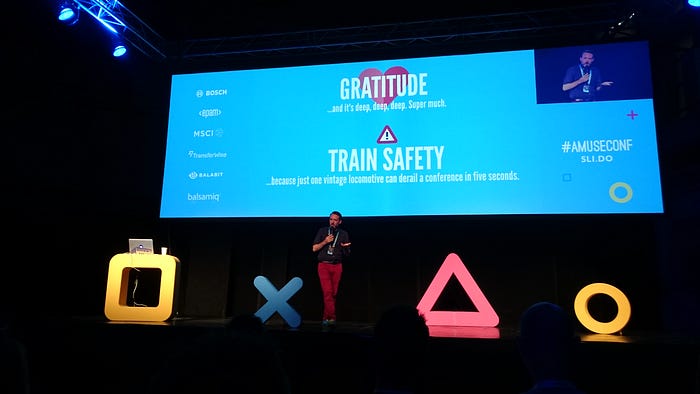
Opening Ceremony
Tom Illmensee, the MC of the event opened the conference with this: “‘Welcome’…this word is just insufficient for how we feel”, instead: “Gratitude” (and “Train Safety” :) ).
I’m a boardgamegeek (as you can see here), so I was really-really excited about the first talk.
“How often do we really let a singular, desired experience drive every product decision?”
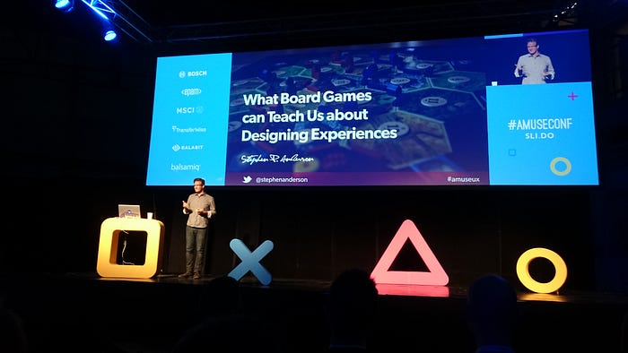
Speaker: Stephen P. Anderson (Twitter)
Talk: What Boardgames Can Teach Us About Designing Experiences
What designing tabletop games can teach us about designing for experiences?
UX can learn from many things, like: LEGO bricks, motorcycle maintenance, Marvel comics, making bread etc.— but would it be useful or relevant to UX?
Why tabletop games?
- Venn diagram of UX and Tabletop games: significant overlap. Rich, nuanced, engaging experiences — our focus. Modern boardgames are good for inspiration (e.g. Catan, Ticket to Ride, 7 Wonders, Pandemic, Codenames). The game market has matured in the last 5–15 years: one great game comes out, & the next game iterates on it (e.g. too much downtime gets fixed). Games are creating a tense, emotional engagement. Matt Leacock (game designer of Pandemic): “I still practice UX, I just do it with cardboard now.”
- Because it’s our job. “Experience design is the design of anything independent of medium or across media, with human experience as an explicit outcome and human engagement as an explicit goal.” (Jesse James Garrett) There are many other similar disciplines that focus on human experience and engagement, e.g.: film making, restaurants, fine arts, advertising, customer support, theater/dance/performing arts, public speaking, architecture, fashion design. But there are many differences, e.g. film is a passive activity, not interactive.
- “Game Design and Interaction Design are fraternal twins. They share almost all their DNA.” (Christina Wodtke) Affordances, discoverability etc. — there is a significant overlap!
What can we learn from tabletop games?
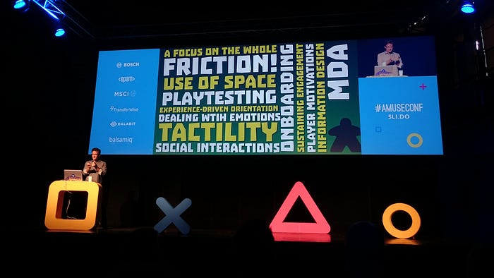
- Experience-Driven Orientation
Model based on Maslow’s hierarchy of needs: things moving up through different levels:
- Functional (Useful): Works as programmed
- Reliable (It is available and accurate)
- Usable (Can be used without difficulty)
- Convenient (Super easy to use, works like I think)
- Pleasurable (Memorable experience worth sharing)
- Meaningful (Has personal significance)
At and near the bottom: focused on Tasks (products, features); objective & quantifiable. On and closer to the top: focused on Experiences (people, activities, context); subjective & qualitative.
More critical parts of the model: stuff at the bottom and on the top. What is your orientation? In the early days of a product: tasks, then it gets more experience-focused. Question: how you are looking at the problem you are solving? There is a shift:
- instead of talking about tasks & features: people, activities, context;
- instead of output & functionality: outcomes & functionality;
- and instead of interfaces, interactions or usability: perceptions, emotions, attention, memory.

A model in game design: M D A — Mechanics, Dynamics and Aesthetics. The designer and the player each have a different perspective. What is the value of a game? Fun? We shouldn’t start design with the mechanics and the rules. Start with fun and aesthetics, and work backwards. In this quote you can change the “player” to the “user”: “Thinking about the player encourages experience-driven (as opposed to feature-driven) design. As such, we begin our investigation with a discussion of Aesthetics, and continue on to Dynamics, finishing with the underlying Mechanics.”
Example: there was a game prototype, and lot of publishers passed on it. His game publisher friend, Randy Hoyt looked at it and said that there is real potential, it is fun, but some things need to be taken to the next level. From his blogpost:
“The key was to go down a level deeper. At work, we were doing a branding exercise for a product, and we listed off the adjectives we wanted to describe the product. I realized that a similar exercise would work here. If we re-themed the game correctly, the mechanics (the intersection of the rules and the components) would work together with the flavor to produce a theme and a narrative to created a coherent context and experience for players.
I mulled over all the feedback on the mechanics: what type of experience were they creating on their own? What adjectives did players use to talk about the mechanics? Players described the game as simple and elegant. It was calming and relaxing to play. They were surprised and delighted by the richness of the decisions. They said it flowed smoothly, that they could play it over and over again.”
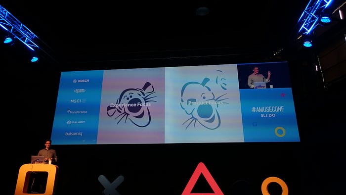
They needed a good theme. He got the inspiration from the movie “Tangled”. “This image captured perfectly the feeling that the playing the game produced, and I knew a theme and narrative woven around this could work to produce a great experience.” The result: Lanterns.
Pandemic: different feelings — the players’ goal is to stop 4 deadly viruses. The associated feelings are: anxiety, stress. Completely different focus and intention.
Takeaway: How often do we really let a singular, desired experience drive every product decision?
- adding features
- eliminating feautures
- pushing back on customer requests (filtering feedback through the product vision-lens)
- prioritizing the backlog
- how we design a familiar feature
- delaying releases — “Until my players feel ______________, I will not ship.” — until the desired feeling is not created, no release
“Games often ship late because they ship based on exit criteria, not deadlines… Either you ship something tiny before you run out of money, or you ship late something that is sufficiently fun. The first are higher risk, but if the core works, they’ll make it.” (Christina Wodtke) Find the core, spiral out from there.
2. Focus on the Whole
Game: system — every little change, detail can effect the entire game. Gestalt Psychology: the whole is other than the sum of the parts. How the parts come together: the whole is equally important. “An experience is other than the sum of the parts.”
“Designing a product is keeping five thousand things in your brain and fitting them all together in new and different ways to get what you want. And every day you discover something new that is a new problem or a new opportunity to fit these things together a little differently. And it’s that process that is the magic.” (Steve Jobs)
Takeaway: Do your processes encourage a focus on the whole and how all parts fit together for a desired effect?
- What gets defined as a release? Is it a complete set of things?
- What is the critical “core” to your experience?
- What do you measure?
- Does your team consider how new features might play with or disrupt existing features?
- Do you test small parts of the entire experience?
- What is the scope of the projects you take on?(more epics and themes vs. stories and tasks)
Brandon Schauer — MVP model: Cupcake → Cake → Wedding Cake, and NOT: Cake → Filling → Icing.
3. Playtesting
Typical process: you have an idea; it is an idea until you put it in front of people and play it. (Until you put it on table, it is not a game.) Then playtest: first with the inner circle of friends (until you have a core that is fun), then outer circle of friends (goal: where does the core break?), then: playtest with strangers (to test the rulebook and onboarding — without you being present).

Takeaway: When do we bring users into the process to play with something? How early in the process are users able to play with a semi-complete version of the product?
To what extent do you include users throughout the entire design and development process?
Do you start with the core experience, then move out?
User Research → Personas, Customer Journeys (lot of abstract work) → Wireframes → Copywriting — but when does it come together as a whole? An integrated experience is presented too late in the process! Something tangible sooner → better research and iterative feedback!
4. Use of Space
Spatial arrangement. Example: using a pepper + salt shakers and sugar packets to explain something — using space & objects to create a visual representation ~ Data Visualization, Infographics.
“Before the page, there was space itself. Perhaps the simplest way to use space to communicate is to arrange or rearrange things in it.”(Barbara Tversky)
E.g.: packing for a trip (arranging things on the bed; sorting laundry). We use space to convey meaning. Gaming examples:
- Avignon: tracks of cards — pushing them away from you;
- Catan: most intense parts is the beginning — initial settlements;
- Star Realms*: shared space between the two players; different decks; cards played during the current turn and persistent cards etc.
(*Btw. this is one of my favorite games :))
Amazon.com: grid view — opportunity: but their arrangement means nothing.

Takeaway: How are you using space and the spatial arrangement of information in your work?
5. Friction
Fundamental difference between games and product design: game is about creating friction, UX is about removing friction.
- “UX design is about removing problems from the user. Game design is about giving problems to the user.” (Raph Koster)
- “People play games for no productive reason. You go out of your way to put up with unnecessary obstacles.” (Randy Hoyt)
- “The friction is the game. In UX a lot of what I did was around eliminating friction. Friction is almost always bad (and only sometime strategically good). You’re just ruthless about getting rid of it. In games it’s the total opposite. Whenever I’m ruthless about getting rid of friction, there’s no game left. For me, the practice of game design is the practice of thoughtfully using friction to create a great experience.” (Dirk Knemeyer)
Game Kahuna: it is a math problem, fun challenge.
UX design is about removing problems from the user (Steve Krug) vs. Game Design is about giving problems to the user. Middle ground: learning challenge that would benefit from being “gamelike” or playful. Don’t make me think about the wrong stuff (e.g. the user interface). We should be thinking about the critical stuff (the content)!
Philosophical question, example:
- Designing an app for the Tokio subway system — Do we help people master the train system, or do we help people not think about it?
- It depends: if someone is travelling to Tokio for some days: they don’t need understand it. But if someone is going to live there (e.g. for more months): should this person has a mental model of the system? Yes.
- Framing things as learning challenges! Help me think better & engage with the content.
Game experiences create learning challenges to make something a fun and interesting game, so they add friction. Product experiences remove and simplify learning experiences (remove friction) to increase efficiency, conversion rates, task completion.
There is a time & place to simplify things for people. In lot of these learning contexts we should be engaged with the content. Otherwise we take away people’s power of making formed & empowered choices.
“ …but people do enjoy things that are not easy to learn. There’s a sense of accomplishment. Most things that are rewarding aren’t that easy to do… Within UX, there’s a lot to be said for other kinds of experiences, not just the usability or how quick something is to learn.” (Randy Hoyt)
Takeaway: In what ways is your work about more than ease of use or efficiency? Is there any learning challenge inherent in the experience you are working on? If so, could this be reframed as a playful learning experience?
+1: Learning Through Games
Fundamentally 3 different things:
- Path: e.g. Candy Crush: progression & level-based game
- Loop: e.g. most boardgames, we play over and over again, see patterns, and we learn them
- Sandbox: e.g. Minecraft: some basic rules + objects; people have done things that the creators could have never anticipated
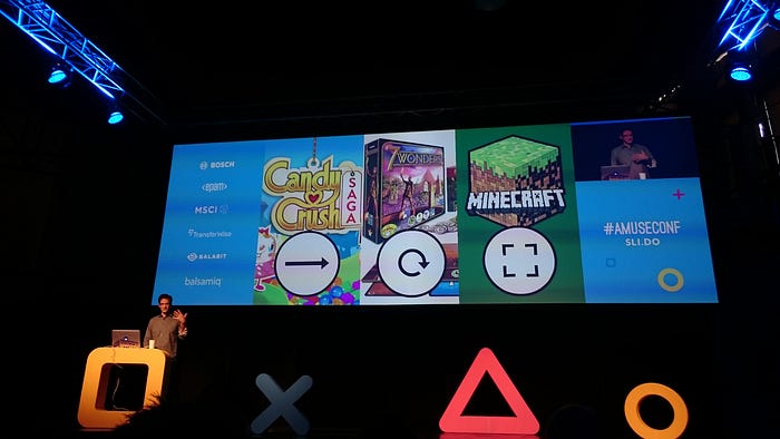
- Path ends in an exchange: for time & money → satisfaction and enjoyment — it is not about engaging with the content, or to learn/grow;
- Sandbox ends in learning through discovery and construction: the maker mindset
- Loop: how the brain works, ends in learning through pattern recognition
We need new tools and systems to help us
- understand each other and our world,
- explore complex topics through safe, playful interactions.
Example: Parable of the Polygons by Nicky Case. Simple rules, goal: making shapes happy. It is about desegregation. Complex thoughts showed through a game.
“Work and learn together to enter into a conversation assuming that you know as much — if not more — than I do, let’s create a shared, emergent mental model by working together.”
Some questions
Could we say that lean and game design are not compatible? They are entirely compatible, the fundamental premise of lean are these rapid iterative learning experiments. Game design is also all about learning. Lean is not about shipping necessarily, it is about learning.
Will virtual extended reality replace only cardboard-based boardgames? There is something fundamentally human about tangible things, having stuff you can touch and feel (the tactility part). More likely: hybrid interactions — boardgame pieces, but the boring parts (e.g. setting up the game) is accelerated through augmented reality. What makes a good game is a choice. What does not make: calculations.
When increasing fidelity as early as the talk described, how do you ensure you still build as fast and cheap as with lower fidelity? That’s the key. The state of the tools and frameworks we have today, pattern libraries etc. allow us to build a hi-fi prototype in hours (if not minutes).
“Bigger differences lead to better insights”

Speaker: Chris Monnier (Twitter)
Talk: Travel Stories
How users of Airbnb tell stories about their travels?
The background: a story about Singapore. How to take a bus in Singapore? There are 3 ways: tap your smartcard when you board a bus; pay with cash or use the Singapore Tourist Pass. Who thinks it is a good story? It is not even a story, these are tips.
The participant would tell her story this way. Real story: she was travelling outside of China, she did not know English. She was told it is okay in Singapore (many people speak Chinese). It started to get dark, she was trying to find out how to get back to the hotel, looked for a bus. It was getting darker and darker. Finally, she met a man in a bus stop, he spoke Chinese. The bus driver also helped. The participant was crying during the research session. The reason: the human connection she made with this stranger.
When they asked her how would she tell this story: she would tell how to take the bus.
Takeaway: People tend to focus on what they did rather than how they felt. People discount their feelings (no one wants to hear that). Usually the most interesting part is how people feel.
Instagrammable Vacation Bingo: cliché Instagram shots you take on vacation. On Instagram you can’t tell the full story & meaning of what the experience was!
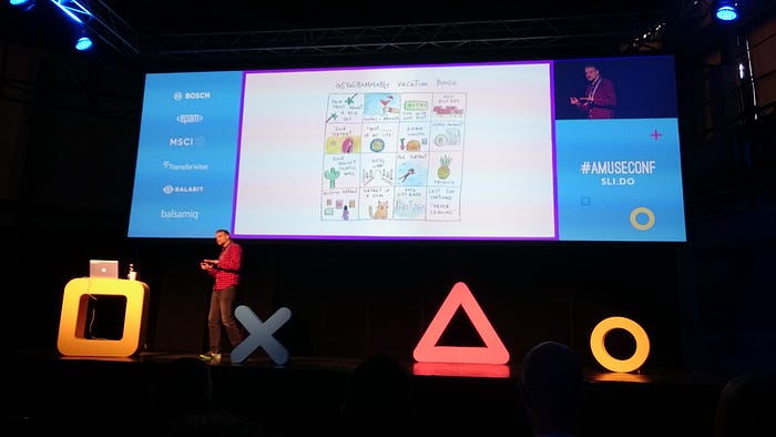
Airbnb’s goal: Help people talk about travel more meaningfully.
Travel planning — key decision phases:
- selecting destination (might take years)
- flight
- visa
- accommodation: in the middle (Airbnb is here at this step)
- activities
Diamond shaped diagram: diverging (opening up possibilities) and converging. After booking the flight: eliminating options, lot of decisions. Airbnb comes at the point when you start to limit options → goal: getting involved in the processes earlier. To reach this goal, Airbnb needs to inspire people. Inspiration is driven by meaning, emotionally resonant things.

Example from research: a Chinese woman wants to go the Paris because of a TV show she liked as a teenager. (Paris means something to her because of the TV series).
What makes travel stories meaningful?
How can they be more than just tips or just Instagram posts?
A simple model about how stories get made: Experience → Reflection → Story.
First: experience in real life; then you think about what you did (reflection), then →translated to a story. Reflection part is critical, where meaning is made. But it is a squishy, emotional topic, tricky to research.
Lessons for how to research these squishy, emotional topics
Research: In-home interviews, Diary Studies, Interviewees brought into a lab; iterative studies over the course of 6 months (cities: Paris, Copenhagen and different cities in China — Why China? Mature ecosystem of travel story apps with hundreds of millions of users. E.g. http://www.mafengwo.cn/).
Lesson #1: Unfamiliar context and how it helps to get better insights
- Why did you went to a specific cafe (in Copenhagen)? “It just looked like Paris.”
- Bastille Day in Paris: “So we [woke] the kids up and went and listened to about a half hour of the classical music. Yeah it was spectacular, and worth every bit of angst.”
- “I love the fact that when you’re in an Airbnb…it’s force function, in some ways, to go to the grocery store… I actually do appreciate that time at home because it sometimes gives you the opportunity to fell a little bit more like a local, as oppose to feeling like a tourist or a traveler.”
3 different stories. Touristy stuff: eating at a cafe. Bastille day fireworks. Local stuff: Buying groceries. All these experiences were meaningful. People who have never done something, then did it, that was meaningful for them.
Being in an unfamiliar context made it easier for participants to notice things that were meaningful (hyper-aware of the new things).
Lesson #2: Novel metaphors
- Airbnb asked participants to walk them through their stories: the goal was getting a deep understanding of the reflection part.
- “The pictures [of the Northern Lights] can be amazing. They have been PS’d. I want to see the real Aurora.” Photoshopped, in China they use it as a metaphor of “too good to be true”.
- “Through movies I’ve watched about homestays with local people [in Japan], it’s kind of a warmth, it feels quite warm, a warm feeling — some noodles, sake.” Metaphor that is rooted in food.
- “[While in Sweden], I chatted with a local high school student about politically sensitive topics. […] When I came back, I thought about what I should improve in the regard. In the past I only watched the domestic news […] You should not only pay attention to your own country — that’s vertical. We need to be horizontal.” Perspective on the world.
Novel metaphors make it easier to realize how people process the world.
Lesson #3: Different Baselines
- “[I wanted to go to the US because] I had always heard about how developed [the US] is, how complete the infrastructure is, whereas in Chine things are still developing.”
- “When got onto the flight [for Korea], we posted screenshots of the air quality in Shanghai and the air quality in Korea, to make people envy us.”
- “In the past I live in Shenzhen in southern China, but in Chicago I saw the snow by the lake…I also walked in the snow for a long time, and after it thawed it melted in the sunshine and my shoes were all wet. In the past I never had this experience.” When you come form a different baseline, different things start to matter.
Talking to people with a baseline view of the world that’s different from your → deeper insights. Research in the US: they would have heard some interesting quotes, but they wouldn’t have triggered the same level of curiosity.
Maximizing the differences leads to better insights.
3 lessons on how to get these insights:
- Getting people out of their context
- Listening to novel metaphors
- Talking to people with different baselines
(But if you are trying to define a problem, study a flow, e.g. how people complete a task or how they work in a factory: you don’t want to remove people from their context.)
A Model for Meaning
After all the research: they synthesized the findings.
4 Layers of Meaning:
- Seeing (“The pictures of the Northern Lights”) — enjoying the sights, visually pleasing
- Thinking (“how developed the US is”) — rational analysis
- Feeling (“walked in the snow…never had this experience”) — doing something for the first time
- Growing (“We need to be horizontal”) — changing someone’s worldview
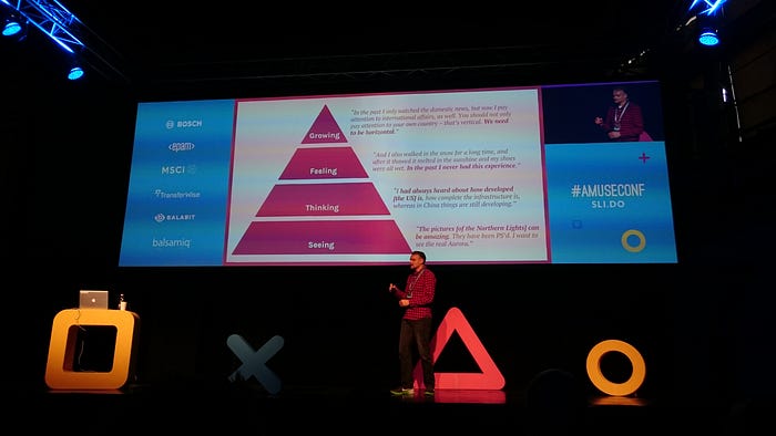
This model has been useful for building products for China, but also for the whole Airbnb (globally).
“But we are starting to talk with technology more and more — all of us have a role to play in this.”
Speaker: Léonie Watson (Twitter)
Talk: The Art of Noise
How we turn the noise into meaningful conversations (with technology)?
Keep talking track: “For millions of years, mankind lived just like the animals. Then something happened which unleashed the power of our imagination. We learned to talk” (Stephen Hawking)
With talking: possibilities for learning, creating, sharing, innovating.
In the 18th century: mechanical model based on the vocal chords, could pronounce the English vowels (a,e, i, o, u).
1939 World Fair in America: Voder synthesizer. Mechanical tool emulatinh the behavior of air going through the vocal chords. “She saw me.” (video) Bad sound quality.
1961 IBM Bell Labs: IBM 704 computer singing Cantando Daisy Bell. The era of synthetic speech design started. (video)
1978 Texas Instruments Speak & Spell Toys: teach spelling for children (video)
1978 Mego Toy Corp 2-XL robot (video) The speech is a lot more fluid. First cheating: using recorded human voice.
1984 DECTalk Text To Speech (TTS) synthesizer — standalone hardware device, then became a software, and a significant screenreader (technology used by blind people) in the next decades. “I am Perfect Paul, the standard male voice.”; “I am Beautiful Betty, the standard female voice. Some people think I sound a bit like a man.” Instead of a robotic, masculine voice: both male and female voices — first step of bringing humanity into robotic voices.
1984 Apple MacInTalk: launch of Macintosh Computer. Steve Jobs: “I would like to let Macintosh speak for itself.” (video) A degree of humor (=way to establish connections between humans)
1993 Apple Voice Recognition — Getting the other half of the conversation: our ability to talk to technology. “Macintosh, open letter. Macintosh, print letter.” “We built a Macintosh that can understand you.” (video)
1997 Dragon Naturally Speaking: one of the most popular speech recognition tool used by doctors, lawyers who need easy dictation skills, + by people who can’t use conventional input devices (e.g. mouse and keyboard).
2011 Apple Siri, speech assistant introduced in the iOS5— feeling: having conversations with our technology. “Siri, where can I find something to eat?” “There are 25 Chinese restaurants located on Spadina” It already knows things about you, has the ability of getting data from your platform. (E.g. current location; you order Chinese food)
2014 Microsoft Cortana, speech assistant: humor and intelligent answers. But still cheating: easter eggs inside the program (ask a particular question to get a certain intelligent answer).
2014 Amazon Echo, Home digital speech assistant. Voice command while you are doing other things (you can just look up and ask, e.g. weather forecast, or set the timer).
2015 Google Now with context awareness: Skrillex is playing: “Google, what’s his real name?” You don’t have to ask: “What is Skrillex’s name”.
Speech is powerful: we use it to persuade, encourage, confront, comfort, amuse each other.
Speech is strange: we use idioms (shortcuts, e.g. “It’s raining cats & dogs” = it’s raining really hard), context, slang, regional variations (pavement vs. sidewalk; dialects).
Speech is not always needed: gestures (e.g. point to things), visual cues.
To make synthetic speech sound normal, it needs to be:
- natural (Siri, Cortana: no precise phrases or formal things needed, more like conversing with a friend)
- intelligible (sound quality; what it is saying?)
- understandable (appropriate to the environment — e.g. telling a bad news about a relative; language should be informal, but not too informal)
What can we do?
Formant speech synthesis: entirely artificial; reacts quickly (lot of screen readers use it); does not sound natural; it is not intelligible; all in one breath, no intonation
Concatonaticve synthesis: building blocks of prerecorded human voices; sounds more natural; more intelligible; less responsive
Parametric synthesis: natural; intelligible; responsive; often neural network-driven; can produce all kinds of audio (e.g. music)
1999 Voice XML: Used to specify dialogues between humans and computers via voice browsers.
2004 Speech Synthesis Markup Language: enables to give the voice a character — we can change the volume, the speed, the pitch etc.
2011 CSS Speech Module: speech on the web. Not an official W3C recommendation (iOS, Safari has a little support for it). Opportunity to create oral or audio design, e.g.: news headline: raise the pitch of the voice.
2014 Web Speech API: adding voice input and voice output to web applications (both halves of the conversation)
Inclusive Design Principles
How do we design the actual conversation? Putting people first: Inclusive Design Principles
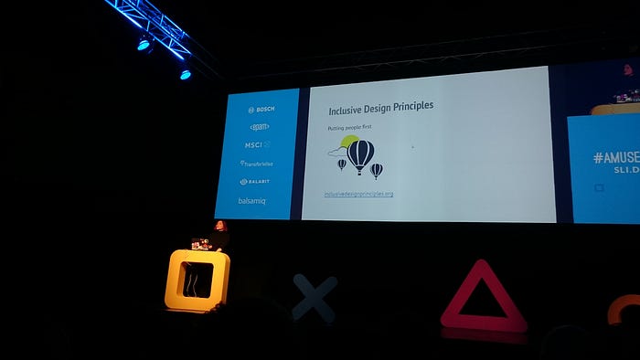
- Provide comparable experiences: Ensure your interface provides a comparable experience for all so people can accomplish tasks in a way that suits their needs without undermining the quality of the content. Provide a way to view the conversation in text (conversation transcripts).
- Consider situation: People use your interface in different situations. Make sure your interface delivers a valuable experience to people regardless of their circumstances. We might be in out kitchen, or in the car. We need to design conversations that accommodate no matter how people are distracted. Explain what the user can do. Ask direct questions. In case of humans: we give each other cues.
- Be consistent: Use familiar conventions and apply them consistently. Use common words and phrases, don’t use technical jargon, unfamiliar words. “Hey Siri” — great wake up phrase, feels natural, fits into the English language.
- Give control: Ensure people are in control. People should be able to access and interact with content in their preferred way. Provide information in small chunks. Let the user decide what to do next. “Would you like to hear more?” How much data they want to receive.
- Offer choice: Consider providing different ways for people to complete tasks, especially those that are complex or non standard. Don’t offer too many choices. Make choices simple. We need to guide first time users, it is an odd and strange interaction.
- Prioritize content: Help users focus on core tasks, features, and information by prioritizing them within the content and layout. Taking an educated guess about the most likely choice they going to want to make, and offer it first. E.g. in a recipe app. don’t do this: User: “Open my Recipe Book”. App.: “You can add a recipe, delete a recipe, edit a recipe, find a recipe or choose an ingredient. Which one do you want?” Better solution: User: “Open my Recipe Book.” App.: “Do you want to find a recipe, or something else?” Enabling the users to consume the conversation in small chunks, and direct the way the conversation goes.
- Add value: Consider the value of features and how they improve the experience for different users. Write for ear, not for eye. E.g.: User: Ask Score Keeper for an update on the Bristol game.” App: “Bristol 35–20 Harlequins, Time remaining 00:30:30”. Instead: use a fashion that is intended to be spoken.
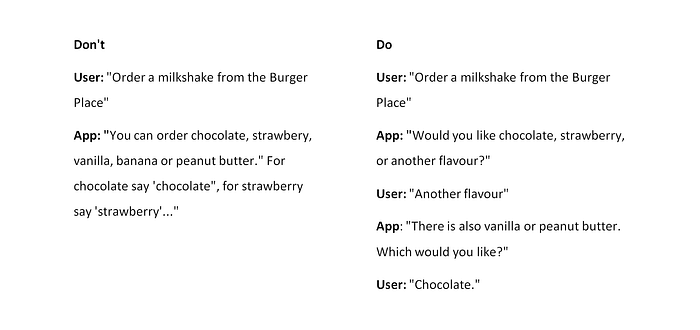
Some more big questions of designing conversations
- Privacy: how much are these devices retaining of the things we say; what are they doing with that information (storing?). Data is sent between servers. Social aspect: no private conversation with this technology (E.g.: her husband did not want to wake her up “Alexa, turn off the lights” — it did not recognize the lowered voice; Or in an office: maybe you don’t want others to hear it).
- Security: What happens with the data when it is sent remotely to the cloud? Can it be hacked?
- Identity: How can we securely identify ourselves? E.g. having a conversation with banks. Humans: ID, signing signature.
- Trust: We tend to anthropomorphize things that we can talk to. More convincing conversations → more we will trust this technology. What happens if the technology is too convincing? E.g. Talking Teddy Bear: advertising built in it: “let’s go and buy a chocolate”
We are starting to talk with technology more and more — all of us have a role to play in this → designing skills, apps, tools, systems that will engage with humans using speech. We will get to a point where this is our default mode for interacting with content.
A question
Ethical questions? What about a technology that can stimulate someone else’s speech? It is another question we need to think about. How do we protect ourselves against it? Morgan Freeman reading my email — that’d be cool. Downside: someone can mimic you.
“ We design for numerous cultures, whether we know it or not.”
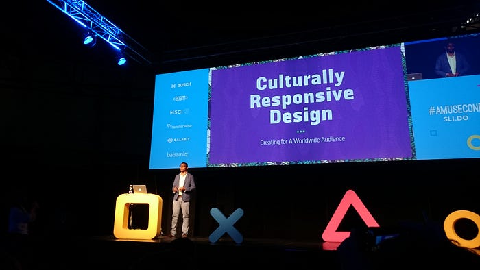
Speaker: Senongo Akpem (Twitter)
Talk: Culturally Responsive Design
What does it mean for us as citizens of the world to start to build tools, interactions and visual design for a variety of different audiences?
Culturally Responsive Design: Be part of this world, but also part of individual cultures; Speak to your own, but also speak to others.
Background: he grew up in Nigeria (Nigerian father, American mother). “Third culture kid”: in between. He went to the Michigan University, then moved to Japan, lived there for 7 years. Unique perspective of what it means to be from a place, but also not.
We design for numerous cultures, whether we know it or not.
Cultural Variables
IBM researcher Geert Hofstede: examining how corporate cultures interact, built and sustained. How do this apply to national cultures? He came with a set of variables of the ways people organize themselves. Not all people from a given culture perform that way. But certain cultures organize themselves according to certain principles → by examining those we can find out what means to design for them.
#1 Variable: High Context vs. Low Context Society
- High Context: lot of implicit knowledge — things are simply understood; difficult to understand what’s going on if you are not from there (e.g. Japan, phrase: “read the air”);
- Low Context: lot of explicit knowledge, codified, written rules (e.g. New York)
Whose responsibility is it to understand something? In Japan: the listener’s. In the US: speaker’s.
Example: Wooden Pagodas in Kyoto — Website homepage: calligraphy is written vertically (Vertical text is a culture and age indicator). Menu is on the top-left. English translation is also written vertically. High context visual identity gets mixed with low context.
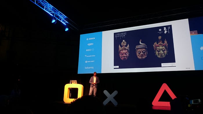
#2 Variable: Collectivism vs. Individualism
People who feel that they are part of the group before themselves OR people who feel that they are an individual before the others.
Research in India about a train ticket selling interface: it was hard to get answers from the participants (due to cultural inhibition on criticizing someone’s work) → The Bollywood Technique: the researcher told to the women: “Imagine: your daughter is getting married tomorrow, she lives in the next town. You just found out that her husband is a bad guy (he is a thief, a murderer, has another family). You need to get a train ticket, and save her ” As a result, the mood changed.
Acknowledging what the cultural variables means for your research → you can get some relevant information. Understanding interfaces isn’t the same as accepting them.
#3 Variable: High Power Distance vs. Low Power Distance
- High Power Distance: the symbols of power (cloth, car)
- Low Power Distance: egalitarian, everyone is middle class.
Separation between those in power (boss, politician) and the regular Joe and Jane.
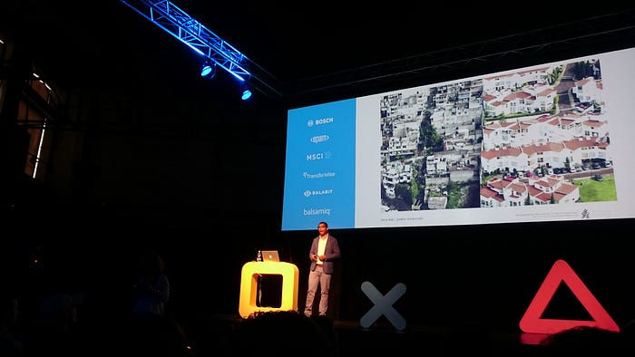
Another example: Inequality and New York’s Subway. The New Yorker mapped the median income against every station. Canal Street is the highest, one or two stops away: drops to around $50.000.
#4 Variable: Fast Messaging vs. Slow Messaging
How speedily do you want things communicated to you.
- Western: fast messaging societies; People want it now.
- Nigeria: very slow messaging culture
Gov.uk website: a website that takes all of people’s social information and makes it fast to find.
Tropico Vernacular by Lobregat Balaguer: Graphic design in the Philippines. Graphic designers there = layout artists, print technicians or simply artists. Terrible font choices, overwhelming color: slow messaging is been replicated in the graphic design. “…a people whose idea of visual pleasure is an explosion of the colors and textures that constitute the experience of community.” (Lobregat Balaguer)
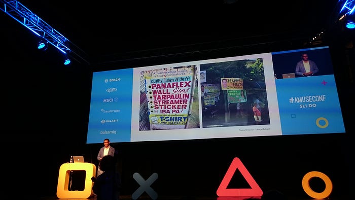
#5 Variable: Ambiguity vs. Directness
How people are comfortable with fuzziness, things not been explicitly laid out, vs. how much they value directness, short to the point communication.
Marshall Islands: during the second World War, researchers discovered these stick charts (~cartography and map-making). These maps explain currents around the island. It seems impenetrable. To them, it is useful (read, created by experts).

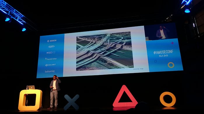
All our design choices come with pre-existing assumptions, conditions.
Code-switching: one dominant culture (in the US: white American), + the black American culture (quite secretive compared to the white American culture). Black Americans are able to code-switch, to move between 2 cultures, 2 languages.
We adjust our communication to emphasize (or minimize) our social differences. This is what we do when we code-switch. Emphasize: you are different. Or minimize: you are the same.
App. called Bridge English: lot of refugees due to the Syrian war. This app helps aid workers going to the refugee camps to make sure that the refugees have everything (e.g. medical equipment) they need. They use Viber’s platform (send a question to translators, they send it back in Syrian dialect), so they don’t need a translator in person. Allowing the aid workers to code-switch (technology takes the load).
Tip #1. Build design projects with the flexibility to code-switch.
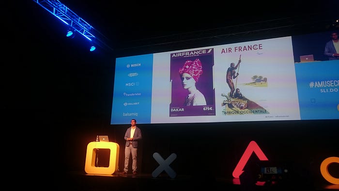
Depicting the “Other”: Humans love to think of people as not like them. In ads, e.g. Air France campaign. On the right (older one): racist — savage, barely human in a canoe in the middle of nowhere + a tiny little plane on the corner is the only sign of modernity. The poster on the left: woman with face paint, advertising flights to Africa.
Asháninka (South American tribe) /Osklen Spring 2016: instead of preconceived notions of savages: creative partnership, cultural collaboration.
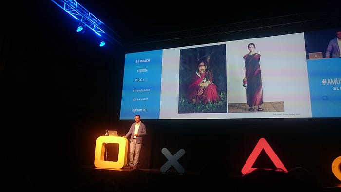
Narratives can deliberately break those stereotypes.
Example: in the ages of exploration (16–17th century) — groups of Portuguese sailors sailing to China, looking for trade routes. These ships were filled with Black African and Indian sailors.
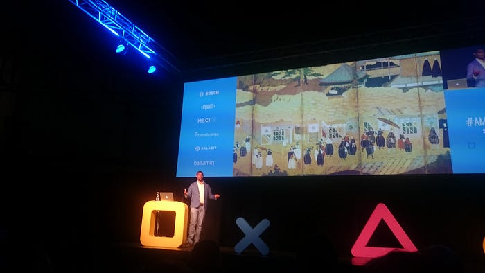
Online interactive narrative: The Voyage of Captain DaCosta. What narrative can I tell that is different from the stereotypes?
Yinka Shonibare (fabric designer, artist): What it means to be African + British? He mixes African wax print fabric with examples of the European culture. Taking what we think is African & showing that is not the case.
So what steps should we take?
“Culture eats strategy for breakfast.” (Peter Drucker)
1. Be flexible in the UX and in the customer research. Find ways to accept that you are speaking to people, and not for them. You are listening instead of dictating.
Example: Healthcare clinic in Nigeria — there were constraints that have been overlooked. Nobody went to the clinic. Why? The clinic was open only during the light hours. No power supply, so people could not go after work. Other problem: citizens could not give feedback to the organization. Solution: SMS system — people can simply text the clinic. Local government realized that the clinic should be open longer, they established a generator to provide power.
Tip #2 .Test designs that explore how cultures integrate and adapt platforms.
2. Forgiving Interfaces: it means 2 different things — it is flexible; forgiving in the social & moral sense.
WeChat app. in China: membrane that lays over the society, and let’s you do many things, e.g. take a picture of your kid at the daycare. It allows people to work with each other.
Civil rights movement in the 1960s: black activists, goal: same access to society. Dramatic period: beatings, lynchings. Lunch counters: activists went to such places, demanded to be served. People insulted/stabbed them, threw things at them. Activists did not move, it was a non-violent movement. Atlanta Center for Civil and Human Rights: you can experience this: you sit there, put your hands on the table, it is a haptic interface that knows when you move your hand, tests how long you can listen to the abuse (~7 minutes on average).
Tip #3. Design forgiving interfaces that flex across cultures.
3. Layered Language: How does bilinguality manifest itself in graphic design? Air Inuit rebrand: Iniut Sans typography. It works in English, French and in Inuktitut. → Multicultural approach to a design challenge.
Holo Halo: imaginary interface, that projects your emotions around your head. What it means when language is not spoken (or written), but starts to become visual?

Tip #4. Create projects that work effectively in multilingual contexts.
4. A Sense of Place:
Regulatory Assistance Project (RAP): they focus on climate change regulation. They created a map for the homepage, but something was wrong, they forgot the disputed regions between India and China. So they modified the SVG files. The pre-existing assumptions were wrong, did not match with the reality.
Lost Nigeria personal project: showcased his mother’s photographs. It was after Nigeria’s independence (1961), and there were high hopes, but the Africa-arising did not happen. Small contained narratives + the hospital she worked at, her travels etc. — What it meant for her to be at that place? What was her sense of places?
Tip #5. Reference location in nuanced ways, to create a sense of belonging.
Culture informs every stage, output and artifact of our design practice. Use & investigate it. Find ways to build flexibility and cultural responsiveness into the things that you do.
Some questions
How can we interrogate our own stereotypes? What about unconscious stereotyping? It is always going to be there. During a UX research: set out questions, make assumptions, and test to see if it is true. Talk to the users. You can’t escape it, but you should know that it is there, and try to to break it.
When you design for different cultures, is it possible to aim for a common field or you must have different versions? It depends on the business field. Someone said that Material Design is culturally agnostic — interesting idea. At their scale, they can’t create different Google versions for China. At your scale, it is important to take into account language, color, photography etc.
Link: Senongo Akpem’s website
I teach sketching for UX designers, I’m passionate about sketching and visual thinking, so it was great to see Eva-Lotta Lamm’s live sketchnoting presentation.
“There are distinct steps that everyone can take that lead you on the way to being more visual and more spatial in your note taking or the externalization of your thinking. ”

Speaker: Eva-Lotta Lamm (Twitter)
Talk: 5 Steps to Change Your Note-Taking
Sketching is a wonderful tool to collaborate, it is very immediate.

She takes notes in a visual form (sketchnotes). Rarely: in the big format (graphic recording).
Sketching digitally (e.g. with an iPad + Pencil): you can play back your process as a video to see which order you did things. You can also reorganize it.(“I still love pen and paper though.”)
Sketching during a meeting: not as visually rich, but the same idea: bringing visual structures makes the notes easier to process.
During research: e.g. user interviews — taking notes by hand makes it easier to find the juicy bits in the video recording. Text heavy + simple icons as visual hooks (e.g.: positive and negative experience; direct quote; problem; idea).
Helping other people to figure out their complex processes: she talks to different people, then through correcting and additions, they get to the final version of the process.
Teaching other people to sketch on whiteboards, express themselves visually. Collaborating: everyone can take a pen and contribute. You can also add sticky notes. The result: shared mental models.
She also draws when she reads a book, prepares for talks, workshops (“visual cheat sheet” for the day).
There are distinct steps that everyone can take that lead you on the way to being more visual and more spatial in your note taking or the externalization of your thinking.
In the next part of the talk, she explained sketchnoting by creating a summary sketchnote about it, and we could follow her along. Here is my sketch:
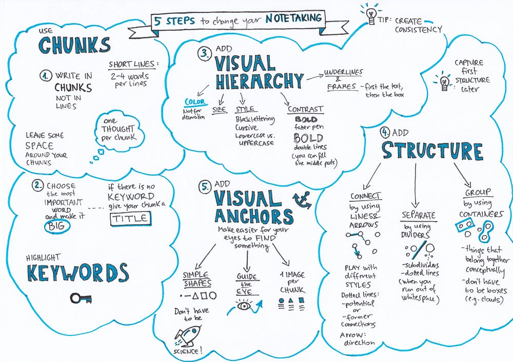
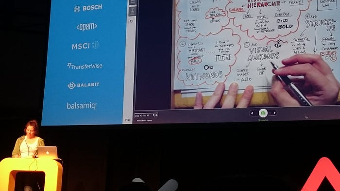
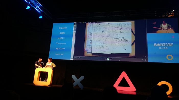
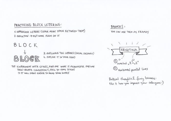
While creating the sketchnote, Eva-Lotta shared many practical tips, e.g. how to practice drawing block letters and have to create banners:
Some questions
Tools of the trade? Any kind of pen. One black and one color. And A4 print paper. Most important thing: “just doing it”.
Digital stuff — toolwise? iPad Pro + Pencil + Procreate App. Or Wacom Surface, it also has pressure sensitivity. “Still a way to go to make it really good.”
Sketch for yourself vs. sketch for someone else: In UX work: talking about concepts, drawing diagrams, drawings structures, so the sketch becomes a shared memory of the conversation. People who were in the room can recall.
What happens if the meeting is super fast/chaotic? You get faster the more you practice. Sometimes you don’t have time for visuals — 1. add text, chunks, 2. then add layers on the top.
Links: Eva-Lotta Lamm’s website
“Animation is about adding something positive to the experience, not just distraction or decoration. ”
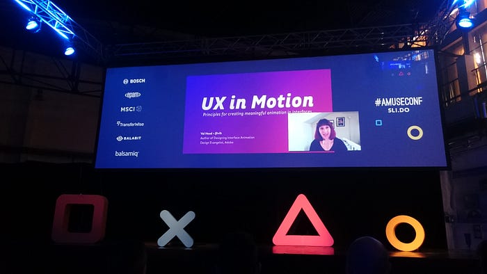
Speaker: Val Head (Twitter)
Talk: UX in Motion: Principles for Creating Meaningful Animation in Interfaces
How can animation positively impact UX? What makes a good UI animation? It is easy to find extremes (really good and horrible, distracting ones). How can you be sure that you are making a good animation?
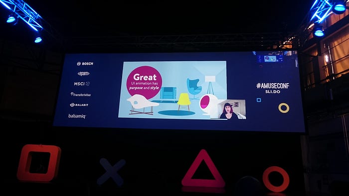
It is about adding something positive to the experience, not just distraction or decoration. It should have purpose and style:
- why is the animation there?
- what is supposed to be accomplished?
Principles
#1. Continuity: Reinforce mental models of the interface and show how content is related.
Responsive design: designing for both huge and tiny screens. If something is off-screen temporarily: it can be layered on the top/behind. The goal: the user should find his/her way around.
Examples:
- T-shirt shop website, where the navigation slides up to the left, while this shopping cart slides to the right. Confidence of being able to find it later.
- Google Fonts: 2 distinct layers: one for looking for fonts (browsing layer); fonts you have chosen for yourself (action layers)
- Google Fonts Bucket icon: the panel scales down/up to the icon. We get the sense that the panel is inside the bucket (physical sense)
- PayPal check-out form: pay with PayPal or by a card — the form is flipping, it has two sides, it communicates the 2 different payment methods

Continuity:
- Be consistent with your spatial or layering arrangement of UI elements
- Transitions between layers or places don’t need to be complex of effective
- Have a clear model for what different layers or places for
Continuity is about making the connection visually (by the transition).
#2. Visual continuity: the object is the same object even if the things around it have changed. Maintaining the “thingness” of an object during points of transition.
Examples:
- Basecamp: file icon: small state → big state. Same file, same icon, just a different view. It creates the illusion of the icon coming closer to the user.
- Platform.ly: morphing header; the navigation never leaves the screen, just rearranges. There are entrance and exit movements to keep the sense of continuity.

Visual Continuity:
- Reuse elements between views
- Why should it leave the screen just to come right back on again
- Planning entrance and exit movements vs. fading to black every time
#3. Feedback: letting the users know that something has happened (e.g. in case of manipulating data or publishing content).
Examples:
- a check-out form that is shaking if you don’t fill it in. It is like a human reaction (~shaking head), it creates a tie to the physical world; and the form also has red highlights around the unfilled input fields.
- Multiple things we have to tell to the user: it can stack up in space and also stack up in time, e.g.: the “Donate $1” label text on a button becomes a check mark (it is using a very small space in an uncluttered way).
- Medium.com: the interaction of adding claps — it not only communicates what is happening, but also shows how many claps your are adding.

#3. Directing Attention: leading the eye and calling attention to changes and important items (e.g. updates or alerts). Animation is a powerful tool for that.
Pulling attention by motion is easy (even if we don’t mean to). Back in the day: animated banners — those wanted to force you.
Examples:
- Fitbit: the only thing animates is your actual information, daily status (same for the desktop view and inside the iOS app — it is consistent on the two viewport sizes).
- Codepen: authoring a document in the browser — it is easy to lose your work. The “Save” button is shaking to remind you. (If every button did this, it would be horribly distracting). The context defines it, it should be important for the user.
- Google Notification Bell icon: Messages can be important. The bell is shaking to get your attention (but they kept it balanced, it does not constantly trying to get your attention). So again, the context dictates what amount matches with what is needed.

Animation for feedback:
- Use time instead of space for more compact feedback
- Mimicking natural gestures like shaking can be useful for error states or incorrect responses
- Fit the animation to the context of in the information being highlighted
#4. Hinting & Affordances: Helping users see the effects, or potential effects, of their actions. Preview the results of the actions before you take the action.
Examples:
- iOS Camera icon: if you tap it, there is a little jump of the homescreen — you need to swipe up, and the system demonstrates the gesture for you.
- Clear App: hinting how the app works. (E.g. when you want to add one more item)
- Drag & Drop interactions (e.g. in Google Keep): seems simple, but designing/building one is hard. Giving a hint, a preview of what will happen before you take the action.

#5. Guiding Tasks: Cueing what should happen next (not only hints or gestures).
Examples:
- Google Docs: rearranging documents, moving files into another folder — it shows the pile of docs, and the number of the moved files appear on the top-right corner. It gives you reassurances, visual confirmations as you go along.
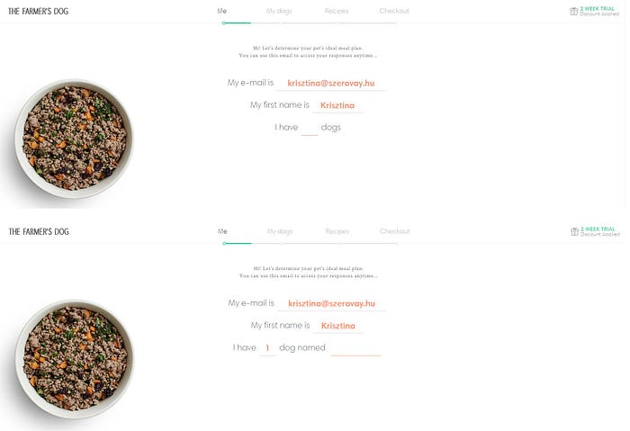
- The Farmer’s Dog website: A form that feels like a conversation — there is one question, you answer it, then the next question appears, you fill it in, then the next…
- ReadMe: Animated mascot: not intrusive, but helpful, guides you through the form. It hides its eyes when you start filling in the “Password” field. It adds personality.
None of these animations made you wait, these move with the user.
Hinting and Affordances:
- Use animation to demonstrate gestures or hint at advanced features
- Move with the user, never make them wait for an animation to finish
- Make it a conversation
- Look for opportunities to express personality within these helpful moments
#6. Perceived Performance: Animation can make unavoidable waits seem shorter. The data is uploaded to a server, and then it takes time to get back to us. If it is too quick: people won’t trust it. It is time what makes animation exist. We can make a thing look faster.
Examples:
- On Facebook: first the skeleton content appears, it communicates that the content is coming soon, so it makes it look faster. And it does not matter if the skeleton matches the actual content or not (e.g. lines, then a video appears)
- Actual loaders: for instance the Twitter bird
- Focus the user on the progress: for instance Shopify uses this technique “Sit Tight! We are creating your store” — focusing on these makes the waiting time feel less, it is not passive waiting.
- Viget Study: Experiments in Loading — How Long Will You Wait? The more designed the loader, the longer we would wait. If the loader seems to be intentionally designed and fits the context, the abandon rates are lower. An example: Sure Payroll — animated calculator: it is context specific, makes the loading experience seem to go faster, it feels like less of a wait.
- Mercury.io: The Psychology of Waiting, Loading Animations, and Facebook: “ The main take away here is that even though short load times are important, loading animations can sometimes be helpful to divert user’s attention. And although custom animations can be especially powerful at doing this, when load times are incredibly long or outside of our control, it might be a good time to use the standard spinner and share some of the blame with the system.”

Links: Val Head’s website
“ What conclusions you would like to be drawn based on your design? How can you make people draw these conclusions without telling them explicitly?”

Speaker: David de Léon
Talk: Design by Magic: Applying the Techniques of Magic to User Experience Design
What is magic? Creating the illusion of possible by apparently breaking the rules of nature.
Magic challenges our perceptional world.
“Magic happens in the minds of the audience and what a magician is really doing is fully controlling what the audience perceives and how they think about what they are perceiving.” (Eric Mead) So magic happens in your head, the magician controls the thought process.
ISO 9241–210: “[User experience is] a person’s perceptions and responses that result from the use or anticipated use of a product, system or service.”
Magician/Designer: what goes into your head, what thoughts follow the input.
7 Connections, Overlapping areas
- Design of Magical Experiences: user experience as magic, but no magician is present
- Magical Things: products that have magical feel. E.g. a Harry Potter wand that controls your TV
- Magic as Metaphor — for design & innovation. Focusing on the real, unmet needs, creating the ideal experience. Look at magic’s unexplored plots. E.g. giving a robot a spoken command: today it is a technical demo (~like sci-fi has been used to push innovation)
- Magic is about deception: deceptive technique. E.g. iOS Email App: you pull down the list, let it go, if there is a new email, it loads — it is about hiding the fact that there is some latency to download. Or the first iPhone camera: “Have you seen this fantastic animation?” — the users liked it, but in fact it was about hiding the fact that the iPhone camera is slow. Another example is Instagram: you select the image, apply filters etc., while Instagram is uploading the picture in the background, so you can upload it “instantly”.
- Magical Prototypes: Simulating the experience, e.g.: before Siri, you talked to a real person on the phone, it was a trick. Creating illusions in order to test a non-existing technology. Another example: the Mechanical Turk, the chess-robot. There was a guy hiding inside. People could experience AI in 1770!
- Magical Performances: Storytelling, Music, Movement, Cinematography etc.
- Magical Experience Design
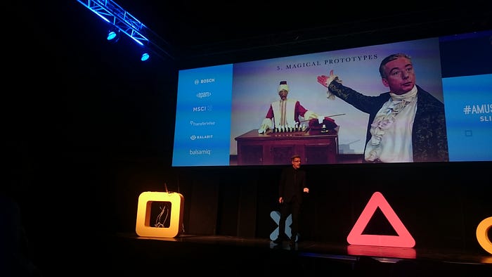
Peek behind the curtain — How magic works?
- Sleight of hand, and connected to this: Gimmicks — an object that looks like a familiar one, but has secret properties
- Psychology: it is a huge part. Misdirection: getting someone’s attention where you want it, and make him doesn’t think about the other things. You tend to look where the magician looks. Your visual attention is being directed. Also you thought processes. Example: the magician is holding his hands in a way that you think about the hand, so you don’t think about other things. Conditioning: putting your hands in your pockets can look suspicious, but if you incorporate it in your body language from the start of the show, the audience will get used to it, and find it natural.
- Gaffs
Video: Penn & Teller — Smoking/Sleight of Hand Trick
Techniques we can apply in UX
Reconstructing Memories: it is about designing your memories. E.g. there is a long, dull onboarding process — users should remember it as a short, fun thing.
- We can emphasize certain things, while de-emphasize others. Directing your attention to what is important.
- You can use humor: after a laughter, people relax.
- A story (the plot, the obstacles) can also shape how people remember, it also focuses the attention in a way.
- We don’t really remember things that required little effort: so a series of low-effort action is better than one screen of lot of cognitive effort.
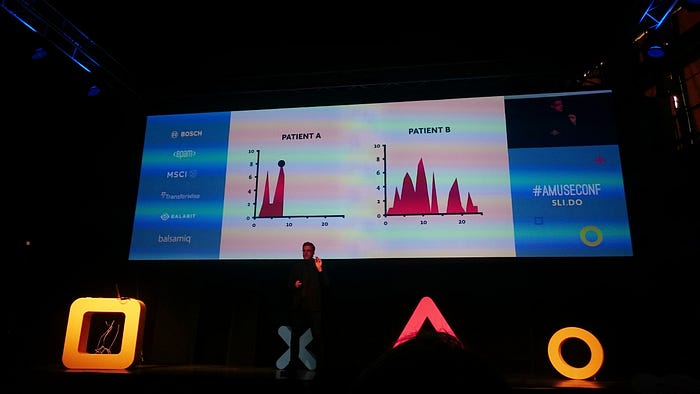
Peak–end rule: “people judge an experience largely based on how they felt at its peak (i.e., its most intense point) and at its end, rather than based on the total sum or average of every moment of the experience.” (Wikipedia)
- Patient A: short procedure — what we remember is the highest point and the experience in the end.
- Patient B: same high points, but in the end: less pain, so it is remembered as experiencing less pain overall.
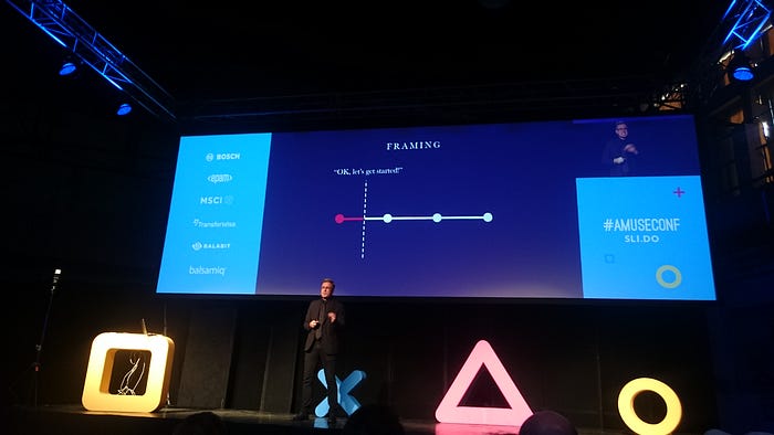
Framing: To guide the memory, you set a frame, what is outside of the frame is not remembered afterwards.
- E.g. the magician talks, does things, and says: “Let’a get started” — it defines a starting point (but in reality, he has already started it).
- We tend to edit out things, small, insignificant details.
- Heartstone is a fantastic lesson in design. The first time user is given very little instructions. After the first round it communicates: “The Journey Begins”, the tutorial starts. But you have already had fun! So you feel that you want to complete the rest of it. Rather than teaching you all the rules, it gives you the rules one by one. And presents the new things as power-ups (new ways to hurt your enemies). It is about changing your perspective. And after the tutorials, you get Quests, and you have to play 5 practice matches before you can play online. Overall, the game makes the whole onboarding shorter and more fun.
Reinterpretation: the magician can influence what you think. You agree to what he said (e.g. “You shuffle the cards” — but in reality, he shuffles them). Changing people’s perception of what has happened.
Methodological Diversity: It is about creating a whole experience from the parts.
Video: Ring Watch and Wallet — Tommy Wonder — he uses 3 different techniques for the 3 objects, so you can’t figure out what’s happening. You look for one explanation, so you don’t succeed in revealing the trick.
Conviction: Example — pack of cards, the top card has a blue back, so you assume that all cards have blue back. Then it turns out that all the cards under it has red backs. The magician has to convince you before revealing the red backs that all backs are blue.
Dramatizing conditions: David Copperfield’s trick on the Orient Express (video) — it was performed on a train, because it made it crazier (the card is attached to the window’s glass from outside, while the train is moving). You automatically draw those conclusions.
Suggestion and Implication: What conclusions you would like to be drawn based on your design? How can you make people draw these conclusions without telling them explicitly?
At the end of the talk, David de Léon performed a live trick: 3 random members of the audience was asked to pick certain characteristics of cards (first the value: Ace, 2–10, Jack, Queen, King; then: red or black; then: Hearts or Diamonds), and then he revealed a pack of card, in that deck it was already indicated on the backs of the cards which one was picked based on the choices of the 3 random participants (it was the ace of hearts :) ).
Continue to Day 2 (topics: banishing your inner critic, service design at Gov.uk, qualitative research at Boston, storytelling and UI patterns, UX of AR/VR, digital afterlife, Film UI)
The Atmosphere of the Amuse UX 2017 Conference
I love trains, and one of my favorite places in Budapest is the Hungarian Railway History Park. That was the venue, so I got even more excited about the conference. Additionally, I’m also a huge fan of amusement parks — guess what: the organizers arranged a ride, a panorama carousel for the conference attendees! I also enjoyed playing at the booths, talking to fellow UX professionals, and I also took a look at the exhibited locomotives. Here are some pictures:
