An analysis of the interactions on iOS 11
A design critique of the new gestures and interactions on the newest iOS.
iOS 11 — as Apple calls it — is no doubt a “Giant step for iPhone” and a “Monumental leap for iPad”. There have been tremendous changes to the way one interacts with iOS on the different devices. With the introduction of the iPhone X, which loses the home button, there is an increased requirement to make actions possible with more gestures on the screen.
iOS 11 brings to our devices a significant number of changes that throws us off at the start (some of the new iPad changes threw me off, no doubt).

Before getting into the depths of the critique, I’d like to make a few things clear –
- I do not work for Apple. This is not a critique of the designers who spent relentless hours working to make iOS 11 successful. As with any designs, there are constraints, trade-offs, and research behind decisions made. I am unaware of them — this is purely an evaluation from a designer, also a daily iOS user, who cannot not see from a critical lens while using products. Let’s just call it an occupational hazard!
- This is purely a critique from my perspective — just like every designer out there, I have my biases and preferences. This critique stems from the idea of what I believe is a better user experience. Definitely, the designers from Apple might have much more validation and data to support their decisions.
- As with any design critique, I like some data to go off of. For this purpose, I had a few simple tasks tested on the iPad just to understand if it was just me with these quirks with iOS. Spoiler: Turns out, it wasn’t just me.
In this design critique, I am going to talk from three aspects of the iOS experience –
- The gestures and interactions
- Precision required to use iOS
- Parity between different devices running iOS 11.
Gestures and interactions on iOS11
Let’s start with the lock-screen
The iPhone lock-screen aims to be minimal and as functional as possible. The one downside I have noticed is the way it sets the mental model of users on how it operates.
A good friend of mine, Shankar, delineated everything that was wrong about the iOS10 lock-screen. Since then there have been a few changes, mainly the conglomeration of the lock-screen and notification center which fixes confusion to an extent but most pointers from that article still holds good.
As I mentioned, I’d like to validate my assumptions with as many users as possible. For testing these interactions out, I performed several contextual inquiries with 6 diverse iOS users testing on the iPad — umm, actually 5 users — one was a “I hate everything Apple” person — just for thrills and giggles.
For those interested in the nitty-gritty of the sessions — the results can be found in Google Sheets.
I tried to understand what Apple designers might have had in mind while setting goals for what the lock-screen should achieve — again, these are my assumptions and I have no data from actual designers from Apple.
Goals of the lock-screen
- Keeping it minimal to avoid distraction and present only what is important and relevant at a given particular time.
- Ability to view current and earlier notifications.
- Ability to search without having to unlock — obviously, have to unlock to view the results.
- Ability to open the camera quickly.
- Ability to access the widgets easily.
- Look at the time and date easily.
I divvied up the way to measure this by splitting into three sections –% of users who accomplished the task successfully.% of users who needed a few tries, playing around a bit to learn, and eventually get it right.% of users who just did not get it at all, and hence failed the task.
Completing the task successfully without too much hassle was categorized as task success, whereas when users took more than a couple of minutes to figure an interaction out, I categorized it as a task that required some learning.
With the above mentioned simple goals in mind, I decided to test the interactions on the lock-screen. The tasks I tested on the lock-screen –
Open the camera app from the lock-screen
Task success — 66%
Task failure — 16%
Learning required — 16%Go back to the center lock-screen
Task success — 0%
Task failure — 50%
Learning required — 50%Expectation when swiping right on the lock-screen
Task Success — 83%
Task Failure — 0%
Learning required — 16%Expectation when swiping left on the widget screen
Task success — 100%View notifications
Success — 50%
Failure — 16.6%
Learning — 33%View earlier notifications (just to see if users understood there was a difference between unseen and earlier ones)
Success, Failure, Learning — 33.3% each
Key Takeaways
These are a mix of both, quantitative and qualitative analysis, after talking to the users who helped with the interface validation –
Takeaway 1: Jumping back to the Home Screen from the camera is confusing even for seasoned iOS users.
The fact that none of the users got this right talks about the confusion. Even fairly advanced users of the iPad got this wrong and realized that they get it wrong always.
A question to ask —
How can the lock-screen experience be improved to reduce the error caused when one wants to move from the camera to back to the home screen?
Another perspective —
Is it even necessary for users to jump back to the lock-screen after opening the camera?
This perspective takes the side of the current design pattern, and if we consider that the requirement to jump to the lock-screen from the camera app unnecessary, the existing flow works just fine.
But. there a few quirks with this flow too…
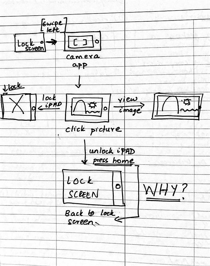
What happens in the current flow is that after a user clicks an image, they have an option to view that image, or return to lock-screen by clicking the Home button. This confused one of the users because pressing the Home button unlocks, which is the most commonly used purpose of the Home button from the lock screen.
Why does pressing the Home button on the camera take users back to the first lock-screen? On the lockscreen when one presses the Home button, the TouchID authenticates and lets users in. Why cannot it take users to the home app drawer page directly instead from the camera app as well after authentication? One rationale I see is that the designers who worked on this might have thought about it as a means to go back.
Another reason I see is probably to handle this situation when the authentication is FaceID. This one is tricky and I see a few trade-offs being made to accomplish an experience with least friction, but how can this be made more intuitive is something to think about.
Takeaway 2: The notification center is still confusing in iOS 11.
The delineation of new notifications vs earlier notifications is a step in the right direction, but again, how can this be made more obvious? Looking at the stats above, even trained users forget patterns that they learnt earlier. There is a significant amount of in-situ learning required to accomplish these tasks, but the learning does not stick as even learned users forget it over time.
The Tips app tries to achieve this to some extent, but seems like it is not efficient enough to help users learn over time from tests performed.
Another point to note is that the pull from top creates a friction by asking users to change direction of swipe to view earlier notifications. Again, this seems like an effort to educate users on how the new patterns work which seems to confuse more than educate.
An interesting challenge to tackle here will be –
How can the training of using newer versions of iOS be improved to make the pattern behavior more sticky?
Control Center & Multi-tasking
Some of the tasks were around testing how other swipe gestures are fairing up in the new iOS. The next few tasks were focused around using the control center, multi-tasking, floating windows and splitting the screen for concurrent windows.
These aimed at testing how easy to comprehend the different gestures are, what is the error rate with these gestures (that is, how many tries it took to get the gesture right while learning), and how aligned were the gestures overall were with user’s expectation/existing mental model, and if they did a good job in altering their mental model if they were not aligned.
Change the brightness of your device
Success — 50%
Failure — 16%
Learning required — 33%Kill a few open apps
Success — 83%
Failure — 0%
Learning required — 16%Close the control center
Success – 0%
Failure – 33%
Learning required – 66%Open an app, and open the dock alone
Success — 50%
Failure — 16%
Learning required — 33%Shift up to multi-task mode with another app
Success — 50%
Failure — 50%Push the floating app around in multi-task mode
Success — 0%
Failure — 33%
Learning required — 66%Split the screen 50–50 on the multi-task mode
Success — 83%
Failure — 16%
Learning required — 0%Kill an open tab on Safari (bonus task)
Success — 33%
Learning required — 66%
Key Takeaways
Takeaway 1: Reverse gestures are going against the mental model set in the first place
When a user swipes up to perform an action, and a new window/view opens, it is an expectation that the reverse action closes or goes back to the previous state. This was noticed two instances —
- When users tried going back to the home lock screen as we saw in the first section.
- When users tried opening the control center by swiping up, users — even seasoned ones — expected that swipe down will close the control center.
Takeaway 2: Similar actions performed had different gestures
It is a safe assumption that killing apps from the control center is an action that is similar to killing tabs on Safari (on an iPad). But, the gesture required to perform the task is different. Killing apps required a swipe up, whereas killing tabs required a swipe left.
Thinking further, I tried to understand the rationale behind designers making this choice — the control center scrolls left to view further apps, and Safari scrolls down to view further open tabs — if the same action performed both the tasks, there will be a gesture conflict between scroll and killing the app/tab.
But, one question we can ask here is —
What if we rethought the way scroll worked for instances where there are multiple elements open like apps and tabs?
A uniform scroll pattern would definitely solve this issue, and there will be no gesture conflicts or multiple inconsistent patterns across iOS.
Takeaway 3: iOS 11 expects precision from users
This is the biggest takeaway I had from testing/using iOS 11 for a while, and I thought this deserved a separate section…
Increased dexterity and nimbleness are side effects of using iOS 11.

Alright, jokes aside, let’s look at two basic usability heuristics by Jakob Nielsen —
Error Prevention
Even better than good error messages is a careful design which prevents a problem from occurring in the first place. Either eliminate error-prone conditions or check for them and present users with a confirmation option before they commit to the action.Recognition rather than recall
Minimize the user’s memory load by making objects, actions, and options visible. The user should not have to remember information from one part of the dialogue to another. Instructions for use of the system should be visible or easily retrievable whenever appropriate.Source — https://www.nngroup.com/articles/ten-usability-heuristics/
Precision in multitasking
The iPad multitasking expects too much precision from users, especially when they are trying to move around the floating app.
The precision required to move around the floating window is quite unforgiving. User’s fingers need to be positioned perfectly on the signifier area which performed poorly in the tests conducted earlier.

0% of the users got it in the first go — not even seasoned users.
How would I better design this?
What if the affordance to pull the widget around was more forgiving (that is, bigger)? What if interactions such swipe to go back on a floating dock was not enabled? This gives some wiggle room and any swipe/pull interactions on the floating dock would mean the user is trying to move it around. A trade-off, but one I assume will work for the majority of use cases.
Closing the control center
Closing the command center once open is not very intuitive as the tests suggested as well. The natural tendency for users is to perform the reverse gesture to undo an action as we discussed earlier. The way one can close the control center is either by tapping on the highlighted region on the screen below or by pressing the Home button. This also requires precision from users, oftentimes I find myself opening an app by mistake when trying to close the control center.

How would I better design this?
What if the swipe down action on the control center closes it? Swipe down does not conflict with any other action on that page. Only swipe up from an app closes the app.What if five finger swipe away closed the control center? Five finger swipe down closes any app, and looking at how the control center disperses when one tries to close it, five finger swipe away might be a good pattern that also sets the mental model for users on how the layer works.
iPhone X swipe-down gestures
Note: I am yet to use an iPhone X to actually know the usability of the different gestures. These are my comments from purely just intuition. For all you know, the gestures might work perfectly fine, and I might end up liking them too.
I find the three different type of swipe gestures from the Home screen cognitively overloading —
Swipe down from the notch — Opens notifications center.
Swipe down from top right corner — Opens the control center.
Swipe down from anywhere from the center — Opens spotlight search.

iPhone X swipe-up gestures
The interactions to jump back to Home screen and opening the multitasking window again requires quite an amount of precision from users. After looking at a few videos online on how this is accomplished, some faith was restored and I believe the interaction is going to be smoother than I anticipated.
However, I’m going to throw in my thoughts on this — going Home on the iPhone is a very essential part of the experience especially since there is no back button like on Android. Losing the Home button is a huge move, also I acknowledge that is a necessary one to get to edge-to-edge display.
The task of going Home requires some precision, it has a similar signifier that the iPad has for moving around the floating window, but bigger.
Swiping it up gently goes home, and swiping up half-way opens the multi-tasking window.
Gesture parity between different devices running iOS 11.
Now, with plethora of different devices running iOS — iPhone, iPhone X, and the iPad — there is quite a bit of differences in actions to complete the same task. Up until now, the different actions performed across different devices held up the consistency. As an iOS user using multiple devices, there is a possibility that I might get confused with the actions to perform.
Triggering Control Center

Shifting to multi-tasking window
With different gestures for the same actions on different devices, there is a significant cognitive load on users. There is a requirement to be mindful about the device they are working on.
Final Thoughts
Apple is at a transition phase now. The iPhone X introduces multiple patterns that are unique, and the iPad multitasking has been turned up to 11. As with any change, there is a general reluctance to accept them — this is human nature — most of us are change-averse. Some of these changes can be quite confusing, and some getting used to. It is going to be interesting to see how these interactions and gestures evolve over time. Some uniformity in the gestures, tweaks in how the notification center works, and better ways to teach/onboard users by training their mental models, will take iOS a long way.
I am Adhithya, a Product Designer at OpenDNS/Cisco, San Francisco. If you liked this article, hit the recommend button below. Err, I can’t say that anymore. So clap away below?! 👏👏👏👏