An in-depth (?) look into good text layouts

I work with UX and development, so I have a great deal of interest about standards and good experience. Also, I love reading, so merging those two things makes me go towards the good (generally overlooked) experience of reading in some mediums.
Reading is a great part of our day, if not books, or newspapers, we’re reading in our smartphones, ads, computers, games, social media, etc. I don’t know about you, but good reading experiences when your eye is not strained, the contrast is good, and other things in this same category, tend to catch my eye.
I like reading when it’s effortless.
We all do, but maybe most of us don’t realize.
What makes “good, effortless reading”
Those good readings, where you don’t feel drained nor tired of reading comes from various aspects. Most of them come from the good ol’ graphic design times, when everything was printed and we needed to create grids and layouts (actually I’m not that old, but “we” as designers) for pages thinking how they would be printed, so people could read it well and actually have the will to read. It even has been penetrated by the realm of Ergonomics, thinking of reading as a kind of work, it even coined the term of “Readability”.
Good effortless reading is made mainly by some variables in the design itself:
- Whitespace or “breathing space”
- Typography (the design of the font itself, serif, sans-serif, etc)
- Font size
- Line height
- Character spacing
- Line width (which is changed by the previous variables)
- Paragraph spacing
- Number of Columns/Column width (this is older, but still apply just like line width)
- Contrast (the interaction between the background color and the text color)
- There might be others, I’m not the almighty truth holder :D
And also some other not-so-obvious factors, which are in the content area, not exactly of the design:
- Size of paragraphs/Text pauses
- Good usage of vocabulary
- Again, there might be others.
You mix all of good choices in each of those variables, that works for the majority of people (looking for general design, not accessibility) and you got yourself a good reading experience.
All those variables change the way we perceive the text, which goes aaaaall the way to Gestalt and all that, but we won’t get into that, as it is a huge theme that I won’t take you to. Our topic is text and good readings (this line is for myself, so I don’t diverge too much).
So I wanted to take a look in what makes the good reading experience in those variables, taking notes of those aspects specifically in websites I enjoy reading by the layout and experience, not solely the content. Which I chose these websites:
The Verge
It’s a tech, science and alike news website
The Outline
A culture, pop, and news website (being extremely simplistic with those definitions, sorry)
Medium
Yes, this what you’re reading now. So, well, you know what it is.
New York Times
A newspaper website, famous in the design industry
I’ll stop there, or we’ll have too much to work with. I’m gonna do a technical overview, with those websites where I’ll get and print each website’s variables in desktop (1920x1080) and mobile (360x640) which are the second most, and most used resolutions by the time this is published. After that I’ll do a brief personal analysis and attribute a number from 1 to 5 of the reading experience, so we can get a conclusion of what changes for me, it may even apply to you, who knows :)
Ah! One more thing, I’ll be only analysing text, not titles, subtitles or images.
Quickly explaining the stats of the variables:
Layout width: The width of the layout itself and saying if it’s fixed or change on the screen size (not between devices).
Font: It’s what font is used and its basic category
Font size: The size of the font in pixels.
Line height: The size of the line height in pixels, and it’s relation with the font size as a multiplier.
Letter spacing: The space between the letters, a.k.a. character spacing. (“normal” means it’s unchanged, positive means in addition to usual font spacing, negative means less than the usual font spacing)
Paragraph Margin: The size of the paragraph margin in pixels, and its relative size that it takes reference, if any. (if you don’t know “EM” and “REM” there’s a great explanation here)
Contrast: The contrast test made in the WebAIM contrast checker, TL;DR: The higher the number before the colon, the better. I’ll also leave the link for the specific tests in each contrast ratio.
Let’s get into it.
The Verge — https://www.theverge.com

Desktop Variables:
Layout width: 730px — fixed
Font: Helvetica (Neutral/Neo-Grotesque, sans serif)
Font size: 18px
Line height: 28.8px (1.6x)
Letter spacing: normal
Paragraph Margin: 21.6px (1.2rem to 18px)
Contrast: 10.05:1 (#424242 to #FFFFFF)
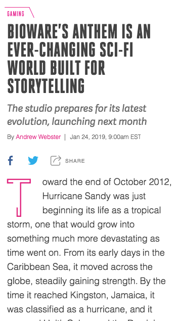
Mobile Variables:
Layout width: 328px — fluid
Font: Helvetica (Neutral/Neo-Grotesque, sans serif)
Font size: 18px
Line height: 28.8px (1.6x)
Letter spacing: normal
Paragraph Margin: 19.2px (1.2rem to 16px)
Contrast: 10.05:1 (#424242 to #FFFFFF)
Analysis (5/5)
This seems to me as a great reading configuration, Helvetica have a great readability for it’s clean design, very easy to perceive the text and words. The spacing of the line makes for great ease in scanning the lines, and to know where you are reading when you finish a line going to the next.
The whitespacing from the end of the text and the browser creates a great gap for you to focus on the reading, also it’s true white, no ads or nothing else. The spacing at the paragraphs makes for a good pause on the reading.
Nothing to say about the contrast, flawless work, mainly for its true simplicity minding on not filling the screen with rubbish.
The Outline — https://theoutline.com/

Desktop Variables:
Layout width: 640px — fixed (319px to the right off center)
Font: Fakt Sans (Roman, sans serif)
Font size: 18px
Line height: 32px (1.77778x)
Letter spacing: 0.225px
Paragraph Margin: 55px
Contrast: 21.00:1 (#000000 to #FFFFFF)

Mobile Variables:
Layout width: 320px — fluid
Font: Fakt Sans (Roman, sans serif)
Font size: 18px
Line height: 32px (1.77778x)
Letter spacing: 0.225px
Paragraph Margin: 35px
Contrast: 21.00:1 (#000000 to #FFFFFF)
Analysis (4/5)
I find interesting that they moved the whole text to the right because of the meta at the beginning (author name, date, etc) it resembles a practice made on book design, which designers made the outer margins wider so the reader can rest their thumbs on the page without covering any text. May not be that, but interesting touch, doesn’t change much in the digital reading experience.
Fakt is a roman font, they are wonderful, but for long reading they have much straight long lines, and few curves, what makes some letters appear as almost the same. Not a big problem, because this is well covered by the extra spacing in the lines and tiny extra letter spacing.
The whitespace is good, true whitespace as well and even larger than the one before. This “larger” whitespace (meaning less text mesh) doesn’t seem to make a great difference between the last.
Medium — https://medium.com

Desktop Variables:
Layout width: 700px — fixed
Font: Medium Content Serif(serif)
Font size: 21px
Line height: 33.18px (1.58x)
Letter spacing: -0.063px (-0.003em)
Paragraph Margin: 29px
Contrast: 14.55:1 (#292929 to #FFFFFF)

Mobile Variables:
Layout width: 320px — fluid
Font: Medium Content Serif(serif)
Font size: 18px
Line height: 28.44px (1.58x)
Letter spacing: -0.072px (-0.004em)
Paragraph Margin: 21px
Contrast: 14.55:1 (#292929 to #FFFFFF)
Analysis (3/5)
Medium is one of the most interested in this topic, they delve in this thinking a thousand times a day, and probably made a real in-depth analysis of this with their site, and there’s a whole bunch of articles in the internet about it, and their constant font changes. But I’ll take the leap and analyze it my way.
Personally I don’t really like serif fonts on text for screens, there’s too many dots, and I get tired if I read too much (I’m getting a bit tired as I’m writing this). Serif fonts had a usage in old days and huge help of creating a little “line” below text, so you can easily follow it along, beside its historic value, but that creates more friction for me now than help.
Actually I started noticing this pattern of good readings because of Medium, its take on focusing on the content got me hooked. Great clean design, as it’s meant to be, the bigger font makes for easier reading and accessibility, I personally would increase line height, as the lines seems a little bunched yet because of the dots of the serif font.
Paragraph margin is perfect, but what I don’t understand is the little tweak on the letter spacing, I even disabled it, and saw the difference, but still don’t get why not a more drastic change. Would love to have this conversation with the designers.
New York Times — https://www.nytimes.com
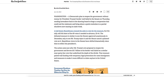
Desktop Variables:
Layout width: 630px — fixed
Font: NYT Imperial (serif)
Font size: 19px
Line height: 29px (1.52x)
Letter spacing: normal
Paragraph Margin: 20px
Contrast: 12.63:1 (#333333 to #FFFFFF)
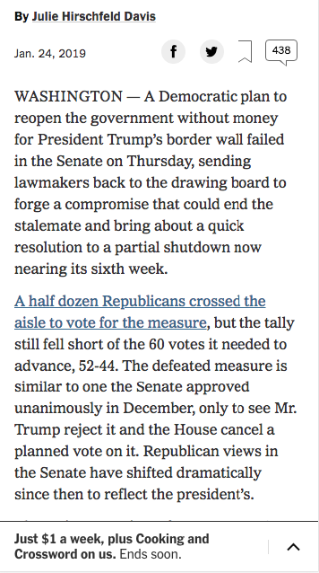
Mobile Variables:
Layout width: 320px — fixed
Font: NYT Imperial (serif)
Font size: 17px
Line height: 24px (1.41x)
Letter spacing: normal
Paragraph Margin: 12px
Contrast: 12.63:1 (#333333 to #FFFFFF)
Analysis (2/5)
Again, the serif font don’t help me, I get confused and tired by the dots and rounded forms in the font. Also, I think the paragraph margin is really low, it helps you put more content in less space so it gives the idea that you “traveled” less space while reading. But it doesn’t help the reading at all, you are constantly seeing a big mesh of text.
The font sizes seem good for this font giving good readability, line height helps with following the line and identifying the next. Great job with the contrast, it’s also the color I always go for (#333) which is not true black, so it’s not “dense” but it’s still black with good contrast.
The thing that bothers me more, is the whitespace. While it is whitespace and the biggest so far, you are interrupted constantly by ads and related articles in the middle of your reading. That bothers me a lot.
Conclusion
Without noticing (I swear!) we came from the highest points to the lowest, but don’t think that “Aaah New York Times fucked up their work”, cause it’s not true. For all those jobs were hired great designers that did an awesome job, this analysis is what I think it’s really good and readable, but these here come from the best to the good. There are terrible designs out there, I may have even done some, little jobs that may be bad at this.
Also by no means this makes me an expert. This was an exercise for me, as a research, I just felt interesting to share it.
To really conclude, fixed width is a must, it helps you create whitespace for reading, and making the line width smaller so it’s easy to scan the text for the next line.
Sans serif fonts came as the right one for me, it is clean and easy to perceive.
Font sizes seem to be bigger and bigger, Medium used 21px on its desktop version, I don’t plan to go that far, but use 18px sure is a safe bet, even for mobile.
Line height seemed safe from 1.6x to 1.8x the size of the font, which helps you scan the lines, the decision is different for each font.
Letter spacing is completely up to the kind of font you are using, I would recommend doing your evaluation and passing down the coworkers or even making a test to see if it would help to use it.
Paragraph margin surprised me for how well I felt reading texts with big paragraph margins, something between 18px and 25px really helped with the pause, as I felt that less than this was really rushed, and more than this felt unnecessary, but of course, it depends on the other variables as well.
I won’t even comment on contrast as everyone knows it, but the WebAIM is a great tool to test contrast everywhere and be sure that visually impaired people, and mainly daltonics can understand and read your text.
Thanks for bearing with me :) hope you liked it.
If you have any questions, or just wanna say hi, comment below.


