An introduction to design cues in UX
It is said that 90% of our language is non-verbal, often portrayed instead through facial expression, hand gestures, tone, speed of speech or inflection and this interesting notion in subtlety of communication is worth considering when designing user interfaces.
Telling the user often needn’t be as explicit as having the instructions in written form. Through good design, we can tell the user what is being displayed or required through subtle design expression, which can be instead of or supplementary to text. There have already been some well received articles and research on this subject of what is often referred to as design affordances and what they are. However, these pieces look to give an introduction in to some of the different types of design cues.
It’s also important to note that design affordances should be used with consideration for social, contextual and cultural understanding, just like in body language. One person’s ‘OK’ gesture can be an inappropriate insult in other cultures; and whilst the exact meaning may have led to some debate, the term ‘affordance’ is generally widely accepted as being a design cue which conveys a message to the user and gives rise to an action, but is neither-copy nor direct language.
So here are a few examples (not meant to be exhaustive) of styles that can be applied to elements of UI design to get you thinking, as well as where they’ve been well executed. Let me know any thoughts or additions in the comments section.
Colour
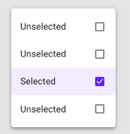
Quite an obvious one, but colour can help to demonstrate anything from levels of severity, activity, user permissions, helping to differentiate between sections and many more.
What it is
Colour helps to convey meaning to users in a very strong and clear way, but be careful to consider accessibility needs when using colour, as different uses of colour palettes, particularly when directly contrasted can have an effect on legibility as well as what colour blind users may be able to perceive.
Designing for colour blindness: https://bit.ly/2KeOSNz
Contrast Checker: https://bit.ly/33HiP0E

For other examples think (read/unread) on your email inbox, the steady gradient changes in things such as volume on your personal device, or how colour can help a user decipher between good, better, best in areas such as e-commerce and many, many more.
What it does in sentence
Can help to inform the user on the difference between one element and the next in terms of type, grade, severity or required action.
Where best to use
Best applied conservatively in-line with a well-defined colour palette to help guide you in terms of primary, secondary and accent colour use where applicable. Over-use of colour can lead to a few issues including: complicating the user unnecessarily, visual clutter of the UI and the meaning or awareness to the user of said colour being diluted. That said, strong, clear colours against subtle backgrounds can, when well executed, help to immediately tell the user what is being shown to them, without the need for additional text.
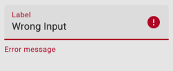
Font-weight and Underlining
What it is
Font families often have more than one weight which can be used to help distinguish between parts of text through bolding or thinning of the text. The weight of text also has other important meaning when considering legibility of text and styling, however in terms of affordances, use bold and underline for clickable links. Weight of text and underlining can also be important in other aspects such as showing a difference between states, sections of text and hierarchy.


What it does in a sentence
Predominantly used to tell the user that the text is clickable and will take them to a linked page, also able to show a difference between states, sections of text and hierarchy.
Where best to use
The most prevalent use of font bolding and underlining can be found in the humble hyperlink. Conventionally text which is blue, bold and underlined will often be seen as being both ‘clickable’ and to direct the user to a linked address. This is worth considering when wanting to design for hyperlinks, but also wanting to reduce confusion. To help with users’ understanding and consistency across interfaces, look to apply this as a rule of thumb when wanting to bounce your user elsewhere for things like further information.
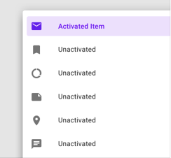
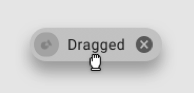
State Change
What it is
Primarily used in button design, toggles and switches, however can be used more widely to help show when an element has changed its state and therefore indicates to the user how they may therefore interact with it differently than before the state change, for example enabled to disabled.
What it does in a sentence
A state tells the user what condition an element is currently in, whether it has been interacted with and what they might expect from any further interaction.
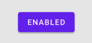
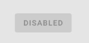
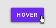
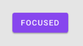
The below examples are taken form Google Material Design (2019) which provides an excellent library of information to help designers, developers and the like create great experiences from their carefully crafted design system. The examples used below help to show different state changes which can be used to convey meaning to users.
Enabled
Disabled
On Hover
Focused
Selected
Activated
Pressed

Dragged
On
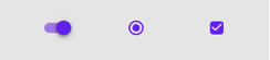
Off
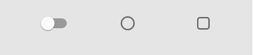
Error
Where best to use
Showing a state change is best applied when you need to convey to the user that an element has changed from its previous state or has the ability to change from one state to another and therefore interacting with the element will produce an expected outcome. For example, when selecting an element ‘On Hover’ may help to inform the user that the element is clickable. Similar to all affordances used, be careful to be absolutely consistent with the rules and states you apply to your element, as well as how it is styled across the UI of your product or system.
Motion
What it is
Motion in the design of user interfaces can creatively help to demonstrate change to the user, be it confirmation, progress or other. The movement or continuous movement (e.g. flashing) may be in response to an action, follow an action in time or even independently if wanting to tell the user there has been a change, for example sliding from left to right on a carousel. The benefit of motion vs many other types of affordances is its ability to grab the user’s attention and help to tell a story to the user as discussed in another great piece on motion in UX: https://uxplanet.org/motion-in-ux-design-90f6da5c32fe
What it does in a sentence
Motion can effectively act as a visual representation for what has happened, an email being sent, a user being denied or payment being transferred from one account to another.
Example: Starling bank using motion to help demonstrate money being moved between one account to another.
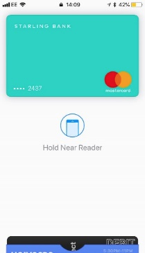
Where best to use
Overuse of motion may cause a distraction to the user or even compete for the user’s attention, however it can certainly add an element of surprise and delight to the user especially when implemented wisely at key touch points, such as the example of a money transfer, where the use of motion feels relevant and practical. Consider also the #1 heuristic for Jakob Nielsen’s 10 heuristics for interaction design is ‘Viability of system status’; motion through progress in this sense can be a great way to continuously inform the user what is happening and manage their expectations accordingly.
Scale
What it is
Similar to and often used in conjunction to motion and state change, the size of an element can help to tell the user it’s inferred importance to users. This staggered importance from most to least is often referred to as visual hierarchy. However, in terms of when this may become a cue for users is when an element may change in size, for example ‘on hover’ or ‘selected’.
What it does in a sentence
Can tell the user which element is the most important or selected at a point in time.
Where best to use
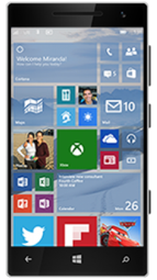
Size and scale can often be better suited (in the author’s empirical opinion) to larger experiences, not restricted to tablet and desktop. Consider large touch screens employed at entrances by many companies such as Argos, McDonald’s or ticket collections. Increasing scale can be a handy way to catch the user’s attention and highlight to them which product is selected. The example of the Windows phone may well be an instance where an unsuitable size increase was less appropriate and therefore degraded the user’s experience at the expense of styling.
Iconography
What it is
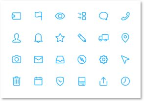
Icons have been used for many years (you may argue since humans drew on cave walls and even before) to help to get across to the viewer a clearly conveyed message and one that can be applied multiple times using the same icon or symbol, not least in UI. Road signs for example use clear signage, ensuring the use of consistent symbols, which are easily understandable and reduces the need for written text alone, which would take longer to compute when driving along the road. Over time in the digital world, some icons have become more common place than others and led to conventional use in certain UI scenarios such as Home, User ID and the Confirmation Check.
What it does
Icons are used across lots of products and systems especially phone applications where space is at a premium (e.g. the bottom toolbar), as well as across many other User Interfaces to help convey subtle but clear meanings to the user. Successful icons help to tie the icon to a word or mental model of what the item performs. If it’s successful, the user will be able to quickly identify the icons use as they continue to use the product or service. Icons will generally be designed around representative images of the action the icon performs and often metaphor. The Xerox Alto was the first to use the metaphor of a ‘desktop’ on a personal computer and it is said that Steve Jobs and Apple took a lot of this intuitive thinking in to their products at Apple, now seen as a byword for great design and usability. Consider ideas such as baskets, checkouts, files, folders and other such real-word ideas which have been ‘digitised’ to help guide the user’s understanding.
Where best to use
Icons are best utilised to enhance functionality. Being able to immediately interpret the meaning of an icon and use it to fulfil a user need can help to improve an experience and increase efficiency of a product through improved success rate and quicker click-through times.
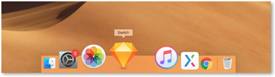
Some icons are universally recognised and so implicit that to the average user they require no additional text at all, only when the user may hover over the icon will it then display to them what it does. Think Mail, Volume, On/Off and Play/Pause. Others may be completely individual to a particular product and for these icons, it’s always worth using additional text or tooltip to help tell the user what the icons purpose is. However, it has been well cited that to remove ambiguity icons should always be accompanied by label, yet this is not always adhered to. https://www.nngroup.com/articles/icon-usability/ .
It is not completely unheard of to see icons being used on mobile app devices without labels, where space may be at a premium and creativity in surplus. For example, LinkedIn has previously used toolbars which have not used additional labels until very recently, whilst Snap Chat have also been known to do this across their product. It can only be assumed that for the latter their target market is primarily digitally-native millennials who will trial and error before adapting to the phone with relative ease (assumption I know), however should they want to improve usability for a wider audience, then they may want to consider if labels to icons would help — through user-testing of course.
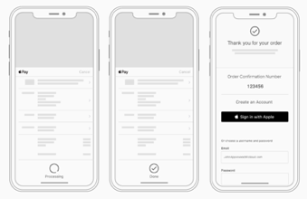
Elevation
What it is
Adding depth and layering, also known as elevation, is a great and different way to add hierarchy to your designs. In order to help show a difference in hierarchical level, elements can be seen to be layered on top of each, bringing the more pressing elements to the front of the pile so to speak, as well as closer and clearer to the user’s vision.
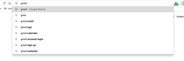
What it does
It helps to tell the user in many circumstances which elements they should intend to interact with such as with fixed headers (kept in primary focus), Floating Action Buttons (FAB) and drop-downs which overlay the original screen as shown in the Google search above. In the case of the FAB, it helps to tell the users the primary Call To Action (CTA) on that particular screen, whilst also allowing the user to interact with other elements on the screen at the same time.
Where best to use
Google’s material design system uses this to great effect. Their ‘material’, which can be considered similar to paper in terms of its virtual properties, can be layered on top of each other. This type of visual cue is well used on mobile devices for bottom toolbars and FABs as well as other features where additional screen space is required. For example, a user wishes to refine their search on mobile, by clicking on the ‘refine’ button may open up an overlaid menu of items, the user can then interact with the overlaid menu to select their option preferences, before closing the menu to reveal their refined list underneath.
Noise and Touch
What it is
A noise, even something very short and quiet, can help to tell the user that something has changed. Perhaps they’ve received a new message, something has been actioned on screen or there was a change in the environment which they may want to be aware of. A noise alone might prove unhelpful however and so in many cases will be accompanied by something visual to further inform the user of the change. Touch, often discussed in terms of haptics is another example of non-visual cues that can speak to the user by way of affordance (i.e. something is in progress, notification to a change etc.). Subtle haptic cues are a great to nudge your user, but be careful to consider its use in context.
What it does in a sentence
Non-visual cues, such as noise and touch can be used as standalone indication to users or to help enrich an experience in combination with others through alerting or encouraging user engagement.
Where best to use
A first thought would be to say minimally, but you should consider setting noise alerts etc. to be at the user’s preference given the differing levels of accessibility needs which may greatly improve with noise or vibration to indicate change. The type and tone of noise or haptic will also help to inform the user in terms of the context of the change, whilst consider that a persisting noise, such as a phone call says something different to the user compared to a one off more clipped sound. Haptics as a low-noise, invisible indicator will no doubt have a big part to play in the future of the disciple of UX. With wearables coming to the fore over a number of years, these interactions and how they inform the users will help to set standards and conventions for future products to come.
Below the fold
What it is
As with much that has been taken in to graphic design and subsequently user interface design, newspapers have been responsible for a lot of the tips, tricks and styles we use. As mentioned earlier, font-weight and use of colour to grab the user’s attention (in contrast to what is typically the cheaper black and white, ink and paper) have both been previously used in print, but also taken is the physical ‘below the fold’ of the newspaper which entices the user to continue reading. When folded, as is often done in order to be stacked or for ease when holding, the front sheet would cut across columns and images shown on the front page, however the reader would know that there was more to view because of this. Similarly, in UI, we can show the user a small snippet of an element like an image or text, without having to show it all in order to allow space for priority elements.
What it does in a sentence
Showing a split in the screen or elements as an indication to the user that there is more to view further down the screen, left, right or even above.

Where best to use
This can be used it a variety of situations wherever the designer wants to tell the reader to ‘read on’. Many modern day sites will use this technique in conjunction with a hero image on their homepage. The hero image acts as their no.1 focus for the user, almost billboard-like, showing off the company’s latest and greatest ideas or products, whilst they will also show secondary products or text below this in order to entice the user to scroll on ‘below the fold’. Similar to a cover story and a newspapers secondary stories.
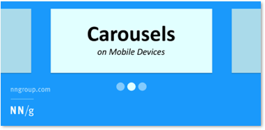
This technique is particularly useful however on smaller screens. By definition, where there is less real estate to work with; designers may want to tell the user there is more further down the page, particularly on their mobile device, be that app or web page. Other areas of where this design may best be applied are open to design discretion and test, but would certainly be useful in static carousels which require the user to select left or right, as well as lists of items where the full item list cannot be displayed across one page.
Grouping
What it is
Grouping and order are often seen as being one of the key principles in graphic design and its use in terms of what it tells the user is also very important when considered for user experience design. As the saying goes ‘birds of a feather flock together’; elements which are seen as being in close proximity to one another or indeed share styles or attributes will likely be assumed by the user as having the same behaviour, as with many styles mentioned in this list.
What it does in a sentence
Grouping visual elements helps to tell the user that said elements share the same properties and will behave accordingly.
Where best to use
Grouping in terms of the style and attribute of an element are applicable across the entire product and therefore the user’s journey. For example, you don’t want your user to be completing their journey only for them to be tripped up due to a lack of consistency in the way an element interacts from one page to the next. Look to contain such rules for elements in you design library. It’s also important how something looks and behaves is communicated explicitly with the wider product and development teams, so that all have a consistent and joint understanding of the way elements will work. In terms of any one off page which a user may interact with such as a dashboard or individual web pages, grouping elements using clear visual differences as well as increasing the white space between groups of elements will help to identify that they are different.
A final word on the importance of metaphor…
Being able to replicate what we know in the real-world in to something visual for the user is a hugely important part of UX design. Over time through instinct or habit, we as humans have been able to develop an understanding of how things work and intrinsically apply what we know to a given object. Understanding that a container can hold liquids, or that a dial will twist around an axis allows us to intuitively use the things we make. When considering how this is applied in software, the same rules apply in metaphor form and for new items which are created with each innovation in software, new rules are made (- think swipe up to return home (iPhone X). When designing consider these rules and what they mean to your user and how you might harness the power of affordance to enhance your users’ experiences.
References
Tubik Studio — UX Design Glossary https://bit.ly/36W23wD
Usabilla — Designing for colour blindness: https://bit.ly/2KeOSNz
WebAIM — Contrast Checker: https://bit.ly/33HiP0E
Google Material Design — https://material.io/design/
Nick Babich, Motion in UX Design — https://uxplanet.org/motion-in-ux-design-90f6da5c32fe
Aurora Harley, Icon Usability — https://www.nngroup.com/articles/icon-usability/


