Analysing and improving the customer experience in a café — a UX case study
Barcelona is a wonderful place where you can find a lot of different and amazing places to stop and spend your free time. In this case we found a great spot related to the loved source of energy, COFFEE: the igniter in the mornings and sometimes the survivor drug in the afternoons or nights.
In this article we talk about the importance of prioritising user experience even in the smallest of places by creating and telling a story that guides the visual journey of customers once they enter a place. This includes the importance of consistent branding that is carried through the entire user experience. Branding can be used as a tool that assists the customer in understanding the intention of a product and will ensure that the customer will leave with a clear vision in their mind, and a story they can pass on to others.

Index
- Overview
- Brief
- Research
- Solution
- Conclusions
- Feedback
1. OVERVIEW

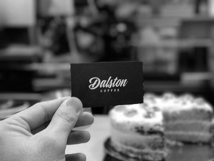
We discovered a coffee place called Dalston located in El Raval. The place is small but cosy at the same time. I did this UX case study with Barbara Koehler.
Dalston is all about promoting local, organic milk and coffee that is roasted in Barcelona.
The coffee is of outstanding quality, there is just one hitch: the place is essentially just a “hole in the wall” and hard to locate for people who have not heard about Dalston and are just passing by.
The problems continue once a customer is inside the “café”.
2. BRIEF
The aim of this study and our interactions with Borja, the owner of Dalston, was to improve the overall customer experience and to promote the amazing product that Dalston stands for, not just to local customers but also to tourists that have just arrived to the city.
3. RESEARCH

Once we entered Dalston we noticed three main problems:
- Confusing layout

- Products are not arranged in a logical way -this is the case with products that are scattered throughout the shop as well as the coffee menu on the wall above the counter,
- Some drinks on the menu are described in Catalan others in English,
- Special products on the menu are not explained. They may be known to locals, but not to foreigners who most likely haven’t heard of drinks like a “Xixona”,
- Labelling of the products doesn’t follow the branding that people know from the Dalston website or Instagram.
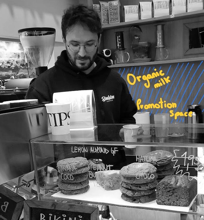
2. Display of information
- Different types of labels are used throughout the shop: information about the baked goods that are for sale is written on the glass of the shelf they are stored in, other items are labeled with a cheap-looking print-out, the coffees that are on sale miss a description entirely,
- The information that is displayed is lacking consistency.
3. Lack of empathy
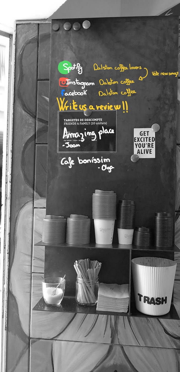
- Even though Dalston has all the right social media channels set up, it is impossible to know about them once in the shop,
- The customers are not guided in how to interact with the different components of the store. Our impression was that they have to guess that water is available free of charge, that the milk is organic, that there is an instagram account etc.
Overall we found that there is a lack of communication with the customers in regards to the ingredients used, the different coffees on offer, the story behind Dalston, and the amazing Dalston Spotify playlist (updated regularly!!).
Our impression was that everything is based on Borja communicating directly with his clients. If they don’t interact with him while in the shop, they will leave the shop not knowing about the place, the background, the story of Dalston.
Bring it out into the open!
4. SOLUTION
We roughly divided our solution into
- Outside
- The branding has to start outside the shop doors.
2. Inside
Overall we decided that Dalston would greatly benefit from re-arranging some of the objects in the small space, concentrating the information displayed in the café, and establishing 3 different types of “information hubs” throughout the store to display information clearly to the customers and guide them on their journey through this tiny café. Simple signposts can achieve a lot, especially if they are kept in line with the brand identity of the shop.
The display of information about Dalston and their products is the most important part of the user experience.
Menu
With some of the information pulled from the current menu, additional information needs to be displayed elsewhere.
The Dalston story
The free space behind the counter should serve as a promotion space and “Dalston vision or story” hub.
Social media
A metal shelf that is attached to the open door (a luxury in the warm Barcelona weather -the front door to the shop can always stay open) should include the “Dalston social media hub”: The instagram, Facebook and Spotify links. Basically as a farewell to the guests and a reminder to stay in touch and leave a great review.
a) The Counter
The use of the same branding to inform customers about the food that is displayed will greatly enhance the user experience.
Existing unused space should be used to promote e.g. seasonal drinks, sales, and to talk about the Dalston story.
Behind the counter is a wall with unused space that can serve as an “advertising hub”. This space could be turned into a blackboard to promote Dalston’s story, the Dalston approach to sustainability, use of local products, where they source their coffees from, the story of their ingredients, and upcoming special products.
b) The Menu
Currently the menu is cluttered. It is a mix of different languages and a focus on coffee is missing.
We suggest that beverages that are outside the “Dalston brand” should be listed on a smaller separate menu on the side of the counter, rather than taking up space on the main menu.
Keeping the menu minimal highlights the importance of coffee as the focal beverage at Dalston.
c) Fixed Objects

Even with objects such as plants or the water dispenser, in a small space as Dalston, their positioning and message needs to be clear.
When we first arrived, plants were covering some of the key information in the shop, and the water dispenser was located in such a way that it was hard to access. It was unclear that using it was free of charge.
This can easily be improved by putting up the water dispenser on a small shelf in a more central position. Plants are only extras in this café and as such need to move to the back.
d) Information
Why leave the customers guessing? Simple changes and improvements can hugely upgrade the user interaction with a small place like Dalston Coffee.
Now go and get a cup!
Interesting links:
- TripAdvisor profile : https://www.tripadvisor.es/Restaurant_Review-g187497-d12157477-Reviews-Dalston_Coffee-Barcelona_Catalonia.html
- TimeOut Review: https://www.timeout.es/barcelona/es/bares-y-pubs/dalston-coffee
- Yelp profile: https://www.yelp.es/biz/dalston-coffee-barcelona
- Spotify playlist: https://open.spotify.com/user/dalstoncoffee/playlist/2Ez7X0Ez8g5qr9i5pajBZs?si=2edn_5puT1ixlfpzwWx7lg
- Instagram: https://www.instagram.com/dalstoncoffee/?hl=es
- WebPage: https://www.dalstoncoffee.com

