Analyzing Facebook’s major redesign, from website to app

Yesterday Facebook had F8 developer conference where they usually show their innovations and new additions for their products. Among others, they talked about privacy, dating app, Instagram and Whatsapp. However, what got attention too and what we would like to talk about is the new redesign of Facebook.
Facebook on their announcement stated: “…a fresh new design for Facebook that’s simpler, faster, more immersive and puts your communities at the center. Overall, we’ve made it easier to find what you’re looking for and get to your most-used features.”
But how it really looks like:
As we can see, the new Facebook app looks completely different from the last one.
The layout
The same layout is being kept, which has 3 columns, left: shortcuts, middle: the feed, right: Contacts but with different placement of the features from before.
Navigation
Before we used to have 3 main pages on the left side and other on top header but now all are on the top among the: Notifications, Watch, Profile, Marketplace, Groups and Messenger.
Stories
Stories before were on the top right corner of the right panel and they were not the main focus, but as we see now we have stories as the first thing on our feed.
Twitter look-a-like
Twitter also has the navigation, search and profile on the top header, so they appear quite similar in that sense.
New Profile
Now the profile picture, name and intro are all in the middle of the screen. The navigation like “Timeline” “About” etc.. with the buttons of “Add friend” “Follow” and “Message” are on the same line.
Under the layout is not changed, there are two columns Left: the info, and Right: user posts.
The back button:
I think this is an interesting feature that Facebook added: the back button when you go to the pages that aren’t on the top navigation. This makes it look like a web app instead of websites that we usually press the back button of the browser.
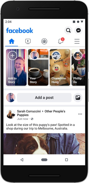
Mobile:
The interesting part is that the web and mobile now will look the same with their components. In mobile we can’t have 3 columns like on web, but the top navigation and the feed (middle column) are the same on mobile.
Final word
This new Facebook design had some very good changes and updates that will make the experience and the new model of Facebook to be connected with friends much better.
There are more features that have been updated but we will see them on live preview when it will be on our devices.
You learnt some tips on this article ? Hit that claps button as hard as you want and Follow me because I am writing for UX tips and great example of UX on mobile phones.

