Analyzing HEY.com design
Hey.com is a new product from the Basecamp company. As it is said by them: “We didn’t reinvent the wheel, only email. Email as you know it is out the door. Email as you want it just arrived. HEY’s totally familiar but completely different.”
Also,” Email sucked for years. Not anymore — we fixed it. HEY’s fresh approach transforms email into something you want to use, not something you’re forced to deal with. “
If you got 37 minutes? Here’s a full product walkthrough from their CEO
Some design things about hey.com
Creating account

🟢 Setting up your account is very easy. You have 3 simple steps: Name, Email, and Password.
🔴 I was among the first people that got invitations to use Hey on the first day of launch. When I created my account, on the third step there weren’t instructions for the password, even though rules were quite a few. But I saw that now they added information about the length of the password.
Walkthrough

🟢 The walkthrough is quite nice because they let you know immediately the first important feature of the app which is “the screener”, where you accept or not if you want to receive emails from that sender.
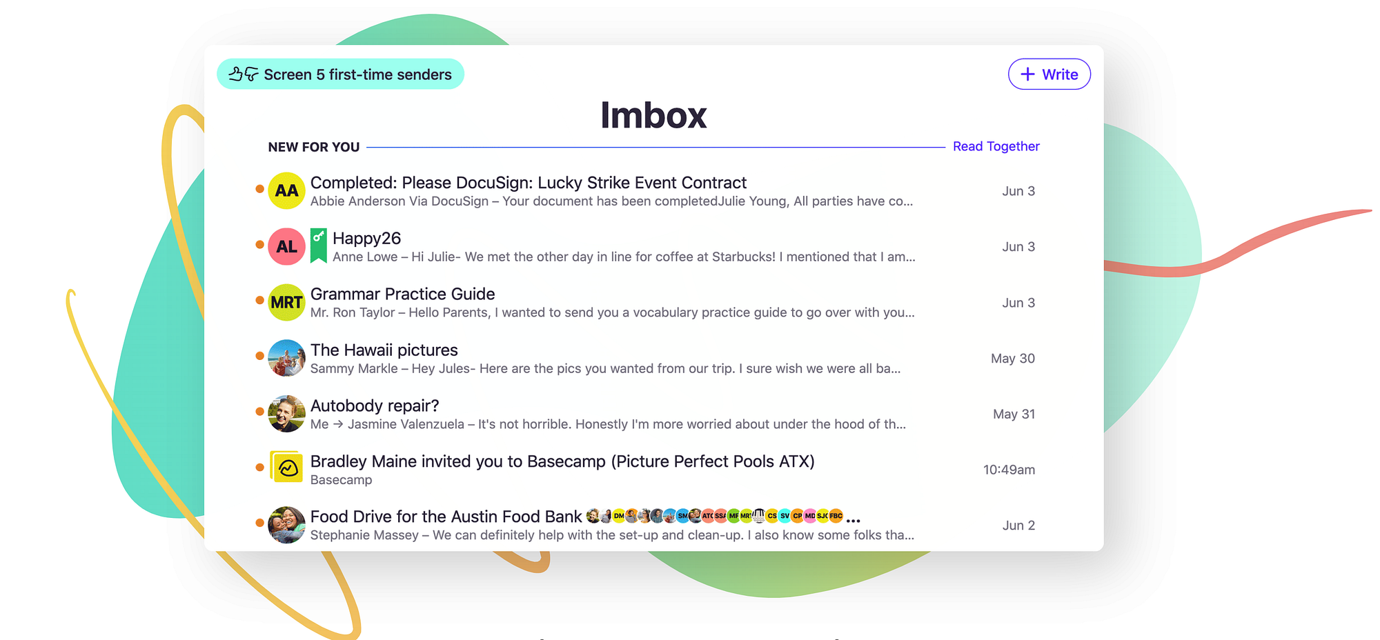
Imbox

🟢 The Imbox “which itsnotatypo.com” is very clear and not cluttered at all. Also, there is a great UI difference between new emails on your inbox and the others that you have already seen before.
Pin and Reply

🟢 Pin and reply appear on the bottom middle part of your screen, where you can access very easily.
This reminds us of the download folder on the macOS dock.
Back to imbox

🟢 As Imbox is the main part of the email, Hey is doing great by giving confidence to the user, in a way that they can go back to Imbox from any other page on the app. So it feels like it gives the user a lot of control over his hand.
Menu & Shortcuts

🟢 As you can see, there is not a sidebar menu like other apps. On hey you will need to click on Hey logo and open the menu. It takes just 20 seconds of your time to scan the menu and from there you can use the shortcuts.
One of the great things about Hey is that you can use shortcuts to move around.
🔴 One risk is that this is a new product and the menu is hidden under one click, therefore it can be risky for new users. But once they find it, they can remember shortcuts and move around quickly.
The Screener History

🟢 The screener history is also a very good feature but also visually pleasing. You have two columns, with the accounts you screened in and screened out.
To move account between categories you just have to click on that simple (iOS style) Switch buttons and see the magic happening.
The Hey team is doing an awesome job and wish them the best. I follow the Basecamp company daily and practice their ideas to boost my productivity. I really like their approach on the calm company and would love to meet them one day or talk to them.
If you liked this review, follow me because I am writing for UX tips and great examples of UX on web/mobile.


