Anatomy of a notification
Notifications are the biggest design fail of this century. Using drama and psychology, notifications can be remade… useful!
This excerpt from Samuel Becket’s Not I, perfectly sums up the issue with notifications. It grabs your attention but doesn’t tell you what it’s about. There is no context, little in the way of purpose. Like some notifications, this delicious piece of clickbait is impossible to ignore. Unlike most notifications, it’s worth investigating further. If you watch this arrestingly short classic, it is utterly mesmerizing. It’s what Aristotle calls language, melody, and spectacle. They are the building blocks for a notification and good design. Now that I have your attention, let’s find out why this is such a good hero for this article.
**************** NOTIFICATION *****************
Notifications are probably the single biggest design failure of this century.
- They can cause permanent damage to the human condition. Hijacking the dopamine system; creating addiction, fatigue, and anhedonia.
- They fundamentally undermine business because people cannot work out what is essential/important/imminent.
- They cause untold damage to the planet, clogging up email systems and consequently data storage.
If you work, you probably still use email. Most emails are notifications to do something you may or may not be interested in. Email notifications often appear with a header like the title above. This may mean something has happened to a topic you are interested in or associated with. Often, it’s an event update. A mix of maintenance updates online and in the real world. Some organisational change. Even an urgent message.
When you get a notification, you don’t know if someone has tinkered with your file, someone has been fired or there is a fire in the building!
Hopefully, the fire alarm has alerted you to the fire. The trouble is that the people now generally don’t respond to fire alarms because they think it’s a drill. It typically takes 5 mins for people to take any action. My mum’s building has the perverse scenario where the fire alarm goes off, but everyone has been told to stay in their flats, in case there is an actual fire! [Would love to know if this is a wider under-the-radar use case here — comment below and I’ll create a survey].
The tedious hell of notifications is a fertile ground for melody and spectacle. Why can’t they be useful? Why don’t they have any nuance? Why are they still a bunch of comedy sound effects? Where a version update has the same melody and spectacle as an organisation announcement? But notifications are so much more than a sound or some number/alert sign.

Dissection of a notification
Research on notifications appears very limited. This is because its been focussed on app notifications or digital comms. It is about text vs email. Or the way to visualise an anchor on a UI. None of this was wrong, but it’s incomplete.
The basics of a digital notification are as follows:
There is content:
- Reminders — These are the virtuous ones. They ensure you don’t miss something, which you have agreed to do. The only problem is if they remind you at the designated time and you aren’t there or available. Worse still are the ones you haven’t opted in to.
- Communications —These are the dubious ones. Its hard to separate the useful-to-know from the completely irrelevant. And useful ones get lost, because there is no clear IA or taxonomy to categorise them.
- Engagement — These are the borderline devious, and closer to deceptive design. They are solely designed to bring you back in. FOMO is the hook and dopamine the fuel.
Then there’s delivery:
- App — push notifications — They inform you of anything from news to updates, even if you don’t use the service. These are the ones cause the most issues. Gen Z tends to switch these off or ignore them.
- APP — in-app notifications — These apply to any information that is relevant to the app you are using. At the very least they are contextual, although their relevance can be indirect.
- Email notifications — These are like push notifications except via email. This is much more of a Boomer/Generation X messaging service and clogs up systems.
- Text notifications — These are like push notifications except by text.
- System notifications — these are like the in-app notifications. They notify you of any system changes or updates including warnings.
Notifying outside of the [2D] box
But delivery is so much more than that:
- an advert also known as above-the-line marketing is a notification.
- a postal delivery such as below-the-line marketing is a notification.
- a sales assistant in a store can act as a notification.
- a water cooler moment is a fountain of notifications about what is going on in the office. Or a live/work cafe. You get the idea.
- Any sound from a lift announcing the floor to a fire alarm is a notification.
- A car dashboard is a panel of notifications.
- The lights flashing, going down or coming back on in a theatre/cinema. These are notifications.
If we want to transcend the 2D confines of a screen to a 3D real world, then we need to think differently about notifications.
There is an understandable debate where a notification stops, and a message starts. Many of the examples cited above are communications. Yet, to consume them you need to be aware of them. One way to define a notification is to think of it as the wrapping around the message.
Here a couple of examples of notifications, which step outside the standard constraints:
- A sonic language for banking — the transaction or account balance could be presented in a positive / negative tone. This indicated if you had spent/saved more or less than expected.
- A loyalty scheme — Giving a customer a bunch of flowers in person by a store assistant for attaining a rewards goal.
These are not exactly ground-breaking. But they are the melodies and spectacles that we might want to explore more. A notification doesn’t have to be dramatic. But it can be more multimodal, tangible, sensory and intuitive.
Anatomy of a notification
Here is the original taxonomy for a notification.

This may be fine for an app notification. But how do you notify different people with the same message in different contexts? For example, For example, notifying people of an imminent departure, at a station.
The following categories are suggested for consideration:
- Source — Where is it from?
- Category — What is the notification about?
- Distribution — Who is it for?
- Level — How important is it?
- Message/Content — What is the message?
- Delivery — How is it going to be sent?
- Design — What is the medium?
- Status — What is the response?

It’s all about Timing… and Engagement
Now that we’ve unpacked the ingredients of a notification, we need to consider the interaction. This is what Aristotle referred to as melody. And this is where the arts can help us. In music it isn’t just the tune (language) delivered through an instrument (spectacle). There is also the musicial phrasing. The tone, dynamics, tempo, and articulation. Imagine playing Queen’s Bohemian Rhapsody without musical phrasing. How else would you have an; a capella, ballad, opera, and rock, all within the same piece?
Knowing how to create a notification is one thing. Knowing how and when to deliver it is the other. That’s where Mindstates can help. They help frame the melody or interaction.
Mindstates show how a person thinks based on how engaged they are and how much time they think they have. These are the same regardless of other personal characteristics.

If we know how engaged someone is and how much time they think they have. We can deliver a notification that will suit their state of mind. Mindstates are universal characteristics. They can be superimposed on personas, archetypes, and customer segments.
Below is an excerpt from a an article on value propositions, using hand washing as an example. It shows which value propositions work best and when.

Precision targeting
Notifications generally need more specificity than value propositions. It also means we need to take the mindstates framework to a finer granularity. There is a world of difference between responding to a notification and reacting to one. Reacting can be sudden and take up all resources. Anything else happening at the same time will be missed/ignored/dropped.

Notifications: A Case Study
A while back I worked on a project to notify customers about an imminent error. The costliest errors were customers who had no skin in the game and didn’t really care about the outcome.
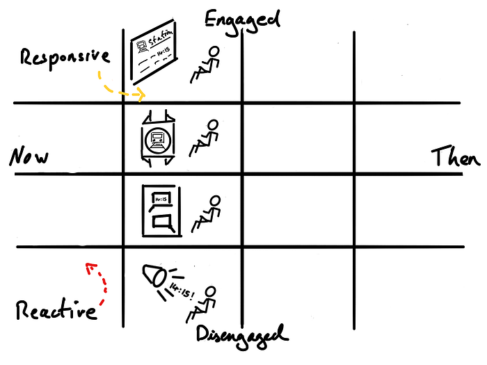
We designed a notifications matrix for this job. A highly engaged person notices a light flashing on a panel. A focussed person may need a push app notification. A less engaged person may need a text message.
A disengaged person will ignore most notifications. So, we came up with the idea of using a customer facing colleague (CFC) as the notification. They would ring the customer to tell them about an error and offer to come out and fix it on the spot.
This was all at the responsive level before reacting to an actual incident. An incident costs a lot more money in 24hr support services. There is also the downtime to fit in unscheduled work at busy repair centres. All this can total into thousands or millions. Depending on if it’s a phone, a printer, a boiler, a vehicle or a train/space station.
In the example above, we are moving between notifications on a dashboard, to anchors on an app, to an SMS delivery, to a real person calling you.
Notifications are not just digital, they are everywhere.
The example below shows how a person can be notified with the same message. i.e. boarding a train. But delivered differently based on their mindstate.
Flavouring to the fact is a balancing act
A notification is a delicate balancing act. It needs to provide enough information for you to be able to decide whether to ignore it or act on it.
The example below takes a classic Buddhist text, called the Heart Sutra, and adds melody and spectacle. You could say the melody and spectacle take over the content. The content is in Japanese. But even if you could speak Japanese, you might say the content was inaccessible. The message is that ultimately everything is empty. And that emptiness is pregnant with possibility. For everyday people like you and me. Who live in the bustling world around us. It’s about interdependence and coexistence. And the interdependence of language, melody and form is a balancing act. Notifications also need to strike the right balance and be more targeted to our needs.
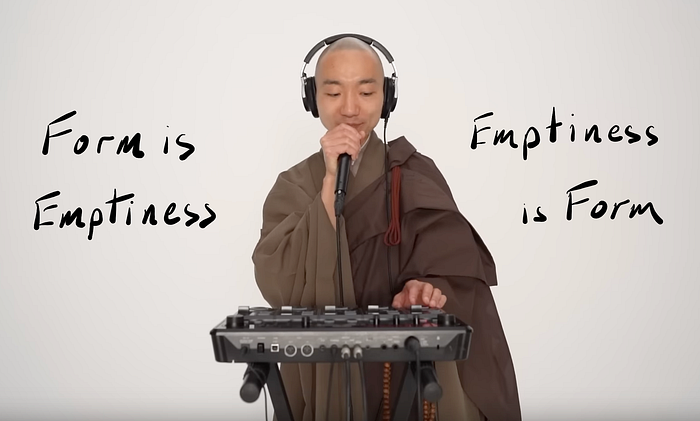
A notification needs to strike the right balance of emptiness and form. Neither becoming the message nor being missed.
Unnoticed notifications clog up phones, messaging systems, and ultimately servers on the planet. Sadly, the useful notifications get lost in this sea of ignored content. And then people have to find new ways to find a way to get the message through. In the meantime, our nervous system gets worn out from the sheer volume of notifications or numbs it all out.
The information architecture for a notification outlined earlier is a draft. For example, I wonder if you can work out where you would place the mindstates? It’s essentially a call to action. Before it’s too late. Before we all switch off. Consider yourself notified.
It’s surprising that there isn’t an information architecture for notifications. One that is freely available. Furthermore its heavily skewed to apps. Notifications are currently a plague. There are countless articles describing the negative impact on our health. They include ways to protect ourselves from their unhealthy consequences. Isn’t it time we changed the way to design and deliver notifications instead?
Mindstates provides a useful framework. To position how and when to deliver notifications. For different levels of engagement and timeliness.
I’ll leave you with a notification for a value proposition. Hopefully you found some value and will notify others.

How do I find out more?
- Get an overview of app notifications to visualise an anchor on a UI
- See an ontology for a digital notification
- Learn about the Mindstates Framework with this 5 minute overview.
- Read the series “Saving the Experience… with Drama”
- Join me every Thursday 12pm UTC for 1 hour ‘Ask me anything’ sessions where I’ll be available to answer queries around Mindstates
Special thanks to Tajwar Aziz for the dissection and anatomical drawing.


