Anatomy of the Netflix forward 10s button
Developing an animated button with Swift UI

In a previous post, we explored the interaction of the Netflix Play button and how it morphs between play/pause states. In this post we will examine what Netflix refers to as the forward 10 seconds button, we will then proceed to develop it with SwiftUI.
What is a Forward 10 Seconds Button?
The forward 10 seconds button, which we will refer to as the Forward button from now on, allows a user watching video to move the video ahead by 10 seconds (forward seek), if a user repeatedly taps it within a short time since the previous tap, the time duration of the seek will increase.
The animation sequence for the seek operation is a very long for an interaction on mobile, yet in my opinion it works perfectly. It manages to convey all the necessary information in a really playful way, it also makes the actual seek operation feel shorter, and it surprisingly never gets boring.
After experiencing Netflix’s implementation of the seek button, all other seek buttons on competing apps are just really dull and unrewarding experiences. A true testament to Netflix’s UX chops. I hear you say, but the content is king! I agree however I would also like to have a joyful experience consuming that content.
The Choreography of the Button
The Forward button view can be broken down into 4 separate animatable views.
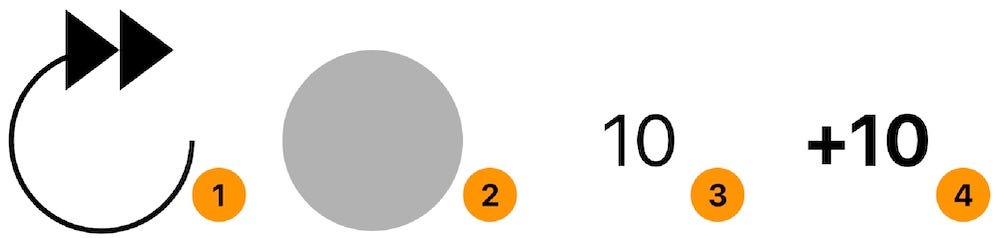
- The rounded arrow view.
- The background of the rounded arrow view.
- The duration label, hinting at the time it will seek.
- The accumulation label indicating the actual time that it will seek.
The animation timeline for these views can be seem below.
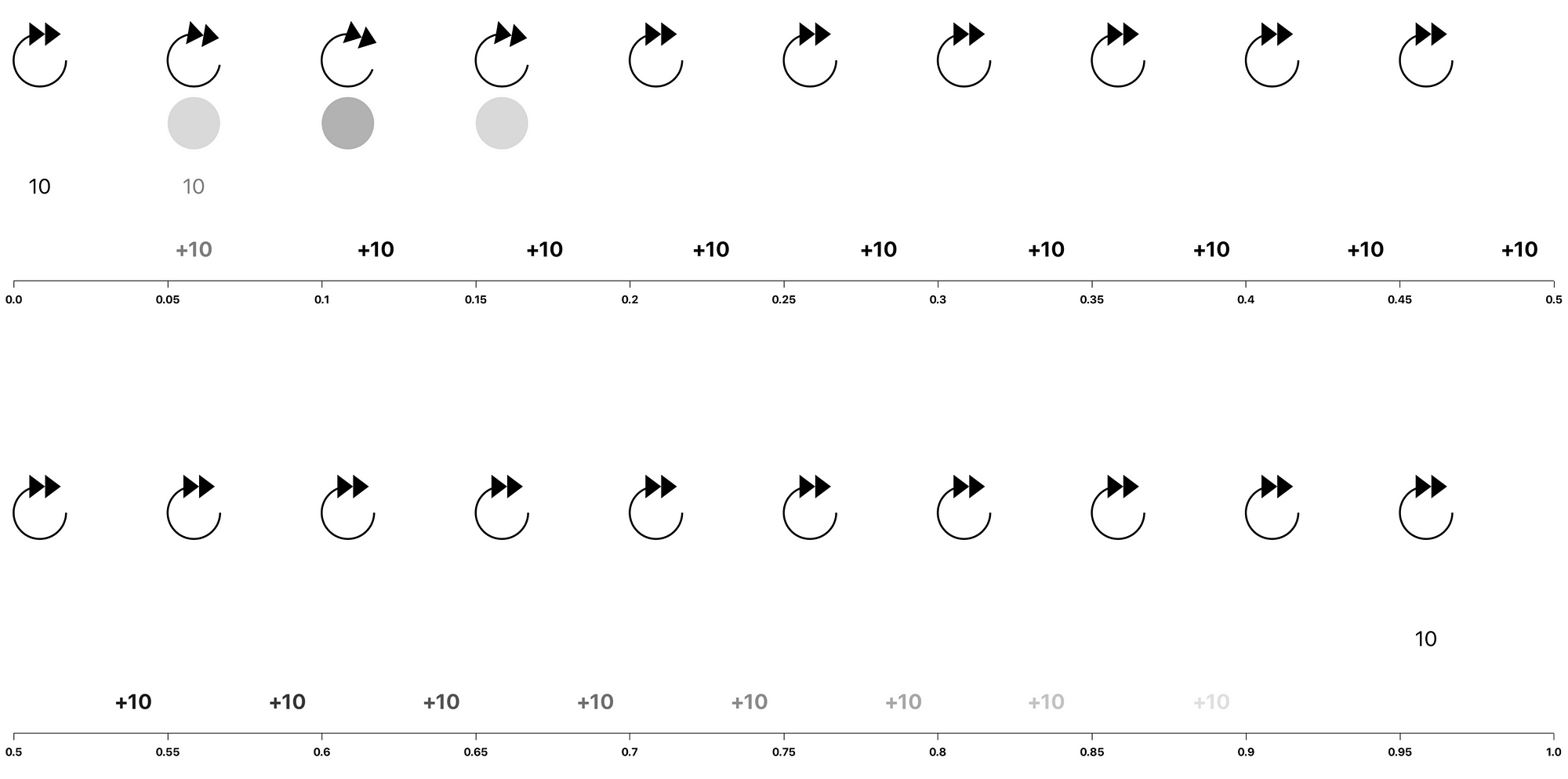
Rounded Arrow View Animation
From the image above, we can see that the rounded arrow view’s animation duration is 0.2 seconds. It rotates itself clockwise by a finite amount (We will be using 20 degrees) and then rotates back. The animation is way too short to worry about its animation curve, hence we will be using the system’s default animation curve.
Rounded Arrow Background View Animation
The arrow’s background animation has the same animation duration as the arrow view, 0.2 seconds. It changes its opacity from completely transparent to a finite amount of opacity (we will be using 0.3) and then goes back to being completely transparent. We will be using the default animation curve here as well.
The Duration Label View Animation
The label’s animation duration spans the entire duration of the whole composite animation. At the start of the animation it quickly fades out at the initiation of a tap, it does not fade in until all the other animations have completed. We will make our label fade out within 0.1 seconds and start to fade back in at 0.9 seconds. As with the other two animations, we will use the default animation curve.
The Accumulation Label View Animation
This label performs the most sophisticated animation of the bunch. At the start it fades in within 0.1 second duration, and at the same time it starts moving out, by translating along the x axis out of the rounded arrow view. The duration of the translation is around 0.5 seconds. Once the label reaches its final destination it fades out. The duration of the fade-out seems to be 0.45 seconds. The translation’s animation curve does not match any of the [ease in, ease out, ease in out] animation curves. After much experimentation, this curve seems to be the closest animation curve.
Finally, if the button is tapped while the animation is ongoing, the button will read the current value of the accumulation label and add the value of the duration label then replay the animation accordingly.
SeekButton.swift
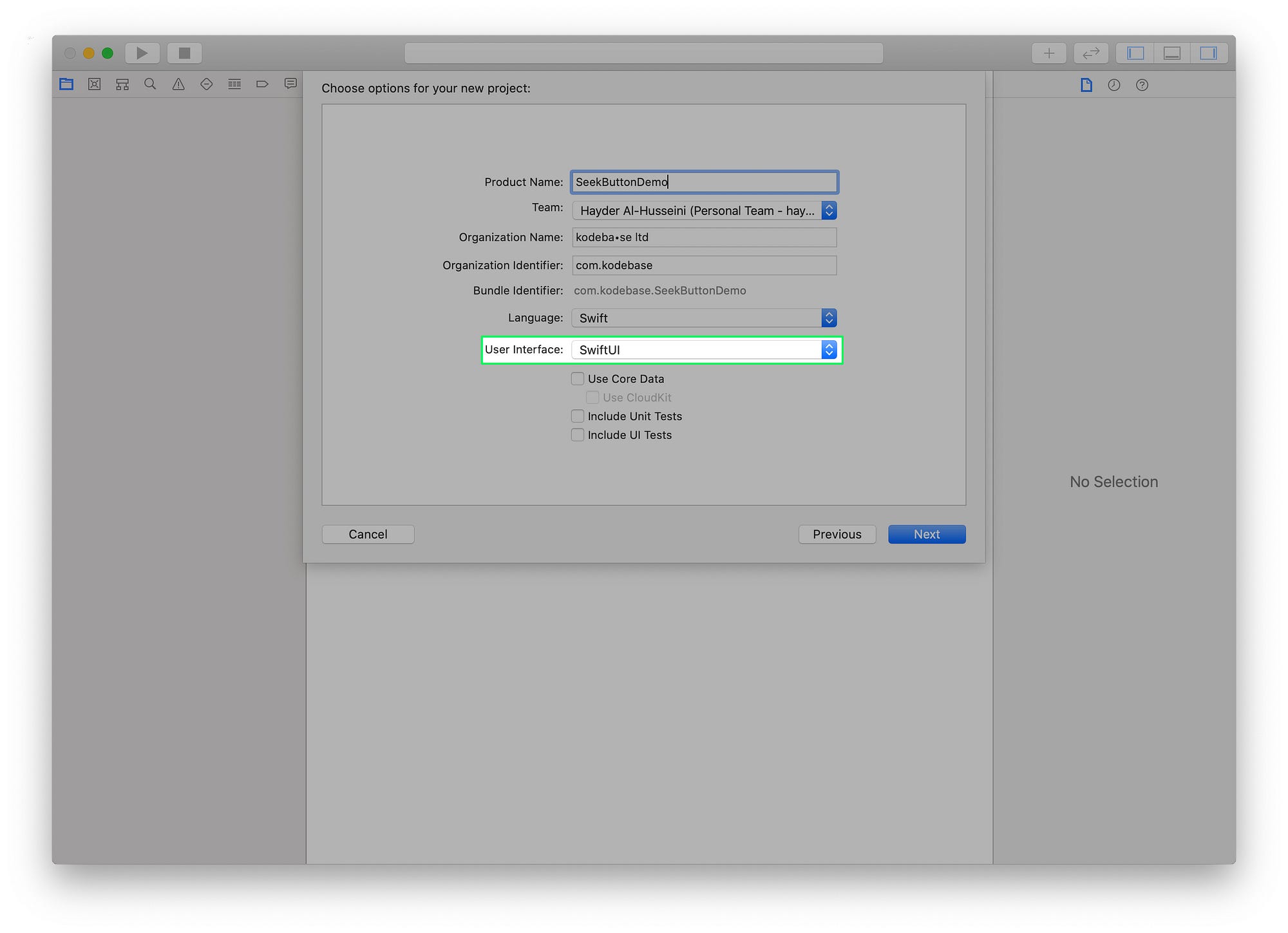
Create a new Xcode project, using the iOS Single View Application template. Let’s call it SeekButtonDemo. In the next screen, make sure to select SwiftUI in the drop-down menu titled User Interface.
Create a new User Interface file, select the SwiftUI View option. Call it SeekButton.
In SeekButton.swift add an action property to the SeekButton struct, that takes a closure as it's value. This will be the action the button performs when tapped.
var action: (Int) -> VoidSeekButton_Preview will throw a "Missing Argument…" error. Fix it by supplying the action argument. We will set a simple action that prints Hello World!. Finally want to limit the size of the button in our preview, add a frame modifier to our SeekButton.
RoundArrow
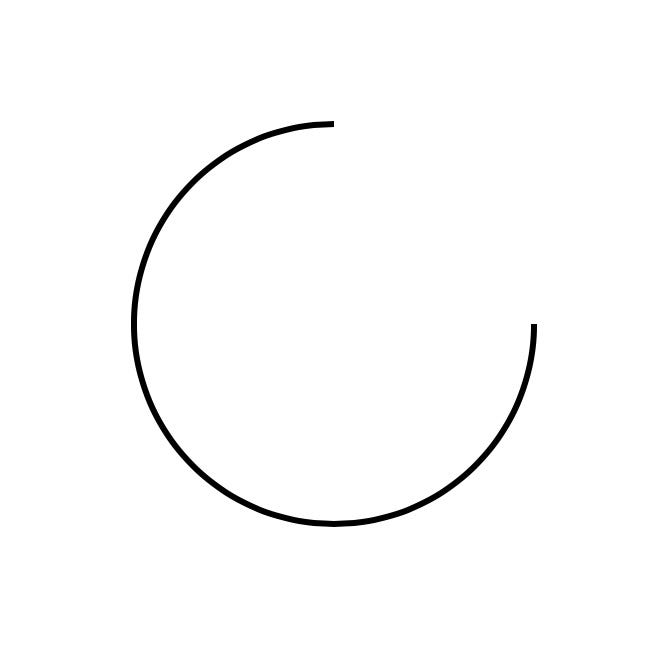
At the bottom of the SeekButton struct, create an extension to SeekButton and create a new Shape struct called RoundArrow.
The RoundArrow struct is simply a path with an arc that start from the 0 angles up to 270 degrees angle counterclockwise.
Back in SeekButton's body the property, replace the default Text("Hello, World!") with the following:
var body: some View {
    RoundArrow()
        .stroke(lineWidth: 3)
}
Xcode’s Canvas should look like the image above.
If you don’t see the live preview of the button, goto to the Editor menu and make sure Canvas is selected.
RoundArrowHead
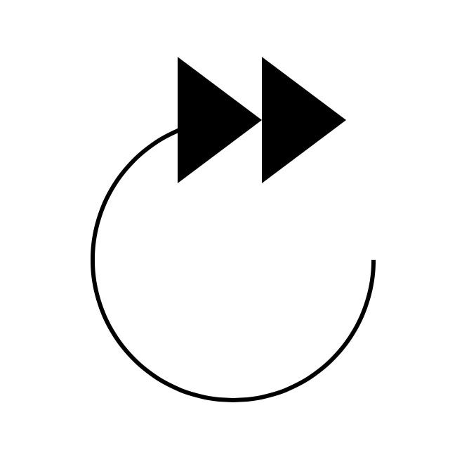
Inside our SeekButton extension, create a new Shape struct called RoundArrowHead.
RoundArrowHead creates two equilateral triangles that are center-aligned to the end of the arrow's arc at the angle 270.0 degrees, pointing to the right. The triangles are in fact two subpaths in the same path. To add the RoundArrowHead shape in SeekButton's body property, we will need to add it to a ZStack.
This should result in the image above.
RoundedArrowBackground
Back to our SeekButton extension, create a new Shape struct called RoundedArrowBackground.
RoundedArrowBackground simply adds an arc to the path, creating a circle. The width and height will match RoundArrow.
The body property of SeekButton will become like this.
The canvas shouldn’t change from before, since we have set the RoundArrowBackground opacity() modifier to 0.
ScalableText
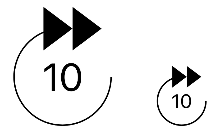
Let’s create a new extension to SeekButton, in it we will create a new view called ScalableText.
We have wrapped a Text view inside a GeometryReader. GeometryReader has its own size, which we will use here to make the Text's font size a multiple of the width, allowing our SeekButton to render it's content at all sizes clearly without having to define the font size for different button sizes.
Now let’s add ScalableText to the body property of SeekButton.
To see ScalableText in action, let's update SeekButton_Previews buy adding two buttons to preview.
The above change should update Xcode’s canvas as below.

According to our earlier analysis of the seek button’s animation, there is a second label, the accumulation label. We will be using a ScalableText view for it as well, however, the string and the font-weight differ from the duration label. Let's refactor ScalableText.
Add two variable to ScalableText, fontWeight and string.
We update the body property of SeekButton to pass in the duration, that we will make customizable by allowing the user to provide a seek interval.
Finally, we will add a ContentShape() modifier and TapGesture() modifier onto the ZStack to make our button interactive.
    .contentShape(Rectangle())
    .onTapGesture {
        self.action(interval)
    }
The ContentShape() modifier tells the SwiftUI that the view's hit area, is a rectangle covering the whole view.
With all our views ready, let’s animate.
Animating the Rounded Arrow
From our animation breakdown above, we want the arrow to rotate by 20 degrees, clockwise. The arrow in our view, is composed of 3 shapes, we will rotate all three together by embeding them into a Group and adding a rotationEffect() modifier.
Additionally we want the background to fade into a maximum opacity of 0.3. We achieve these effects by adding two state properties to our view rotation and backgroundOpacity.
The function animateArrowAndBackground() looks like this:
The function has two animations, one to animate out and one to reverse the animation after the other one has completed.
Animating the Duration Label
To animate the duration label, we will add a new state property durationLabelOpacity, add an opacity() modifier to the duration label and update our body property and tap gesture.
The function animateDurationLabel() is very simple.
Netflix’s button flashes the duration label with every tap. We reset the animation value so that we can achieve the flash as well. We will not reverse the animation here, we will tackle that shortly.
Animating the Accumulation Label
This label is more involved. We will animate the label out by offseting the TextView inside ScalableText. Let's extend ScalableText.
We’ve added a new property xOffset, we will scale the value passed in based on the size of the button, so that the offset animation will always be proportional to the size of the button. We've informed SwiftUI that we want to animate this value by providing it as our animatableData property.
For a great write up on SwiftUI animation, checkout out this post.
In SeekButton we've added two new state variables accumulationLabelOpacity and xOffset.
The function animateAccumulationLabel() looks like this.
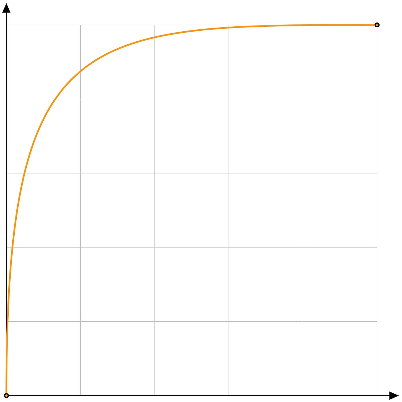
Here we reset the animation values, so that when a user taps multiple times, the animation restarts from the beginning. We then fade in the label and offset it’s x coordinate by 80.0. We provide the animation curve here as well, the curve’s control points are (0.0, 0.0)and (0.2, 1.0).
For a better understanding of these timing functions check Apple’s Documentation.
After the label has reached its final destination, we fade it out.
Accumulating the Label
To increment the value of the accumulation label, we will keep track of the number of ongoing animations by using an animation counter. When the user taps and if an animation is ongoing, we add the interval to the current value of the accumulation label and restart the animation. Once an animation is complete we reduce our counter. When the counter reaches zero, we will fade in the duration label. With that the SeekButton's body becomes.
The incrementSeekValue() is where we add the interval to the current value displayed by the accumulation label.
And the popAnimation() function is where we reduce our animation counter and check if we should fade in the duration label.
The button will be sending multiple seek request to the player. To achieve a smooth seek experience follow this technical note from Apple.
Accessibility
To make the button accessible, we will add the following Accessibility modifiers, accessibility(label:), accessibility(addTraits:) and accessibilityAction().
The accessibility(label:) modifier will provide VoiceOver with a description of what the button does. We will report "Forward 10 seconds".
The accessibility(addTraits:) will be set to .isButton. The .isButton accessibility trait, informs VoiceOver that it should report this UI element as a button.
And finally, we need to factor out the tap gesture's code into a separate function, so that we can perform an accessibility action with the accessibilityAction() modifier.
That completes our forward 10 seconds button. What about rewind 10 seconds you ask? I’ll leave that in your capable hands.
Thanks for reading. You can download the code from github.

