Member-only story

Something I see frequently in early career UX prototyping is a lack of understanding of existing design patterns, and what they communicate to the user. And specifically of the cognitive psychology which sits behind them.
This sometimes due to a lack of experience, a lack of understanding or a lack of study of design patterns.
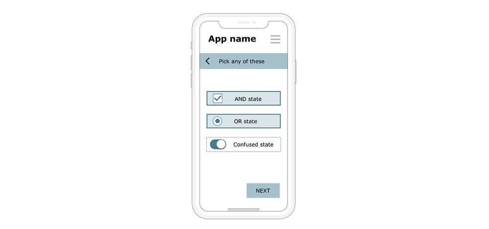
The biggest culprit of this is “AND” state vs “OR” state when considering selectors.
Definition:
- an AND state is where the user can choose/select multiple options
- an OR state is where the user can only choose one option from a list of several.
Add to this, the initial and perfectly reasonable desire to adhere to Nielsen heuristics.
#4: Consistency and standards
In this case, the intent of the heuristic is not to make all screens hyper-consistent with themselves, but consistent with patterns the user will experience elsewhere.
Both are achievable, but I have seen it cause confusion, so here’s a case study to explain.
A case study of confusion
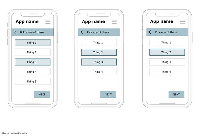
Here is an app onboarding journey of three set up screens, where the user has selected various options. You can see that the three screens use “consistent” selectors.
Can you see the problem?

The designer has created a generic “on focus” or highlighted selector state for their app.
Although the selector is consistent across the product, some of those screens are asking “AND” questions, and some are asking “OR” questions — but there is no accurate visual affordance of the reflected state, and so how exactly will the user understand what is going on? (Also, you’ve just decimated at least one of the four pillars of accessibility)
