And the 2024 color of the year is...
From Pantone to Papanek. Speculating what will be the next Pantone Color of the Year

In the next few days, the color authority will speak. Not to say that others have not spoken, but when Pantone speaks, everyone listens.
The colorful state of affairs
This has been the trend since 2000, when Pantone announced the color of the year every 1st week of December of each year.
And according to them, a global team of color experts will conclude their long conversations on color at the Pantone Color Institute to share their findings. Essentially, decisions are made based on trends from various sources and industries, but also based on discussions and usages they have had in their design studios.
Known as color anthropologists, these experts share their views from a psychological or emotional perspective. Cultures from various backgrounds are often considered. Moods are created, and hopes and aspirations are made from the expressions of colors. And because there (shouldn't) be any commercial intent, Pantone's color of the year is a way to showcase the power of communication through colors.
At least, this is what Pantone wants us to believe.
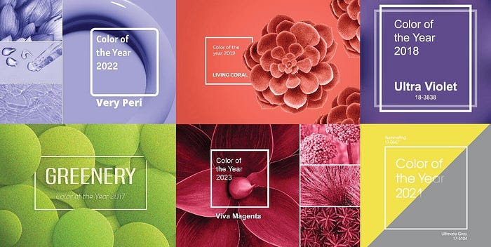
The 2023 Color of the Year was Viva Magenta. In a single sentence, the descriptions of the chosen colors are as follows:
"a shade rooted in nature, descending from the red family, and expressive of a new signal of strength."
"Vibrating with vim and vigor, a shade rooted in nature descends from the red family, demonstrating a new signal of strength."
Much of what was said could be due to an attempt to inject energy into our lives after three years of living with a pandemic. However, perhaps it could be too much of a stretch when they also include war, an unstable economy, social unrest, supply chain breakdowns, and mounting climate change.
Rebelling the color authority
Who is to say that a single color is the representation of all of the above issues? And what happens when 2023 comes to an end? Will a new color ensue with the same narrative, or will a new script appear?
This is where the color authority becomes inconsistent. Yes, hype can be created around the release of a new color. In a way, it triggers anticipation and gives the designer's brain a new puzzle to solve. However, one reason why the color of the year happens only towards the end of the year could be largely due to a fresh start effect.
Professor Katherine Milkman dubbed it the Fresh Start effect, which is a phenomenon when people feel more motivated and excited at the beginning of something new, like the start of a new year. As the mind goes through a psychological reset based on the timing of the year, room for new behavior can set in. This is helpful for people to create new goals for a new beginning. In this case, a new code of color symbolizes a new coat of paint on the house or new attire.

And while the effects of the color of the year are strongest at the start of the year, that same effect gradually wears off as the days go by. Looking back at 2023, other than Motorola and Away luggages, not many companies have left a lasting usage of Viva Magenta. In fact, one might even say Barbenheimer was a more sensational hit when it went viral in July 2023, with stylish renditions of pink and black used in multiple mediums. The difference, however, is the phenomenal amount of user-generated content across the internet. No matter how satirical it can be, one can still recognize the power of communication these colors have for the mass majority.

Other color authorities?
And yet, if there should be an authority on color, a universal standard like the Accessible Perceptual Contrast Algorithm (APCA) or Web content accessibility guidelines (WCAG) are more worthy candidates. Yes, they are a tad boring and repetitive, but they uphold consistency, quality, and inclusivity for all. They are built upon earlier versions to maintain the congruency of thought. And because of that, the lessons learned establish the foundations needed for various designers to follow.
For example, because WCAG recognizes various types of people: those with difficulty perceiving color, those with partial sight, older users, or people with different degrees of color blindness, techniques such as color contrast ratios or text inclusions. For more sophisticated executions, designers consider weighing in on luminance, tint, and shades. Designers Zain Adeel and Theresa-Marie Rhyne are among the many experts in color theory who apply rigor and tests to get the colors right.
Such approaches to color ought to be taken seriously because the benefits are clear. It does beg the original premise:
Is there really a need for a color of the year?
Money vs Meaning
No doubt, color is a multi-billion-dollar business. Look no further from cars to fashion, and you will see color choices do matter, leading companies to be on their toes to know what the emerging trends are, paying lots of money to experts like Pantone to help them choose colors for their logos, their spring lines, their packaging, and their products.
Which is why it is rather unconventional for a designer to go against the grain of challenging the notion of having a new color every year, simply because his or her livelihood depends on the spinning industry of consumerism on a yearly basis.
Unless you are from a similar school of thought as Victor Papanek.
As a pioneer of sustainable and social design, Papanek views design as a political instrument. While it is risky to use politics due to its poor association with bad governance, the principle remains the same. When policies are done well, they bring about a transformative power that benefits both society and the environment. The same principle and actions can also apply to designers, who can bear the responsibility of making better, more durable products and services that bring about a moral contribution to society and ecology. Many of these ideas from his first book, Design for the Real World, published in 1971, are still relevant after more than half a century.
A personal take on color
If there was ever going to be a defining color for people, both consumers and producers, what could it be? I am a designer, someone who creates, dreams, and actuates, so it is my impulse to respond to a brief. In the next few paragraphs, here is my take on a chosen color:
There was a story about how two researchers, Gianni Pes and Michel Poulin, conducted an ethnographic study on the citizens of Sardinia's Nuoro Provinces to identify people in the area who lived for 100 years and more. Whenever they found someone who met the age criteria, they would put a blue dot to represent the individual staying in the region. Soon, both researchers drew concentric blue circles on the map, referring to them as zones with extreme longevity. Dan Buettner popularized the term "Blue Zone," which was recently featured as a Netflix documentary in August 2023.
To live long, happy, and healthy is an agreeable aspiration for mankind. Thankfully, there are principles that we can adopt when designing for the blue zone. But what if we also incorporate some of the green practices mentioned earlier? By using ecological methods with longevity, we can achieve a possible utopia for every living thing in a long-term, self-sustaining system. Wouldn't that be worth pursuing for more than a year?

By mixing blue and green, the color Teal comes to mind. A fitting color that originates from the rings around the eyes of the Eurasian Teal, a member of the duck family. As teal is a common sight in the natural world, such as the blue of tropical lagoons and the green of dense jungles, the color is a visual reminder of the delicate balance we need to strike in taking care of our limited resources. That same balance can also be felt psychologically when calming blue meets enlivening green. So too is what the world needs right now with the ongoing battle to combat climate change and submit to peace globally. If a color can unite, then perhaps teal could be considered the color for 2024 and beyond.
Of course, Teal is my current color of choice that draws meaning and creates reflective power in my work, but it might not necessarily be your color due to your background, culture, and inspirational impulse. And perhaps there really isn’t a need to reach a common consensus or derive an answer for a chosen color from a color authority.
Kitty O’Meara is an award-winning author of a children’s book that came out of the pandemic. Titled “The Rare Tiny Flower,”, the book came from her observation of the world not listening to each other, leading to anger, fear, and sorrow. Her response in her writing was for people to always find reasons to celebrate humanity and the gift of life on Earth. The following poem is an excerpt from the author:
“Maybe there are
other colors to see;
What’s lovely to you
could be lovely to me.”“What we now understand
to be utterly true
is how much depends
on expanding our view.”“It could be helpful
to breathe and be still,
calmly deciding
what won’t work and will.”“Enjoying each color
and welcoming all,
creating a party
instead of a brawl”- Kitty O’Meara

I will end with a quote from Victor Papanek:
The only important thing about design is how it relates to people.
As we await Pantone’s color of the year for 2024, what color comes to mind, and how do you want others to see it in the real world? I'm curious to hear your take on colors.
Further readings
- Adeel, Z. (2018, December 17). My struggle with colors, part II. Medium. https://uxdesign.cc/my-struggle-with-colors-part-ii-ed71bff6302a
- Buettner, D. (2012). The Blue Zones, second edition: 9 lessons for living longer from the people who’ve lived the longest. National Geographic Books.
- Milkman, K. L. (2021). How to change: The science of getting from where you are to where you want to be. Portfolio/Penguin, an imprint of Penguin Random House LLC.
- O’Meara, Kitty. The Rare, Tiny Flower. Tra Publishing, 22 Mar. 2022.
- Pantone. (n.d.-a). https://www.pantone.com/articles/color-of-the-year/what-is-color-of-the-year. Pantone. Retrieved 10 November 2023, from https://www.pantone.com/articles/color-of-the-year/what-is-color-of-the-year
- Pantone. (n.d.-b). https://www.pantone.com/articles/color-of-the-year/what-is-viva-magenta. Pantone. Retrieved 10 November 2023, from https://www.pantone.com/articles/color-of-the-year/what-is-viva-magenta
- Papanek, V. (2022). Design for the Real World (Third Edition) Thames & Hudson.
- Poulain, M., Pes, G. M., Grasland, C., Carru, C., Ferrucci, L., Baggio, G., Franceschi, C., & Deiana, L. (2004). Identification of a geographic area characterized by extreme longevity in the Sardinia island: The AKEA study. Experimental Gerontology, 39(9), 1423–1429. https://doi.org/10.1016/j.exger.2004.06.016
- Rhyne, T.-M. (2023, July 1). Getting categorical with Pantone’s 2023 color of the year. Medium. https://uxdesign.cc/getting-categorical-with-pantones-2023-color-of-the-year-b5f56492b90e
- Smith, S. V., Garcia, C., & Sanzgiri, L. (2020, January 6). The business behind the color of the year. NPR. https://www.npr.org/2020/01/06/794040112/the-business-behind-the-color-of-the-year
- Understanding success criterion 1. 4. 1: Use of color | wai | w3c. (n.d.). Retrieved 10 November 2023, from https://www.w3.org/WAI/WCAG22/Understanding/use-of-color
- van Braam, H. (2018, February 18). Teal Color - What Color is Teal? Color Psychology. https://www.colorpsychology.org/teal/