Applying usability heuristics: How well is your competition really doing?
In the UX/UI design process, “usability heuristics” are broad groups of characteristics that can help designers and researchers assess how easy an interface is to learn and use. They can go a long way to give you a bit of separation from your project so you can be as objective as possible in figuring out what needs improvement.
It’s also really handy in looking at your competitors and assessing where gaps might lie — that your product can fill. An added bonus: it helps you create a standard vocabulary for design critiques that you can use in your own iterative design process.
In the competitive research phase of a project that I’m working on — an insurance product targeted at millennials — I came across Lemonade Insurance, a provider that seemed to be targeting the same age bracket, with a similar range of products and features; Lemonade seemed like an ideal competitor to evaluate through usability heuristics.
In this article, we’re going to evaluate Lemonade’s usability, and hopefully identify some areas of focus that we can address in our own product. We’ll be applying Jakob Nielsen’s “10 Usability Heuristics,” which were written in 1994 but outlined general interface design principles that were so useful that they’re still referenced today.
We’ll also be applying “severity” ratings to each heuristic, on a scale from 0 (not a problem) to 4 (“usability catastrophe”). The full key is available with final scores at the bottom of this article.
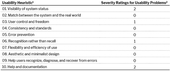
1. Visibility of system status

This heuristic refers to the system keeping users informed of what’s going on, with appropriate feedback. Lemonade generally did a great job of this: When I initiated a quote I knew what I was getting into. The problem began when I had no idea how much longer the process would take. A similar issue occurred when I had questions and had to visit their FAQs, when it wasn’t clear how I’d get back to my quote.
Score: 2 (Minor usability problem: fixing this should be given low priority)
2. Match between the system and the real world

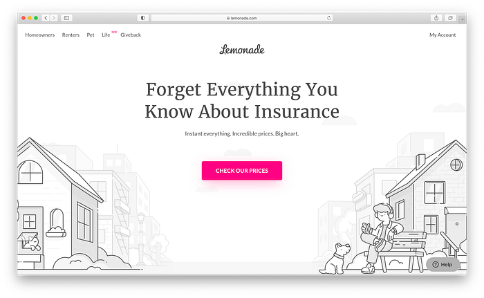
Lemonade did an awesome job of keeping the language informal, free of jargon, friendly, and upbeat. It didn’t feel or sound like an insurance transaction, so my experience lived up to their home page promise: “Forget Everything You Know About Insurance.” I know it’s easy for a lot of companies to default to corporate or industry buzzwords, and I saw very little of that.
Score: 0 (I don’t agree that this is a usability problem at all)
3. User control and freedom

This heuristic is about giving users clearly marked “emergency exits” in order to get out of unwanted actions. In the process of getting this insurance quote, I never saw such an escape hatch, which explains the score of 1; however, I will add that this was likely an intentional choice — to try to get the user to complete the quote process which would better the chances of completing the sale.
Score: 1 (Cosmetic problem only: need not be fixed unless extra time is available on the project)
4. Consistency and standards

Providing good consistency and standards means that your users shouldn’t have to wonder about the use of certain words, or be confused about one situation being similar to another. Lemonade was clear throughout my entire experience: Where language was repeated it maintained the same meaning, and when interactive elements (buttons, links, directionals) presented themselves they behaved as expected.
Score: 0
5. Error prevention

Nielsen suggests in this heuristic that “careful design” can prevent errors occurring in the first place. The simplicity of Lemonade.com and its focus on completing the quote process support this. The single color palette (aside from a complementary tonal grey palette) ensures that important steps are focused and call attention to the right actions.
Score: 0
6. Recognition rather than recall
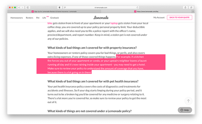
According to Jakob Nielsen, “the user should not have to remember information from one part of the interface to another.” Unfortunately, once I entered a part of the website that dealt with education and FAQs, it wasn’t immediately obvious that I was on a very long page of anchor links, and the secondary navigation disappeared completely, which led me to resort to the back button. While an implied “back to top” arrow was present at the bottom right, it was so faint and lacked contrast that I missed it completely.
Score: 1
7. Flexibility and efficiency of use
This heuristic addresses the need for “accelerators,” which are ways that users can interact with the site depending on their experience level. I felt that Lemonade earned a 0 because of its streamlined quote process and ease of profile and account management. Nothing else indicated a score beyond that to me.
Score: 0
8. Aesthetic and minimalist design
This heuristic addresses the need to keep content and visual design focused on the essentials in order to support the tasks that users want to accomplish.
Most of my experience with this site kept tasks easy to understand and execute, and all of the varying elements — including information architecture, typography, visual design, and interaction design — supported that as well.
The site is pared down but not so much that it loses its brand personality.
Score: 0
9. Help users recognize, diagnose, and recover from errors
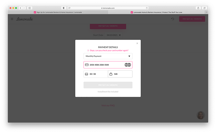
Nielsen states that “error messages should be expressed in plain language…and constructively suggest a solution.” I ran into a problem when I incorrectly entered a credit card number, and the payment dialog box informed me in plain language what had gone awry. The credit card number field was also highlighted in pink, making it very obvious what needed to be done before proceeding.
Score: 0
10. Help and documentation
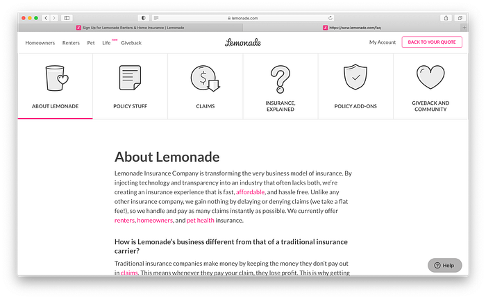
Ideal systems should encourage use without documentation, and if it’s even needed, should be easy to search for. My time on Lemonade.com was very straightforward and easy to navigate, and I thought the site did a great job of using plain language to guide the user through processes like getting a quote. Despite the simplicity, I did have questions, e.g., “What happens if my stuff is ruined because my upstairs neighbor let his bathtub overflow?” Unfortunately I couldn’t find the answer midstream in getting a quote, so I found my way to a help section that I didn’t immediately realize was launched in a new window. The combination of secondary anchor-link nav (that disappears), barely perceptible back to top arrow, and no search function led to this score.
Score: 2
Final Scores
I thought that Lemonade did a great job against Nielsen’s usability heuristics. Where there were problems, they were fairly superficial and could be resolved without too much of a heavy lift on design.
Even though I didn’t uncover much, going through this process helped me appreciate what this website got right. It also helped me set the evaluation standards for my own project and reviewing other competitors — having these common terms and variables will certainly help make presenting these findings more compelling as my work moves forward.