The intersection between Architecture and (so-called) UX Design
My thoughts on designing for the user in the physical and digital world.

Hi, this is my very first story on Medium, so I’d like to start with a topic that is very close to me…
I’m an Architect by profession. After graduation, I worked for a few years as an Architect but soon realized that User Experience Design is something I genuinely love to do in my life. Currently, I am Senior Product Designer at K2 — Polish digital agency.
In this article, I’m going to compare Architecture and UX Design and share my thoughts on differences and similarities between these two disciplines.
For the sake of simplicity I’m going to use term UX, but we all know it’s not the best and proper name for this domain.
Differences
It is quite obvious that Architecture differs from UX Design. Probably it’s much easier to find differences, but there are still few of them that are worth mentioning giving us a better perspective on this topic.
Maturity

Architecture is with us for ages. First structures that served the housing purpose were shelters in the Neolithic period (up to 10 000 BC). In UX Design, I would compare these dwellings to command-line interfaces (one of the first means of interacting with computers): they don’t look good, they are not so comfortable/easy to use, but still can satisfy basic needs.
However, the significant awareness of these two disciplines happened after a while. In Architecture, we can relate it to the first book on the subject of architecture which is “De architectura” by Vitruvius dated in 1st century AD. It covered many aspects of design that are valid nowadays. On the other hand, in UX Design, we can think of Don Norman and his introduction of the term “user experience” in 1995 (which is more-or-less the evolution of Human-Computer Interaction area).
Looking at the dates, we can clearly see the disparity in the maturity of these to disciplines; nevertheless, we should remember that dynamic of these two disciplines matter as well.
Product
For sure it is not surprising that product of both Architecture and UX Design process is something completely different, but it is also good to look at it in terms of analogies.

Keep in mind that by UX Design I mean the area that is not pumped by Human Experience, Customer Experience, Product Design or any other terms that are intentionally ignored in this particular comparison.
So as Architecture delivers physical objects, UX Design is responsible for digital products. When we think of space as an Architect’s canvas, we can relate it to screen which is the medium for UX Designer. If we go deeper, we will define building (as a very common structure that users interact with) and its digital counterpart — an interface (let’s say of an app)…
We can easily apply these analogies to other scales (larger or smaller), but I’m going to cover it in one of the similarities below.
Process Length
That’s a huge difference and the one that played a significant role for me to become UX Designer.
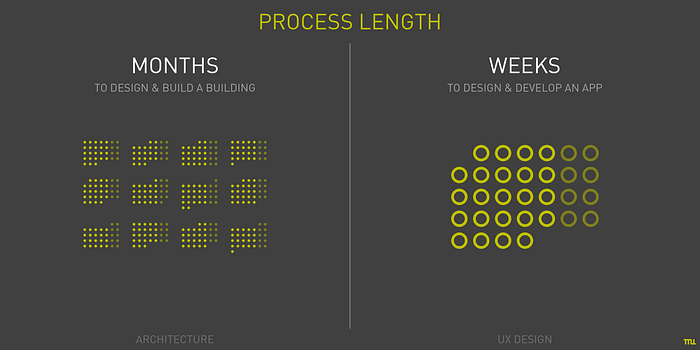
In Architecture, before you will see the product, the real result of your work, it usually takes months, not rarely more than a year (including construction phase). During that time you can deliver dozens of digital products like apps or websites that serve their purpose with sufficient quality. In many cases, you are able to design & develop MVP (minimum viable product) within days — this is the significant advantage for impatient designers.
Lifespan
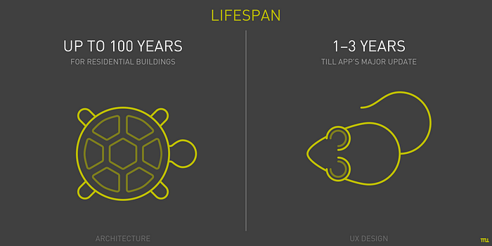
As expected, the long process leads to long-lasting product. It’s not unusual to see buildings that are 50 years old… and some of them would probably stand there for another 50 years or more. That might be quite rewarding for an Architect, but it also means huge responsibility for such designer.
In UX Design it’s easygoing: you design an app, and in a year it would probably be updated to proud version 2.0, to become newer version with a fancy brand new name next year, and then forgotten, sold or died — which is not uncommon for digital products.
Research
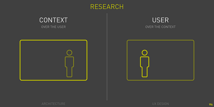
This area is not very flattering for Architects. Their research is mainly about context which in theory is not a wrong approach — they care about surroundings, relation to other building, to city space, to street scale, etc. Unfortunately, sometimes there is a lack of user needs research — they are easily interchangeable with business needs, business context. Times when the user needs where priority passed decades ago.
On the other hand, UX Design doesn’t ignore user at all. The design process is often preceded by diligence research, prototypes are tested with users, the finished product is thoroughly analyzed for user traffic and more. There is a business in this process as well but has a much lighter impact on final user experience.
Authorship
I like this one because it’s a bit controversial.
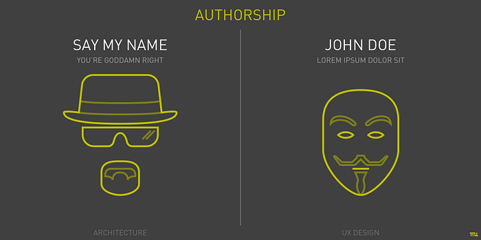
Buildings — unlike paintings — are not usually signed by the Architect’s name. However, we can distinguish many buildings by design “style” and tell the name of the author. And I’m not talking about distinctive individuals like Gaudi, but more “toned” architects like Frank Lloyd Wright, Mies van der Rohe, Zaha Hadid, Norman Foster or Bjarke Ingels (in fact, I wouldn’t call him “toned”). They have their own beliefs, their own ideas, their own means of expression which makes their buildings unique without the loss of quality or usability.
It is not the case in the most of digital products. Of course it is a different product with different possibilities to express authorship, but still — it’s a significant difference that means a lot to me.
Similarities
Now it’s time to point similarities. They are not so obvious sometimes, but with a bit of simplifying, we can find some valuable insights that present these two disciplines in the new view.
Process
Earlier I mentioned that process length is something that differs Architecture from UX Design. However, the phases that happen in this process are easily comparable.
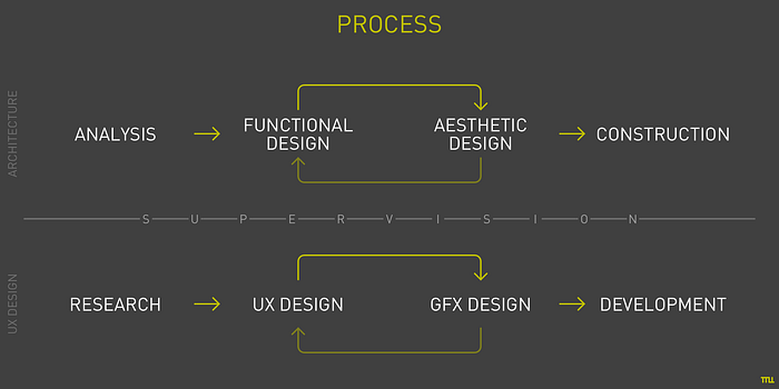
Aside from strategy phase, in Architecture Design we start with analysis — like in UX Design we start with research. Later on, we are ready to focus on usability design (function). And of course, it overlaps and mixes with aesthetic design (form) but in a similar manner for both disciplines — it iterates, has impact one on another. And at the final stage, there is a time for making the project happen — construction/development.
What is also very important here is it’s highly desirable to have author’s supervision during the entire process — it assures that the initial idea will be delivered without any deficiency.
Intermediate products
They are not the same — definitely — but have a lot in common.
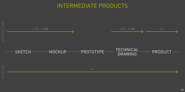
A sketch is usually the easiest way to start — no matter you sketch the plan of the house or wireframe of an app. Pencil and the paper serve the purpose of either Architect and UX Designer. In UX it is widespread to build mockups, but Architects use mockups as well. The objective is kind of different but helps look at the design from another perspective (not rarely literally). Prototype, on the other hand, is rather distinctive for UX process — it’s often used for testing which naturally cannot happen while designing, let’s say, huge office space. In both disciplines, we need some technical documentation — mostly for construction/development phase — and it’s really comparable here.
What makes the UX design easier, is that for the entire process your all intermediate products are in real, 1:1 scale — from very beginning till the end. However it makes digital products a bit less impressive and surprising at the final stage — nothing could be compared to evolution from crude drawing to real building that changes surrounded space for long (and preferably for good).
Scalability
In this similarity, I will use an example of an app (once again) as UX Design product because it’s very convenient to compare it to a building.
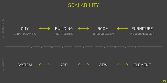
As we design, we shouldn’t think only about the scale that we are currently working on. Not only because of the strategy issues (they are essential on a larger scale), but also because on every scale we have opportunity (if not necessity) to express our idea: no matter if it is a view of tasks to be done or a button that adds these tasks — all should be related and consistent. A good building doesn’t look good only from the street view; its idea, style, quality are apparently visible in the space inside, as well in the tiniest details like door handles.
Components
Similarities are also visible inside the product, within its components but it might be a bit tricky.
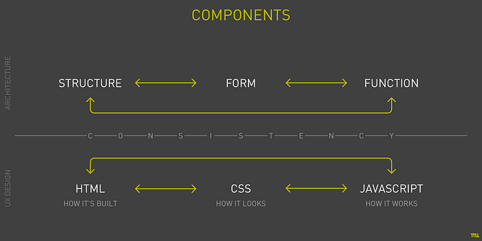
Let’s start with some common web technologies: HTML, CSS, and JavaScript. They all serve its purpose, and all of them have it’s equivalent in Architecture design. If HTML is responsible for how it’s built, so building structure is it’s analog. When we think of CSS and how it looks, it compares to form of the building, its materials, facades, etc. JavaScript makes it work like a function of the building give its real purpose and destiny.
There is also the choice of technology which plays a significant role in designing both digital products and buildings. It’s accountable for delivering all other components and elements that need to be used.
Attitude to affordance
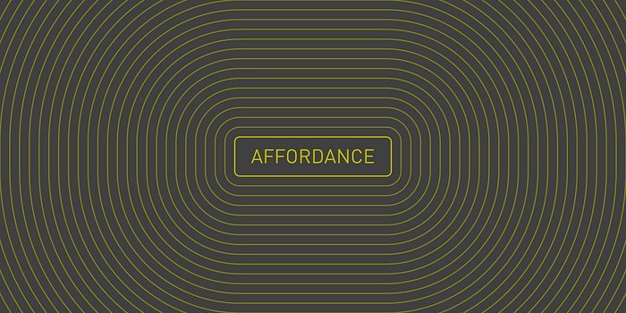
Affordance is an essential term in design. It was introduced by psychologist James J. Gibson, but later used by Don Norman in relation to Human-Computer Interaction, which in this context refers to object’s perceived properties that provide (or not) clues how to use it. In simple words: button should look like you can tap it and it will make something happen.
In architecture, there is a phrase that corresponds with affordance: Form Follows Function. It was introduced by Louis Sullivan (American architect, 1856–1924) and then widely used in Modernism movement. It states that form, shape, look of the object (not only building) should relate and come from its function and purpose. So entrance to the building should look like one — not like shop window next to it (it’s definitely a too coarse example of this theory).
This concept is ubiquitous and clearly visible in both Architecture and UX Design.
Attitude to skeuomorphism
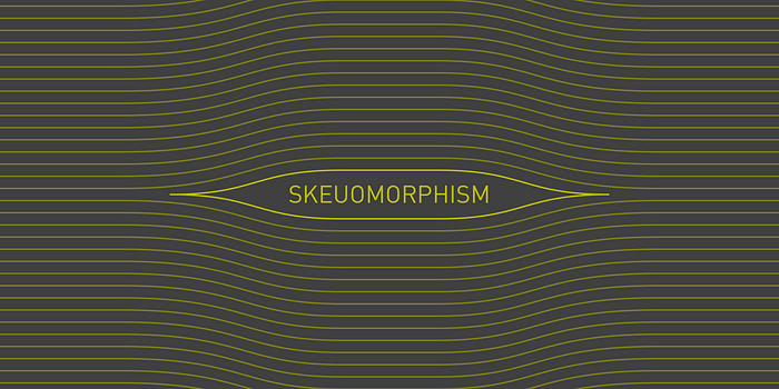
Skeuomorphism: another buzz-word that is widely use in UI Design. Here it’s nothing else than mimicking and imitating real-world object and materials in the interface. There was the trend to show paper texture in every notes app (iOS still has it!), to give buttons plastic, 3-dimensional look or even to use brick-wall backgrounds (!). Luckily it ended.
Most of the best buildings do not use fake materials. The real beauty comes from the honesty of the material: no matter if it’s warm wood or rough concrete. This trend is here for a long time and hopefully will remain.
JEMS’s option “zero”
You might haven’t heard of Polish architectural studio JEMS, but I encourage you to take a look at their projects (www.jems.pl). They are with no doubt one of the best architectural teams in Poland.
They follow the set of rules that is called option “zero” — Referring to patterns and values comprehensible by everyone:
- …
- Clarity and unequivocally of form
- Consistency of form, function, construction (structure) and technology
- Consistency of whole and detail
- Homogeneity of material
- Truth about the material — natural materials
(These rules were noted by me a few years ago, so there is some chance they were slightly updated.)
As you can see, most of these points could be applied not only to Architecture but to UX Design as well. However what is most significant here is point number 1:
- User first
So what is Architecture about if not about designing (for) User Experience?
Thank you.

