Are the numbers on elevator panel arranged in the right order?

Well, Yes. They are in the right order (bottom to top). But the fact that you clicked on this article might suggest that you thought there was something wrong with them, but why?
One might think that it makes more sense to put numbers in a natural way. Just as we read, left to right, top to bottom. But this method is not very comfortable in every case. Here is an example.
Have a look at your computer’s keyboard. How are the numbers arranged?
Since a computer is nothing but an extension to a calculator, the number pad resembles that of a calculator.

This concept is known as mapping.
Mapping
It is one of the five fundamental psychological concepts of discoverability (affordance, signifiers, constraints, and feedback being others). It technically means the relationship between the elements of two sets of things.
The number pad of the keyboard was mapped to that of a calculator. This helps in an easy adaptation of new technologies and faster working.
Another example?
Have a look at the dialer pad of your mobile phone, guess where does it take inspiration from?
Spatial correspondence between the layout of the controls and the devices being controlled, makes it easy to determine how to use them. — Don Norman
When you enter an elevator, your brain maps the floors of the building with the control panel. So if you want to go towards the top of the building, you will start looking from the top of the control panel, and if you want to head towards the basement? Correct answer! You will look from the bottom.
Also, if you recall your visit to a hotel or in fact any apartment building, you might have noticed that the room numbers start with 100 or 101, representing the first floor. 201,202,203 representing the 2nd floor and so on. You see this creates a direct mapping between floors, rooms and the elevator panel. All numbered from bottom to top. The buttons reflect their presence in the real world. This helps in faster decision making.
People are not so patient waiting in an elevator (that’s why they have those mirrors installed in there), they are generally in a hurry to reach in a meeting, to catch a flight, to catch that last bus. So why spend another moment thinking which button to press? Or the worst of all pressing the wrong button and waiting for the doors to open and close.

Now the questions is, should the numbers increase horizontally or vertically? Since we are comfortable reading left to right, floor numbers should also be arranged that way.
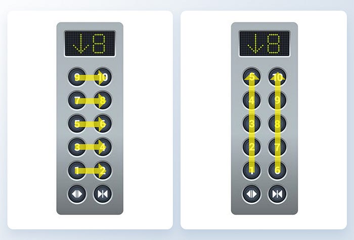
Conclusion
Everything should be thought out from the user’s point of view. The user looks up to find their floor, or down if leaving the building. And that’s how the arrangement should be.
Learned something new? Please 👏 and share! This will tell me to write more of it! :)
Want some more light on the topic? Here are some interesting articles