Member-only story
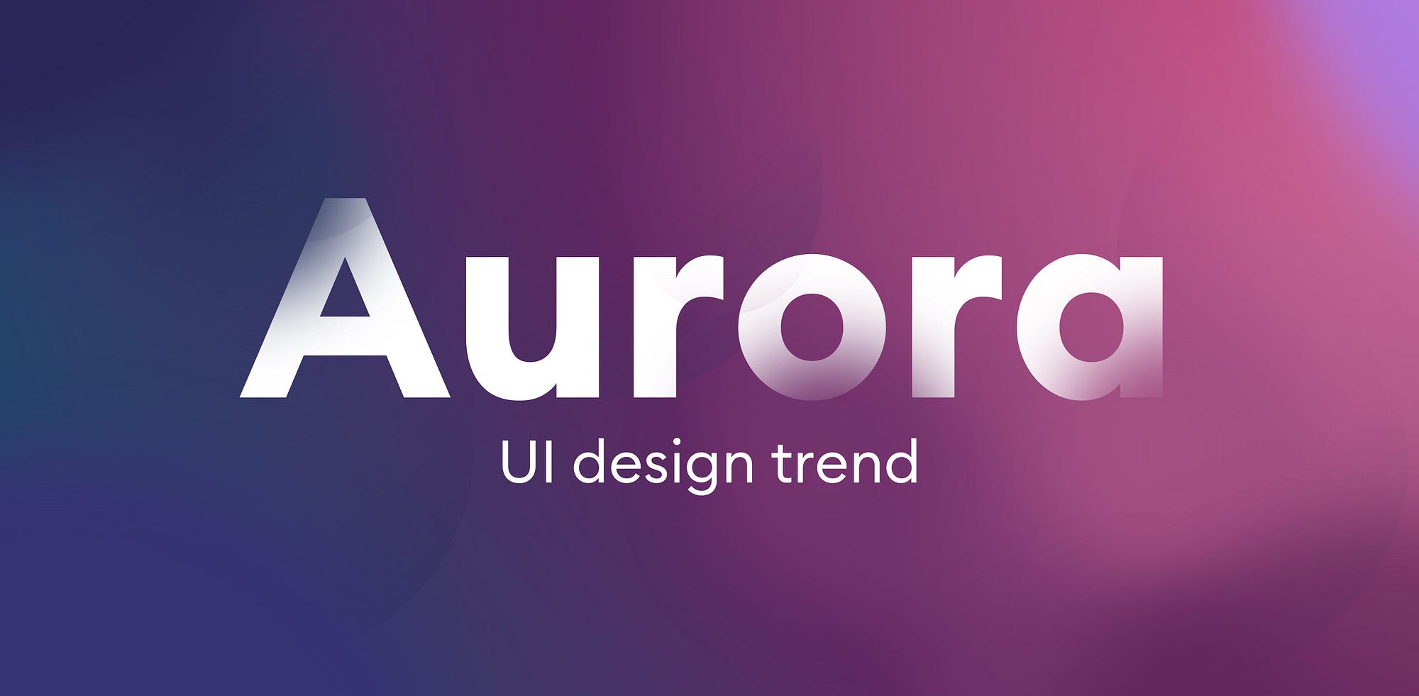
Aurora UI — new visual trend for 2021
Blurred, organic gradient backgrounds are going to be a thing this year.
UI design and especially its more artistic, visual side is constantly evolving. While most current products repeat the same, trusted and well-known IA patterns, UI and the Value Proposition are the biggest differentiators the product can have.
Nobody is going to try and redesign a registration process that works well in thousands of other apps — we’ll tweak it, for sure, and hopefully with some research, but in the end, it will just be a copy of what the users already know.
All the morphisms
Both Neumorphism and Glassmorphism were the response to the design trend pendulum swinging back from forced minimalism. The momentum here was just as big as when it was swinging the other way around — from Skeuomorphism all the way to functional minimalism of Material Design and Modern design trends.

I’d say it takes about 7 years for a design trend to start reversing (give or take). The wooden backgrounds and stitched leather of the first iPhone (2007) gave way to minimal designs of iOS 7 (2013), and 2020 started bringing the real world, organic inspirations right back.
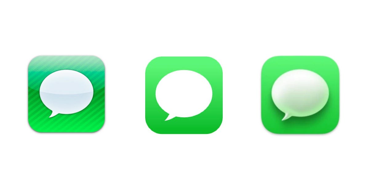
With both the usage of the frosted glass aesthetic (both Microsoft and Apple), skeuomorphic icons (Mac OS Big Sur update) people have generally reacted positively to the change.
We wanted the products we use to be “crafted” and have a soul, instead of being a utilitarian white-label from a design system (like Material Design).

There’s nothing wrong with minimalism, even in its extremes, but it does make everything blend together into a mass of sameness. The design diversity has been diminishing long…


