Automotive UX highlights from IAA 2019
A report from Frankfurt motor show with a focus on in-car UX and UI.

Frankfurt’s IAA is arguibly one of the most important events of the year for the car industry. This year’s edition was dominated, as expected, by EVs and infotainment (term that is now too narrow to define what can be done on cars displays these days) took a central stage, with many OEMs setting up demo dashboards out of the cars to showcase their systems.
At the moment, automotive HMI is a pretty interesting environment for UX and UI, as there’s no standard yet and each OEM is experimenting its own way, with different screen ratios, different amount of screens, different interactions… It’s a little bit like it was in the early days of mobile phones, where we had some crazy designs going on.
Many of them are taking inspiration from mobile devices, others are staying closer to traditional automotive infotainment systems (and their bad design), others are trying to sit safely in the middle.
Here (in alphabetical order) I selected the most interesting ones (to me, of course) as well as the ones from high-end “traditional” automakers, regardless of how good they were, just to check if they are keeping up.
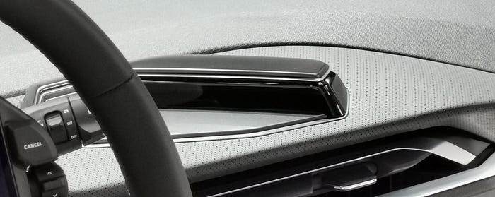
Audi


Among the German top players, Audi was one of my favorite. The UI is not jawdropping, but way better than others in the same price tier. Quite minimal and not too “photoshoppy”. On the interaction side, I really liked how they introduced the hovering on touch screens. Touching something on the navigation bar, for example, doesn’t trigger anything, you see the element highlighted, but you then have to actually press with a little more force to launch the application (not sure if this is an option or the only way to interact).
The three screens (1 instruments cluster and 2 central displays) are disconnected to one another, and to me this limits the possibility of apps and information flowing between them in a more natural way, as well as the option of combining into one single bigger display (this would have been great for the 2 central displays).
BMW


BMW’s central display is pretty small compared to where the market is going. The interface though is one of the most clean, with the instruments cluster using a slightly more skeuomorphic/classic approach (which could be understandable) and the central display a more minimal design.

On their i-Next concept car, they showed an unorthodox approach, with what seems to be a voronoi effect on the widgets. Usable in real life? Not sure. But on this concept it looked cool.

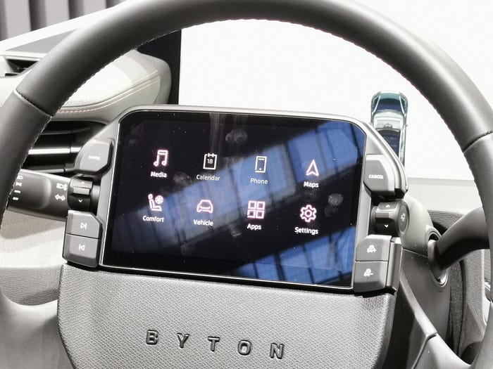
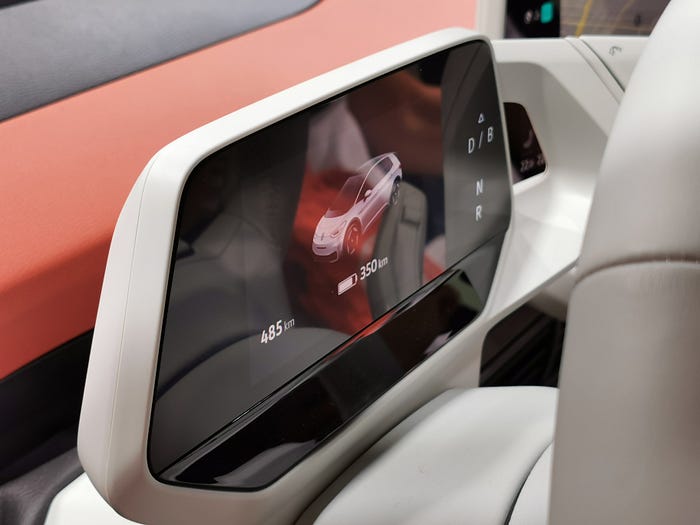
Byton
Byton is a Chinese all-electric vehicle automotive brand co-founded by former BMW and Nissan Motor executives. They don’t currently have any vehicle on the market, but they aim for their M-byte to hit Chinese and western markets very soon.
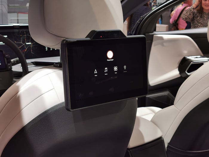
Byton has undoubtedly the craziest screen on a car today, especially on one that wants to hit the streets in the next year or so, and it’s not just a concept car. One giant display goes from one side to the other of the dashboard, plus one other quite large screen (about the size of an iPad mini) is on the steering wheel, plus another similar one between the driver and the co-driver and, optionally, 2 more for the back passengers (!!!).
Besides the number of screens, which is not the highest you can find, is the size of the main one that leaves people speechless.

The big screen is not a touchscreen, and this isn’t surprising, given its position on the dashboard being too far to reach. Functions and apps can be controlled from the touchscreen and actual buttons on the steering wheel or from the touchscreen between driver and co-driver, but also touchless gestures are available (I explained my doubts on this form of interaction here so I won’t go over it again).

The main screen can be split and used independently by the driver and the person sitting next to him. The back screens can be controlled from the front (for example if kids are in the back).
Regardless of what you might think about the monstrous size of the screen, the UI is one of the best I saw in the show. If I had to be picky, I’d say a little too inspired by Tesla on the ADAS and some other parts, but definitely ahead of everything else in IAA. The day mode seems a little excessive; thinking about driving with this white light source in front of my face might be too much. In dark mode everything looks immediately more realistic to use and enjoy.


I like that despite going crazy with displays, they decided to keep physical controls on the steering wheel, which, interestingly, can be turned without affecting the screen that doesn’t rotate along with it.
I couldn’t test it myself, by we’ve been able to enjoy a private demo by a Byton employee. What he showed us were some interesting interactions, like this one for the climate controls, where you control temperature and stream with the same dragging action (notice how the red/blue circle around the cursor gets bigger when dragged to the right. Up for hotter and down for colder temperature, left for weaker and right for stronger stream).
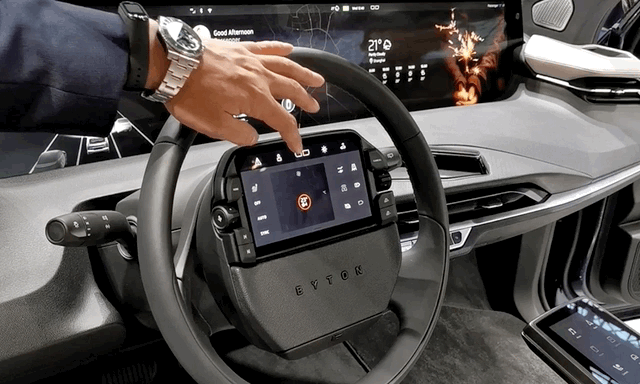
As far as safety goes, the eye tracking camera is supposed to check where on the screen you’re looking, and if the system determines you’re being distracted from driving, simply shuts off the screen.
Continental
Even though Continental is not an automaker, I thought to include this curved screen they had on display because it had a few interesting things. First of all, the design is curved in different directions, not just a single curve, which is pretty cool. It includes areas with haptic feedback, so if, for example, you swipe on a volume control, you feel an haptic response all the way through under your finger. Another interesting aspect is that, like Audi did, they use a “force touch” approach, so buttons don’t immediately trigger anything as you touch them, but you have to actually press to perform an action. To be totally honest, I think they have to calibrate this a bit, because you have to press with a quite good amount of pressure.
Lastly, I wanted to include this because, the UI was one of the best around.

Honda
Honda presented their citycar Honda E at this event and, if we just consider the number of screens, this gets the first prize.
On the dashboard there are:
- a screen for the instruments cluster
- 2 central information displays that work independently (1 for the driver and 1 for the co-driver) on some apps or work as one on some others.
They both have the same navigation menu and driver and co-driver can decide independently what to display on screen. - 1 display on the far left and 1 on the far right that work as mirrors, as this car doesn’t have regular mirrors but cameras.
So a total of 5 screens.

The content on the 2 central displays can be swapped between the 2 by pressing a button on screen.

The UI design is somehow ok. Not my favorite by far, but at least is not looking like a 10 years old system like some other pricier OEMs have.

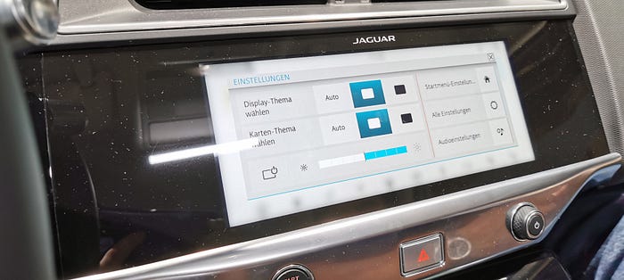
Jaguar
The setup on Jaguar cars is similar to Audi’s in terms of screens and how they are placed on the dashboard.

Next to the bottom central display though, they add physical knobs for AC controls that incorporate small screens to show the set temperature. As I stated in my article about the UX on Tesla Model 3, I think that, at the moment, the presence of some physical controls is still necessary, so kudos to Jaguar for not going crazy on the digital.
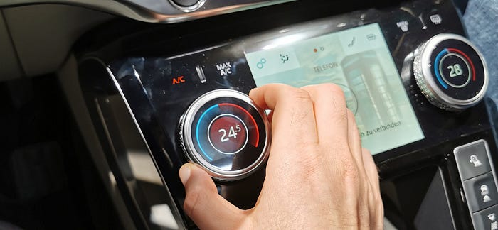
The UI is quite nice and clean, it does the job and it looks contemporary.
As other OEMs, also Jaguar goes a little more skeuomorphic on the instruments cluster, without being too crazy. I believe we’re still in a transitional phase from analog to digital for this part of the dashboard, much like in the prehistoric era of smartphones, hence this in-between style. I can take it.
Mercedes
I’ll go straight to the point: Mercedes’ was probably the worst I’ve seen that day.

Apparently it’s still 2009 at Mercedes. Glossy elements, 3D (inconsistent) icons with definitely too many colors, glows, fake 3D environment… Huge no for me.

Too bad, because the screen is actually pretty nice. One single wide element going from cluster to central display.


There are different options to control the system besides VUI (which is a given for all OEMs) and touch. A touchpad to the right of the driver, or a tiny “touchpad joystick”, exactly like the one used on Blackberry phones a million years ago, do you remember it?
I mean, even the design is the same. It’s 2019 Mercedes, Facebook is now seen as evil, nobody plays Farmville, we don’t use digital compact cameras, Glee is not on TV and we don’t want to control screens by rubbing a cufflink.

Polstar
Polstar is the EV brand from Volvo. It’s the first car to sport Android Automotive OS. It was a big disappointment to me, as they decided to lock all the functions with no possibilities for attendees to explore any part of the system, which in such context seems pretty dumb for me.
Industrial Design wise, I don’t like this screen. It looks like an iPad Pro that has been forgotten inside the car. It’s an odd element on the dashboard, not integrated in any part of it. Tesla Model 3 is somehow similar, but the suspended nature of it make it look intentional, while this one is really looking like just sitting there because the car actually didn’t have any display and you brought your tablet as a workaround. A matter of personal taste, of course.

I know Android Automotive OS for what I’ve been able to find online, and it looks pretty good. The 4 areas approach is interesting and I’m glad it doesn’t really draw from Material Design for its look.
I included it here because it’s definitely worth mentioning, but nothing more I can say about it.
Porsche

Porsche works with 4 displays (even though the co-driver one is optional). The instruments cluster has a really awesome wide and curved design, then there 2 smaller landscape oriented central displays and a portrait oriented one for AC controls and more.

The 2 central displays have almost the same features, with the driver’s one having a few more functions related to the car status.
Unlike the Honda E, it doesn’t seem possible to swap content between the 2.

The UI design is aligned with the most modern ones in automotive HMI. High contrast, minimal design, no room for decorative elements, very functional and focused on avoiding distractions.

Wey
Wey is a SUV brand from China. It’s good that, in alphabetical order, this comes last, as the interface here seems to take randomly from all the other ones mentioned above.


I’m not sure what’s the concept here. It seems that every screen was designed by a different company.
Besides the UI, also the UX was confused, surely not helped by warnings and messages in Chinese popping out from time to time.
A NOTE FOR ALL BRANDS:
Yes, IAA takes place in Frankfurt, BUT it’s a very international event, with attendees coming all the way from China, Japan, all over Europe and more.
Why why why setting German as the language for the infotainment systems?!
BONUS CONTENT
Hyundai


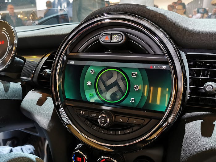
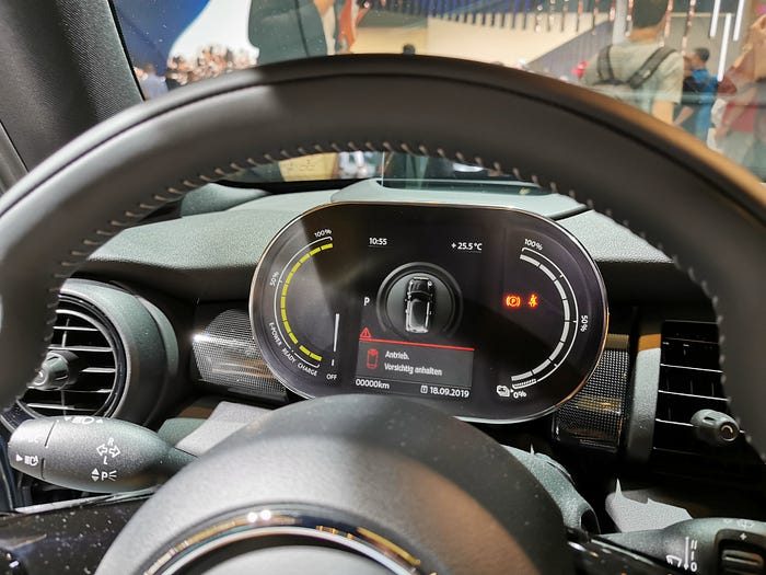
Mini
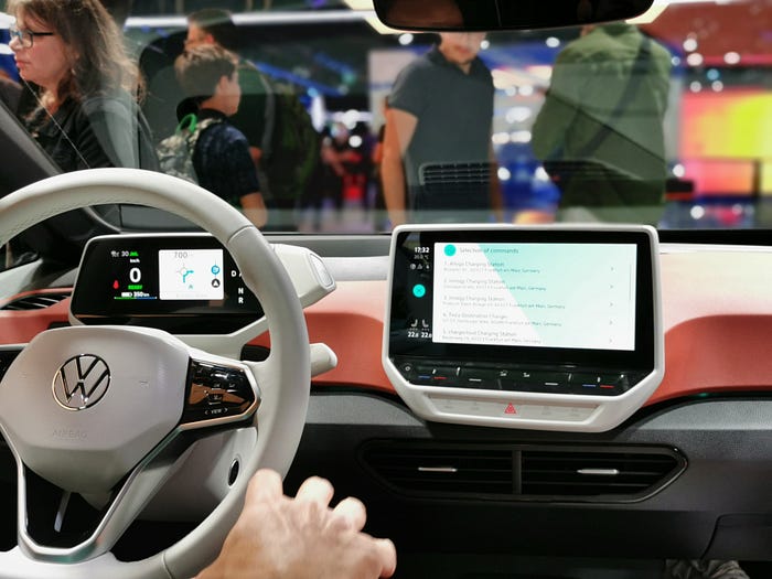
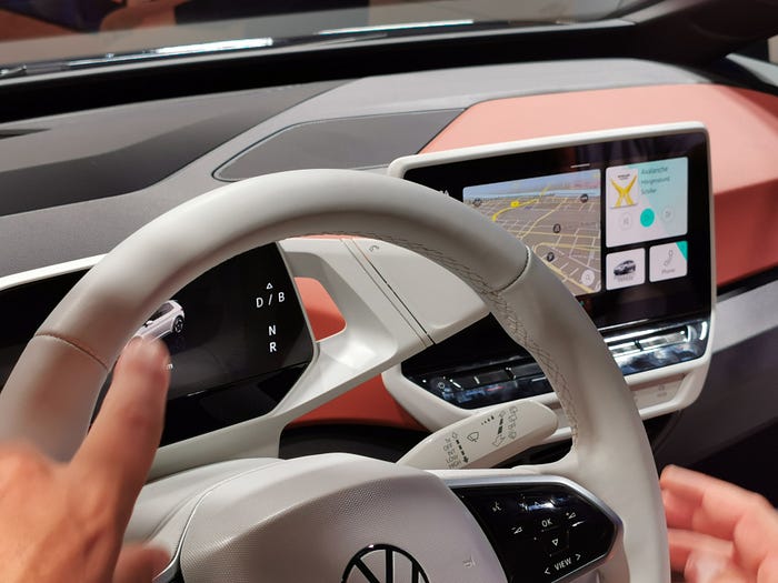
VolksWagen (ID-3)
⬜️⬜️⬜️⬜️⬜️⬜️⬜ 👧🏻👧🏼🧒🏻👦🏼👧🏾👦🏿👧🏽👧🏻👧🏼🧒🏻👦🏼👧🏾👦🏿👧🏽👧🏻👧🏼 ⬜️⬜️⬜️⬜️⬜⬜️⬜
My new book “Designing Digital Products for Kids”! Out December the 4th!
Learn the secrets to design successful digital products for children.
You’ll find answers to all your questions regarding the industry, and its peculiarities in 📐 UX design, 🎨 UI design, 🔍 user testing, 📈 business strategies, and much more.
⬜️⬜️⬜️⬜️⬜️⬜️⬜ 👧🏻👧🏼🧒🏻👦🏼👧🏾👦🏿👧🏽👧🏻👧🏼🧒🏻👦🏼👧🏾👦🏿👧🏽👧🏻👧🏼 ⬜️⬜️⬜️⬜️⬜️⬜️⬜