Background grids, from paper to display
So we are building a CAD or a drawing app. It has lots of handy tools and an infinitely large space. There’s enough room for drawings, notes, and anything else.
We start with a blank page, literally. Sketch welcomes its users with a sterile empty space implying that they already know how to start and what they are going to create.

It’s like a blank sheet of paper, except that it’s an infinite one.
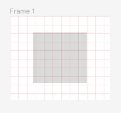
Scholars start their study with a graph paper. It provides basic scale and structure, making drawing more accurate. As students progress, they use paper with smaller grid cells and learn about different kinds of graphing paper types and patterns. Even after college, we use notebooks with grid patterns as they help us organize our tasks, notes and sketches better even while being on the go.
In modern design tools background grids are clear equivalents of graph paper and are often used for the following purposes:
- Create a sense of scale
- Serve as visual anchors for aligning objects
- Provide visual feedback on panning and zooming
The first two work for regular paper, and the last point is most useful for large virtual canvases.
A word on games…
We’ll explicitly exclude games from this story as otherwise, it would turn into a never-ending one. Game designers usually have much more creative freedom and don’t stop on regular conventions.
Pre-3D era games heavily relied on isometric grids to add a sense of depth

while some go as far as making a radial grid a core part of the gameplay.

At the same time, game-making tools are not too much different from more generic design apps in the way they use grids.
Lines and dots
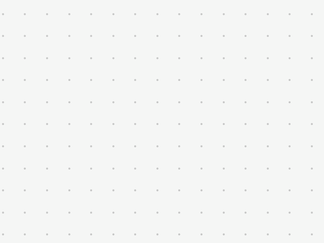
When talking about background grids in software, we usually imply line or dot visuals on a regular grid.
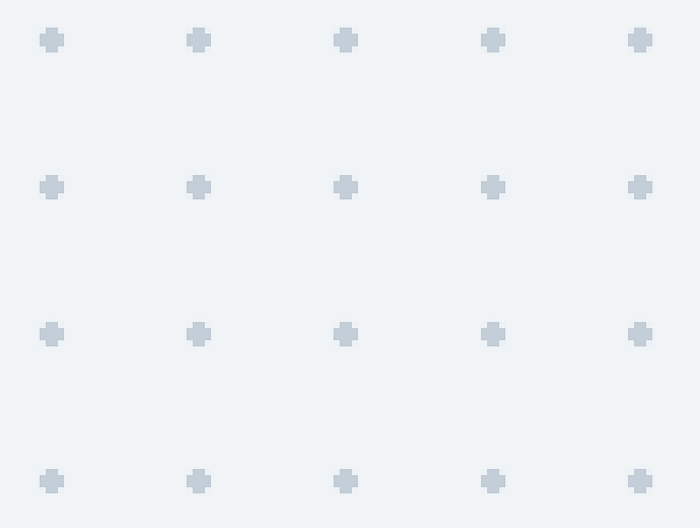
Grid cells could be subdivided into smaller ones for better accuracy and dots may be replaced with small crosses or rectangles.
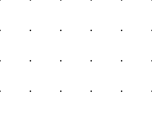
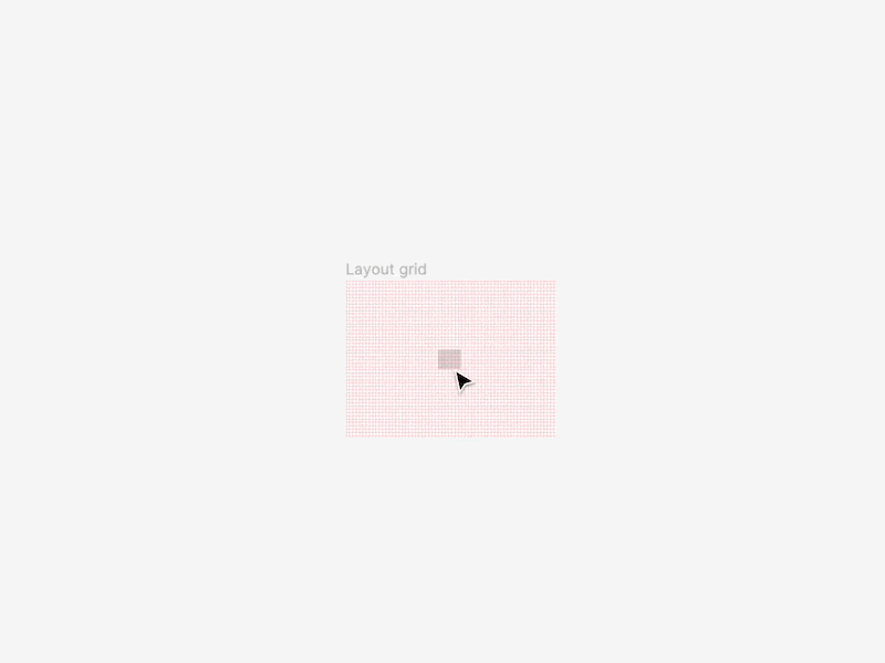
Let’s try drawing two simple grids: one made of lines and another one made of small circular dots.
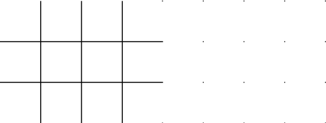
At this point, details don’t matter much. Grid cell size (module) may be anything, the background is pure white, and grid elements are black. The only thing worth changing is the radius of the dots for optical compensation.
Now dim the color, tweak the module size, add optional subdivisions and that’s the end of the story, right? Wrong. We are just getting started.
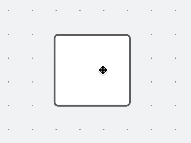
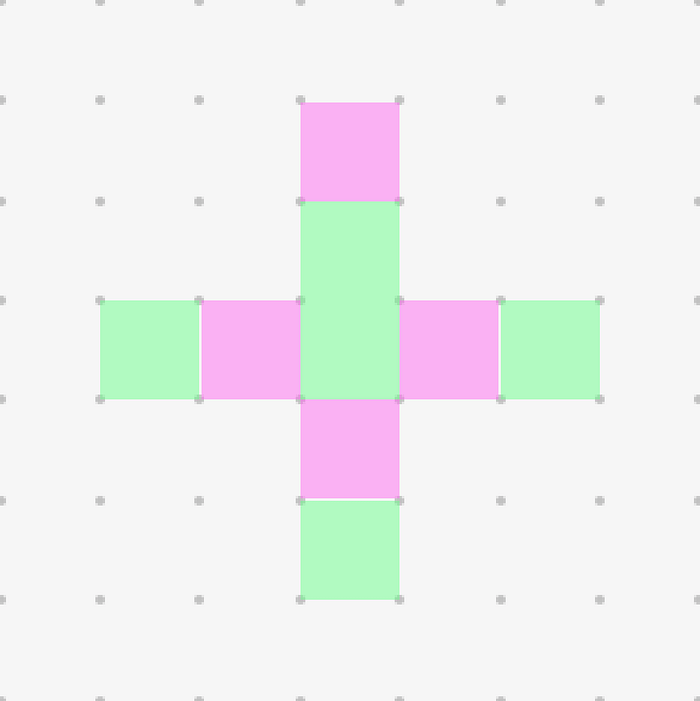
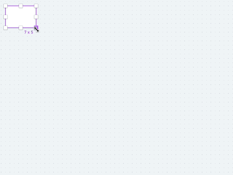
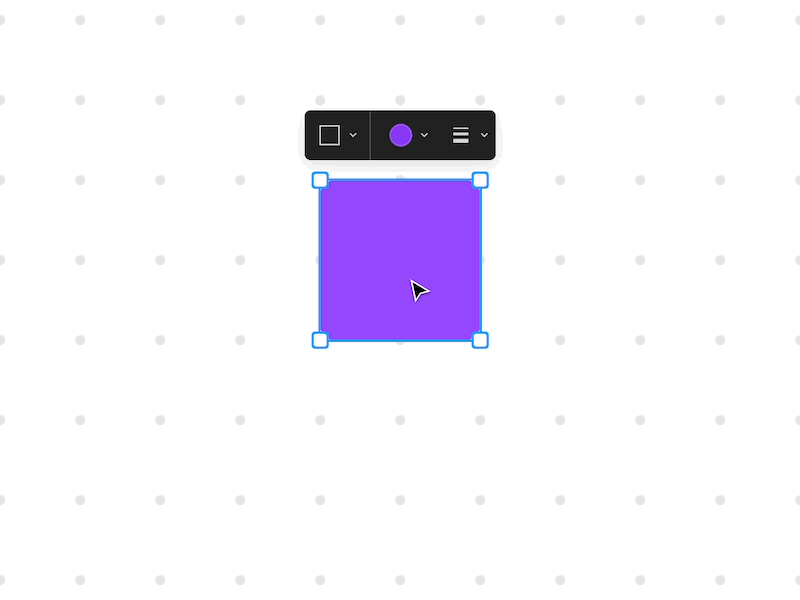
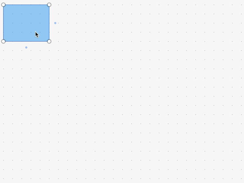
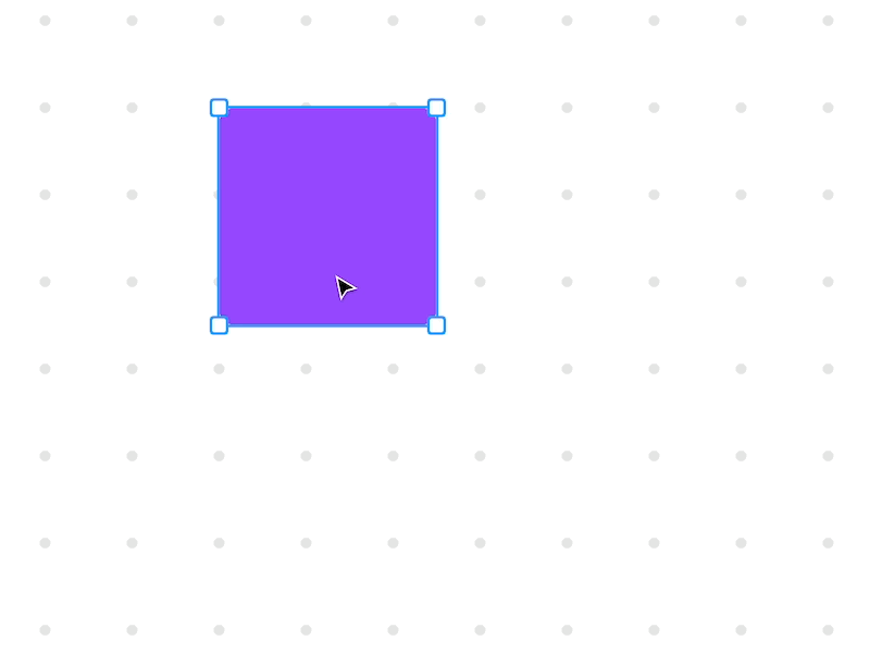
First of all, we need a basic content example, so let’s draw a rectangle.
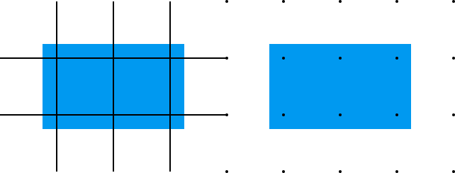
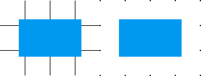
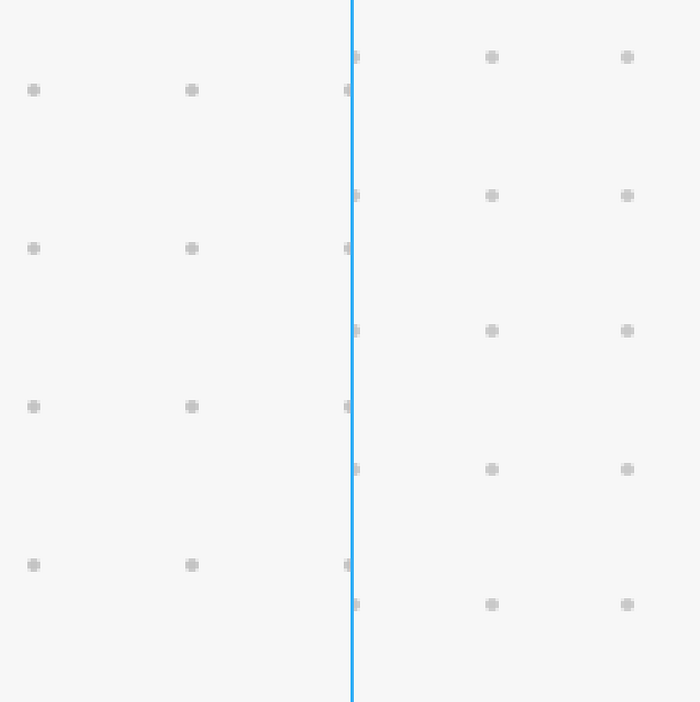
Unlike graph paper, we are not forced to draw the grid on the background. If we are using the grid as a ruler, we may easily place it above the object so that it helps us align content despite its layering. Think about it as a tracing paper placed on top of the content.
In Figma, a design tool where content alignment is a critical part of the work, layout grids are always placed above the content so that you always have a visual reference.
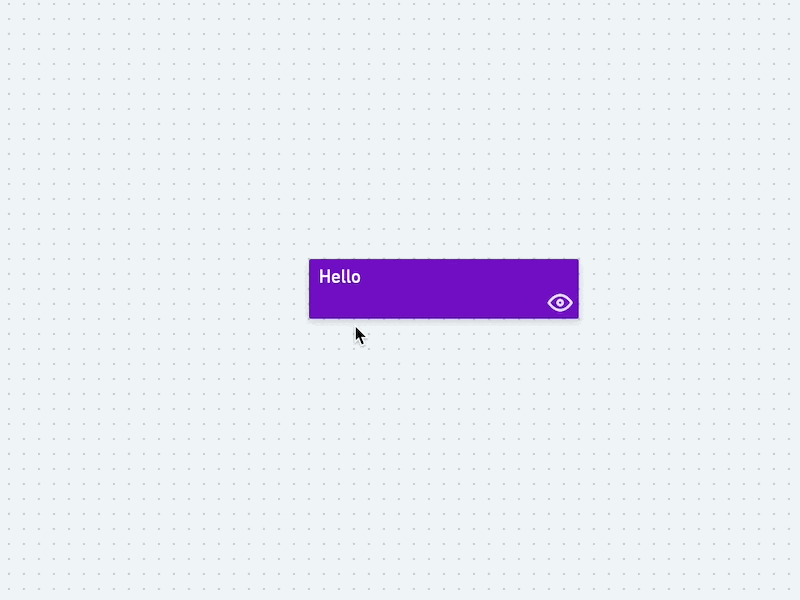
The downside of this approach is rather obvious: for more casual products such grids are overkill and mostly add visual noise, so let’s return to our paper reference and treat the grid as a background rather than an overlay.
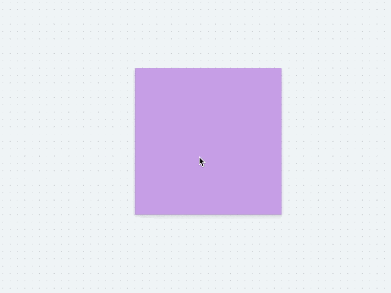
Now if we move around the canvas, we do understand the panning direction with the help of visual feedback from the grid.
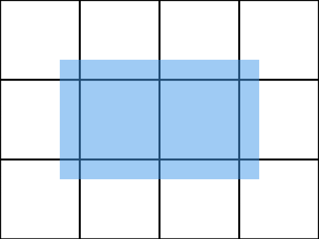
Here the rectangle’s opacity is reduced to 50% so that it does not hide the background. While panning the grid provides clear visual feedback about the direction and speed of movement even without any content on the canvas. Both grid visuals work equally good here, nothing magical.
Zoom in, zoom out
No zoom — no cry
Everything looked so tidy and elegant when we just moved around, but see what happens if we try zooming!
If we treat our canvas as an infinite sheet of paper and zoom as a distance to the sheet, then everything is ok. But notice two things:
- Line grid looks too heavy when zoomed in
- On zooming out both grids quickly lose contrast against a background becoming merely visible
In practice, the last point could become rather annoying if we don’t take it into account.
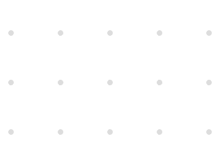
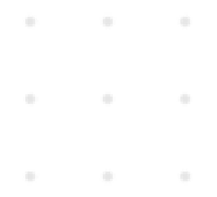
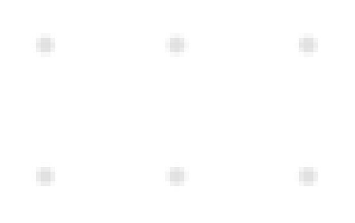
In Lucidspark dot grid looks like specks of dust on the screen.
The actual size of grid elements does matter, we cannot easily ignore it.
Let’s start with the linear grid as it does seem to scale equally bad in both directions.
What if we stop treating the lines as a part of a canvas and retain stroke size at any zoom level?
Looks better, but there is another problem, moire. When you zoom out too much, the grid is turned into a flickering mess of pixels. Not cool, right?
So before we proceed, we may need to accept the need of designing grid behavior for at least two different zoom ranges: above 100% and below 100%.
Below and beyond 100%
When zoomed in, line grids look perfectly fine if we don’t scale up the stroke.

In the same scenario, unscaled dots are nearly invisible, but if we scale them up proportionally, they become a natural indicator of the zoom level.
Now let’s try zooming out.
At some point, we’ll have to deal with moire or “dust”. We may use the following approaches for fighting visual artifacts:
- Hide/disable the grid below a certain zoom level (say, 75%, 50%, or 25% depending on the cell module size)
- Decrease grid density each time we hit a certain zoom level. Say, double the grid module at 50% (1/2), 25% (1/4), 13% (1/8), 6% (1/16) etc.
- Ignore them and pretend everything is ok. Just kidding 😆
Switching the grid off is rather straightforward, but looks quite weird leaving us with no benefits of the grid at a significant range of zoom levels.
Replacing the grid with a lower density one has a clear advantage: it provides most of the benefits of the grid at all available zoom levels.
See how the density of the grid changes while the dot size remains the same? Disabling element scaling for both dot and line grids below 100% works fine except for a few details we’ll talk about soon.
Fine-tuning
One of the trickiest parts of designing a grid is that it should be prototyped, tuned, and tested inside the actual product rather than in an artificial environment or, worse, as a set of static images. There are quite many details that are very easy to miss if you are not paying enough attention.
50 shades of grey
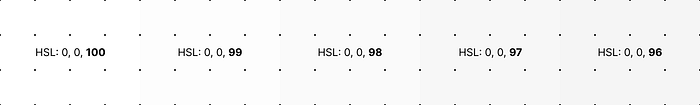
Background color. Should it be pure white, black, or anything in between?
White would likely conflict with white content on the board, and dark grey may appear “dirty” or have a very low contrast to the grid and other canvas elements…
Even adjusting lightness by just one step leads to drastic changes in the way the canvas background and the grid are perceived.
The same is true for the grid color: high contrast is accessible but annoying and low contrast grids may be merely visible even on quality displays.
Here are some example background and dot grid colors for a few popular whiteboarding apps:
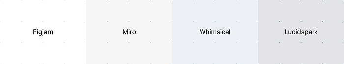
Even for an ideal static picture, a choice of colors and balancing between accessibility and looks could be trickier than it looked at the very beginning.
Grey uniformity
As if that’s not enough, keeping dot size intact while zooming out could lead to changes in the perceived lightness of the canvas due to an increased dot density.
A simulated example below demonstrates the result.
We could reduce the effect by making the lightness of the dots a function of the zoom ratio.
Miro uses this trick for lowering color flickering on zooming out.
Pixel perfection
It’s easy to optimize the visuals for the ideal case of 100% with static images, everything looks crisp and perfect. Problems start when you actually try to interact with the canvas.
At this point, we’ll need a bit of patience and a screen loupe as we’ll literally be talking about matters as large as a single pixel.
Whimsical draws crossed lines rather than true circles in order to optimize performance. Looks nice and sharp.
Figjam renders antialiased circles which also seem identical.
But if we try to zoom out a bit the beauty fades away…
We may still see individual dots, but they are somewhat blurry and don’t seem to fit the pixel grid any longer.
Now let’s take a look at Miro at 100% and 86%.
Notice anything interesting? Both grids are formed of perfectly aligned crisp dots.
But hey, how can it be?
In order to understand the trick, we’ll need a loupe and a ruler.
Let’s make a screenshot of the Miro canvas at the same 86%, and start measuring. The dots are still perfectly crisp, but what appeared to be a perfect order is in fact an optical illusion.
On this image, I painted a green square between perfectly aligned dots and a magenta one where dots are offset for a pixel. We can’t trick physics and always accurately display objects below 1 px, but we can trick the eye.
The difference between these two approaches (true rendering vs sharp image) is merely distinguishable on retina displays, but at 1x a pixel-perfect grid looks noticeably better.
Snapping in
Just works, huh
We almost forgot one of the key reasons grids are used, object snapping.
Objects are being snapped to the grid edges on creation, resizing, and moving.
Let’s see how it works…
A little bit jittery, but not bad. Especially as we get perfect dimensions as the end result. Now let’s move our object.
The product is the same, but this behavior makes it feel less responsive and more annoying. Yet at every certain moment, the rectangle is perfectly placed on the grid.
This effect becomes even more obvious if the grid’s module is large or you zoom in too much. It’s just impossible to ignore.
How do we get a perfect grid snapping without making our product feel weird?
Ghosts and grids
One possible solution is to create a “ghost” version of the object that perfectly snaps to the grid while the original can be moved freely.
The main downside of this approach is that now the ghost could be rather annoying as it adds a significant amount of flickering on small movements and adjustments.
We may try fine-tuning the ghost’s visuals, swapping the object with the ghost, introducing small animations, and conducting voodoo rituals, but the effect would not go away.
Any other options?
Divide and conquer
What if we discard the ghost entirely and instead optimize movement and resizing separately?
The object’s movement is perfectly fluid and snapping only occurs once you release it. On resizing, snapping works normally and is not perceived as slow.
The difference in grid look and feel is even more significant on high zoom levels.

Notice that at high zoom levels during the resize our grid works as a guideline rather than a forced structure?
People naturally zoom the canvas in when they want to fine-tune something, so why not build a small improvement on this habit?
It’s way faster than turning the grid snap feature on and off.
Oh snap
And what happens if we try snapping a moving object that does not perfectly with the grid?
We may:
- snap to the center or a single predefined corner
- snap to the center or the closest corner
- adjust the dimensions of the object so that it fits the grid
Adjusting the dimensions sounds like a plan only until our users really care about precise sizing. And as our grid module may change on zooming out, this “smart” behavior may become an unpleasant surprise.
Snapping to the closest corner sounds cool only until you test this behavior on a prototype only to reveal that it’s incredibly annoying.
The only option remaining is snapping to a predefined corner that, just like in all drawing apps, is the top-left one. Wanna align your stuff to a bottom-left corner? You can’t. The world is cruel… 🥹
Wrapping up
Now that you’ve learned a few tricks you may better understand the underlying complexity of a seemingly basic component of design tools you may never even thought about.
And if by this time you got questions about irregular grids, zoom level limits, or finding ways of improving snapping algorithms based on velocity, you are already on the right track and don’t need any assistance.
Thanks for reading and keep being curious.


