Member-only story
Balancing complexity and simplicity in chart design
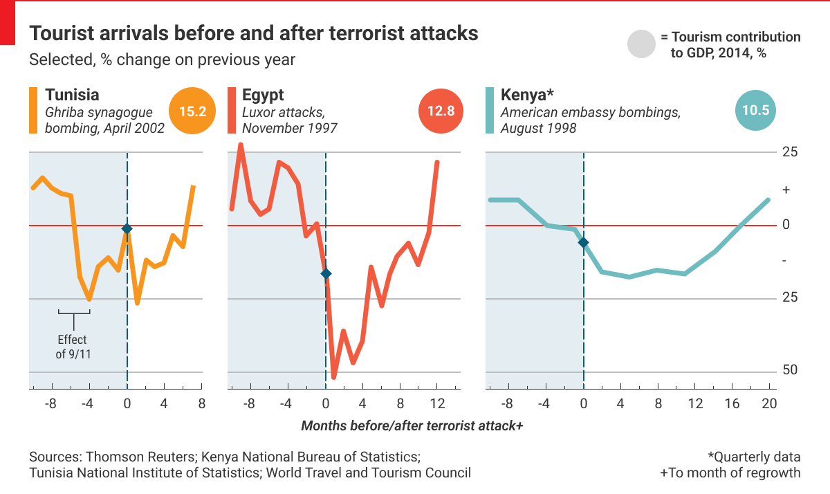
#22: The one with the simplified line chart

Balancing complexity and simplicity allows you to create a clear and concise chart while providing enough information to convey the intended message. Too much complexity in chart design makes it difficult for viewers to discern the main message, causing confusion and frustration. This might be related to the complex data, chart choice, and chart junk. The latter can make it more difficult for viewers to understand the message, making noticing patterns and trends in the data harder.
So will adding more elements to the chart always make it more complex? Not necessarily. Enriching charts with context and annotation can improve understanding of the data. Context, such as labeling axes, adding a meaningful title, and providing a comparison, can also help clarify and understand the data. Annotations can highlight specific points of interest in the chart and explain unusual data points.
Some of those elements worked in the chart created by The Economist team, and others didn’t. The primary purpose of the chart was to show the impact of the terrorist attacks on the country’s tourism. The presented data was limited to the three specific events in three countries within five years. The effect is conveyed by showing the change in tourist arrival compared to the previous year’s period. With this simple trick, the influence of seasonality is neglected. Do you see what’s working in this chart and what’s not?
Good data visualization solutions✔️
Elements that work in this chart
Splitting into separate line charts
First of all, I like the selection of the chart. Three separate line charts focus on the country’s trend rather than cross-country comparison (while still allowing it thanks to the synchronized Y-axis). It’s also a solution enabling comparing countries with different data aggregation levels. Both Tunisia and Egypt have their data on a monthly level, therefore the noticeable fluctuation. In contrast, data from…

