Baseline grids & design systems

 There has been quite some amount of design systems in my last years of work experience. My recent project set in motion the exploration of baseline grids that I naturally started to embed into all typography components within the design system. I did little-to-no-exploration on this topic as the solution to aligning typography’s baselines to a specific grid and systematising it within design system felt trivial and intuitive. And so it was, with a little bit of “math and logic” I managed to accomplish the task and set it in motion the typography’s baseline alignment to the grid through the design-to-implementation-to-testing process.
The solution I came up with was “gratifying and wonderful, yet messy and tedious at the same time — an ugly approach”, as the Smashing Magazine’s article CSS Baseline: The Good, The Bad and The Ugly from December 2012 designated it. Yes I had a gut feeling that the approach I came up with is a bit marginal and to challenge myself I finally did explorations on how to tackle the baseline grids. And I had a major relief when I stumbled across the Smashing Magazine’s article where I found a suspiciously familiar approach with familiar conclusions made, meaning that I was on somewhat on the right track?
Probably on the right track, or on the side-track, I don’t know. I have decided to write this article to sum-up my experience, creatively develop the “ugly” approach further, address this issue not only from a development perspective, but also design and testing angles, systematising it into a design system. And most importantly, I want to raise a discussion on the topic and hear your feedback.
In this story, I will cover 5 rules you need to follow to align typography baselines to the specific grid, prerequisites you need to fulfil, few words on how implementation of the component might differ from the design, how to use rem units, what are the pros and what are the cons of the approach. And of course there will be a lot of examples, specifically 4px baseline grid and 10px baseline grid examples.
Prerequisites
Before I jump to the baselines, I want to mention a few words on tool and conditions on which the story will unfold. I don’t want to dedicate many words on why one should have a baseline grid; what is a design system etc. I assume that if you got to this article, you have at least a brief understanding on the topic.
If not, well… in essence:
- Design system is a group of interacting or interrelated UI entities that form a unified whole. In the design system as a system of knowledge, complex entities are defined through simple ones — “movement from simple to complex”. Each design system starts with the simplest entities from which more complex entities and definitions are deduced, building up the system as a whole. A proper design system has a style guide at its foundation, from which colour palettes, typography, and sizing rules are defined. More complex entity definitions are based on these, e.g. buttons, text fields, links, etc. These are used in even more complex entities like forms, navigation bars, drop-downs, building up page templates.
- Baseline grid. In typography, baseline is a line upon which the text rests. Aligning baselines to a specific absolute grid establishes a vertical rhythm — a pattern that is easier for the human brain to scan, especially useful with a multiple-column content. To read more on the benefits of the baseline grid jump to the very same Smashing Magazine’s article I already mentioned, I could not explain it better than they do.
Now, a few words on the tools. The approach will be demonstrated using the Sketch tool for designing the components. The approach is not limited to this specific tool and can be scaled to any other tool you are used to work with.
Lastly — the bounding box of text components. I see that it, for some reason, brings issues for designers by bringing in extra space above and below text. They try to create different workarounds, like measuring vertical space around text instead of using the text’s bounding box or crop out the whitespaces around the text. Personally, I think that these workarounds add an extra layer of complexity and effort and will make dev-handoff and maintaining consistency between designs and implementation an absolute…“nightmare”? The way a bounding box behaves in design tools and in code has a reason: it’s derived from the line height. And that too has its own reason, which unfortunately I don’t know. There might be some logic behind it or it’s just a mere concatenation of circumstances. But trying to ignore and override these basics and principles is harmful.
This tutorial will pivot around the text bounding boxes as they are without any manipulations to these.
A philosophical thought. Practice is the criteria of truth. The design is the theory and development is the place where practice starts to manifest itself. It’s the designers, who need to adjust to rules and limitations on how products can be crafted within the code and not vice-versa. In design one can draw mostly anything, there are almost no restrictions, In development one can’t (in a reasonable amount of time and limited resources). What is the reason for designing something that can’t/won’t be built? Actually there is a reason, but let’s leave it for another philosophical article.
Building and Systematising a Baseline Grid
Ok, let’s start learning how to build a baseline grid and incorporate it into the design system. I have outlined 5 base rules you need to follow to successfully achieve the goal:
- Absolute Grid Setup;
- Height Rule;
- Line Height Rule;
- Offsetting Typography;
- Compensating Typography’s Offset.
In this story, I will be building a 4px baseline grid and 10px baseline grid and I will lead you through all the rules in detail, showcasing the examples. These rules are not limited only to the 4px or 10px grids and can be applied to any other grids: 8px, 11px, 20px, 24px etc.
1. Absolute Grid Setup
Set up an absolute grid within the design tools you are using.
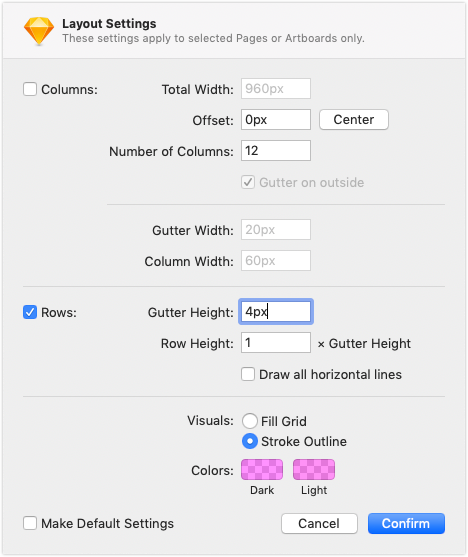
If you are using Sketch, navigate to “View\Canvas\Grid Settings” and set the grid block size to be the desired grid step - in my case it is 4. You can also use the layout’s row settings to achieve the same goal by setting gutter height to 4px and row height to 1. It doesn’t matter what to use from these both: grid or layout, they both give the same result. I will be using Layout without columns setting not to bother with horizontal grids and stroke outlines not to clutter the screen.
2. Height Rule
All user interface objects’ bounding boxes and spacings within the design system should have a height that can be divided by grid step evenly.
In my case, the heights should divide by 4 evenly as I am building a 4px baseline grid. This is a necessity in order to keep the objects’ Y coordinate on the absolute 4px grid when stacking up objects vertically in any order. You should not care about how an object actually looks, what is encapsulated within the object: what internal paddings it has, how many sub-objects there are, is it a group of objects or not etc. All you should care about is how the object externally manifests itself through its bounding box size.
This is specifically important when doing designs systems where objects can be infinitely nested in any type of hierarchy through parent-to-child relation:
- Most children don’t know their parents — specific user interface elements can be placed in any parent container;
- Parents share most of the children — multiple parent containers can nest inside instances of the same child user interface object;
- Parent elements do not always know what children user interface elements they might nest inside;
- Parent container can be simultaneously a child element; a child element can be simultaneously a parent container. Parent container containing a children user interface element can be nested in a higher parent container and be a child to that container (or even be nested inside itself — an example of recursion).
If all children user interface elements’ heights can be divided by 4 (or other grid steps) evenly, when we nest them into the parent containers solo or together with other children that follow the same rule and wrap content, then the parent’s container height will also divide by 4 evenly. And when the parent acts as a child, it fulfils the very same principle. You can also set a fixed height for the parent containers as long as fixed height divide by grid step evenly.
This also allows designer to focus and work on a specific UI object without knowing the context of where it will be used and nested. As long as its height will divide by 4 evenly it will always be aligned to an absolute 4px grid.
Example 1
For the first example I have added 4 abstract objects which heights can be divided by 4 evenly within the parent container: object A with height of 32px, object B with height of 76px, object C and object D with heights of 44px. Spacings between these objects are 16px & 32px — these also divide by 4 evenly. Total height of the parent container is equal to the sum of the heights of the content plus spacings — a 292px in total. 292 also divides by 4 evenly and it passes “2. Height Rule”. So if I nest the parent container in a higher container as a child I will fulfil the success criteria and remain on the absolute 4px grid.

Example 2
If at least one child object or spacing height will not divide by 4 evenly, it will offset the upcoming objects below from the absolute grid within the parent container. Additionally it will make the total height of the parent container not divisible by 4 evenly failing it to pass “2. Height Rule” on wrap content. And parent container used as a child will keep on passing offset higher into hierarchy.
I have changed the height of the object B from 76px to 74px. All upcoming objects after B now are offset by 2px from the absolute grid. Total height of the container now is 290px, 290 does not divide by 4 evenly, so if I stack this container in a higher container, it will offset other objects in that container and alter the parent’s height, passing the offset even higher into hierarchy.

Interesting thing to note: even though objects C and D are offset from absolute grid by 2px, they now lie on their own relative 4px grid that is a property of these two only: the spacing between C and D and their heights — all can be divided by 4 evenly.
3. Line Height Rule
Text box is user interface element which boundary box size is determined by line height. So as per “2. Height Rule”, line height should divide by grid step evenly. Font size can have any value as long as it’s smaller than or equal to the line height. Having line height divisible by grid step evenly will also make a distance between baselines of specific multi-line text also divisible by grid step evenly.
Yet due the way how the text elements are rendered within design and implementation: each line of text is placed roughly in the middle of the line height, the baselines of a single text in most cases will be off the absolute grid right onto its own relative grid.
Example 3
I have designed a “Heading” component for my design system in Sketch as a symbol. I used a “Roboto” font with medium weight, left text alignment, font size of 24px and line height of 28px. I have also set up the layout to grow vertically down from top to bottom in case when there is not enough horizontal space for text to go on multiple lines.

I have achieved the “2. Height Rule” with line height being 28. When I will stack or nest this component it will not offset the parent or other children from the absolute 4px grid. Yet within this user interface element baseline of a text is off the absolute 4px grid by 2px.
If I will put in multiple lines of text within this “Heading” component, I will see that:
- Baselines are truly on their own relative 4px grid that is off by 2px from the absolute 4px grid;
- No matter how many lines of text this element will have, the total height of the component is a value of line height multiplied by number of lines. And because the line height divides by 4 evenly, the total height of this user interface element with any amount of text lines will also divide by 4 evenly.

4. Offsetting Typography
To compensate for how text is rendered within the line height; to make the relative text’s baseline grid to match the absolute grid, the text’s baselines needs to be offset down through adding a spacing on top of the text box. The spacing to have static height and be encapsulated together with the text box as one component in a form of a top padding.
Example 4
Taking a look back to the “Heading” component I built in Example 3, I see that the baselines with their relative grid are offset by 2px from the absolute grid. So, I need to add and encapsulate 2px top padding to the component to shift the relative 4px grid onto the absolute 4px grid.

Now each and every baseline of text lay on an absolute 4px grid. Yet, by adding 2px top padding as an offset I have increased the total height of the component by 2px from 28px to 30px (with one line of text) and from 84px to 86px (on three lines of text) and have violated the “2. Height Rule” — the total height of a component with any amount of lines will not divide by 4 evenly.
If I put this element in a parent container, it will offset the upcoming children elements by 2px from the absolute grid. Total height of the parent container will not divide by 4 evenly, violating “2. Height Rule”, shifting more components and altering heights of higher containers.

5. Compensating Typography Offset
Offset to be compensated with bottom offset: bottom offset equals to grid step minus top offset. The sum of top and bottom offset should be equal to grid step. Bottom offset to be encapsulated together with the text box as one component in a form of a bottom padding.
This rule will align text components back with “2. Height Rule”.
Example 5
With the “Heading” component from the previous examples, as I am aligning its baseline to 4px grid and the top offset equals to 2px, the bottom offset to be equal to 4 - 2 = 2px. Let’s encapsulate the bottom offset as a bottom padding and see what will happen.

The baselines now sit on the absolute grid no matter how many lines of text the component will have. No matter where I will nest this component it will not push other components off the absolute grid, nor will it alter the parent’s height.

That’s basically it! Just 5 steps you need to apply to each of component within design system to have text’s baselines aligned to absolute grid.
More 4px Baseline Grid Examples
I will design a couple of more components and align them to a 4px baseline grid. Then I will stack them into single parent container to showcase how they are neatly aligns to the absolute grid within any parent container.
Example 6
Here is the design specification of “Body” component:
- Font size: 16px;
- Line height: 24px;
- Font: “Roboto”;
- Weight: medium;
- Text alignment: left;
- Text color: #000, Opacity 87%;
To put the baselines on the absolute 4px grid, I need to offset typography by 3px at the top and to make the height of the object divide by 4 evenly, I need to compensate the offset with 1px at the bottom.

Example 7
Here is the design specification of “Caption” component:
- Font size: 14px;
- Line height: 20px;
- Font: “Roboto”;
- Weight: medium;
- Text alignment: left;
- Text color: #000. Opacity 54%;
To put the baselines on the absolute 4px grid, I need to offset typography by 1px at the top and to make the height of the object divide by 4 evenly I need to compensate the offset with 3px at the bottom.

Example 8
Finally, here is the specification for a “Text Button” component:
- Height of 44px;
- Rounded corners: 2px;
- Background color: #AFAFAF;
- Button’s text label is based off the Body component from Example 6: “Roboto” font; medium weight; font size 16px; line height 24px; color: #000, opacity 87%; centre text alignment; text spans only to 1 line, truncated with ellipsis if does not fit;
- Left and right paddings: 12px;
I want the text to be centred vertically and align its baseline on the absolute 4px grid. I can use button’s top and bottom paddings to perform alignment: I have to make top padding to be 11px and bottom padding to be 9px. These paddings will align the label’s baseline on the absolute grid and will keep it in the middle of the button.
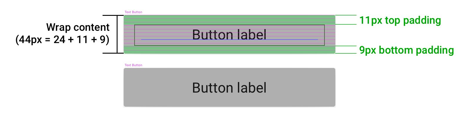
Nice!? But does anybody see the issue with this approach? The issue here is that I have delegated the role of aligning children’s baselines to the grid within the parent container to the parent. Parents should not control the offsets of the child because children might change. If I will decide to use a smaller font size with smaller line height, I will have to revisit the top and bottom paddings. Will I remember to do this? What if there are dozens of such kind of components that I will have to revisit?
The proper approach here will be to have a separate “Body” component that encapsulates the baseline alignment and use this component inside the “Text Button”. I have already designed a “Body” component in Example 6 that encapsulates the baseline alignment, so lets modify its text alignment to “Centred” and allow it to span only to one line of text with ellipsis truncation and then nest it inside the “Text Button”. To make the “Text Button” have 44px height on wrap content, I need top and bottom paddings of a “Text Button” to be 8px.
Because “Body” component already is aligned to 4px baseline grid, when it is nested in the “Text Button” that has 8px top and bottom paddings the parent’s height will divide by 4 evenly; “Text Button” paddings will not offset the “Body” component from the absolute grid as paddings fulfil “2. Height Rule”.

If I would like to make a “Text Button” based off the “Caption” component, I can just plug “Caption” component in, without making any adjustments. “Caption” component is already aligned to 4px baseline grid, and it will nest perfectly within Text Button. The button will become thinner though, from 44px to 40px on wrap content.

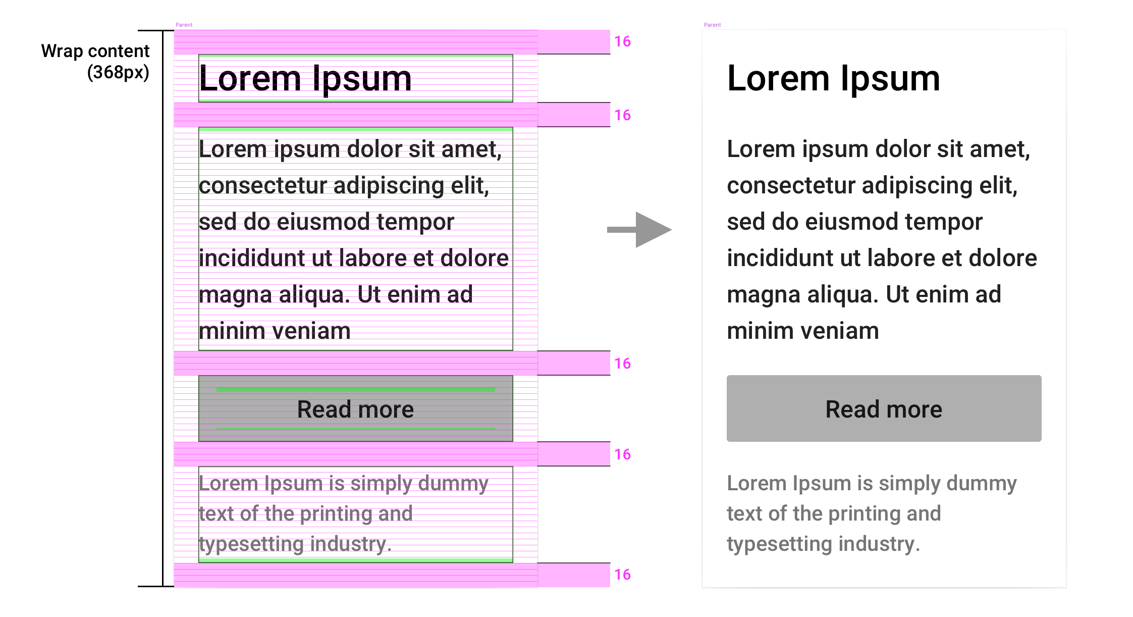
Example 9
And here is the design for the parent container that nests all designed 4px baseline aligned components: “Heading“, “Body”, “Caption” and “Text Button” with 16px vertical spacings between elements. Each element is aligned to 4px baseline grid.
10px Baseline Grid Examples
Just to enforce theory with the practice, I will align components I designed for 4px grid to 10px grid using the very same defined 5 rules.
Here, the interesting things starts to happen. The bigger the grid step is, the more baseline alignment is prominent. Yet it is harder to maintain the design system with large grid steps as you are less flexible with big grid step numbers as we will see with the examples below.
Example 10
Design specification of “Heading” component for 10px baseline grid:
- Font size: 24px;
- Line height: 30px;
- Font: “Roboto”;
- Weight: medium;
- Text alignment: left;
- Text color: #000, opacity 87%;
To put the baselines on the absolute 10px grid, I need to offset typography by 7px on top and to make the height of the component divide by 10 evenly, I need to compensate the offset with 3px at the bottom.

Example 11
Design specification of “Body” component for 10px baseline grid:
- Font size: 16px;
- Line height: 20px;
- Font: “Roboto”;
- Weight: medium;
- Text alignment: left;
- Text color: #000, opacity 87%;
To put the baselines on the absolute 10px grid, I need to offset typography by 5px on top and to make the height of the object divide by 10 evenly, I need to compensate the offset with 5px at the bottom.

Example 12
Design specification of “Caption” component for 10px baseline grid:
- Font size: 14px;
- Line height: 20px;
- Font: “Roboto”;
- Weight: medium;
- Text alignment: left;
- Text color: #000, opacity 54%;
To put the baselines on the absolute 10px grid, I need to offset typography by 5px on top and to make the height of the object divide by 10 evenly, I need to compensate the offset with 5px at the bottom.

Example 13
Remember I said in the beginning of this chapter, that with big grid steps, you are becoming less flexible? Yep, this is the example of flexibility loss. With 4px grid step you have x2.5 times more values for heights for components than with 10px grid; With grid step of 10, your minimal size for heights is 10px, unless you do a margin wizardry that I will show you on this example of “Text Button” component.
I want to build a text button with height of 40px based based off “Body” component. But I won’t be able to centre the “Body” component to 40px height vertically, not going off the 10px grid as I will fail “2. Height rule” by making paddings not divisible for 10 evenly.

If I want to keep height of 40px and not offset “Body” component off the 10px baseline grid, I will have text either too high or too low within the button.

It seems that the minimal height of the “Text Button” component I can go with to have “Body” component centred is 30px with 0px top and bottom paddings; next size that I can go with is 50px height with 10px top and bottom Button paddings. 30px is too narrow, let’s try 50px.

For me, it looks too “fat”, I still want to make this button 40px thick with centred vertically label. Surely there is nothing I can do?
Well… I can take the 40px thick button I built in the beginning and compensate top 5px padding and bottom 5px padding with 5px top margin and 5px bottom margin, all encapsulated within the “Text Button” component — that is the margin wizardry I was talking about.

I will definitely use this version of the “Text Button” component as 40px height perfectly matched 16px font size.
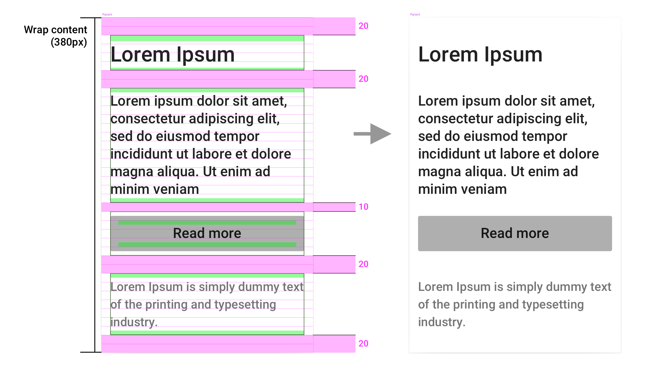
Example 14
Let’s stack up all 10px grid aligned elements into the parent container with 20px spacings between all components and 10px spacing between “Body” and “Text Button” components. Each element’s text is now aligned to 10px baseline grid.
Design & Implementation
Now the fun part begins. The way how text is rendered within the design tools and within the actual code implementation may sometimes differ. So, the offsets that I have defined for all the components above to put baselines on the absolute grid might not put the baselines of the implemented components on the very same absolute grid.
So, the rules don’t work and it was a waste of time? No, it’s not. Just simply apply the very same rules and determine the proper offsets for the implementation directly. Yes implementation offsets will be different than the ones in the designs, but you can easily track this difference within UI specification or any other documentation within your project.
The way have I used to that in my projects:
- I design components with specific offsets;
- I hand off specification to developers for implementation;
- After implementation, I manually test the component against the specification;
- If the implementation texts’ baselines are on the same grid as in designs, I pass the component forward to the QA team;
- If the implementation texts’ baselines are off the grid, I calculate new offsets specifically for the implementation and track these in the UI specification documentation. Then I return the item back into development and wait for it to be fixed.
Example 15
To showcase mismatch between design and implementation, I have designed a “Body” component that uses a “Futura” font and implemented the component in code using ReactNative.
For the designs on the right, I had to add 1px top padding and 3px bottom padding to put the typography within the component on the 4px baseline grid.
On the left is the implementation that uses the very same 1px top padding and 3px bottom padding. As a result, the implementation’s baseline is 1px higher and -1px off the absolute 4px baseline grid than in the designed component when I compare it side by side.

Basically, I need to add a post-correction to the implementation paddings: subtract 1px from bottom padding and add 1px to top padding. The result will put implementation’s baselines on the very same baseline grid as in the designs.

The implementation post-correction needs to be tracked and documented in the UI specification or any other documentation for the traceability purposes for the team members — developers, testers and other designers
The UI specification that I used to create will look like this for the “Body” component after the post-correction applied:

Developers and QA will take into account the correction; other designers will understand why the designs of the very same component use different offsets; UI specification will be the place where this difference is tracked.
“Roboto” Font based Components
Interesting thing I noted while I was preparing examples for this chapter — components that I designed before that uses “Roboto” font seem to be rendered the same for both implementation and designs, so no post-correction is needed when “Robot” font is used. I guess, the design vs. implementation mismatch largely depends on the font?


Rem and baseline grids
You can scale same principles of aligning typography to baseline grid to the rem units. All you have to do is to convert the grid step value from pixels into rem, and then use this value in across all 5 rules.
The formula of conversion grid step from pixels into rem is the following:

Where “Root size (px)” is the font size of the root element in pixels.
If the root element’s font size is 16px and the grid step is 4px, then the grid step in rem will equal 0.25. Then, if I use rems for my components, I need to make sure that line height values and heights can be divided by 0.25 evenly.
If the root element’s font size is 16px and the grid step is 10px, then the grid step in rem will equal 0.625. Then, if I use rems for my components, I need to make sure that line height values and heights can be divided by 0.625 evenly.
If I will get a number with infinite decimal expansion e.g. with grid step = 12px and root element’s font size = 18px, then the grid step in rem will equal to 0.6666… that will get approximated to 0.6667. Approximation will cause misalignment of baselines on the grid. In these cases, I suggest to set root element’s font size equal to grid step, then grid step will always equal 1 rem which will make the calculations in a little easier.
You can even go further and use rems not only for typography but for non-text sizings: paddings, margins, widths, heights etc. Then making your grid step equal to 1rem will be the best approach to go with as it will make your calculations against 5 rules easy to perform.
Multi-column content
Last thing I want to cover is the multi-column content. Two text components with different line heights will have their baselines matching the absolute grid. Yet, because they have different line heights, not all baselines will be on the same line.
“Body” component (line height 24) will match its every 5th line with “Caption” component (line height 20) every 6th line — 5/6. It’s the proportion of two line heights to the power of -1.

My observations on multi-column content is that the bigger the grid step is, the more often baselines will match within two different text components with different line heights , yet with big grid steps your designs will be less flexible which will require different workaround. Just re-visit the difficulties I stumbled “Text button” component alined to 10px baseline grid in the example 13.
Conclusion
It’s easy to align typography to any baseline grid by following 5 rules: “Absolute Grid Setup”, “Height Rule”, “Line Height Rule”, “Offsetting Typography”, “Compensating Typography’s Offset” and incorporate these rules to the principles of the design system — encapsulation of properties within the entities.
Benefits of the approach
- Design systems approach works great with systematising baseline alignment of text components. You design and implement text components once and re-use the instances of the components an infinite amount of times. If the components follow the 5 rules of aligning baselines on the grid, then no matter where you stack them, how much of these elements you stack, in what order you stack them, texts’ baselines will always be on the absolute grid.
- The localisation of the design (Sketch symbol) or implementation (Pattern Library element) in a single place means that if any changes are to be done, it should be done in the single place. Changes will automatically cascade to the instances — it’s the most important benefit of using a design system.
Downside of the approach
- Offsets depend on the font you are using. If you decide to change font, you will have to re-visit offsets. Luckily, it will be easy to perform with a design system as you will have less than 10 text components ideally.
- Some fonts are rendered differently in designs versus implementations. I have covered this in “Design & Implementation” chapter: implementations might need different offsets, so you have to double-check the implementation on QA phase and make adjustments if necessary or do the offset determination directly in the implementation.
- Having offsets embedded into text components means that you would have extra space between two text components when you stack one component under another with 0 spacing between two. And that without these offsets, you could have brought these two closer by a little fraction. Well it is true but not in all cases. If the sum of top element’s bottom padding plus bottom element’s top padding is smaller than grid step, then even without paddings you will not be able to bring them closer and keep them on the same baseline grid without colliding their boundary boxes. If the sum will equal or be greater than grid step, then yes in that case you could bring these closer. That will require you to re-visit all combinations of text components and determine between which pair of components you can abide the paddings and then somehow systematise these rules into a design system which is too much effort to do.
I guess that is it, thanks for reading this. I understand this approach is not something new and probably some of you are already using it — I just tried to summarise it for those, who didn’t knew it.
I am really keen on listening to your feedback, comments and questions. Probably you have some suggestions how to improve the approach or share you experience. So please, do that in the comments section.
Thanks for reading,
Dmitrijs.

