Basic color theory for better app, product or brand design
Help users get the most out of product with the right use of color.

Color accounts for an innumerable part of the success of any given brand. The right use of color, or the wrong use of it, could be the defining factor for whether or not users download/look over your app in the store, enjoy your app, or delete it after one use. The same also applies to product branding.
Color works in cohesion with iconography, typography, and an overall optimized UX to achieve optimal results.
Humans are creatures of emotion. Colors subconsciously evoke different emotions in people. Your brand should choose a color that best evokes the emotion desired in its target market in order to facilitate a deeper connection with the product.
Colors not only improve the visual appearance of your app, but also improve its UX by aiding in navigation.
The state of mind induced by the different colors affects how users interact with your product. This could translate to whether or not they convert into paying customers.
As such, understanding the psychology of color, in order to leverage it to best suit the purpose of your mobile application is very important.
Here is a chart with some of the most commonly used colors. They are split into 3 categories: primary, secondary and tertiary colors.

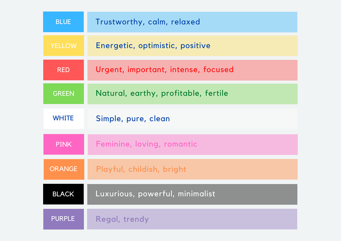
And here’s another chart with a sample of colors and the emotions affiliated with them.
The modern person uses a myriad of tech/non-tech products everyday. Here’s how some of your popular products are applying the principles of color psychology.

As you can see from the image above, the color spectrum is split almost in half. This separates the bright colors (also known as the warm colors), and the darker colors (also known as the cool colors).
You may also have noticed that e-commerce sites (think Amazon, Alibaba, Jumia), retailers, and various consumer brands tend to go with the warmer colors. This is because the colors on this end of the spectrum evoke feelings of happiness and energy, and subconsciously make the user more likely to make a purchase.
Numerous social media platforms also go with warmer colors that set a bright and cheerful mood on their platform. Think Snapchat’s yellow and Instagram’s vibrant mix of pink and yellow (evident in the logo).
Financial service firms like banks (think Barclays/ ABSA’s former branding, VISA ), and tech companies (think Twitter, LinkedIn, Facebook), more often than not go with the cooler colors. Blue is especially popular with this category of brands, as they seek to evoke the feeling of calm and trust in their user base.
On the far end of the cool spectrum is grey — black, which luxury brands absolutely love to use. Think top fashion brands like Calvin Klein, and luxury tech products like Apple.
In the early days of Uber, it was marketed as a premium black car service, hence the black and white branding that it has stuck with to date. You can check out Uber’s very first pitchdeck explaining its initial concept and value proposition.
Some colors sit right at the edge of warm and cool. One such color is green. Green is very often selected to represent brands that want to communicate a natural feel to their clientele. Agricultural brands (think farm machine manufacturer — John Deere) and organic lifestyle product brands (soaps, body oils) typically use this color.
Now, color psychology is by no means a precise science. Colors are not the only elements of good design that result in paying customers. Context, culture and numerous other factors come into play. However these are the subject matter for a whole other article.
With this in mind, how about taking another look at your app before publishing it on the store for your users to get a hold of.
Do you have an example of a mobile app whose color scheme was an excellent pick for its purpose? Do let me know in the comment section, along with any questions you may have.

