Member-only story
Experimenting with basic CSS animations

I’m a big fan of web animations, but I didn’t use them because there was no visual guide (or at least an easy way) for me to look at what I needed and then implemented. In this post, I will teach you what I consider to be the basic CSS animations you will need in your projects, also some practical examples of how they look, and more.
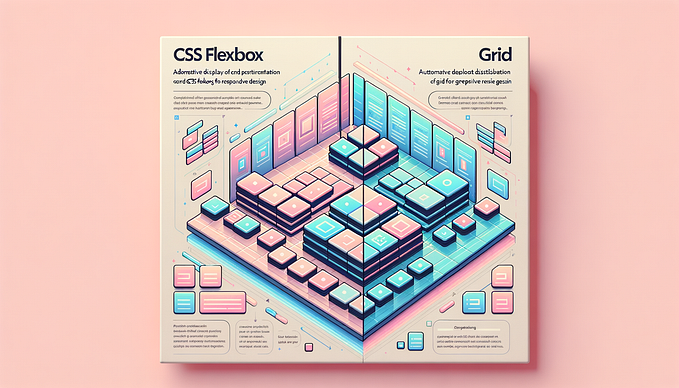
CSS Animations
According to w3schools
“An animation lets an element gradually change from one style to another.”
I know this might seems basic, but there is a difference between transition/transform and animation in CSS, according to hubspot
“CSS transitions are generally best for simple from-to movements, while CSS animations are for more complex series of movements. Before you can add either of these effects to your site, you need to consider which will do what you want.”
In this post we will be working with both of them, so don’t worry if most of these concepts don’t resonate with you.
The animation maker: “@keyframes“
Our friends in w3chool define this as “When you specify CSS styles inside the “@keyframes” rule, the animation will gradually change from the current style to the new style at certain times.”. So in this case I will name them the magic property that allows the user to create an animation (you will also need to name the animation here, but patience).
One example of how this might looks is this:
@keyframes example {
from {background-color: red;}
to {background-color: yellow;}
}
Which we are only specifying from which state we want to change the background-color to a brand new color. There are other ways of doing so. What I use most of the times is %, like:
@keyframes example {
0% {background-color: red;}
50% {background-color: yellow;}
100% {background-color: blue;}
}
Also, I add some other properties like movement or something else.


