Basic usability, basically missed
Overlooking basic usability industry standards can affect interaction costs, even for big businesses.

A deep understanding of one’s users, what their workflow is, what their problems really are and how they are using your product is key to creating successful products. Because what might work for one product, may not work for another? Right? So using research to obtain these insights is always necessary? Right?
Well what happens when there are basic industry standards that get overlooked?
The argument is that with the age of the internet, more and more people are getting used to using websites, and the need for old industry standards become obsolete. But not everyone is at that stage. There can be ‘rule of thumb’ principles for basic usability that will always help users interact with products. Either based on psychology, past research, or both.
User behaviour and usability heuristics, on the whole, don’t change much. Especially for elements of the web that are still around; links, navigation, information architecture, calls to action, the list goes on.
In this article, I have chosen to look at Money Supermarket. There are many great things about this site, this study is merely meant to provide insight into how even big companies can overlook very simple usability practices. Whether they seem arbitrary or obvious, these little changes can reduce cognitive load on users. Although mistakes can be found in most websites/there always being room for improvement, the very basic of usability standards should be evident in every design.
The notion is that these usability standards can be implemented without radical redesigns to ensure a more consistent, easier to understand interface. Theoretically leading to a more satisfying user experience.
Elements I have chosen to look at:
- Navigation Inconsistency
- Structure Inconsistency
- Returning Home
- Signing in/Retrieving quotes
- Letting the User Know Where They Are
- Removal of the Hamburger Menu
- Using Blue for Non-link Text
- Repetitive Links
Information Architecture Issues
Inconsistency
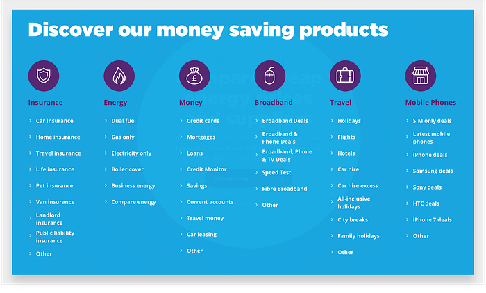
Money Supermarkets global navigation changes so much throughout the website, it’s almost inconsistent from page to page. You can see some examples of all the different navigation options I came across while browsing through the website, there may be more!
Navigation exists to help users, not to be a puzzle in its own right. Users should be able to understand it immediately, and apply that understanding throughout the site. Sadly, lots of sites change their navigation features as users move around. Options come and go, making users feel a loss of control. How do I get that menu choice back? I saw it just a few pages ago.

The inconsistency creates a high interaction cost. The thought required to try and navigate around increases cognitive load. A user has to think about where the previous menu choices have gone, and where they can now be found.

Minimize the user’s memory load by making objects, actions, and options visible. The user should not have to remember information from one part of the dialogue to another.
If a user lands on any of these given pages through a link, or internally, it proves very difficult to recognise where you now are, or how to get around.
Recommended Fix
- Make the navigation consistent throughout the website
Structure
So the global navigation is inconsistent, that’s all it affects right? Well no. The inconsistency in the global navigation causes inconsistency within the structure. It appears the navigation is a mixture of old and new navbars. On the homepage, we are met with the categories and what’s within them. The structure quickly switches depending on what navigation you’re dealing with.

The changes in global navigation mean the user is met with contradictory information and its order throughout the site. The first example may seem minor, borderline pedantic, all these little things add up affecting a sites information architecture.
It opens the door for users to miss finding this feature if they are on either the broadband or mobile navigational menus. There’s really no need for it not to be included on every page, in the right place.
More confusing structure comes in the order of the menu items under the hamburger menu.
All the navigation has vanished into the abyss of the hamburger menu. Adding to that you are met with a completely different order to the information displayed on the home page. Money has now dropped to 3rd, with Travel coming in at 5th, if I knew more about sport there could be a good joke in there. However, the point remains the same, inconsistent navigation is harmful.
Recommended Fix
- Make sure all links within global navigation consistent in their order
- Don’t remove links from the menu between pages
Returning Home
There are two ways to present links to homepage: implicit, through logos, and explicit, through a link labelled Home or similar. You should use both these types of links.
Because of their dependency on search engines, most users enter websites through an interior page and bypass the homepage entirely. Explicit links to access the homepage provides a new starting point for those who are on the wrong page or want to explore what the site is generally about (what landing pages are good for).

In the example above you can see where the site does apply an explicit link to return home. This only appears in the form of a breadcrumb trail. Which is a perfect way to navigate home, but these are not found on every page. It can often be more frustrating to have a useful usable feature on some pages, but not on others where it is also applicable. Having familiarised themselves with the option to get home on one page, removing it on the next increases interaction cost, users will look for it.
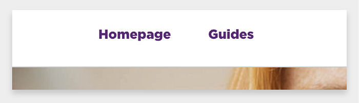
The image above is a perfect example of a conflicting mental model of how a homepage link should behave, and how it actually behaves.
The homepage link here is not for the homepage of the main website at all, it’s for the homepage of the ‘guides’. A way to navigate back to the homepage of guides is fine in itself, perhaps often users will wish to return to this page, but using the global navigation for getting back to this point, along with the language used, just completely conflicts with any mental model of what a homepage link is designed to do. In this case, it would be best to use a submenu, or make the design more obvious it’s a sub-site, or transferring these options into a breadcrumb trail and changing the language used.
Recommended Fix
- Provide an explicit link to return home on every page, whether through the global navigation or breadcrumbs.
Sign In Button/Retrieve Quotes
A user’s understanding of an icon is based on previous experience. Due to the absence of a standard usage for most icons, text labels are necessary to communicate the meaning and reduce ambiguity.

The homepages navigation shows just an avatar icon. Accompanying text does indeed present itself on some, if not most of other navigational menu’s. However, going from page to page and to understand what that icon is for is counter-intuitive. Not to mention no one is probably doing that. I would have this clarified through data/user testing, but I would make an educated guess most users who will be using the website to log in and view their profile/retrieve quotes will be coming in via the homepage. So the easier it is made for the user to complete this task on the homepage, the better.

There’s a lot of debate about whether icons make effective labels, even with text. Even when users are using the icons multiple times a day to complete tasks, the text should only be removed once a user fully knows its context. Generally, icons can be equivocal at the best of times.
If the icon is there to serve a visual aid, place it before the text so that the icon is scanned first. The users who may recognise it without the text then won’t be forced to read first.
The copy could be made more clear — why would a user need to sign in? Retrieve a quote? See their account? Are users finding it hard to locate account details? Retrieve quotes? Both? Previous research can tell us that text is critical for recognising ambiguous icons, but what that supportive text would be, I would subject to more testing/data.
Recommended Fix
- Always use text to support ambiguous icons.
- Don’t force the user to navigate the site to gain meaning of ambiguous icons
- Display the icon before the text to support scanning.
- Use good copy to match users mental model of why they should access their profiles.
Letting the User Know Where They Are
Navigation should not only show where you can go but also where you are now.
This helps both users who navigate internally and those who have landed on any given page through a different source (ads, searches, etc.). With websites with lots of information, knowing where you are is always helpful.
Make it easy for visitors to identify where they are and the page topic at a glance. This can be achieved by changing appearance in navigation, or being reinforced by breadcrumbs and headings.
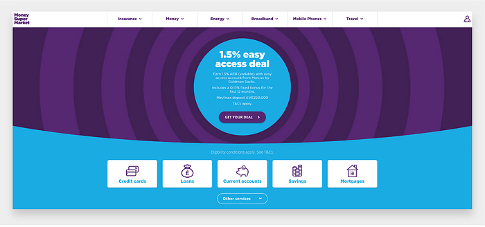
In the picture above, there are no navigational indications to suggest what page you’re on or even a title to scan to make sure it’s the right page. The only information clues you can gather is by the icons further down the page, or by reading the text, giving the users quite a lot to do, not quickly worked out within a glance.
There are almost no visual clues to help users clarify what page they are on when they reach the lower breakpoint.
Users need to know they’re on the right information scent. Where navigational changes can’t be shown (lower breakpoints) use breadcrumbs and headings to reinforce navigation signalling.
Recommended Fix
- Highlight where users are within the website by changing the appearance of the navigation
- Use titles to improve scanning on all breakpoints
- Use breadcrumbs for when global navigation can’t be highlighted
Removal of the Hamburger Menu
Uncovering navigation shouldn’t be a major task: Make it permanently visible on the page. Small children like minesweeping (passing the mouse around the screen to see what’s hidden), but teenagers don’t like it, and adults hate it.

Sometimes this can’t be avoided, for instance, on mobile. However, there is no reasoning for putting navigation behind a hamburger menu on a desktop. Adding to the inconsistency issues touched upon before, the hiding of the navigation adds to these woes.
Recommended Fix
- Don’t hide navigation
- Don’t use hamburgers on desktops (maybe all platforms?)
Using Blue for Non-link Text
Having non-link text the same colour as clickable links will always cause confusion. If you teach users that your clickable content is confirmed by certain signifiers, a user will expect other elements with the same signifiers to behave the same way.
Don’t use blue for non-link text, even if you don’t use blue as your link color. Blue is still the color with the strongest perceived affordance of clickability.
Money Supermarket use of blue for non-link text it starts to create confusion for what the websites clickable contents is.

An example of this confusion can be seen above. ‘Compare deals by using our price comparison tool’ which wouldn’t be out of place as a call to action. Even though the text’s proximity may not suggest to an experienced user that it’s not a link, using blue appears will appear as a signifier to most.
Recommended Fix
- Avoid using the blue colour text completely for anything that isn’t clickable.
Repetitive Links
Repetitive clicks that force people to select what they want again and again aggravate users and require them to spend unnecessary effort. On the landing page, a user is met with a primary call to action (which it’s lack of contrast to its background make it quite a poor signifier).
The mental model of the buttons function is that the reaction matches the primary call to actions copy, ‘getting a new quote’. Instead of this users are met with added length by the middle stage in the user journey. A new page with the almost identical copy, and the option to ‘get a new quote’. This isn’t a case of reducing clicks, it’s a case of reducing unnecessary clicks, a more direct path should be created.

In the image above I have shown the current user journey with orange lines, with the proposed user journey in green. The added step on the orange path doesn’t add any more persuasive copy or additional information to the primary call to action, nor does it match the mental model of what the task the button should be performing.
I can’t imagine many users selecting to get a new quote after that offer will want to be met with the same offer and instructions on how to acquire it.
Recommended Fix
- Don’t make users repeat unnecessary actions to complete a task.
Hopefully, this article will bring some consideration on how all these little things influence the overall user experience. The basic heuristic principles are there to be used to one’s own advantage in design.
Thanks for reading! (If you did manage to get through it all that is)
P.S. Apologies if the Skeletor illustration never made any sense. This might clear it up.

