Baskerville typeface specimen — a UI case study

 As designers, we are acutely aware of how large a role our chosen typefaces play in conveying a brand’s character. Fonts carry with them an emotional impact and expressive quality. Readability enhances a user’s experience. And research suggests that 95% of a website’s design is typography.
The Project
And so, when I was asked to participate in a recent one-week design challenge, in which the goal was to create a prototype landing page showcasing a randomly picked font, I was looking forward to the journey ahead.
And the typeface I was handed; the incredible Baskerville.
Baskerville — A Quick History
Baskerville is a Transitional typeface, meaning it is a refinement of the Old-style typefaces that preceded it. It is named after its creator, John Baskerville (1706–1775), who designed it in the 1750s as part of an ambitious project to create books of the highest possible quality.
Moreover, Baskerville took a radical approach in which much of his designs recalled aspects of his own handwriting. And, compared to other typefaces popular during the period, Baskerville also increased the contrast between thick and thin strokes, made the serifs of his characters sharper and more tapered, and defined curved strokes as more circular in shape.

Baskerville first used his typeface in a printed edition of Virgil’s epic Aeneid in 1757, which was then followed by other classics, including an edition of John Milton’s Paradise Lost, wherein Baskerville wrote a preface explaining his ambitions.
Having been an early admirer of the beauty of letters, I became insensibly desirous of contributing to the perfection of them. I formed to myself ideas of greater accuracy than had yet appeared, and had endeavoured to produce a set of types according to what I conceived to be their true proportion.
— John Baskerville, preface to Milton’s “Paradise Lost” (1758).
Even today, Baskerville remains a truly excellent typeface for book design. Its sharp, high-contrast forms make it highly legible — and it is considered to be a true representation of eighteenth-century rationalism and neoclassicism.
Design Process
The Why — Design Inception
In beginning my design process, I first defined my Why. This was born through consideration of Baskerville and the interesting duality it seemed to exhibit.

Conducting my research and delving deeper into its forms, Baskerville’s most obvious characteristics were that it was confident, resilient, and timeless — all qualities likely demonstrated in the fact that it is a refinement of Old-style designs.
However, where many of Baskerville’s characters were clean, defined, and stoic, others were flourishing and elegant; a personality exemplified in its uppercase “Q” with beautiful flowing swash, as well as the typeface’s iconic ampersand.
…And as I thought more I also discerned an intellectual, sophisticated, and mysterious quality to Baskerville, again shown in the subtle details of some of its characters, lending to an evocative sense of smokiness and a strange intensity.
Mood & Visual Language
With Baskerville inspiring these various (and sometimes competing) concepts, I began to think about the visual language for my design, along with iterating on various mood boards.
Ultimately, I really wanted to capture the essence of duality in what I felt was Baskerville. And I didn’t want to create something too traditional or predictable either, or anything that simply showed that Baskerville was “old” (during my research, I saw too many existing type specimens for Baskerville that followed this direction).
For myself, Baskerville felt neither traditional nor old. But it was timeless.
—
Colour: For my colour palette, I wanted to represent Baskerville’s duality of character with grey and cream tones set against deep and dreamy pinks and blues — an analogous colour palette set against a monochromatic one.
The depth of these colours also aimed to emphasize my Why’s motif of sophistication, and the juxtaposition of bold colour against monochrome aimed to embody Baskerville’s confident personality.
Further to this, as I experimented with these colours, I found that their dream-like qualities resonated with a sense of mystery and brooding character. Perfect for what I was trying to achieve through my Why.
- Keywords: Deep, dreamy, analogous, monochromatic, mysterious.

—
Space & Shape: John Baskerville was a self-professed perfectionist, with the forms and construction of his typeface meticulously crafted. So my design needed to show that level of precision, measured detail, and (similar to colour) depth.
That being said, as the characters themselves took occasional inspiration from John Baskerville’s own handwriting, the man was not opposed to adding a natural, flowing quality to his work.
Baskerville’s use of space, as well as its carefully considered forms, are what really makes it feel elegant, sophisticated, and intellectual.
Furthermore, since Baskerville is an incredibly readable font, openness would be another important aspect to convey.
- Keywords: Open, precise, measured, defined, elegant, natural, flourishing.
—
Movement: Similar to its use of space and shape, Baskerville is full of constant movement due to the fact that it is a legible and readable typeface.
And to add to this, with it being occasionally punctuated by its use of flourishes and swashes, there is a feeling of rhythmic progression and interest not shown in other typefaces.
- Keywords: Flowing, progressive, constant.
—
And so below is the final iteration of my mood board design:
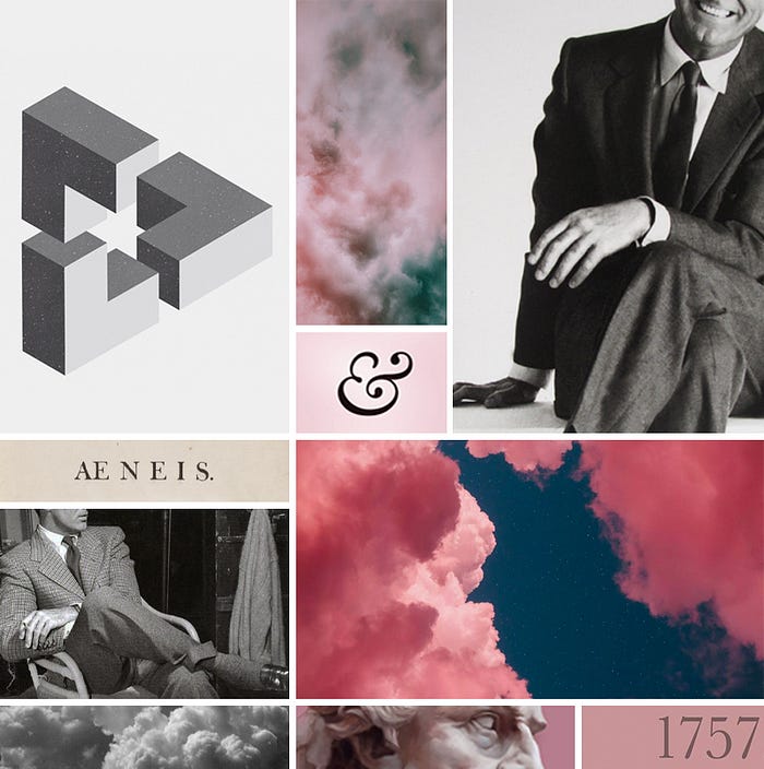
This mood board captures my deep, dreamy colour palette, and aims at expressing my visual language to further evoke feelings relating to my Why:
- First, the photographs of the gentlemen here show Cary Grant — an individual who, as I researched and began to think more on Baskerville and who it would be if it were a person, seemed to be a fun fit. Grant, amongst many things, represents the confidence and sophistication of Baskerville, but framing the photographs so that they cut off below his eyes adds to the sense of mystery.
- In the top left, the MC Escher-like “impossible geometry” further brings this feeling of sophistication and intellectualism, but also of measured rationalism juxtaposed with mysteriousness; again, the interesting duality of Baskerville.
- Which in turn leads into the depictions of the clouds and smoke. Here, they explore that mysterious and brooding, yet elegant and flourishing, quality within Baskerville.
Mid-Fidelity and Structural Design
As part of this design challenge, it was required that the final type specimen be made in Adobe Photoshop, which in itself provided some unique challenges (more on that later).
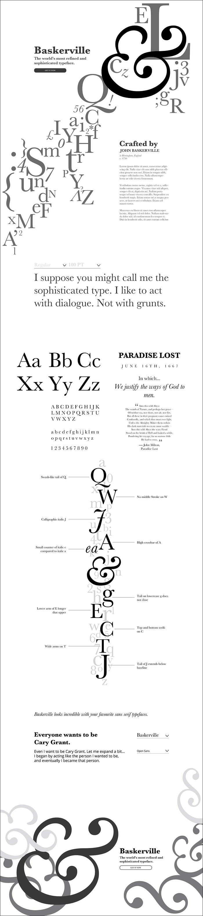
Shown here is my final mid-fi design. I wanted to get as close to my final proportions and layout as possible before adding any colour, something I felt was important in respect to John Baskerville’s perfectionism (and a quality of his I believe I share).
Around 80–90% of the elements are perfectly aligned to the 12 column grid that is typical of modern webpages, which also allowed the design to feel open with room to breathe.
The element that most notably breaks this rigid and defined structure is the large diagonal letter river that flows through the first part of the design. This is perhaps one of my favourite parts of the landing page (even more so once colour was added). It adds a sense of confidence and movement while beautifully demonstrating many of Baskerville’s characters, and its complexity really adds to the sophisticated feeling I was working to evoke.
Continuing on, the landing page would then give visitors the opportunity to test Baskerville in various weights and point sizes (using a quote belonging to Cary Grant). And in the section beneath this, we see examples of all of Baskerville’s alphanumeric characters accompanied by a faux mock-up of Paradise Lost — the intent here being to imitate Baskerville’s use in high-quality book design.
The middle portion of my landing page is then dominated by another vertical letter river, again that breaks my otherwise rigid grid, which showcases some of the key characteristics and subtle elements of Baskerville’s most unique characters. And to continue experimenting with a sense of depth, this section is also backed by a collection of characters at a reduced opacity.
The last section I wished to include in my landing page was the opportunity for visitors to see Baskerville paired with modern, sans serif fonts. I included another cheeky, yet not so subtle, nod to Cary Grant here. No one said Baskerville wasn’t allowed a sense of humour!
Final Hi-Fidelity Design & Prototype
Moving on from my mid-fi, I began the process of experimenting with the chosen colours from my visual language. To represent Baskerville’s sense of consistent progression, I also wanted to use a lot of gradients. For which I will not apologize!

And so here it is, the pay-off! Not only do I love a good gradient, but playing with these against the rigid structure I had created really added to the duality and juxtaposition I was aiming to achieve.
For the background of the design, my gradient becomes deeper, darker, and broodier, as if we are descending into a strange dream-filled sleep.
And to further reinforce this, my letter rivers, along with the alphanumeric/Paradise Lost section, both use gradients to capture the mysterious, yet sophisticated, air I was going for.
—
Another element that stands out in my final design is the focus on Baskerville’s big, beautiful, italic ampersand. This character is quite obviously a pleasure to look at in its own right, so I sought to use it to my advantage in my design.
Utilizing this ampersand as a decorative aspect — to guide the eye, add visual flair, or frame certain sections — proved to be quite powerful.
—
I created the isometric shapes in Adobe Illustrator, inspired by the work of Daily Minimal. I believe they do an excellent job of conveying Baskerville’s sense of intellectualism, sophistication, and mystery. Moreover, their precise geometry also further helps reinforce the theme of perfectionism that had begun to manifest in my design.
—
A final decorative element you may notice are the various floating diamonds. These essentially came about by accident with little forethought (something that, when it happens during the design process, I truly love and find exciting).
Scattered throughout the beginning and end sections of my landing page, playing with the size and opacity of these diamonds also helped add depth, elegance, and mystery to the design.
I have included the hi-fi prototype again at the end of this case study in full-width, so that you may experience it how it is truly intended.
Conclusion
As mentioned earlier, I was excited to start on this project from the outset. It was great getting to portray and experiment with a typeface in this way — very meta, in other words, but I think that in itself really lent well to Baskerville and the direction I chose to go.
I will most likely go through this exercise again for my own satisfaction; choosing a different font and searching for an exciting way to represent it.
I certainly feel that I was able to bring much of my own aesthetic to this project too, while still remaining true to my Why and the spirit of Baskerville. And I found my only real challenge during the process was dealing with the huge amount of text layers in Adobe Photoshop. As is known, Photoshop is not the most friendly nor the most optimized application for dealing with text! But whatever, it worked out in the end, s’all good!
Future Considerations
I do have a few elements I would like to refine in this design, should I wish to add that final coat of polish.
- Font colours/sizing: The body text that gives an overview of Baskerville’s history could do with some property tweaking to make it a bit more legible against the background gradient.
- Headings: I may wish to experiment with headings to give more context to the various sections of the design, rather than leaving it in its current, more abstract, state.
Enjoy the full-width prototype below, and I would love to hear your thoughts! Thanks for reading.

