Becoming a better designer through prototyping
In order to level up your design chops, you need to focus on the interaction design. And you can achieve this through prototyping.
It’s all too common: you’ve spent countless hours ideating and designing something theoretical that ends up completely missing the mark in production. The truth is that it’s easy to get bogged down over the perfect snapshot of a product. But in order to level up your design chops, you need to focus on the interaction design. And you can achieve this through prototyping.
Prototyping is an iterative process that allows you to evaluate and test your designs. Over the past few years, I’ve created prototypes for every occasion and in every level of detail. Looking back on my process, this is what I’ve found:
- Prototypes provide me with incredibly rich feedback
- They help me articulate my ideas and concepts to stakeholders
- They save my business money and time
- They make me a better and more thoughtful UX designer and storyteller
In this article, I’m going to walk you through how to choose the right prototyping tool, introduce tips and tricks to make your prototypes feel real, as well as provide you with considerations to make before prototyping, so you can truly take your design to the next level.
Finding the right tools: How to evaluate what’s out there
When it comes to comparing prototyping tools, there’s often a paradox of choice: many tools offer comparable features and pricing, which leads to more confusion. My personal preference is Flinto, which I use for the majority of my prototypes because of the speed and detail within the program. But it’s important to stay flexible: in certain cases, I’ll jump into a code editor and whip up some HTML/CSS/JS to do the job.
Ultimately, you want to select the tool that’s going to make your job easiest and most efficient to accomplish. Keep in mind that this tool can change depending on the project, the team, and your needs. Take the following things into consideration when evaluating which tool is best for you:
Detail and customization
Choose a tool that supports building custom transitions and multiple gestures so you have the option to be as granular as the project calls for.
Determine the learning curve
The last thing you want is to have to learn a completely new tool on top of actually doing the design. For that reason, I would recommend that you choose a tool with a gentle learning curve. You want whichever tool you pick to enable your process and allow you to focus on your time and ideas, not on learning the software itself.
Team alignment
Using the same tools as your colleagues is highly recommended. Just as you may share Sketch or Illustrator design files, you can pass along your prototypes, repurpose assets, and dive deeper into how someone built out specific interactions.
While there are other factors to consider (i.e. ease of sharing and code output), the above are a great jump-off point as you decide which prototyping tool to proceed with. Remember: it’s not about the tool, but rather what the tool enables you to create.
Beyond design fidelity: How to make your prototypes feel like the real thing
There are a handful of techniques you can use while prototyping to make them feel like the real deal. Why is this important? If a prototype feels real, the feedback you receive will be more constructive and you’ll be able to iterate more effectively before passing along to your development team.
The typical rule of thumb is that the higher your design fidelity, the better. And while design fidelity is important, the fidelity of interaction can translate to how usable your product is. The way that you can make all of your prototypes stand out is by considering the entire user experience with the following principles:
Element states
These include focus, active, and hover. For some reason, many designers omit these — even though they are essential parts of the interaction design.
If you’ve ever conducted a user testing session and had your subject express confusion as to where they were supposed to click or navigate, that is a result of not including element states in your design.
As a best practice, you’ll want to start out by building your component states. This will help inform the user on what they can interact with as well as provide you with richer feedback.
Hover is an important gesture to consider for desktop products. Hover effects help indicate or put emphasis on an action the user is about to take. Let’s take the trash can as an example:
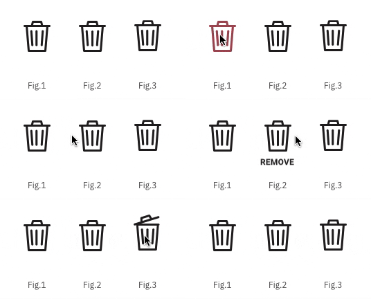
- Figure 1 changes the color of the trash can to red, indicating this could be a dangerous action
- Figure 2 includes a tooltip to indicate the action that will be performed
- Figure 3 is more playful and uses the icon itself to illustrate the action you are about to take
While these are micro-interactions, establishing a consistent hover effect will leave your users with a predictable experience and interaction pattern.
Press/Click/Tap gestures are important because they provide visual feedback on the action you just took. If users don’t observe a state change when they tap, they can feel confused about the relationship between their action and the response. This is especially important on mobile since hover isn’t an option, and on a desktop, this could trigger an active state. Consider this (albeit exaggerated) example:
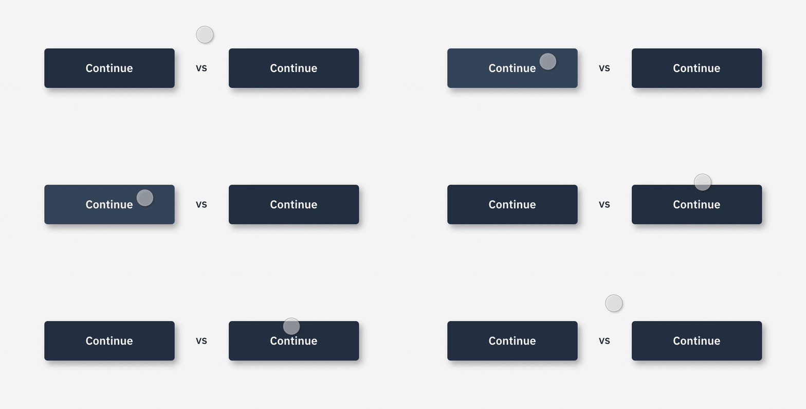
Eliminate confusion for the user by clearly indicating that an action has been taken.
In addition to tap, add in Swipe Gestures to move from one screen to another. Because of the omnipresence of operating systems like iOS and Android, the swipe gesture is a familiar navigation pattern and is an expectation that users now have when interacting with mobile UI.

Transitions, transitions, transitions
How are you going from here to there? First and foremost, be informative and intentional when transitioning from page to page. By using motion to add and remove elements from the stage, you can help establish context, while relying on fixed elements to anchor the UI.

- Figure 1: Push-Left. An out-of-the-box segue in iOS that slides screens over each other. This option is common in many software kits but can be jarring for users when transitioning between simple layout differences
- Figure 2: No Transition. A straight cut to the next screen can be helpful if there are minimal elements changing
- Figure 3: Custom Transition. This can soften the cut between screens and inform the user of what information will change
Let users explore
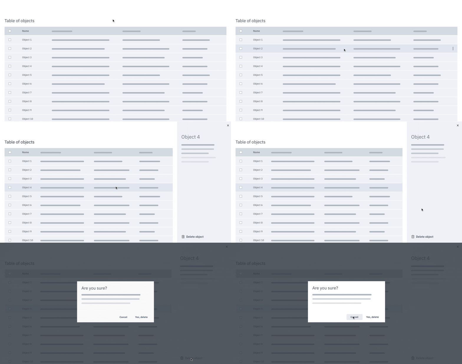
Nothing feels more real than letting a user have control over the domain. And sometimes that means having to let them explore and stray off the path (a little). This is a great way to see how users naturally navigate and learn how to use your application.
You can successfully achieve this by providing a few different methods of performing the same action to determine which course should be primary. Consider this Table of Contents use case:


Meeting user expectations (…or not)
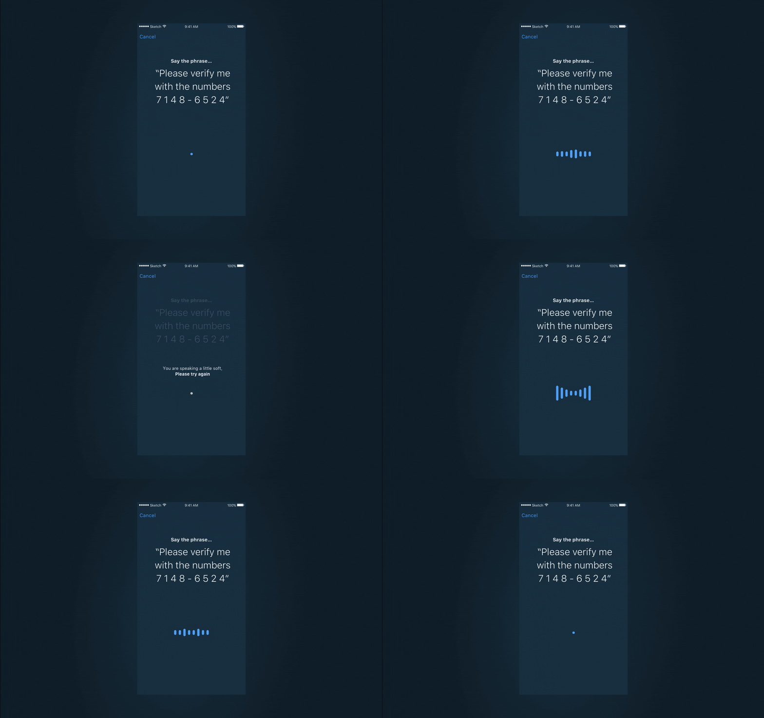
Downloading, uploading, or needing long search queries? Add a timed screen with an animated gif to set the expectation that this action has created a delay. When a user experiences an error in the middle of your flow, this is an opportunity to course correct. Systems aren’t perfect and it’s better to understand how you can help a user succeed rather than only providing happy paths in your prototypes. Ask yourself, how can the product fail elegantly?
A good example of this is voice verification. While prototyping, I purposely put in an error message letting the user know that what they said was too soft. From this, I was able to gauge the users’ reaction to the system not performing at its peak and adjust messages and actions to set them up for success.
View on your intended medium
Building a mobile app? Mirror your prototypes to a physical device. The intended medium for your designs comes with its own set of things to keep an eye out for. If they’re not properly tested, you could be missing out on data that can help you improve the experience. Mobile phones are a great example: testing on a physical device can show you the ergonomics of the UX (i.e. if a user has to stretch to click a button).
Get creative and get real
Push the tool you use. Take advantage of video support and create animated GIFs or screen captures to help simulate the UI.
A prototype that fakes a user into believing it’s the real thing leaves a lasting impression. And we know there’s no better treat than a trick :)
Before you build: Scope what you need to make, based on your audience
Now that you’ve got the toolset and know the best practices to make your prototypes, it’s time to consider your audience. Ask yourself: Is this prototype for a presentation, hand-off, or user testing? It’s important to remember that what you make doesn’t need to address everyone.

Beyond alignment with your team, to better scope what you need to create, consider these scenarios in which you are:
Presenting your prototype over video conference software.
Most video conferencing software has a little lag while screen sharing, and while frame rates vary per conference, you can assume that a good portion of your motion will skip or be lost.

Sharing with development.
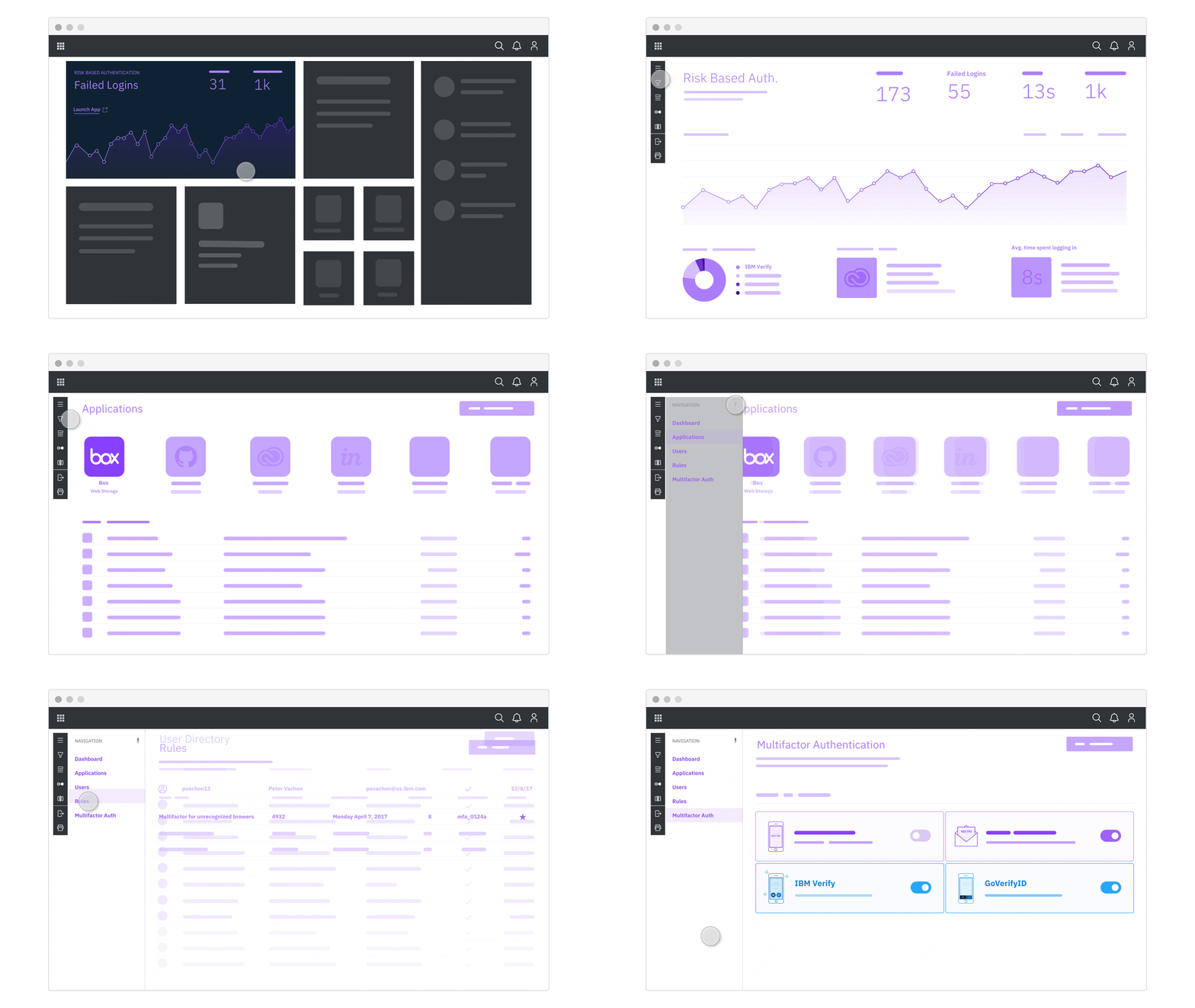
If you are providing prototypes to convey interaction patterns to your development team, keep them as smaller vignettes. Pro tip: Try and extract actual values of the motion, like duration, delay, curve, etc. In order to string all the vignettes together, I like to provide an IA diagram or high-level map of the experience as a quick reference guide (see below).

By simply communicating the intent of the screen and user action, you can allow your devs to hyper-focus on the details of motion while understanding the context of where it will be implemented.
User-testing.
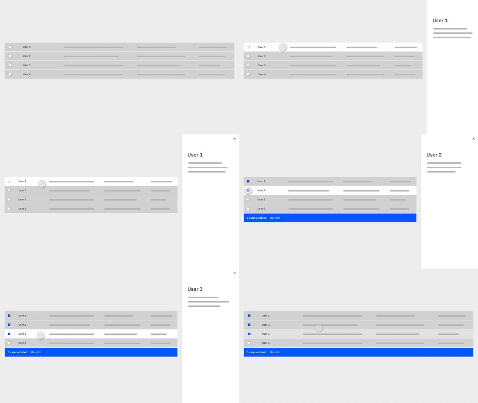
This is when you want your prototype to feel as close to real as possible. Within your prototype, allow actions to be out of sequence and provide users with multiple paths if they’re accessible. Don’t force users down a happy path; rather, learn from their interaction.
If you’re user testing remotely, make sure your prototype uses a program that allows for easy sharing. InVision is a great candidate for this use case because of it’s robust sharing capability. While it doesn’t support the level of customization you may want in your transitions, you can easily create basic element states and links between screens to get users to move through your prototype.
Key Takeaways
- Don’t get bogged down choosing a tool. Prototype with whatever tool gets the job done, and don’t be afraid to invest in a quality tool
- Make your prototypes feel real by adding a little bit of finesse
- Prototypes are one of the best resources for your extended team (i.e. stakeholders, development, research, etc.)
- By forcing you to consider the entire design process, prototyping will make you a more thoughtful designer

