Becoming a Figma ninja with base components
Base components allow you to work faster, more consistently and reduce time spent updating existing designs 💪
In this article you’ll learn 3️⃣ things:
- What Base components are.
- The pros and cons of using them.
- When use and not use base components.

Component libraries are getting ever more complex, with ever simple digital products requiring dozens of components and hundreds of variants.
As a designer, I’ve worked in teams of all shapes and sizes, from small startups where I was the first designer to big organisations where I was one of 100’s.
Especially on small teams, I’ve struggled to find the balance between maintaining a complete, well-functioning component system while keeping maintenance time low.
If you are facing a similar situation, you might want to give Base components a try.
What are base components?
As the name suggests, base components are special structural elements that serve as the base of other components (eg. a button) and are used to build all different variants (eg. enabled, disabled, hover…) through overrides.
Building variants through overrides, not by creating a whole new component makes these variants faster to build, increases consistency and, most importantly, reduces maintenance time in the long term.
Base components are best used to create elements with lots of variants (eg. Input fields, Buttons, Tables, Cards…)
Here is an example:
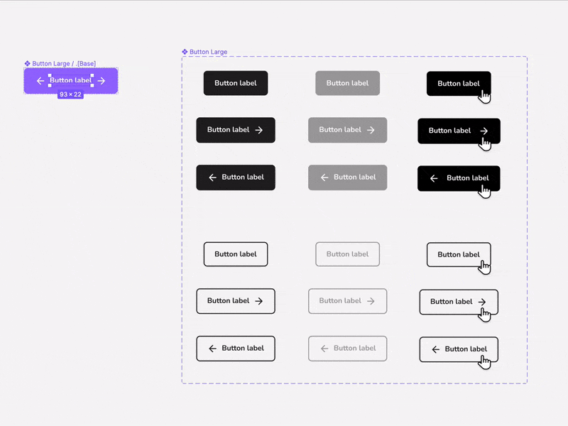
As you can see above, all button instances are created by nesting an instance of the Base components and overriding the necessary properties. The designer can now control the colour, shape, font and spacing of all button instances from the base component, with changes automatically rippling through to all variants 🥳
📝 Quick note: A Base component is never used directly in the UI, rather it’s used as the structure to build all other variants.
🌟 Quick tip: when using Figma, use . or _ on the name of the base component (E.g. Button/.Base/Primary/Large) this prevents the base button from being published in the design system while allowing its use inside other components.
️⚠️ Fair warning
Although powerful, Base components are not right for every team. More on that below.
The pros and cons of Base components:
👍 Pros of base components
Increase consistency
Since all the variants share the same Base component, we know that properties (colour, size, spacing, text styles…) are consistent across all variants.
Reduce maintenance
Digital products are constantly evolving. A lot of the effort to maintain a design system is spent updating existing components to match new requirements.
This update process can be time-consuming, painstaking and prone to errors.
Base components can make the process of maintenance easier by allowing changes to instantly and accurately propagate to all variants.
Build better
This is my personal experience, but I’ve found that using base components forces me to create better components.
How❓ When all instances of a component use the same base component, it forces me to think about simple solutions that work on all variants and discourages one-off overrides. Developers tend to appreciate this consistency and simplicity 👩💻
👎 Cons of base components
Like with any method of building components, there are some disadvantages to using base components, and for some teams, it might even be counterproductive.
Let’s talk about those.
Increased complexity
There is no way around it, variants made from a base component are more complex.
They contain the Base component itself, as well as any hidden layers and overrides necessary to make each particular variant.
This complexity is not hard to manage, but you should be aware of it. When onboarding new team members, someone will need to make sure they understand how to use Base components.
“Phantom instances”
Let’s use the example below. The base button has glyphs both before and after the label, but in our buttons should only show one glyph at a time.
The problem is that an untrained (or distracted) designer, could toggle on a hidden glyph layer creating a component that shouldn’t exist. I call these phantom instances.
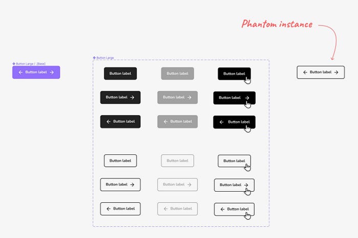
Once created, phantom instances can be hard to spot and might even make it into the codebase ☹️
Although impossible to eliminate completely, training designers on using Base components and creating a culture of reviewing and critiquing work, instances of phantom components can be massively reduced.
Who should and shouldn’t be using base components?
Adopting base components is a trade-off between speed over complexity.
In my opinion, the decision has a lot to do with the resources available to the team.
Small teams [1–8 designers]: 🟢
In small teams, where all designers see each other’s work and communicate well, the gains in efficiency and speed of Base components can have a big impact.
Team members will be able to spend more time designing new patterns and less time on repetitive maintenance tasks.
Medium teams [9–15 designers]: 🟡
Here it could go either way, is up to you and your team to decide.
Large teams [16+ designers]: 🔴
I would think twice about implementing base components in a big team for two reasons:
- Work is more distributed and siloed, so the cost of training new joiners and the risk of “phantom components” will increase.
- On a team with dozens of designers, saving a couple of hours a week in maintenance becomes less important, while making the system lean and easy to use is key.
For bigger teams, I would recommend building each variant independently with only the sub-components and styles that are needed.
References
Lots of awesome people have already talked about Base components. Here is a few:
- Using Variants effectively • Anthony DiSpezio for Figma
- Base Components • Joey Banks
- Figma Master Component Quick Tip • Ali ÇORAK
That’s it for base components. Enjoy your day 👋

