Member-only story
Best practices for address form design
Address forms are incredibly common on the Internet, yet very few sites do them right. Here are some things to consider when designing an address form.
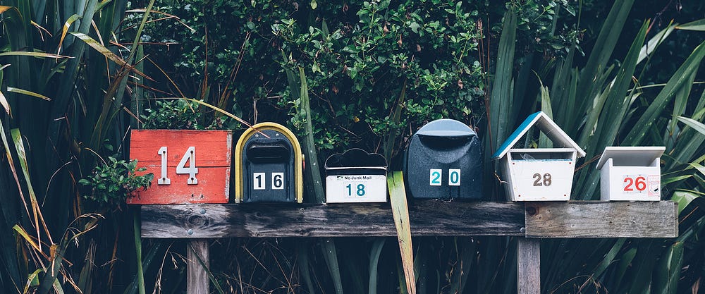
Whether you were buying a pair of trainers or registering to vote in a local election, chances are, you came across an online address form before. They can range from single input field to multipage questionnaires, but all share the same usability principles.
Choosing the right solution for your use case can be hard, and the stakes are high. Entering postal address into an online form bridges the gap between virtual and physical worlds and giving away this information may require a lot of trust for your users. Mistakes in this area can costly — from abandoned checkouts and lost packages to more serious security risks — so here are some design guidelines you should follow.
1. Use search and autofill in conjunction with manual entry
Predictive search that suggests address details once the user starts typing is a great way of streamlining the process and reducing the number of errors. Often presented as a stand-alone field, it can be an excellent space saver, but don’t fall into the trap of creating a minimalist UI at the expense of a good user experience.
While search should work fine for most common addresses, a significant number of users will either want to edit the result they selected or, failing to find what they were looking for, will need to enter their address manually. Make sure you cater for both cases without making your users do the extra legwork.
A common solution is to present the user with a single search field and a secondary call to action that opens a manual entry form. Assuming the user succeeds in finding something that resembles their address, the system will present it back to them as non-interactive text with options to edit or remove the entry (left). This is a good solution for the “happy path” but requires a lot of clicking around for users who can’t find the correct address on the list. A better solution is to show the full address form upfront and use the first line as an optional tool to populates it (right). This way…


