Biases in design: hiding in plain sight in a world full of visuals

Golden rules, best practices, and principles of good design: these are all key concepts I learned in design school. As a graphic design student, one of the things that connected many of my classes was a focus on learning the “universal truths” or “fundamentals.”
As I progressed through the design program, these long-ago established norms started to form my basic understanding of what “good design” should be.
I thought I was using my design education to improve the world around me. But the more time I spent doing my own learning and exploration outside of a classroom setting, the more I started to realize that my definition of what was “good” or “universal” had been heavily colored by a western, White, privileged social view. What I, and so many other design students had been (and are still being) taught, was actually the opposite of what we believed we were being trained to do. In many ways, our education was preparing us to make the world more homogenous and exclusive, rather than more diverse, inclusive, and richly expressive.
This realization was not an easy one to hold, and still isn’t. But it is a necessary one. It’s led me to a deep examination of my own biases (and those of the design industry in general) when it comes to the building blocks of our work. What I’ve uncovered is that many of our “fundamental” perspectives on inspiration, typography, imagery, color, and symbolism are actually preventing us from seeing the full picture: that there’s more to design, and beauty, than what we’ve been sold.
Inspiration
Whenever someone asks me about my design heroes, names like Dieter Rams, Paul Rand, and Mies van der Rohe are always the first that come to mind. Their styles and philosophies have guided my development as a graphic designer, and throughout my education and professional career, I’ve used their work countless times to inspire my own creations.
Of course, these are just a few examples of my heroes. But when I look at my overall inspiration bank, it’s mostly filled with White men. The reason for this lies both in my Scandinavian background, as well as the fact that throughout history, White men have held the greatest positions of power, allowing their work to be the most recognized, heralded, and regarded as truth. Only in the last few years have I started to reflect on how my background — my Whiteness — influences what I see (and don’t see), and how my graphic design experience is very different from many Black designers. We’re slowly accepting that the facts in many of our history books are whitewashed, but we also need to reflect on the fact that the people who designed them, and designed so much of the world around us, have also created a false narrative from a single cultural viewpoint. When the creators all look the same, so will their creations.
A resource to expand your view:
An Incomplete Directory of Feminist Bookstores
Typography
There are many different kinds of privilege in the world. Age, race, physical ability, gender, social status, and countless other factors play a role in what is considered normal or “good” by popular standards. Two of the most significant and influential privileges, however, may be ones that are hiding in plain sight: our language, and our gender.
English-speaking countries are often viewed as more educated, or more authoritative, than non-English speaking ones. There are many references to the English language and colonialism. So it shouldn’t be surprising that when it comes to typography — the way we design and tell stories with words — our views are often rooted in a White, western, world view. For example, we’re taught that “left-aligned” text is universally “easier to read,” while ignoring languages like Arabic, Hebrew, Pashto, Persian, Urdu, and Sindhi, which are some of the most widespread right-to-left scripts, and also the most visually intricate.
Not once in design school did I learn about the beauty and barriers of these languages from a typography perspective. If I was supposed to be learning about composition and structure and flow, and how typographic design has the power to deliver complex messages and emotions, why were these languages completely ignored? The western and English-speaking worlds have always been in a position of power,, but we are missing entire volumes of cultural understanding by not learning about, and celebrating, other ways to write and communicate.
The biases surrounding gender, of course, are more visible in our culture today than ever before. We’re seeing the impact from a legislation standpoint, with countless anti-trans bills and anti-abortion laws being passed throughout the US, and much of the same hate rhetoric spreading in other countries around the world, too. But what hasn’t been nearly as recognized, or addressed, is gender bias in design — especially in typography.
As graphic designers, we’re taught that different typefaces have different personalities. Depending on the message we want to communicate, the typeface we choose will vary. But rarely do we examine how these choices reinforce stereotypes — especially gender stereotypes. I remember countless times throughout my career where I’ve been on the receiving — and delivering — end of comments like “this type ‘feels’ too feminine,” or, “we need a typeface with a harder line — something more masculine.”
The relationship between gender stereotypes and how we use typography is something that the type designer Marie Boulanger has researched and explored through her thesis and book. In her writings and talks, she explains that when it comes to type, we often characterize different typefaces in very human ways, and we consciously, or unconsciously, assign them binary gender attributes. She also explores the problems associated with this. In this article from Design Week, Boulanger explains that assigning gender to type is “harmful not only because it uses stereotypes that nobody wants to hear about anymore, but if we’re thinking about design and problem solving, it actively harms the resolution of those problems.” Assigning gender to typefaces reinforces already ingrained stereotypes around how women and men should act, look, and speak.
A resource to expand your view:
A Resource Hub for Decolonizing Typography (Resource list)
Imagery
It’s been said that a picture is worth a thousand words. But a picture can also mean a thousand different things to different people. Everyone “sees’’ different stories, references, and associations in an image based on their personal preferences and learned perspectives. While it sounds cliché, the truth really is in the eyes of the beholder, because our experiences determine how we view and interpret the world.
In the book, The politics of design, there’s a study where people are asked to pair an image of a dark storm cloud with an emotion.
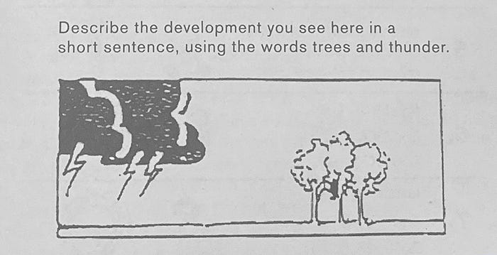
The results were fascinating, but not surprising. People from colder climates typically viewed the storm cloud as negative, because of what they believed its impact would be on their lives. However, people from hotter climates perceived the storm cloud as a positive force, because they viewed it as a welcome element that would cool off their harsh environment. The study proved that our feelings about imagery are dramatically impacted by history, background, location, and a variety of other personal and cultural factors.
Thinking back to the language-biases of typography, the study also shows how our western, left-to-right thinking seeps into our visual interpretations. Someone who reads right-to-left might think that the cloud is moving away from them, while someone who reads left-to-right looks at the picture and imagines the cloud coming towards them — changing how they feel about the intent and impact of the picture. This only further supports the theory that our perception of images and situations is never neutral, and that we need to consider how the meanings we imbue into them as designers may impact the people who see them.
A resource to expand your view:
Black Contemporary Art (Online Collection)
Color
In branding and marketing, we often talk about the meaning of colors. We’re told that red hues stand for passion and action, while blue shades evoke feelings of responsibility and calmness. We’re also taught that these principles are universally true — but when we investigate the origins of these interpretations, we begin to see that their common meanings are based in a western perspective rather than any inherent, human truth.
The reality is that different colors mean different things for different cultures, based on how the color has been used in communications in the past. For example, in most of the western world, red means passion and action, but in some African countries like South Africa and Côte d’Ivoire, it is the color of mourning.
Imagine how a designers’ misunderstanding of the color red in one culture might impact its viewers in another part of the world.
Color is complex, and we can’t be visual designers without asking how our perception of colors changes based on where and who we are.
A resource to expand your view:
An Anti-Colonial History of Colors (talk)
Symbols
Symbolism is everywhere around us, from road signs to apps. But we often take for granted that understanding the meaning of these symbols isn’t a capacity that we’re born with. We’re taught by our cultures and communities what these symbols are intended to stand for.
It may seem logical, for instance, that a “download” icon is an arrow pointing down, and an “upload” symbol is an arrow pointing up. But even with these seemingly basic representations, it still takes time and repetition for people to build consistent visual associations in their minds. It starts to become even more complex when symbols are based on geographically specific, or culturally-outdated, references. A great example of this is the floppy disk. Some applications and programs still use a floppy disk icon as the symbol for “Save as.” While most people have been trained to know the icon’s meaning, not everyone knows what it’s actually depicting, because that technology reference hasn’t been part of our everyday lives for decades. There’s actually nothing inherent or ingrained about this symbolism. It’s an entirely learned construct, and it’s critical for designers not to confuse nature with nurture, and assume that everyone is approaching symbolism through the same contextual lens.
Emojis are another good example of how making assumptions can be more confusing than clarifying. It is not for nothing that there are hundreds of dictionaries out there to explain what various emojis mean. Designers and western individuals often assume that a “thumbs up” emoji always means something positive. This assumption has become so systemic that it’s used on global platforms like Facebook, LinkedIn, and more. However, in some cultures, a “thumbs up” is actually considered offensive. When we use symbols to simplify the complex without understanding cultural aspects of the meaning of symbols, we run the very real risk of what we’re trying to communicate being misinterpreted at best, and harmful at worst.
A resource to expand your view:
Beyond Biohazard: Why Danger Symbols Can’t Last Forever — 99% Invisible (Podcast)
As I continue to evolve as a creative professional, and also as a human who believes in the necessity of advancing equity and inclusion, I’m committed to unlearning and relearning the world around me. I am making a conscious effort to look for inspiration in new places and challenge my decisions daily.
In writing this article, I was pushed to not only question some of our previously assumed design standards, but also to discover new resources and tools that can help reshape how we approach design in the future. If it’s true that it’s taken centuries of community whitewashing to get us to this point of homogeneity and bias, then it’s also true that it’ll take a community of curiosity and determination to help unravel it.
What are some of the resources you’ve found helpful in examining your biases and creating a more diverse and inclusive design? You’re invited to share them in the comments so that we can start seeing, and understanding, the full visual picture together.

