Bird Scooter redesign — a UX case study
Increased Competition = More Features + Better Experience
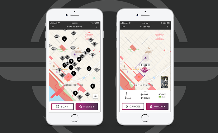
TL;DR 🛴
Electric Scooters are popping up everywhere and competition is increasing. The city of Santa Monica awarded 4 micro mobility companies permits to operate dock-less scooters: Bird, Lime, JUMP (Uber), and Lyft. Bird was first to market, but it lacks many of the in app features and strong branding of its competitors. I set out to redesign the process of finding and unlocking a Bird scooter.

(Disclaimer: I am in no way affiliated with Bird Co. I am a Product Designer who noticed a problem and offered a solution. )
Problem❗
I want to love e-scooters. They’re fun, convenient, and cheap forms of transport. Micro transit companies solve real business and user goals, and are generally loved by the communities that they operate in.
Yet every time I attempt to use Bird, whether by myself or with friends, I find myself confused and looking for more. How do I find my scooter on the crowded map? Can I reserve a scooter? Will my scooters battery life last until my destination?
Users & Audience 👥
In Los Angeles, a lot of people spend a lot of time getting from point A to point B and are seeking new forms of transport. E-scooters are emerging as a viable alternative. After watching scooters take over the city, I identified a few common types of users that get frustrated with Bird’s lack of features.

Competitive Audit 🔎
I wanted to learn more about the offerings that the 3 other scooter companies had within their apps. Massive companies like Uber and Lyft are entering the market for the first time. — What were they adding to the experience?
I was able to test drive all 4 companies within the first weeks of the program. While each app has similar features, it was clear that Bird’s design was far behind its competitors.

Design Process ✏️
Its clear that the scooter industry is brand new and is still struggling the provide the best product for its users. There were a thousand different directions I could take this project.
It seemed overwhelming at first. After digging for insights via user personas, my direction became clear. A few simple improvements to Bird’s UI would leave a large impact on the rider experience.
Updating the following features would have the largest impact:
- Find the closest scooter on a map
- Easily identify a single scooter in a group
- Qualify the scooters battery life in terms of distance
- Reserve the scooter for later
Rethinking the Map: Zoomed Out 📍
When a user launches the app they are overwhelmed with hundreds of Bird logos. I understand why Bird might have designed their map like this when they first launched. New brands often over use their logo. A crowded map also showed users that there were plenty of Birds available to ride. Cities now have scooters parked on every street corner. The map should give the user more value beyond “we have a lot of scooters”.

Rethinking the Map: Zoomed In 🔋
If Bird riders want to ride with their friends, it would help if they knew the location of groups of scooters. They don’t want to spend time guessing where the closest group of ready to ride scooters are. I chose to show groups of scooters as pins, or as Bird likes to call them, ‘Bird Nests’. This dramatically lowered the amount of overlapping logos that flooded Bird’s previous map design. It also let groups of users know where they could find more than one scooter around a single location.
Another issue with Bird’s map is that users were unaware if a scooter had enough range to reach their destination. I solved this by adding the approximate amount of range in miles that a Bird had left in its battery. Only showing the battery icon with a green, yellow, or red filling means nothing to most users. We know how much battery our cell phones have with a quick glance, as we use them everyday. With a scooter, it’s difficult to understand that a half full battery has more than enough range to reach to their destination.

Added Feature: Bird Location Context 👀
Once a user has found a scooter that fits their needs on the map, the next issue is being able to locate the scooter. I solved this by adding more context to the selected scooter in the form of an address of the scooter’s location. The pinned location is tied to an approximate address shown in the app. This helps the user navigate to the scooter in a real world context. Street signs and numbered addresses give contextual clues to the scooter’s location.
Bird also started to require its riders to take a photo of their properly parked scooter. This prevents people from throwing Birds into a big pile of trash after they complete their ride. Instead of wasting the data collected by this task, I allowed the next user to view the last photographed location of the scooter. Again, this helps bridge the gap between the physical and digital world.

Added Feature: Reserving a Scooter 🚷
The last issue I tackled in the redesign was the option of reserving a scooter for later use. Currently, the only way you can reserve a Bird scooter is if you’ve already unlocked it through a scan.
This lead to a few problems. If you found a scooter nearby on the map, there was no guarantee that it would still be there by the time you walked to the scooter. Many times a rider will stumble upon the closest bird and unlock it. This causes a huge headache for users. Unlocking a bird becomes a matter of luck. It also prevents people from using Birds as a dependable form of transportation. If I were to ride a scooter home from work, I would want to guarantee that my form of transport was ready to go. Otherwise, a user could end up with the same horrible feeling as missing a bus after a long shift at work.
I added a reserve option once a scooter is selected. If the user choses to reserve the scooter, a countdown timer starts and they have 30minutes to unlock the scooter. The user would not be charged the unlock fee until they scanned the scooter in person. I also added the ability to get walking directions from the users current location, again easing the process of reaching your scooter.

Outcome 😁
This project taught me a few new aspects of design to consider while working on creating a better user experience. I found out that when it comes to transportation apps, helping the user navigate the real world is just as important as how they navigate within the app. Transport heavyweights like Uber provide contextual clues for riders when they are locating their driver: vehicle make illustration, license plate number, driver name, etc. Why don’t micro mobility apps do the same? Its important to reassure the user that they are able to get where they are going with as little friction as possible. My redesign helped accomplish that.
I also learned how important it is to get outside and learn how the app has an effect on users in real life. By only looking at the data, you wouldn’t see that Bird users ran around the block trying to locate groups of scooters. You also wouldn’t hear the feedback from users when they were unsure if a scooter had enough juice to reach their destination. I identified these real life problems, and solved them by adding features within the app.
Curious to see what it looks like? View my InVision Prototype.

Final Remarks 🛴
I hope Bird considers adding some of the features I proposed in one of their future updates. Bird can create a better experience by listening to their users and quickly iterating new design features that solve real life problems. Currently Bird has the most scooters in the market, and is looking to capitalize on their $1 billion valuation. With competition heating up, I can’t wait to see whats next for the micro mobility industry as a whole.
If anyone at Bird is reading this, I’d love to chat. I’m only a quick Bird ride away from your headquarters. ;)


