How to not get in trouble when branding your app with red
How not to get into trouble when branding with a logo that uses the most evocative, emotional, and intense hue on the spectrum.

A solid brand identity is vitally important, not only when you are marketing your product but also when you are designing a mobile/web application for a particular product/service. As we all know, there are situations where you get to involve in branding the whole product before it goes out to the market, and also there are situations where you have to design a mobile/web application for an established brand, in which case you will be limited.
Logo is an integral part of branding, to which we look up to when deciding the brand /theme colors of the application.

And then you get a product/service which is all or mostly red!
This sort of challenges some of the conventions we follow in web/mobile app designing.
So, should we panic? nope!
Because conventions are not rules, those are just how things usually done and that doesn’t mean we have to stick to them all the time. Think of it as an opportunity to think outside the box. Basically, to use other conventions wisely!
Before we jump into problems and solutions, let’s get to know the Red.
Psychological attributes of Red
In color psychology, Red is related to following attributes:
- Strength
- Power
- Danger
- Love
- Desire
All those values may or may not be related to your product/service. Even if we don’t have a problem with the psychological meaning, there are few more things to consider.
Effect of Red is physical

Appears to be closer to you
Technically, red is not the most visible color but it has the property of appearing to be near than it is, causing whatever the element/component which is in red to be brought to the foreground. As a result red is able to grab your attention before other colors. This explains why we use red to indicate errors.
Red makes your heart race
Red can increase your pulse rate, metabolism and it can also give you the feeling that you are running out of time. Masculine properties of red can also activate the “fight or flight” instinct. This result in tempting your users to take quick decisions.
Even though the fast-food restaurant websites mostly use red because, depending on their business above mentioned qualities may benefit them but if you take a telecommunication brand for an instance, all those qualities of red may not be beneficial for them.
That’s why we cannot treat red in the same way which we would treat any other color when it is acting as the main theme color.
But there’s something that I must mention, only you, the UX designer will know what your users are really expecting and in need of. So, like in every other case in UX, use tips but be flexible. There’re no ready-made solutions.
Red is solid and substantial

Square or cube shape is complimented by red color. It is sharply focused by the eye and goes well with sharp angles, hence holds the strongest of all attractions to stimulus.
Why you may not be able to paint your app in all Red?
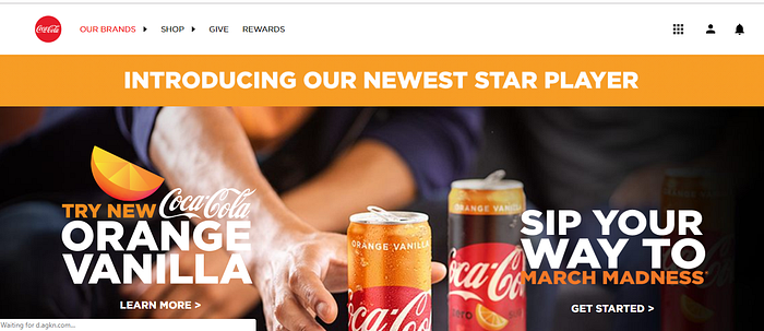
If you take a look at the below example which I found while doing my background research on this subject, which I also believe to be a work in progress, gives us few good points to talk about.
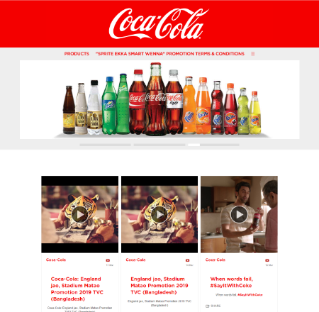
Coca-Cola might needs its users to feel that masculine qualities which trigger the Adrenaline, giving a feeling of adventure to its consumers. But on the other hand, there are few questions we get in general when we look at an all red website.
1.How long someone can stare / stay on such all red web page?
As explained above red always makes you feel that you are running out of time and rushes you to take the next action.
2.So many components fighting for user’s attention!
In a way, this is also related to the above problem. When each and every element on your site is in red, it creates a competition between those elements and increases the cognitive load. This makes the importance hierarchy of actions less obvious, which may result in users missing out on most important actions among other important actions.
3.Can the error messages still be in red?
Often we use the color red to display error messages because of its ability to grab the attention faster than the other colors. But when the other elements are too in red, it just creates a competition among all the elements, making the user unable to focus on the most important message.
Few tips to do it right with red
1.Have a secondary color/colors for your theme
Your logo can be all red but that doesn’t mean you have to have red as the only color in your color scheme. You can incorporate some accent colors to your theme. This will make it easier to find a balance between advantageous and disadvantageous qualities of red depending on your brand and its users.
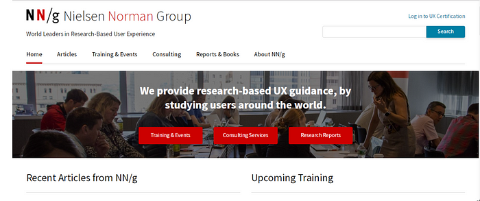
Here in the above example, they still have red for the buttons which I will explain later, but in general for actions, they have used the color blue.
It’s true that often we let the links to be in the main theme color, but when the main theme color is red, we have to take one step back.
Just like how the NNG site has done, you can use the other accent color of your choice to represent the links, or you can let them be in black and use the most common hyperlink decoration: underline! But still, using red for hover will not hurt your design if you do it right!
These methods will let red be in the site without being too much in your user’s face and it won’t make your users go away from the site so quickly.
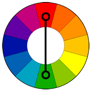
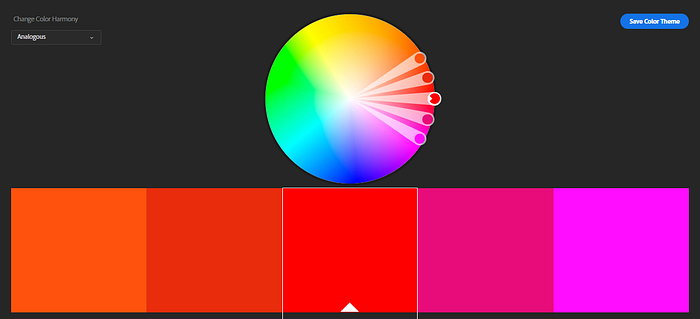
Important : When selecting the accent color, picking up the directly opposite hue (Complementary color) of red will just increase the competition between elements to which those colors are applied. Instead, it might be a good idea to use colors that are next to each other on the color wheel (Analogous colors) because they usually match well and create serene and comfortable designs.
2.Use red only for the most prominent action
Even after having a secondary color in your palette, if you really really want to add red to a Call-To-Action button, make sure that you are adding it only to the most important action.
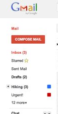
Classic example would be: early days, Gmail used to have their most important Call-To-Action in Red.
Even with the NNG site, those three buttons which are in red are main three actions / services they offer. You cannot find anymore red buttons in NNG site other than them. They have dedicated those red Call-To-Actions for the most important actions.
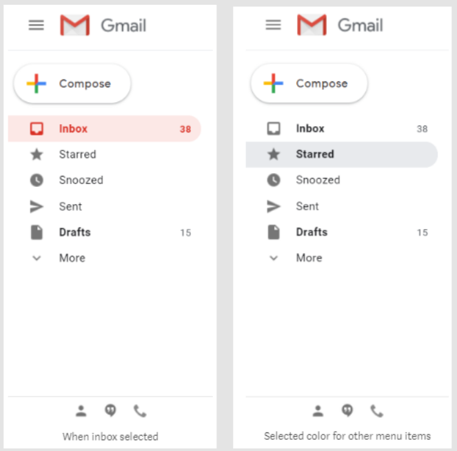
However with the new look and feel of Gmail, they have made use of rest of their theme colors for the “Compose” e-mail button. But still, they are using red to indicate selected state for inbox in the side menu.
This way it helps us to keep the usage of red at a minimum but, we are giving back place it deserves by giving Red to the most important Call-To-Action / Actions. Then, anyone who is interacting with your site will remember red as the main brand color, even though they will not get to see red everywhere.
3.Swap the application of main color and accent colors
Again to keep the use of red at a minimum level, you can try using red where you would normally use the accent color and use the accent color where you would use the main color.
These could be the hover decorations for main navigation links and any other link or anywhere else in the design where it keeps red at a minimum. Because, you don’t have to worry, red will always stand out and take its place even though we swap its place with the secondary color.
4.Handle errors with care!
Reduce the use of error message
Whether your theme color is red or not, addressing the root causes to reduce the need of error messages is important. Increasing the scanabilty of your app, having inline validations and a having a reliable back-end will take you a long way in this matter.
Make the error messages concise and to the point
Regardless the color of the error message, if you can present what you want to say in a short and sweet manner, it will definitely help to grab the user’s attention.
Use related colors to red
Here we can relate to the analogous colors again. Since they tend to have same qualities you can try using those colors for error scenarios.
Follow the law of proximity!
Always make sure to place the error messages near, where the user’s attention is needed. So the user won’t miss out or will not have any difficulty in figuring out where a particular message belongs to.
Use other methods of increasing visual interest
Color is not the only option you have when it comes to creating different level of importance in visuals. Try using following options or a combination of them!
1. Use a different font family/ font size / font weight
2. Use of iconography
3.Use animations / illustration /imagery
You can refer to this article : When your brand isn’t broken: elegant error handling for sites with red logos by Nina Mehta which explains above points in detail with examples.
5.Use related colors
May be it’s totally other way around for you. You may need all the qualities of red to your branding but still you don’t want to use the pure red on your app.
In such a scenario, you can use related colors. Such as:
- Light red represents joy, sexuality, passion, sensitivity, and love.
- Pink signifies romance, love, and friendship. It denotes feminine qualities and passiveness.
- Dark red is associated with vigor, willpower, rage, anger, leadership, courage, longing, malice, and wrath.
- Brown suggests stability and denotes masculine qualities.
- Reddish-brown is associated with harvest and fall.
Last but not least, everything we do depends on our users and their needs. So, it’s just a matter of applying what we know, accordingly!
Hope I have presented my findings in an understandable way. Feel free to share your findings, experience during such a scenario and any feedback you’ve got for me! :)
☕️ As a writer living in Sri Lanka, I don’t have the option to join Medium Partner Program. So if you find this article helpful, Buy me a coffee.
References:
- The Psychology of Color: A Designer’s Guide to Color Association & Meaning
- Branding and Red color
- Psychological Properties Of Colours
- The color system
☕️ As a writer living in Sri Lanka, I don’t have the option to join Medium Partner Program. So if you find this article helpful, Buy me a coffee.