Building a design system using Figma and Zeroheight
Design systems are a hot topic in our industry and I’ve always had an interest in them. It’s not very often you have a project in a fast-paced agency that requires one. Ultimately they are time-consuming and perhaps a bit over the top for a standard website or small app. I find that for these projects a style guide works perfectly.
Recently though, I’ve started a new project where the same styling needs to be applied across a suite of continually evolving products. I’m talking web apps, mobile apps and a marketing website. I wanted to share with you the tools I’ve been using and where I’ve got to so far.
The tools
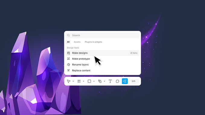
Figma
Typically, for all of my UI design work I use Figma. This tool allows you to create libraries, which can then be pulled into what I call production Figma files. This means you could have 1 library being pulled into multiple production design files e.g. the marketing website or the web app. I’ll go into more detail about my Figma set up shortly.
Zeroheight
In terms of the design system, I came across Zeroheight a few months ago and fell in love with the concept. Essentially Zeroheight relies on linking up your Figma files to a project, meaning every time you make an update in that Figma file, the design system will automatically refresh. This is nice because it’s relying on the design file to be the single source of truth, which it should be. I often find that changes get made in development that are then published to the design system, which only leaves the design file outdated. This then means that any future design work requires additional time to fix the inconsistencies or worse, they never get updated.
When it comes to the development you can add code snippets against each component, meaning everything is in one place for both design and development. Zeroheight is a place for both designers and developers to be responsible for making sure everything is up to date.
It’s also worth noting that every design system that you create can have a personalised domain name and password protection!
Getting Set Up
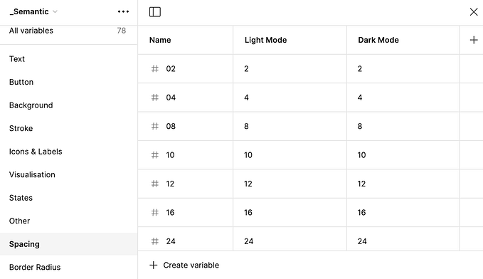
As I’m creating such a large design system I’ve decided to create separate libraries in Figma for the different elements and components. If it’s a smaller project then it’s worth considering storing everything in one file. However, there may be instances where I’m working on a mobile app and only need to pull in typography and colours. Here’s a list below of the current libraries I’ve got set up and a link to a great blog post that explains how to link these figma libraries into Zeroheight.
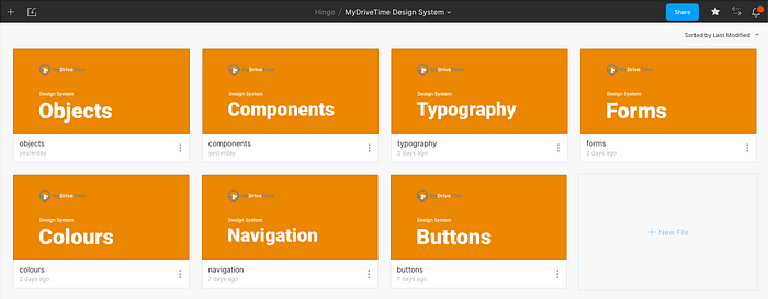
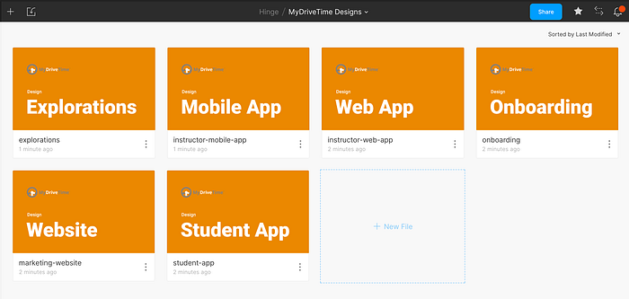
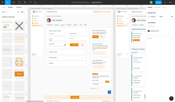
Now that all of our are libraries set up, it’s time to create the production Figma files where you want to connect the two together. Below you can see the files set up.
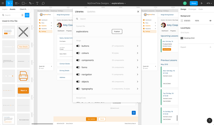
Once you’re inside a production file, you can toggle on and off the different libraries you’ve created depending on what you need. The libraries that you’ve turned on will then show components and styles under the assets tab in the left sidebar.
Building Components
One of the most important parts in making sure that this whole process works smoothly is making sure that all of your Figma components are set up correctly. I’m not going to lie, it does take a while to get this done properly…but in the long run when you have to change the colour of an icon or the size of the default button you’ll only need to do this in one place! 🙌
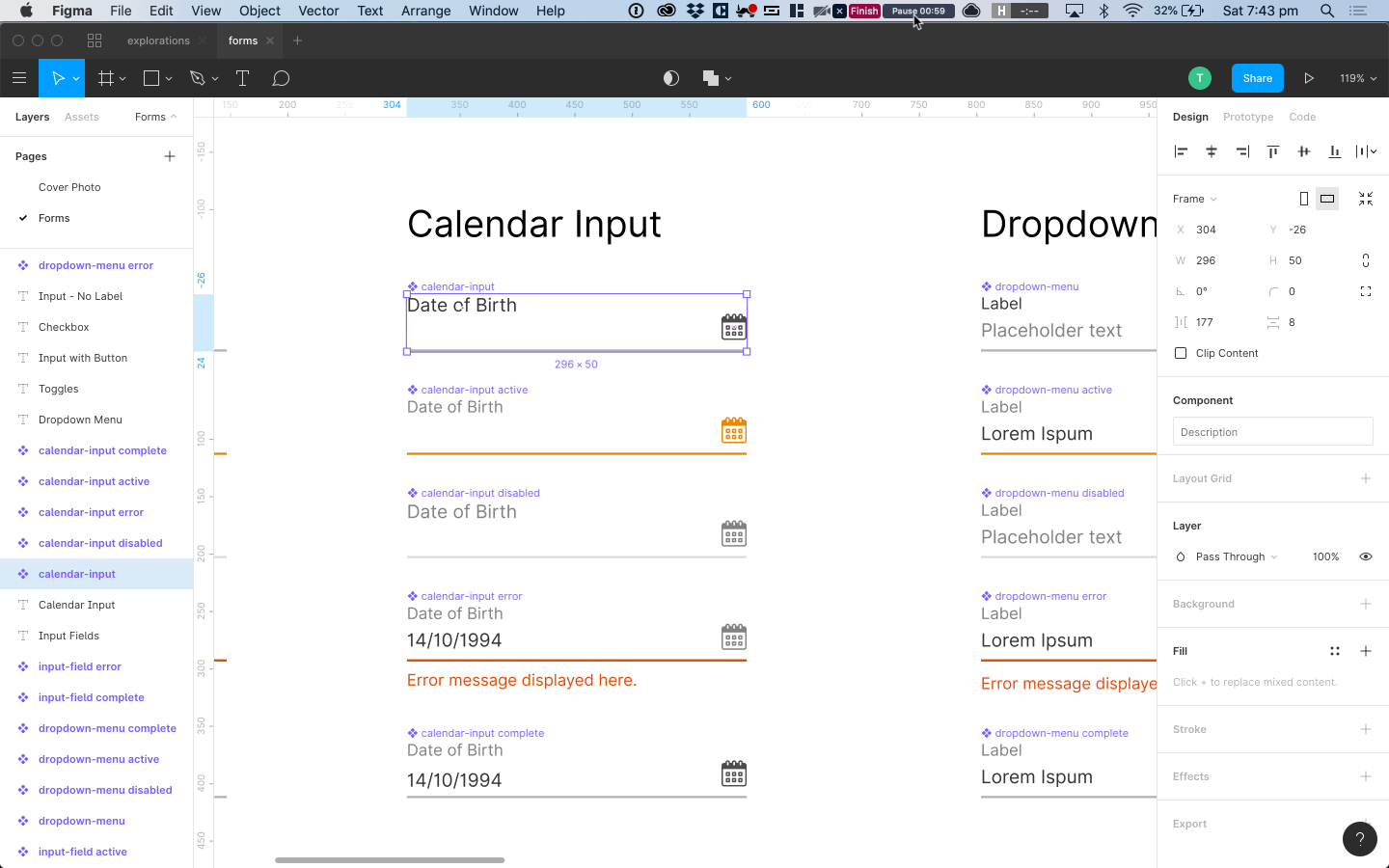
I’d also suggest spending time making the components resizable. It’ll save so much time when working on responsive designs. Having 1 component that works on any screen size is the goal here!
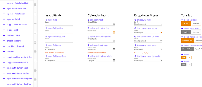
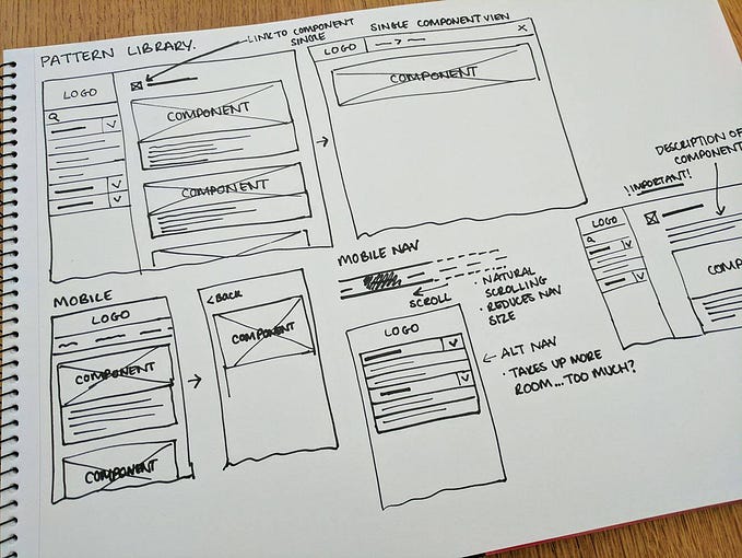
You can see below how we’ve set up the Figma library for forms and also how a resizable component works.
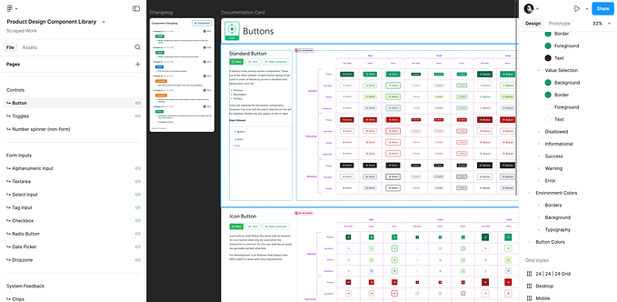
But how does this look in Zeroheight?
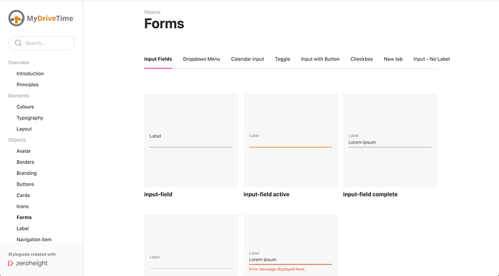
You’ll be able to see that within the design system you have your navigation in the sidebar on left. Here you can create categories and add different pages. Our set up for now is:
- Overview
- Elements
- Objects
- Components
Within each page you can then add different tabs to keep things tidy. So for forms we’ve got input fields, dropdown menu, calendar input etc. and then each tab contains the different states that are required.
Once the team start developing the design system we will be adding in code snippets for each component and writing up all the documentation.
To Summarise
And there we have it! This is where I’ve got to after spending a few weeks designing all of the components and setting up the design system. It’s at the point now where development will be starting soon, of which there will then be a part two documenting this experience.
My key takeaways from this process so far would be:
- Invest time setting up components the right way. You’ll thank yourself later
- Being able to create screens entirely out of reusable components is such a great feeling!
- Your design system will constantly be evolving…just make sure everything is documented
That’s all for now! I hope you enjoyed getting an insight into the setup and a sneak peek at what‘s been achieved so far. Stay tuned for part two ✨


