Building trust with UX —based on beauty industry examples

I am very much into my skincare and I love the thrill of finding a great new moisturiser or toner. Today there are so many beauty and skincare brands out there that it’s often difficult to know how trustworthy they are. Trust is key for any brand, especially in the e-commerce environment. There are so many points where a customer can drop off, and lack of trust is one of the key reasons for that. Luckily, this is where UX can help.
In this article, I will be having a look at what creates that trust and adds to the brand’s credibility.
Look and feel of the brand
This is the first thing people see when they come in contact with the brand. Packaging and website design are very important, especially if the person has organically found the brand without any outside recommendations. I am not going to go into too much detail here, we all know the aesthetic usability effect, where aesthetically pleasing design creates a positive response in people’s brains and leads them to believe the design actually works better — this totally applies to online shopping and skincare too.
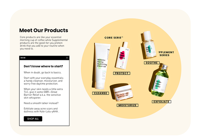
More importantly, look and feel are crucial at the entry points into the brand; it means little things — that often slip between the cracks — such as making sure all third party links are aligned and lead to a meaningful place, all branding is consistent when switching between channels, and there is always a clear action to be taken. A good example for that one is having a skincare quiz upon landing onto the brand’s homepage, it helps new customers navigate a wide range of unknown products and guide them towards what would work for them. It’s an example of putting user needs first, rather than pushing what marketing wants to sell most.
The flip side of having great packaging and a sleek website is that there are hundreds of brands with very similar Instagram-friendly design. What’s wrong with that approach, you might ask? Well, when everyone looks the same, the brand is not memorable or unique, and it blends right in with all the other new brands. Moreover, that could erode trust, because people are becoming more and more aware of social media scams where pretty looks do not translate into quality products.
Holistic experience
One of the key UX mantras is looking at the experience as a whole, not just one part of it, by considering how the customers will be interacting with the brand. So many companies only optimise a part of the whole experience, like checkout or social media, forgetting that a customer will be going through a whole journey. There a few beauty brands that do it well, though.
Glossier is a great example of a brand that combined pop up stores, online shopping, and social community experience, making it a destination for their super fans to talk, share and co-create, thus, organically creating more awareness and growing positive influence. Glossier followed classic tech startup stages, starting out with one thing, the boy brow —their MVP — and doing it well. Even Forbes cited the power of the community as one of the key success drivers, that helped Glossier know which direction to grow in, and what their customers want. That is a very positive example of scaling a brand without sacrificing customer experience.

Another part of a great holistic experience that is often forgotten is customer service. In the age of social media it is very easy to see how a brand treats their customers, how it engages and responds to feedback. You can see influencers, who often comment not only on the products, but their brand experience and it never comes off great if the customer service is rude or the brand has a reputation for not handling negative feedback well. All touchpoints should be complimenting each other and enhancing the experience, especially right now, when customers want more information. Quite a few K-beauty brands are great at engaging with customers and building the relationship via diverse channels and storytelling.
Consistent personality and TOV
This is a natural extension of the holistic experience. Without a well-defined personality and tone of voice the brand will get lost in the sea of other brands and its credibility will suffer as well. And consistency lets the tone of voice and brand personality shine through, while supporting positive customer engagement.

Starface is an example of a brand with a very distinct personality — it is consistent throughout all the channels, from Twitter to their website and even product packaging.

Another brand with a defined personality is Function of Beauty — they love a pun, and their brand comes off very light and humorous. Function of Beauty have had a very startup-like path as well — they started off with 2 hair products and scaled up to more hair and skin products, which got them a solid customer base and understanding of their customer needs.

Transparency
This one is about reputation, recommendations and findability of information. Have you ever been in a situation where you can only see glowing reviews on the product page and then came across a lot of negative ones on Google? This scenario definitely makes you question the brand’s ethics. Thus, to build up transparency, especially for lesser-nown brands, we need to think about how easily customers can find information about it. A lot of this will come from branding and marketing, but UX can also contribute to that. One study found that 94 percent of consumers are likely to show brand loyalty to companies that offer complete transparency.
You might have seen current trend of including customer reviews directly on the product page. And some websites encourage pictures too — it boosts trust when you can see negative reviews alongside positive. Skincare is super subjective, and it’s perfectly fine that one product doesn’t work for everyone, therefore, it is suspicious if only positive reviews are kept visible. Glossier even lets you search within reviews and look for reviews from people with a similar complexion and skin type. Yesstyle — which is a massive aggregate of Asian skincare — does that quite well too. With the amount of products they have, clear information and reviews can massively help customers make up their minds.

A lot of companies are doing their own blogs which help communicate their values and tell more about their products. Incorporating real-life experiences into online shopping — blogs, expert advice, real-time consultations and calls — is quickly becoming a part of online shopping experience. Furthermore, engaging dermatologists and aestheticians helps build the brands’ reputation as experts in their area. It also helps to build trust when the blogs recommend other brands alongside with their own, since that shows that they care about the customer, rather than purely sales.


Product page
I wanted to take this one into its own section because it is a very important stage when shopping online, especially for those not familiar with the product.
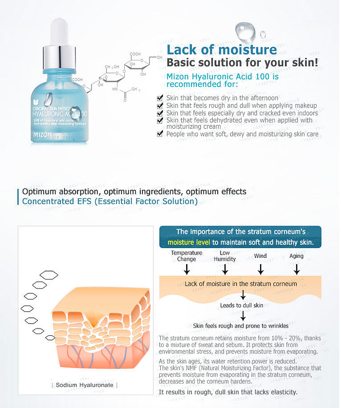
So how can UX help? It’s all about the right information and its hierarchy. NNg have created amazing guidelines for what a product page must and should have, so I’ll just give a quick summary. The must-have things include price, photos and ingredients. Helpful things to have are shipping notes, usage directions, who this product is for and reviews. And it’s always great when any saving opportunities highlighted. However, this much information can create clutter and increase the cognitive load, so there is definitely a balance to be found. It is a fragile balance between having too much information and not enough information. From UX point of view, it’s best to give customers an opportunity to see more information if they want to, but make it super clear how to purchase.
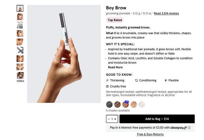
Photos are another key element — lack of photos can discourage from buying, especially if it’s a make up product. Thoughtful modern brands are starting to provie diverse photos, like Gucci does for their lipstick, where you can see how it differs depending on skin tone or Glossier for their Boy Brow and Generation G lipstick.

Usage instructions are really good to have if it is not clear how to use the product (and it’s very often the case in the skincare industry right now) — covering the basics, like ‘is this hair treatment heat activated?’ or ‘can I use this serum alongside a moisturiser?’ helps understand if a product is a good fit for the existing routine the customer has.


Supporting new customers
This one is all about helping make sense of what products are the best for the customer. If the brand is trying to upset me on everything, I usually reject all suggestions, because they are based on their ambition to sell more, rather than help me, and I cannot trust them. However, there are more organic ways of getting customers excited about more products. They can include anything from ‘Best sellers’ sections to search and filtering to guidance to the product you need.
Skincare quiz is once again a great way of helping new users get to know the product range.


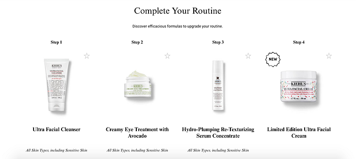
Another way to support new customers is to recommend products that compliment each other.
Price range
It’s not an obvious one, since all of us like a good deal, but on a subconscious level people do not trust things that are too cheap. It’s anchoring in action — most likely the customers have seen other brands’ versions of similar products, so they have an idea of what they might pay. So you need to see where the average price is and how your product compares and fits into that landscape. Naturally, a super high price with nothing behind it can also scare customers off — even though people often think more expensive equals better quality, in the beauty industry there are so many brands that if you stumble upon an unknown expensive brand with no background to their pricing, you’ll move on to a more affordable alternative. Not to call out any specific brands, but my Instagram ads very often surface ridiculously expensive brands no one ever heard of, and I am not inclined to buy them without understanding the pricing.
Offers and discounts
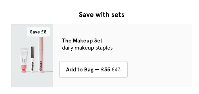
I am not going to talk about pricing strategy and what promotions to run. To build trust, the more transparent the brand is about terms and conditions, the more loyal the customer can become. Quite often brands only offer discounts if you followed a link or copied a code from a landing page, which you struggle to find at the point of checkout— many customers miss out on offers due to that. And this is where some brands stand out if they allow customers to get that discount without jumping through hoops. Showing that a product qualifies for a discount at multiple points in the journey — most importantly on the product page and at checkout — can help build trust, and prove to the customers that they are taken care of.

Checkout experience
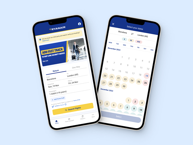
This is the moment of truth. There are a few things that shape the checkout experience, and the one that contributes most to trust is how the checkout fits into the shopping experience — is it part of the website or are you taken away to a third party site? How many payment methods are supported? Does the experience look on-brand or feels disconnected and sketchy? If the customer thinks the payment is not secure enough, they will not buy the product. A lot of websites right now are using an out-of-the-box solution, which is familiar to customers and makes the checkout easier, especially for those who are already registered. Smashing Magazine has a great article with tips on improving the checkout experience.
And, finally, dark patterns — the techniques to look out for and recognise that a brand is trying to lure you in and get your trust. Harry Brignall has put dark patterns under the spotlight in his website, and there are lots of great further reading recommendations if you want to learn even more. As for the dark patterns in the beauty industry, here are a few:
- Trying to guilt into buying by talking about environmental initiatives and charitable contributions.
- Overusing celebrity endorsements — unfortunately, not all influencers and celebrities are transparent and even use the product they are paid to sell.
- Using words like cruelty-free, no toxic ingredients, ethical in all brand mentions — today it’s the norm, not an exception to have non-toxic and cruelty-free skincare, so this shouldn’t be an extra selling point. Furthermore, some brands just throw the words around, without any proof of that.
- Setting free shipping price in a way that ensures you have to buy a certain min number of products. For example, Starface’s best-seller costs $12, and a refill for it is $9, while min shipping is $25 — so you are either forced to pay $5 shipping or spend a bit more, which as humans, we are more inclined to do. So watch out for the technique and ask yourself if free shipping is worth it.


