Button Design — UI component series
All you need to know about button design, one of the main interactive building blocks for creating a user interface.

In order to design the right interactions, we need to look back at the history and origins of physical pushbuttons, a direct predecessor of the UI component so heavily used in all digital products today. Buttons are amazing. The touch of a finger setting an appliance, a car, or a system in motion, even if the user doesn’t understand the underlying mechanisms or algorithms. In Power Button, Rachel Plotnick traces the origins of today’s push-button culture and describes the ways that button-pushing became a means for digital command, which promised effortless, discreet and fool-proof control.
“You press the button, we do the rest,” — Kodak cameras appealed to potential consumers, through a catchy and direct tagline.
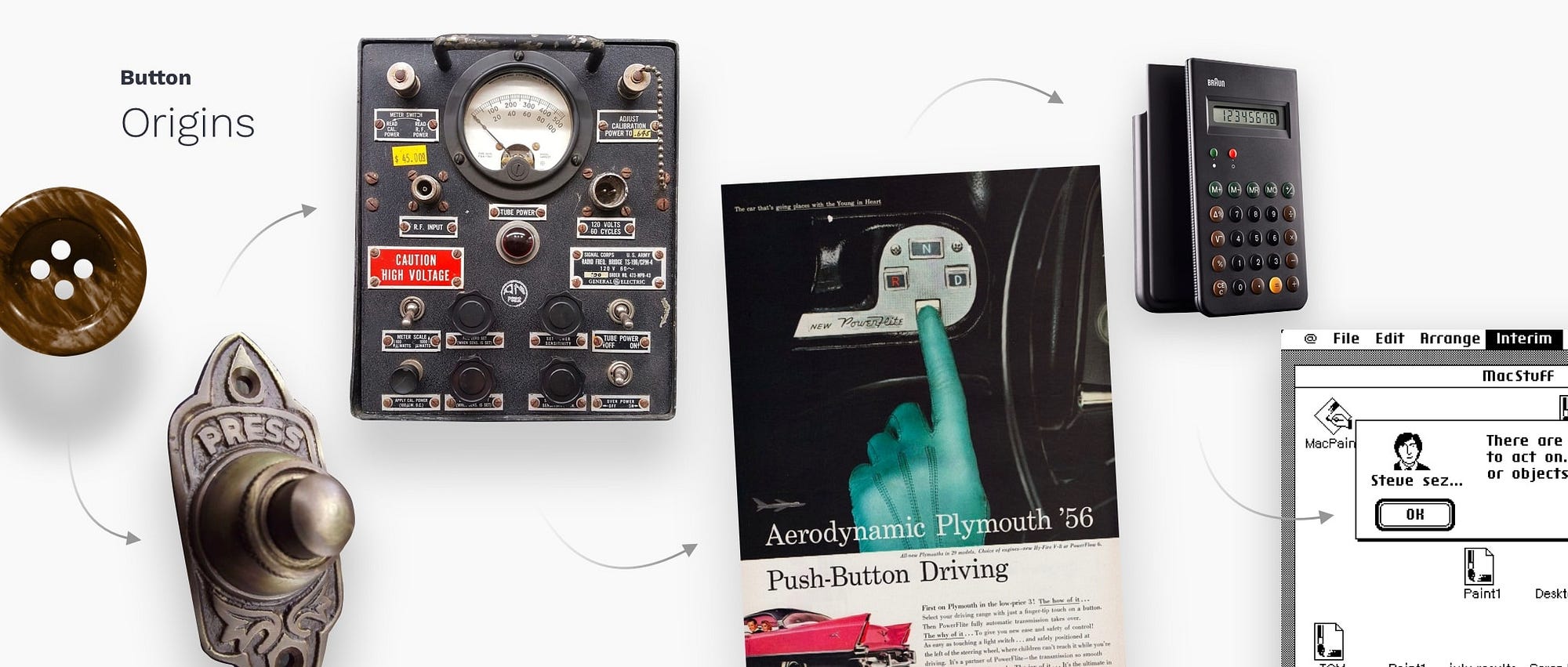
This is what fascinates users even today. The instant gratification of making things happen with a simple touch. Despite tons of new home appliances and other devices migrating to touchscreen controls, physical pushbuttons are not going away soon, and behavioral habits formed by them affect how intuitive and easy to use is your button design.
Buttons vs Links
Buttons communicate actions that users can take. They are typically placed throughout your UI, in places like: Dialogs, Forms, Toolbars, etc. The distinction between buttons and links matters:
- Links are used when you’re navigating to another place, such as: “view all” page, “Roger Wright“ profile, etc.
- Buttons are used when you are performing an action, such as: “submit,” “merge,” “create new,” “upload,” etc.
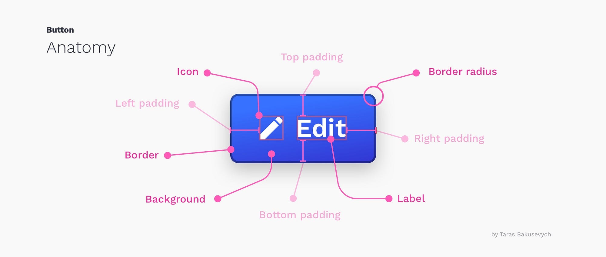
The button state communicate its status to the user
Creating correct interactions and styles for your buttons is one of the most important parts of the process. Each state must have clear affordances that distinguish it from other states and the surrounding layout, but should not drastically alter a component or create a lot of visual noise.
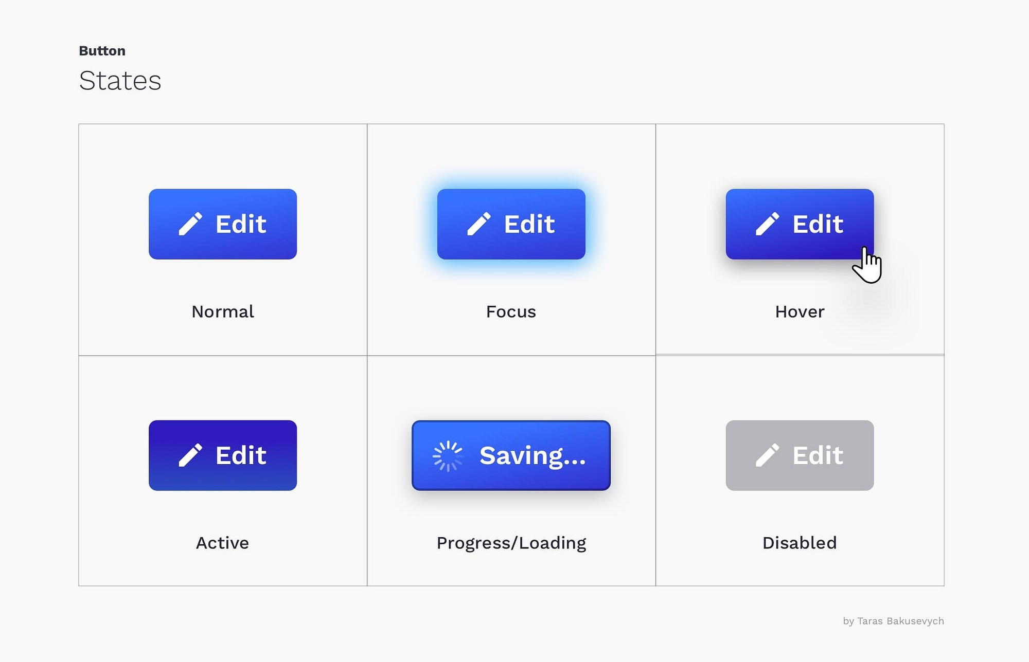
Normal — communicates that component is interactive and enabled.
Focus — communicates that the user has highlighted an element, using a keyboard or other input method.
Hover — communicates when a user has placed a cursor above an interactive element.
Active — or pressed state communicates that the user had tapped on the button.
Progress/Loading —used when action is not performed immediately and communicates that the component is in the progress of completing the action.
Disabled — communicates that component is currently noninteractive, but can be enabled in the future.
Buttons come in various colors, shapes, and sizes.
Most common are rectangular buttons with rounded corners, that are easily identifiable and look good next to the input field. Choosing the right style for the button will depend on the purpose, platform, and guidelines. Here are some of the most popular style variations:
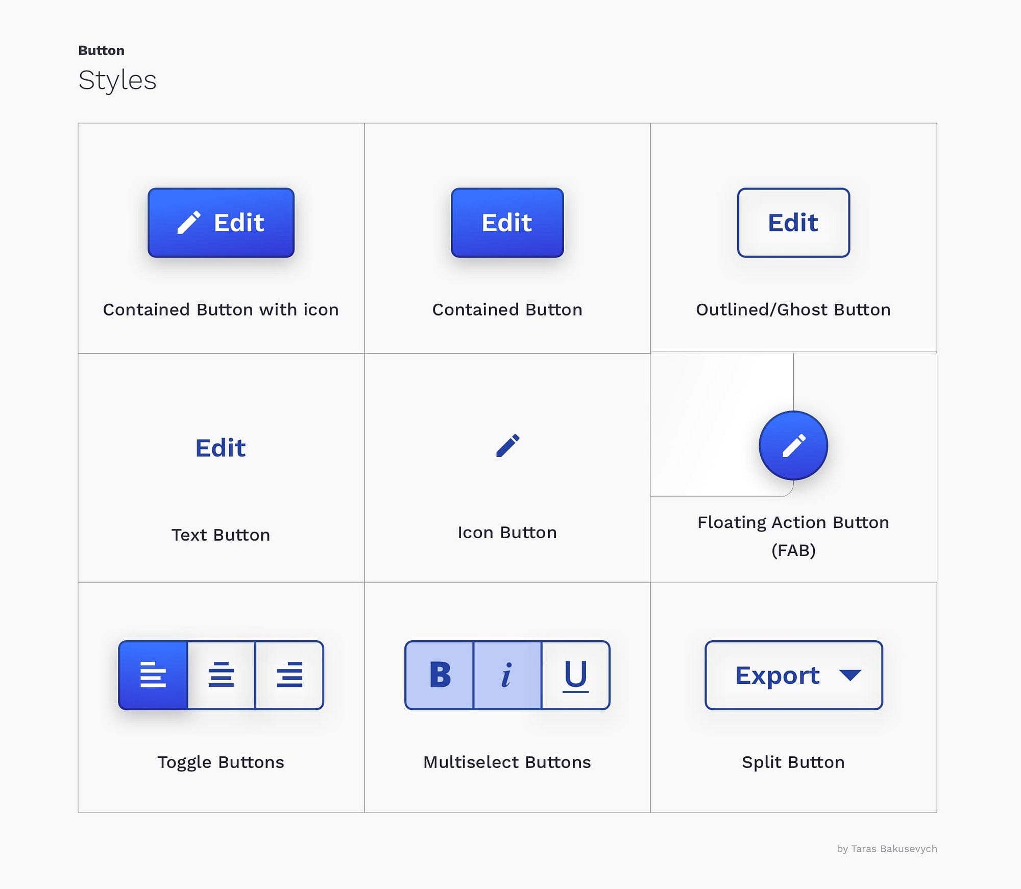
Styles communicate the importance of an action
Styles primarily used to differentiate more important actions from less important ones. Create a hierarchy of actions that will guide the user where there are multitudes of choices. Usually, you can have a single prominent button(that style is often called “primary“), and several medium “secondary” and low emphasis “tertiary“ actions.

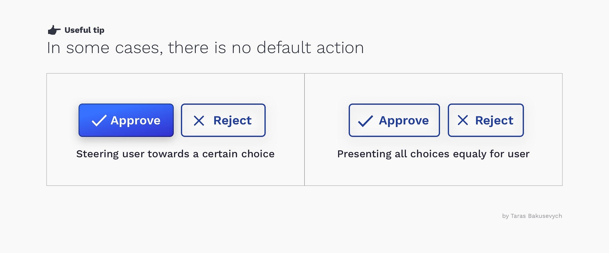
Sometimes there is no “default”
Generally, you want to make the most commonly selected button the “default” (use primary styles) and put it in a focused state. This helps the majority of users finish their tasks faster and points them in the right direction.
The exception is when all choices are equal, or action is particularly dangerous, in those cases, you want users to explicitly select the button rather than accidentally.
Don’t Make Me Think
Don’t Make Me Think is the title of a book by usability engineer Steve Krug. One of the many points it touching upon is how important it is to make interface obvious for users, not creating puzzles or mazes. Based on years of using various devices and other products, we have formed a certain expectation of how buttons look and function. A big deviation from what is considered “standard” will create a delay and confusion for users.
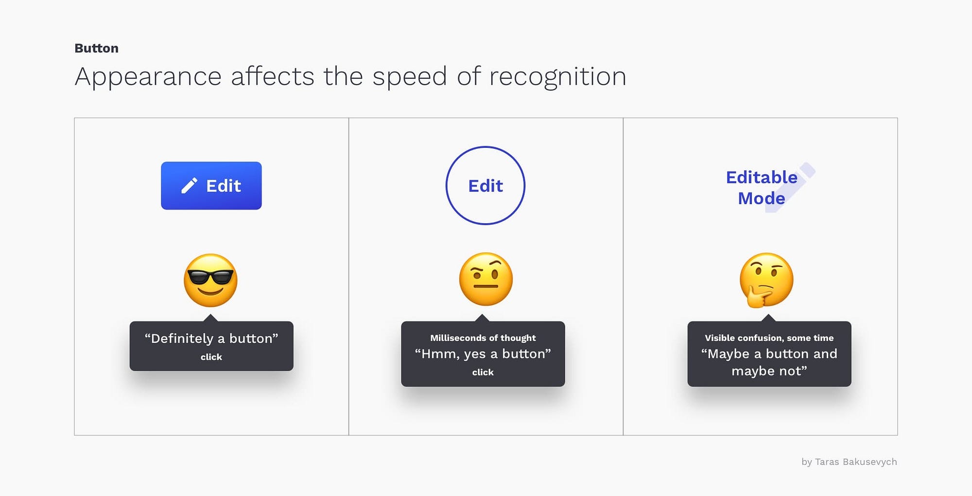
Avoid using the same color for interactive and non-interactive elements. If interactive and noninteractive elements have the same color, it’s hard for people to know where to tap.
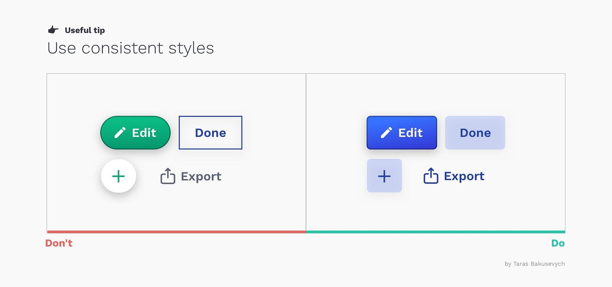
Consistency improves speed and accuracy
“Consistency is one of the most powerful usability principles: when things always behave the same, users don’t have to worry about what will happen.” — Jakob Nielsen
Consistency improves speed and accuracy, helps avoid errors. Create predictability that helps users feel in control and capable of achieving their goals in your product. When you creating primary, secondary and tertiary styles try to find some common elements like color, shape, etc. Try not only to be consistent inside your design system but be conscious about the platform you design for.
Make buttons large enough for reliable interaction
Pressing a button should be a simple task and if a user is unable to successfully tap on a button or in the process tap on a neighboring element by mistake, it will lead to a negative experience and loss of time.
For most platforms, consider making touch targets at least 48 x 48 dp. A touch target of this size results in the physical size of about 9mm, regardless of screen size. The recommended target size for touchscreen elements is at least 7–10mm.
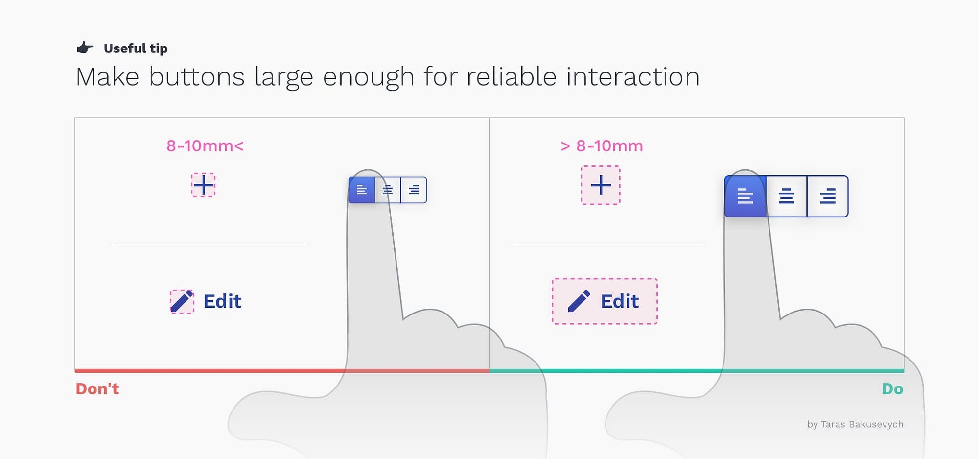
For icon buttons, make sure the touch target extends beyond the visual bounds of an element. This not only applies to mobile or tablet, but the same size recommendation also holds true for pointer devices on the web like a mouse.
Design for accessibility
This recommendation should be repeated for every component. Target area size was one of the factors that affect accessibility. Other are font size, color, and contrast. There a ton of tools that can help you easily check how your components design performing.
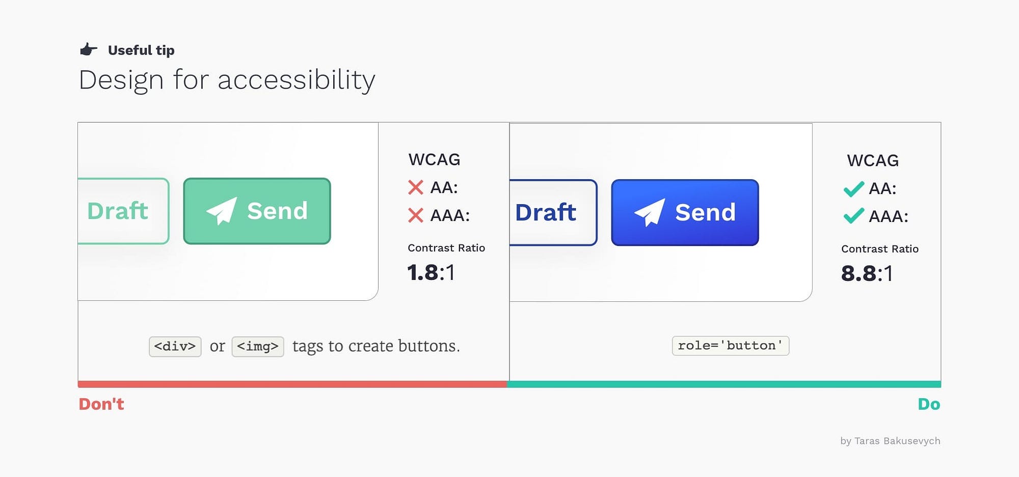
Designers should work closely with dev teams to make sure buttons are working with screen readers. The button role should be used for clickable elements that trigger a response when activated by the user. Adding role=”button” will make an element appear as a button control to a screen reader.
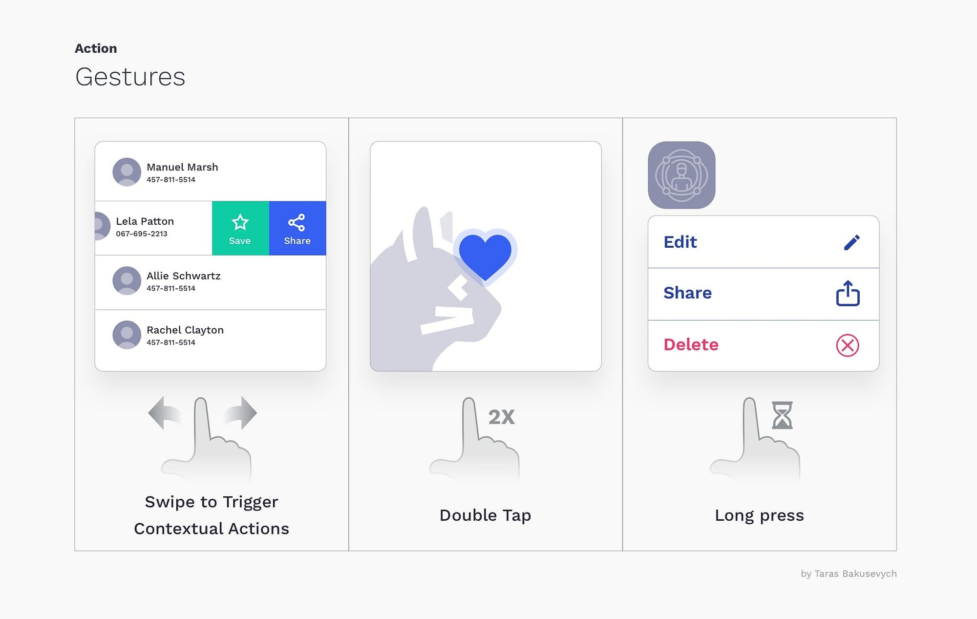
Gestures become fairly widely adopted
Gestures let users interact with the application using touch. Using touch as another way of performing a task can save time and give a tactile control. As some gestures like swipe to trigger contextual actions, double-tap to like or long-press, being used more widely every day, they still are not very apparent for the average user. I would suggest using them as an alternative way to perform an action for more advanced users.
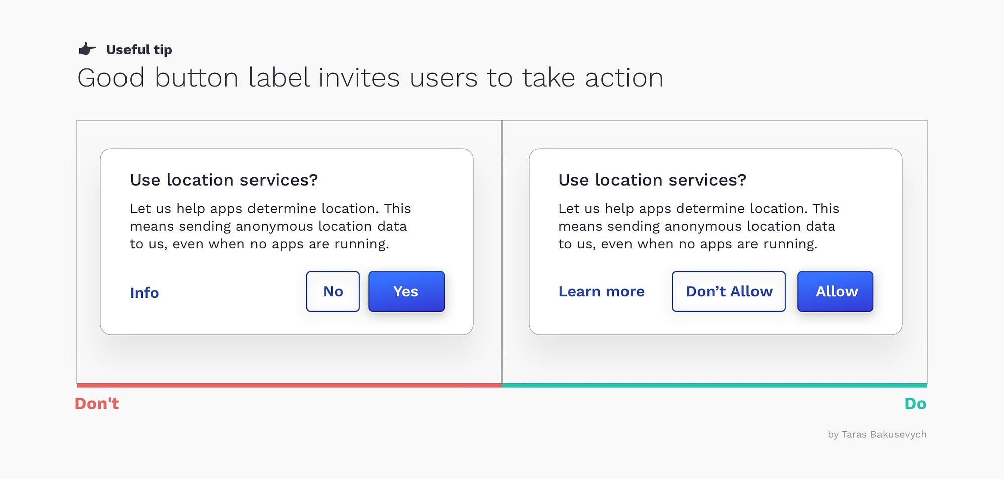
Good button label invites users to take action
What your buttons say is as important as how they look. Using the wrong label can cause users confusion, loss of time, and possibly some big mistakes.
A good button label invites users to take action. Best to use verbs, and label the button with what it actually does. It's like the button is asking the user — “Would you like to (Add to basket)?” or “Would you like to (Confirm order)?”.
Avoid using Yes, No or labels that are too generic - like Submit.
Ok/Cancel or Cancel/Ok? Either is fine
Both are just choices, and designers can argue for hours about their preferences.
- Having OK action first supports the natural reading order. It may help to save some time if we know that most likely this is what uses will select. Windows puts OK first
- Listing OK last improves the flow. Some may argue Ok as a next button will move the user forward. Putting OK last, help users evaluate all options before taking action, and help to avoid mistakes and rush decisions. Apple puts OK last

Either choice has good arguments in its favor, and no choice is likely to cause usability catastrophes. I personally mostly put OK last in the action list, in something like dialog window (Maybe because I’m primarily Mac user.)
Disabled buttons suck
Everyone was in this situation before. Being stuck on the screen for several seconds or minutes, trying to figure out why your progress is blocked by a disabled button and what you need to do bring this thing back to life). Disabled controls are used to indicate component is currently noninteractive, but can be enabled in the future. Disabled buttons are used because removing the button from its native location and revealing it in a later context could confuse users.

I suggest avoiding disabled buttons if you can. Better to have it always enabled, and if users didn't provide some required information just highlight the empty fields, or bring up notification.
You may also like
Components series — a detailed look on the components we use every day and how best to design them.

