Buttons: attention to detail

Buttons are an important component of any website. They allow users to interact with the site. But we often forget how important they really are … If everything is done correctly, buttons can improve the common user experience, and finally bring more income for the business.
Buttons are key elements of each interface, so it is important to consider them with attention to details such as the indents, size , location and accessibility.
Depending on the style and tasks of the site, there are many variations of how the button may looks like. This article provides examples of the most basic.
Contrast
The main button on the site should always be contrasted. To perform the main action on the site, the user should not have doubts that he is doing something wrong. To do this, it is important to use contrasting colors for the button and text. Also, the wording of the text on the button should clearly convey the essence.
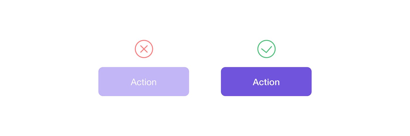
In poor lighting conditions, a dim monitor screen, or for people with poor eyesight, a slight difference between the color of the button and the text can be difficult.
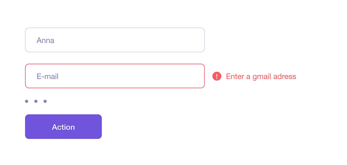
Also it is important to say about inactive buttons. Usually they are needed if the user has filled out the information in the form incorrectly. In this case, better to re- think about the situation and with poor visibility and not to use transparency or color change to gray (as an example). The reason why the button does not work is better to write for the user either next to the button, or to shift the user’s attention to a specific field where there was an inaccuracy. This will not cause unnecessary questions for the user and his time will not be spent figuring out why he can not proceed to the next step.
Additional button
If the site has an additional offer for users, it makes sense to place it next to the main action, and not take users away, for example, to the block below. For a secondary button, a less bright fill color is usually used, or only the stroke is left.

Toggle button
Usually used to switch states in an application. They save space, as they immediately show the user several options.
Inverted colors are often selected for the toggle button, thereby confusing for some users. Many mistakenly choose a lighter color as active. Instead, you can use colors in one direction, then the change of state is more clear, and there will be no doubt in the user.

Delete / Close Buttons
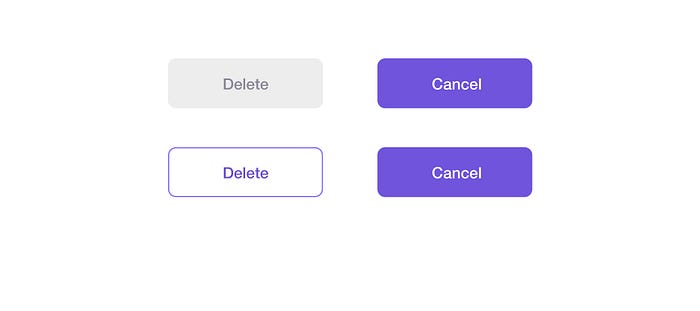
Special attention should be paid to the “ Close ” and “ Delete ” buttons. In general, the same rules work for them, but there are exceptions .
There are two layout options for the “Close” or “Cancel” button. The first option is next to the active action button, but then it makes sense to make it less bright. The second option is in the form of a cross and in the upper corner of the page or form.
It is important to remember here that if the action is irreversible, then sometimes it makes sense to make the “Close” button brighter. It is also possible to swap the “Ok” and “Close” buttons. In this case, if the user clicks automatically, it will be the “Cancel” button, which means that he will have some more time to realize the action.
As a result, in addition to the main button on the site, there are many additional buttons that are also important to pay attention to. Then the priorities for users will be clearly arranged, and the interface will be holistic and clear. Thank you for reading!
My portfolio on Behance
Have a good day! 😉


