Member-only story
Should “cancel” be a button or a link?
Which one is UX best practice?
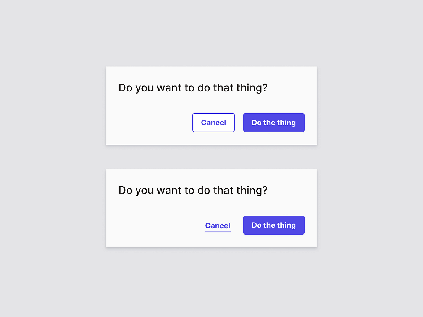
A common type of dialogue that is often presented when interacting with a web app, is the “cancel” option. Usually when the user is filling out a form, or manipulating data (e.g. inside a side panel, detail page or modal view). One would typically see it next to a primary action, presented as a link. More and more however, this cancel option is presented as a button. Is this good or bad practice, and why?
Navigation vs. Action
When looking at a web app, a user typically has to deal with two types of interaction: navigation and actions. Both types of interactions are usually represented in a different but distinct way.
- Navigation is a link.
- Action is a button.
Why is this? Links stem from the early days of the world wide web. It’s what it makes it be a web (and also world-wide). Buttons are a form of skeuomorphism that translates the physical world of flipping switches and pressing buttons to do stuff, into the digital world of the internet. And thus, they are used differently:
Actions are manipulation of data the user is managing through the interface of the web app, while navigation is a state change of the interface the user is, well, navigating through. In other words, links (or navigation) don’t lead to changes of the underlying data, but can lead to the presentation of new pages, or a different presentation of the current page the user is navigating in (i.e. change the view). So when we look at it this way, we are basically saying that navigation is a state change of the UI and an action is data manipulation. In other words, going from one state to the other is the same as navigating from one state to the other. I’d like to note that actions (buttons) can lead to navigation, but it’s not a requirement.

UI Design
How one would visualize a link and button is of course a design style decision, but typically links are blue underlined text and buttons are boxes with text inside of them. Both links and buttons can contain icons to emphasize the…