Member-only story
Should “cancel” be a button or a link?
Which one is UX best practice?
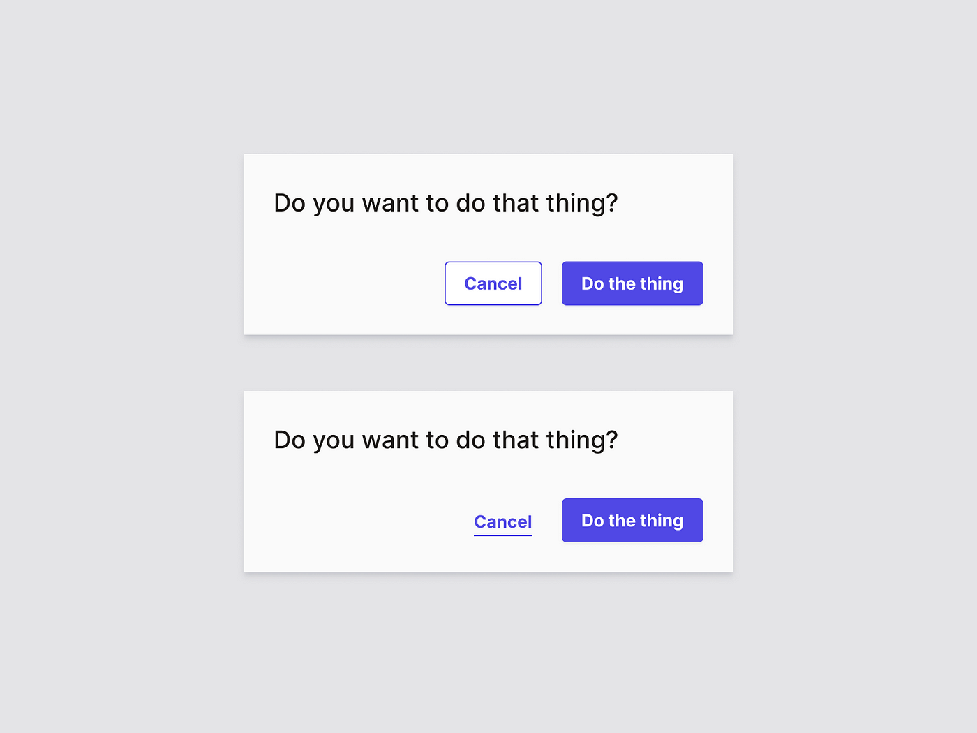
A common type of dialogue that is often presented when interacting with a web app, is the “cancel” option. Usually when the user is filling out a form, or manipulating data (e.g. inside a side panel, detail page or modal view). One would typically see it next to a primary action, presented as a link. More and more however, this cancel option is presented as a button. Is this good or bad practice, and why?
Navigation vs. Action
When looking at a web app, a user typically has to deal with two types of interaction: navigation and actions. Both types of interactions are usually represented in a different but distinct way.
- Navigation is a link.
- Action is a button.
Why is this? Links stem from the early days of the world wide web. It’s what it makes it be a web (and also world-wide). Buttons are a form of skeuomorphism that translates the physical world of flipping switches and pressing buttons to do stuff, into the digital world of the internet. And thus, they are used differently:
Actions are manipulation of data the user is managing through the interface of the web app, while navigation is a state change of the interface the user is, well, navigating through. In…

