Member-only story
Categorizing an analogous color harmony for data visualization
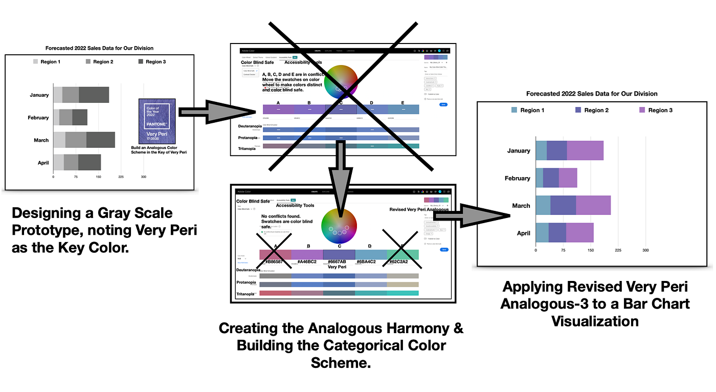
There are instances in data visualization and graphic design where there is a need for a categorical color scheme with neighboring colors on the color wheel. For example, the data might reflect different components from a unified source. Here, I use the case of forecasted sales in three regions of the same unit or division of a company over a four-month period. The color scheme will distinguish between the projected revenue of the three sections of the division. However, the colors will be of similar hues to indicate the data is from the specific unit within the company. An analogous color harmony is an optimal solution for this situation.

To reflect the 2022 year, I will build this color scheme with Very Peri, the 2022 Pantone Color of the Year. I will be using Adobe Color to build this scheme of three colors adjacent to each other on the color wheel. The final color deficiency tests of the data visualization will be performed with the Color Blindness Simulator, Coblis. Let’s get started by reviewing the analogous color harmony.
Reviewing of the Analogous Color Harmony:

